No matter how enamored you are with your brand, eventually you may have to shake things up a notch. You may cultivate a dubious reputation, your target audience may grow indifferent, or emerging competitive forces may compel you to adapt. Despite the reason, you only have two viable options when you face these dilemmas; you can keep religiously to the old branding standards that landed you into this mess in the first place, or you can start over a new leaf, rebrand your company with a new vision and a new image, and start to rebuild.
When it comes to brand redesigns, 2016 has been a busy year for the consumers. Whether or not the new aesthetics were publicly ousted or widely praised, brands repeatedly reassured the public that they inspired the change, for better or for worse. Redesigns have been simple and bold simultaneously, and confirming to all effective marketing techniques in the modern world. The redesigns were rolled promptly across all social media platforms as well. While we have already covered subway’s foray into rebranding, and the revamped logo of Netflix in previous posts, here are some of the most radical and controversial logo redesigns of 2016:
1. Nesquik
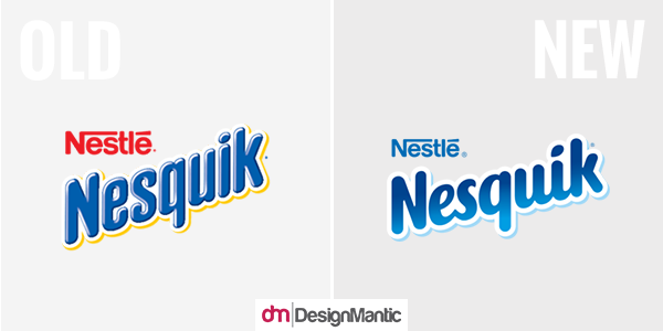
Being tucked in to bed with a steaming cup of Nesquik is one of the most soothing feelings I fondly reminisce with a nostalgic sigh. Which is why it perked up my ears when I heard of the new logo and packaging of Nesquik designed by Futurebrand. If I don’t let my sentimental affections get in the way, both the old and the new logos suffice for a chocolate drink/ powder product! However, coming to think of it, the old logo did seem cold, remote, and even downright corporate.
Following in the recent fad of minimalism, the new logo is much softer and friendlier to look at. I especially love the custom lettering job where the letterforms are imbued with an airy, yet simultaneously condensed feel due to the italic structure.
While the rebrand wasn’t entirely necessary, it’s a visual improvement, lending the brand an indispensable kick in the rabbit butt to stay within the territory of more timely aesthetics. According to Futurebrand, they modernized and evolved the global trademark to embody and articulate a sense of approachability and warmth, using the white outline to exude the core brand notion of milk complement, and further reinforced it by replacing the dot over the ‘I’ with a droplet.
Verdict: Win!
2. FDA
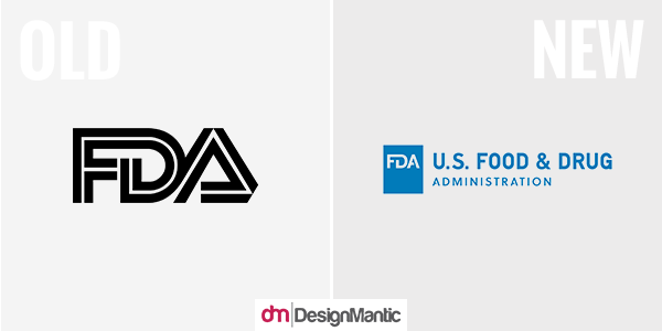
In case you haven’t noticed before, we come across the logo of FDA so frequently that perhaps we have simply chosen to ignore it; which might be one of the reasons why the unit decided to foray into a rebranding venture. The previous version was a fairly tolerable chunky inline wordmark, incorporating a few (well-placed) daring executions, such as the “DA” ligature, and how the F” and “A” joined the “D”. Other than the fact that it was commonplace and old, the logo gave no cause for rebuttal; it was easily distinguishable, it had equity, and it reproduced well. It was a good Logo. May it R.I.P.!
An extremely sore new acronym takes its place, awkwardly tying the “F” with the “D”, while leaving a despondent “A” hanging alone in thin air, with a notch in its crossbar that seems rather superfluous and uncalled for. The hierarchy of the logo seems off as well, with the logo shouting “U.S. FOOD AND DRUG!”, while pushing the important “ADMINISTRATION” part to shy away into oblivion. Overall, unapproved!
Verdict: Fail!
3. Universal Studios
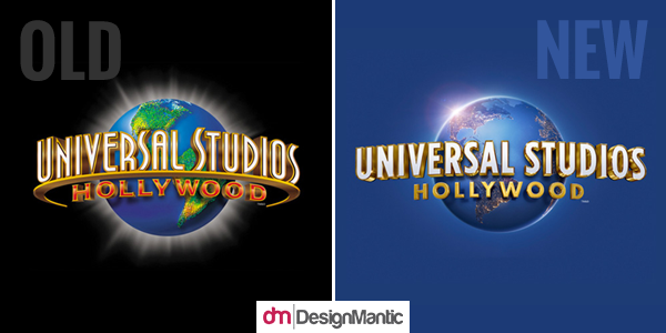
When universal Studios decided it was time to simplify the rather busy logo, it came as no surprise to me. In a way, both renditions of the logo perfectly represent the theme park, and nobody would have complained even if the old logo had stuck around for a few more decades. However, indubitably the new logo wins the round with a less heavy-handed aesthetics of the Hollywood-Golden-Age of 1950s (with a stab at Planet Hollywood), and a more contemporary feel than what the logo was flaunting before.
The new logo uses a globe that draws from a previous revamp to the Universal Studios logo in 2012. This globe has a more realistic rendering, and I love how the new typography follows through with the update! The logo also bids adieu to the needless “ring” around the previous version of the globe. It’s interesting to see how the brand went with a night-time earth (albeit bright) with points of light dotting the land, rather than the halo-ringed green-land daytime earth used before. Overall, it’s one logo evolution that makes sense and retains the overall aesthetics of the studio.
Verdict: Win!
4. Vera Bradley
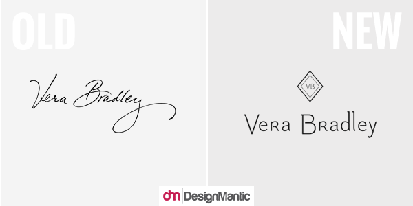
The old logo wasn’t particularly good or bad, that is as far as signature logos go. It was for the most parts, forgettable. When it came to functionality, it failed to yield the significant visual presence one would expect from such an extensive use of real estate. It was faux classy to be sure, poised as the imprimatur of the luggage’s and handbag’s designer. Since signature logos are not a piece of cake to work with, it perfectly makes sense why they would go for a more logo-ish identity. Sadly for Vera Bradley aficionados, the new logo is a real design travesty of 2016.
There’s absolutely nothing to feel excited for; the awkwardly dopey serifs on a few of the letters, the ball terminal on the “a”, the dipping initial caps, the inconsistent and needless stenciling, and the ridiculously high ascenders! The monogram is just as bad (if not worse), with its crammed “VB” and barely contrasting strokes. I think that it is a poorly-executed type-driven logo that only appears adequate in its physical application on the products; and that is probably because even attaching gold-plated Papyrus on a leather handbag would hardly look anything but decent.
Verdict: Fail
5. Kodak
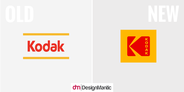
Kodak has recently reinstated its iconic logo with an identity and typographic revamp by Work-Order, a NY based agency, to steadily coincide with its reoccurrence as a more general consumer brand. When the previous logo was launched in 2006, it was a drastic change that shocked the customers with its adamant retiring of the camera-shutter icon, which had made Kodak one of the most identifiable brands to date. Kodak has returned to its classic icon not with a sense of ashamed remorse, but rather an acknowledgment that the timeless logo holds a special place in the minds of their customers and has the potential to re-establish a history-rich, confident consumer brand.
The contemporary typographic treatment accompanying the icon is a hint at the fact that this is the same trusted brand people knew, albeit in a more savvy fashion. The vertically-stacked type not only modernizes the logo but also offers a fresh take on what it can do. The geometric sans of the original logo is replaced by a lightly wider sans that does the space justice. Ultimately, this modern-day approach to the logo design succeeds in establishing a revival of the old.
Verdict: Epic Win!
6. Instagram
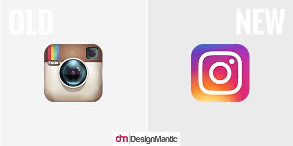
The skeuomorphic camera icon we had come to associate with Instagram was an epitome of a modern-day classic. Not because it was a design miracle, but rather due to its ubiquitousness in users’ phone screens! The icon was so widely popular that people were left in a disarray when it was suddenly changed by the company. Of the uproar, almost 75% of the negative reactions simply stemmed from the fact that it had changed.
Not that the new icon is particularly homely or irrelevant. In fact, as far as camera icons go, the revamped icon is lovely and incorporates just the right amount of minimal elements indispensable to make the icon resemble a camera. However, sadly it is depleted of the minimal amount of elements necessary to be recognized as Instagram anymore! While the new logo is glossier and savvier than its predecessor, the lack of graphics becomes its death.
With Instagram touting to be the largest photo sharing platform on the web, lack of creativity is the last thing we could have ever expected from the company. While a plethora of brands are recently abstracting their logos in an attempt to modernize them, the intent is to render the designs more suitable for smartphone screens. Instagram’s new logo unfortunately misses the mark since its insipid design makes it highly forgettable.
Verdict: Fail!
7. Dell
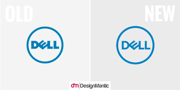
The original Dell logo with its drunk, clunky “E”, was one the worst mainstream, large-scale designs we have had the misfortune to behold. Its 2010 touch-up promised a slightly more effective evolution that minimized the real estate occupied by the wordmark by placing it inside a circle, making the tipsy “E” less in your face. The first thought I had at looking at the new Dell logo was that it went on a diet, and it worked!
Considering its origins, it’s nothing short of incredulous how the new logo somehow manages to look good, and some designer on the face of the earth finally figured out how to make that “E” appear wanted. The elegant strokes and the contemporary thickness of the letters strikes the perfect density for the logo to be scalable across all mediums and sizes.
While it’s still an unchartered territory for a logo design, it’s the most sophisticated that the logo has ever been (or could ever hope to be), and hovers at the edges of “cool”! Dell EMC and the Dell Technologies logos extricate the wordmark back out of the circle to pair it with a corporate, simple sans serif, and looks surprisingly good! Bland and corporate at a glance, but effective, solid, and good in essence.
Verdict: Win!
8. Fanta
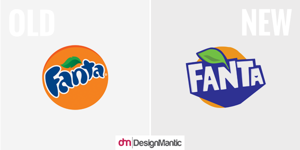
Even after 8 years, the logo of Fanta holds true and will continue to do so in most markets. Nevertheless, the new logo answers the same challenges of “fun”, “pay attention to me!”, and “soda!” in addition to rendering the logo in the opposite polar end of the spectrum; instead of plump and curvy letters, it employs straight and hard-angled ones. While both suffice for the logo of this “bursting to energy” brand, they have their own pros and cons.
Personally, I am more predisposed towards the lettering in the new logo. It is imbued with a bold energy, and exudes a nice dimensional effect with some shadows which are too subtle to be highly conspicuous. Notice how cutely the second “A” sports a smirk. Unfortunately, the leaf is far too distracting and is downright terrible, as are the orange slices on the packaging. This could be a great soda logo if those two elements are resolved.
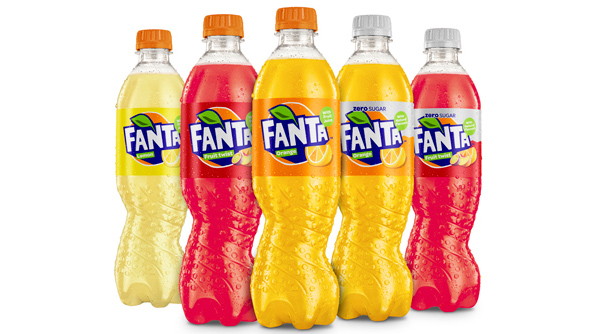
Image Source: Coca-Cola UK
The asymmetrical silhouette – defined “slider” makes the new packaging of Fanta highly distinctive, with a torsion or “twist” in the lower body, insinuating at the presence of real orange juice and creating a lasting impact. However, unfortunately Fanta failed to create any real integration between the bottle and the new label or logo. There appears to be two disparaged things brought together by parallel forces. Not to mention, instead of bringing to mind vibrant and tangy images of squeezing an orange, the bottle reminds me of someone wringing a wet rag! Overall, the lack of consistency across applications and elements portrays a sense of neglect in quality control and creates unnecessary confusion. The lack of direction is too out there for me to ignore!
Verdict: Fail
9. MasterCard
An escalated connectivity of consumers and the digitization of Ecommerce processes is driving a digital transformation that is promising to tout seamless payment choices. In order to reflect an optimism and a readiness about this bourgeoning transformation, MasterCard has evolved its brand identity; modernized, simplified, and optimized for a progressively digital world.
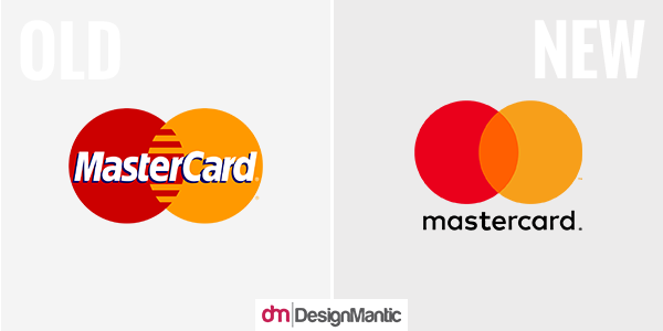
The splendid overlapping circles were the most redeeming aspects of the old logo, which were obscured by a barely-fitting, less than attractive condensed sans serif tagged with a flat drop shadow. However, despite the popularity of the logo, the interlocking lines of the circles weren’t made to adapt to the digital world of today. While the new logo keeps the overlapping circles, it figuratively emulates the functionality of the old logo by coloring the overlap orange.
The all lowercase approach gets rids of that financial institution drabness, while simultaneously building on the equity it has erected over 50 years of two, as minimally as possible. Overall, the brand overhaul is a clean break for MasterCard to develop a clear house style that takes roots in the crispness and the simplicity of the new logo.
Verdict: Win!
10. Axway
In collaboration with the leading design consultancy and global brand, Landor, the new brand identity of Axway introduces a redesigned website, a fresh visual expression, an attention-grabbing logo, and an enticing tagline “Imagination takes shape”.
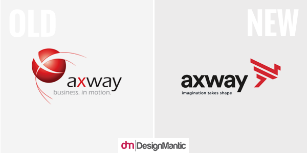
Axway’s new logo is derived from the legendary visionary creature Griffin, touting the upper body and head of an eagle and the rear body of a lion, in order to pay ode to Axway and its customers; two powerful elements uniting to achieve success. According to Landor, the symbol embodies to perfection the essence of the Axway brand, fusing reliability and stability with a bold, open-minded vision for the future.
The old logo was a vacuous and a fairly incomprehensible corporate mark with a bad case of typography to boot. The latest rendition of the brand identity is an effective corporate icon which is as vague as the description of the company itself. I love how the corporate sans serif of the wordmark pairs nicely with the angles of the icon. Other than that, I can’t really decide what to make of this branding overhaul!
Verdict: MEH…
11. Deliveroo
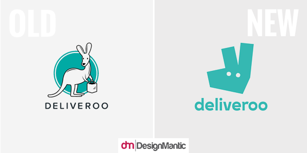
The previous logo of Deliveroo was perhaps too literal with the icon of a kangaroo protectively holding a delivery bag. While the logo clearly portrayed the nature of the company, it lacked in inventiveness and execution sadly! The new logo solves all design dilemmas by being overly ambiguous and minimal (even the depiction of the kangaroo isn’t very perceptible). However, now that the brand name and service have established a measure of equity, they can afford to take a leap of faith, on the optimistic assumption that the name of the delivery service will suffice to carry the premise of the business.
As part of the new brand identity, the color palette, the Roo mark, the illustration, and the typography all work harmoniously together to create a unique, distinctive graphic language. In order to articulate the energy, vibrancy, and the spirit of the brand, tone of voice principles were also defined for Deliveroo. The shape of the kangaroo is bold and quirky in the new logo. Despite being stripped of all vestige of expression, the kangaroo still permits a sort of permanent engagement status.
The wordmark is a pleasant respite from the age-old geometric sans serif by displaying a couple of eccentricities. Perhaps the biggest is the rotated counter-spaces in the “o”s and the “d”, where the skinniest part of the letters falls on the sides, instead of the bottom or the top. Nevertheless, the graphically agreeable identity of Deliveroo boosts the brand way above start-up level and offers a few bursts of surprises, even in its sheer simplicity!
Verdict: Win!
Can you think of any other rebranding forays of 2016? Do let us know in the comments below!


CoCa Cola also changed to a new design under one umbrella of coca cola!