This content has been reviewed and verified by Zaheer Dodhia, a logo and branding expert.
A brand’s logo is one of the core elements of its visual identity. It is because of this reason every brand wants to opt for a design that is unique, aesthetically enriched and represent the organization at its best. Symbols, artistic iterations, a product of the organization, animals, flowers, motifs and a myriad of other things can be a logo for a brand. One such type of logo includes wordmark logos.
What is Wordmark Logo?
When we talk about designing your wordmark logo, a question pops up in our mind that what actually it is? The answer is simple!
Wordmark (word mark) or logotype are those logos that are made utilizing the alphabetical letters of the business name, product or services. It is the unique text-only typographic treatment of the business name to make it identifiable as the brand identity or logo. Wordmarks make a perfect and easy logo, especially for small business owners. Because:
- Wordmark logos are more identifiable.
- Wordmark logos make it easier to remember the brand name.
- Wordmark logos are simple to use.
- Wordmark logos are timeless and need less variation over time.
- Wordmark logos that match the domain name you pick make your site’s address more memorable.

While designing logos, it remains the top priority of every brand to employ golden rules to design memorable logos. When it comes to design an impressive wordmark logo, melding typography and embodying illustrative elements call for striking a perfect balance, a flair for design and know-how of technical facets, which can be quite a task for those small business owners who opt for designing their logo without the help of a professional graphic designer.
With a little attention and care, even an immature and small business owners can design a compelling wordmark logo on their own. To let you stay ahead in your design game and make an impressive wordmark logo, we have curated a checklist of some dos and don’ts that will act as a guide in this task. So, note down these commandments of logo design embrace recommended strategies, imply your individual style, avoid suggested mistakes that designers usually make and design a logo to impress all.
Dos of Wordmark Logos
- Make an ideal pair
- Safe bet of uppercase-lowercase
- Strokes of color
From classy to clever to cliché and from simplistic to sophisticated to sober, there are variegated ways to design a logotype/wordmark logo. However, there a few sure-fire bets that you can make while designing your logotype.
• Make An Ideal Pair
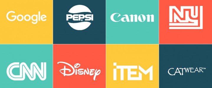
Matches are made in heaven, but alphabetic pairing is done by designers. So, one of the most important rules that you should consider while designing your wordmark is to opt for ideal pairing. When combining two letters from the business’ name to form a logo, make sure that the two letters have a complementary and ideal shape for pairing. A number of letters form a natural pairing and you are in for a treat if you have to design a logo the brand name of which includes these letters. For example, letters ‘H’ and ‘K’, ‘I’ and ‘R’ and many other pairing have adjacent strokes or complementary shapes to connect and fit just like a pair of glove fits in our hands. In the practical world, the logo of Cable News Network (CNN) is the perfect example of a paired wordmark logo in which two ‘Ns’ are perfectly glided with each other.
![]()
• Safe Bet Of Uppercase-Lowercase
Opting for the uppercase-lowercase option is a no-brainer when it comes to design wordmark logos. An aesthetic amalgamation of uppercase-lowercase letters of business name can carve out an outstanding piece of art. When you design an wordmark logo and doctor any two letters from the company’s name, you have enough room to play with color, size and style, where you can bring your own creative spin to make the logo look attractive and unique.
The best example for uppercase-lowercase logo is of Los Angeles based men’s fashion brand Item. Its logo starts with a lowercase ‘i’ and continues with uppercase letters. The letter ‘i’ is a perfect choice to opt for uppercase-lowercase designing because of its dot that simply brings a fun, distinguished yet defined touch to the logo.
![]()
Similarly, the old logo of New York Giants, the famous football team also reflects a perfect way to entwining an uppercase and a lowercase letter together. The team currently has a logo comprising lowercase only letters, but this old logo is the best iteration of this technique.
![]()
• Strokes Of Color
If you don’t want to take the risk of merging, tweaking and playing around your ligatures, one of the easiest ways to amp up your logo is to add colors in it. Whether you want to bring a wide variety of colors in single letter like ‘G’ of Google or want to make all the letters in a single color like Pepsi, there are a number of options you can use colors to enliven and beautify your wordmark logo. The option of using colors not only adorns a logo, but it is also one of the ways to show a lot about the company’s image, culture and beliefs. This is why you should touch up on the psychology of colors and choose colors wisely for your business. A logo designed in bright colors reflects the fun and liveliness of an organization; whereas, using a somber hue in the ligature portray formal and sober face of the brand.
![]()
![]()
Don’ts of Wordmark Logos
- Avoid overtweaking
- Curb your kerning
- Font faux pass
While above points will help you create a perfect and aesthetically appealing wordmark logo, you must also consider following points and avoid these mistakes.
• Avoid Overtweaking
Letters in wordmark logo are the quintessential part. You can play with the letters, but you must also maintain its originality and outlook. You can move, alter, add color and style to the letters, but do not overwork letters to make them look like symbols or anything in close connotation with any other image. You know, you have blurred the lines between tweaking and over tweaking when a letter begins to resemble other picture or symbols. If we look at the famous computer repair organization – The Computer Doctor’s logo, we can easily notice that the letter ‘u’ is tweaked to give it a shape of a mouse. The logo received a lot of criticism from all over the globe that the organization has to opt for another logo.
![]()
Similarly, in the old logo of CatWear, a clothing brand for the independent women shows how the letter ‘A’ is tweaked so much to give it a picture of a cat.
![]()
• Curb Your Kerning
Kerning brings finesse to a design, but it is imperative to embrace nifty kerning skills to boost typography. While designing an wordmark logo, letters should not be kerned too tightly; rather, prefer a balanced and appropriate kerning. The best ways to deal with kerning problem include: adding serif, incorporating colors and creating patterns. If a design misses all these elements and ligatures in your logo are too tightly kerned, it may cast huge impact on the name of the brand. The vividly bright logo of Kids Exchange has got it all except perfect kerning. The letters in the logo are kerned too tight that it eliminated the space between kids and exchange.
![]()
• Font Faux Pass
In a wordmark logo, the selection of typeface occupies immense importance and can make a huge difference. Which is why you should be drilled in the commandments of typography. While adjoining two letters that lack adjoining points to form a close connection can easily be connected with each other just by changing the font. Trying out ligatures in a couple of fonts or combining different fonts reveals the most suitable typeface for your design. It is through trial and error method that you can get an idea about how letters can be connected to create a strong visual appeal. The logo of Mega Flicks, truly interprets how careless usage of fonts can devastate the logo. In this logo, the letters ‘l’ and ‘i’ are not adjoining well; rather, they look like one letter ‘u’, giving altogether different and subliminal meaning to the brand name.
![]()
Image: Flickr


Those examples are brilliant and perverse, thanks for the laughs!