The creative arts are many, varied, and ever changing. Neither boundaries nor languages can hinder a truly creative piece of work from gaining strength and popularity all over the world. And when it comes to designing, whether it is a promotional banner or a web design, a greeting card or a logo design, creativity is on another level. There is color, there is a symbol, and then projecting the company name in the most decipherable, most recognizable and the most memorable way possible, there comes the use of typeface, and all of this combined can make your monogram or the logo identity stand out in the crowd of competitors.
The fact that there are many typefaces now that are being used in the designing world can only mean one thing; that it’s the new age. Everything is done on computers these days and the myriad of selections of fonts that we have has made it very easy to convey the mood of our message. By a simple change in the typeface we can go from formal to friendly, from simple to italic, make it appear anything we want.
Its Origins:
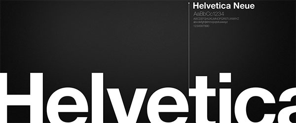
The ongoing tussle on the best typeface, however, has opened the doors to many discussions. Helvetica, the most popular typeface is, constantly under criticism, for being not only boring but the fact that it has sustained itself for the past 54 years is simply logic defying. Created by Swiss typeface designer Max Meidenger and Eduard Hoffman in 1957, it was put up against the Akzidenz-Grotesk in the Swiss market. Originally called the Neue Haas Grotesk, it was later on given the name of Helvetica, which is the Latin name for “Swiss” so that it could be used internationally as well.
You See It Everywhere…
It is true that the Helvetica can be seen on almost every sign, every slogan, and it is also used vastly in the art of logo designs of many famous companies. From BMW, Bayer and Lufthansa in Germany, the Helvetica look spread to Bank of America, Knoll, Crate&Barrel, JC Penney, Mattel, Sears, Orange, Target, Toyota, Panasonic, Motorola, Kawasaki and Verizon Wireless . It is also widely used by the U.S. tax forms, and was also chosen by NASA for the space shuttle orbiters.

It is an easily adjustable font, its simplistic styling makes it very easy to be incorporated in almost every design, and there are countless signs and logo designs that have used it. This leads us to consider the fact that it may not be so just because it has been around for some time or that it was easily available on almost every system, though some would have us believe just that.
If designers are to be trusted then we must look closer to find out why all they want to use is Helvetica, and consider the fact that it maybe because it really is worth something. Helvetica is so commonly used because it works so well. The design embodies the concept that a typeface should absolutely support the reading process – that clear communication is the primary goal of typography. Helvetica is so widespread in its use and has such a global appeal because it has a neutral outlook, it is colorless, and hence it can be easily molded into any design. It can be used to project whatever impression the words and the colors that are used with it desire to project, it is clear and decipherable in any and every font size. It’s also considered to be safe by designers, as in using Helvetica can ensure an easy acceptance; it poses no threat of rejection because it is so easily legible.
It’s Not What It Seems:
On the other hand, there are many people who consider using Helvetica sign of bad taste. They believe that not only Helvetica is not an original in its own design, but it also comes off as neutral, and by neutral it seems to be a tasteless, thing which has no character of its own to hold on to. Whatever impression the designer wants to project, he has to depend on colors and images along with this typeface to deliver his desired effect. It seems bland, too easy to ignore or overlook, and forgettable.
What made the matters go from bad to worse, according to the article in Smashing Magazine, was the advent of personal computers, where systems like Apple could add only few typefaces and they chose Helvetica among there other few choices, so it became easily available to everybody, and people could all copy one another because everybody could access it. Also, it appears to be stiff, and not comfortable to look at, they appear stiffly erected besides each other, with the space in between giving off an unconnected feel. A typeface is not a fraction of a word. Letters make up a word; the principles of typeface classification dictate that it expresses a mood or atmosphere. That is why, the Helvetica is not ideal for any and every sign, especially, if you consider it for logo design. And the fact that now there are similar typefaces around, like Ariel, we can only hope that we have not been so influenced by Helvetica that we never come up with any improvements, for after all that is said and done about Helvetica, it cannot be denied that it was a bad idea that just got famous.
Helvetica vs. Other Fonts:
When we speak of similar typefaces, there is a long list of fonts that can easily substitute for Helvetica better expression and personality. Some designers prefer using it but many others are finding alternatives such as Akkurat, Neue Haas Grotesk, New Rail Alphabet, Graphik, Replica, Synthese, Encore Sans, Gedau Gothic, Chalet 1960, etc. If you are one of the designers who think Helvetica is being overused and gives a trite feel to your design, don’t forget to check out the other fonts I have mentioned here. For it is true that Helvetica just came out at the right time, with an impressive marketing behind it that overshadowed the deadpan, and made it what it is today – the most famous typeface to be used.
We can only hope that in the still-young history of the sans serif, things will change in favor of more intelligent, more original sans serif typefaces.


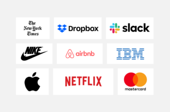

Microsoft and America Airlines logos no longer use Helvetica which is quite visible in the picture.
Hi Pedro, Thank you for pointing out! It’s been corrected now, we’ve
replace ‘Microsoft’ and ‘American Airline’ logos. And we hope it looks
good. Be sure to stay tuned to our blog, we’d love to hear more! 😉