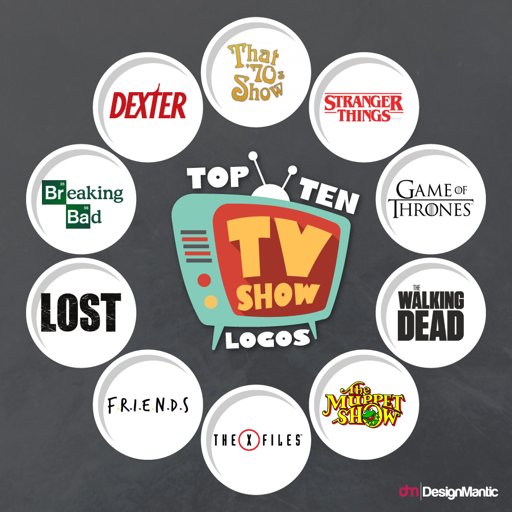
There is so much to love about a great TV show – from its title, characters and music to its storytelling, backgrounds, dialogues and costumes. But one of the most powerful elements that classically condition us to be hooked to a show is its compelling title logo.
As one with an open eye can see, each logo consists of a unique set of fonts that formulate a title. The basic idea behind a logo is to translate a show’s theme and message to the audience. This is seen not only in TV shows, but also movie covers, music and video games. With that being said, let’s look into some of the most popular entertainment logos and the concepts behind their designs.
1. Dexter
Source: Showtime Networks, Inc.
Ah yes! Who could ever forget our favorite blood splatter analyst/serial killer? Well as long as he kills other murderers, it doesn’t really count as murder from his end right?
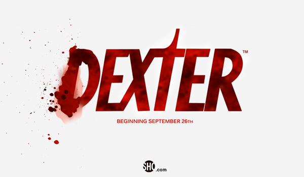
Regardless, the logo for Dexter (2006-2013) was one of the more memorable ones in history. This is possibly due to its warm red font color, the blade that makes up the letter T and of course, the blood splatter effects. Truly nothing else could make it more apparent to the viewers that they were in for a real gore fest.
While it is uncertain as to who made the logo, Lindsay Daniels is credited as the designer behind the show’s title sequence.
2. That ’70s Show
Source: IMDb
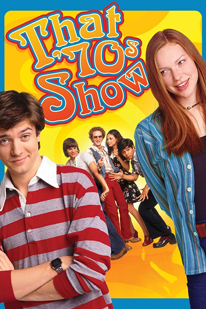
That ‘70s Show (1998-2006) uses the Arnold Böcklin typeface that was made in 1904. The name of the typeface was given in memory of Swiss painter Arnold Böcklin had passed away in 1901. It was the most common font during the 60s and the 70s, which is reflected in the TV show’s logo, title as well as the characters, theme, soundtrack and overall setting.
3. Stranger Things
Stranger things (2016-Present) is a show that has recently garnered a massive fanbase and one of the most appealing factors about the show is its alluring logo font.
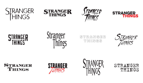
Creator of the ST logo, Jacob Boghosian said he drew inspirations by referencing several Stephen King book covers as well as movie posters from the 80s era.
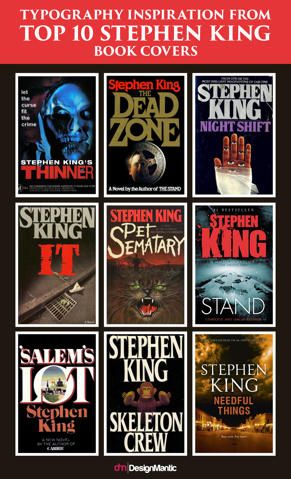
Image Source: Stephen King
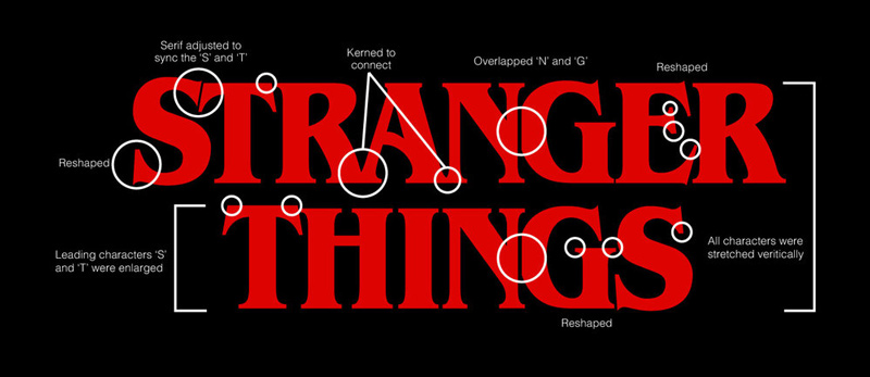
Over 20 potential logo designs emerged from this, but eventually, the ITC Benguiat font was the one Jacob and his team went with.
Then the logo’s typeface contours were later modified to make it look more unique and the rest is history.
4. Game Of Thrones
Source: HBO
If you haven’t heard already, Game of Thrones won’t be gracing us with its eighth and apparently final season until 2019. Yes, your eyes are not deceiving you and that isn’t a typo. Even though the reason behind such a large production gap has been explained, fans are still livid over the announcement.
Nevertheless, it gives us all the time to reflect on everything that has transpired in the series so far and how the show got its global reception in the first place.
To start off, let’s delve into the show’s iconic title sequence. We wish we could talk about the logo design alone, but the overall glamor of the series lies in the entire title sequence. The title sequence was created by The Rock Paper Scissors production firm, its design was done by Elastic and the computer graphics by a52.
Elastic’s head Angus Wall explains that the sequence serves as a legend like the map at the beginning of a fantasy book. Out simply, the sequence informs the audience about the show’s locations as well as the changes in storylines and the characters that are reflected in each episode. It is to help fans, both old and new know exactly what is going on without being left in the dark.
It was with this brilliant concept that allowed Elastic to snag the Emmy for Outstanding Main Title Design and rightfully so. As a matter of fact, the show’s notoriety has come to a point to where brands are designing logos inspired by it.
5. The Walking Dead
Source: AMC Networks
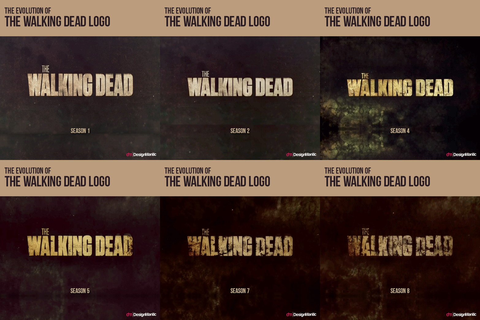
The Walking Dead’s logo is indeed an interesting one as it appears to decay more and more with each new season that airs (Season 8 logo is shown above). If you don’t believe us, then take a look at this sweet little montage GIF of the logo in all the previous season sequences:
Logo Source: AMC
The Walking Dead’s title sequence was developed by veteran film title sequence director Kyle Cooper and his production studio Prologue for the 1st and 2nd seasons. The sequence powerfully showcases the show’s grueling post-apocalyptic themes and setting that easily informs the viewer what the show is all about.
6. The Muppets Show
Source: IMDb
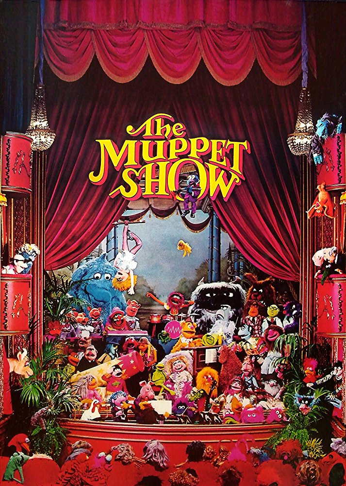
The Muppet Show was something that brought laughter in the form of satirical and intelligent jokes that were enjoyed by both youngsters and adults alike. The main title logo of the show gave off a very old-timey look that hearkens back to the early 20th century era.
The show’s title sequence was made by the show’s creator Jim Henson and continued to evolve visually over the years. The letters in the font mostly used thick serif elements of ITC Bookman, which was in resounding fashion during the 70s. The font came off as goofy, whacky and whimsical just like the show itself.
7. The X Files
Source: Fox
The X-files’ title sequence will remain etched in the minds of those who grew up in the 90s. Everything from the ominous music to the images being shown evoked a sense of fright and mystery in many.
The sequence has since then been praised as one of the best TV sequences in television history. In fact, the sequence was so great, that it gave the show its first Emmy in 1994 for Outstanding Graphic Design and Title Sequences.
The main logo stood out due to its Industria font and the iconic FF Trixie ‘X’ in the background.
8. Friends
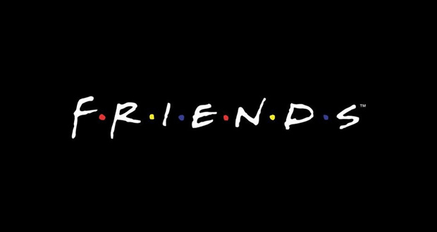
Source: Netflix
Who could ever forget the sitcom show that towered over the rest that was known simply as Friends? A story about six 20-something friends who are trying really hard to deal with the world around them and the hilarious antics that ensued, are timeless even till today.
For the longest time, viewers assumed the show’s title was an abbreviation due to the colored dots between the letters. However, that theory has been shot down as has the theory of the number of letters referring to the number of the characters in the show (obviously).
But one of the biggest rumors surrounding the title was the colored dots and the concept behind them. Some fans have pointed out that the colors refer to the different traits and characteristics of the show’s characters. Elsewhere, a Quora user pointed out that the dots are the same colors as the umbrellas that the characters were holding during the sequence, which was quite clever.
We did some puzzle solving of our own about the three colors and we believe that we have a better conclusion to it. Upon combining the three colors, a new color will be formed – brown. And according to the greatest tell-all these days that is the internet, the color brown symbolizes elegance, reliability, stability, warmth and honesty. When you think about it, these elements mesh perfectly with not only the show’s title, but also the characters as well.
9. Lost
Source: IMDb
The title sequence for Lost was surprisingly only 15 seconds long, but it was enough to capture the audience’s attention and let them know what the show was about. The sequence was made by the show’s creator and director of Star Wars: The Force Awakens, JJ Abrams from his laptop during the sound mixing of the pilot episode.
Abrams was also the one who made the discordant and ominous sound that plays during the short sequence before it cuts off after zooming into the letter O. The concept behind the title being out of focus at the beginning of the sequence was to relate the show’s mysterious theme to the viewers.
10. Breaking Bad
Source: AMC Networks
It goes without saying that we saved the best for last and arguably the best TV show of the last decade is indeed Breaking Bad. This show was a giant piece of ingenious art all over that garnered rave reviews with each season that passed.
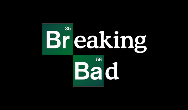
One of the show’s most differentiating aspects was how its title logo incorporated the use of chemical elements from the periodic table. As you can see from the picture above, you will notice the Br and Ba accompanied with their periodic numbers denoting the elements of bromine and barium respectively. These two use the Helevetica Bold whereas the rest of the letters use Cooper Md BT.
Conclusion
Oh how time flies and yet the logos from our favorite shows will never disappear from our minds or our hearts. It is truly fascinating how many different fonts and their variations are being used nowadays as computer wallpapers and custom T-shirts, skateboards and more. If we failed to list your favorite TV show logos here, give us a shout in the comments below.


