Videos are loved, and for a reason; they move. Motion excites us. Our brain is wired to get attracted to anything moving!
We like moving objects, be it blazing fires, ocean waves, dancing peacocks, or waterfall. Not many of us would prefer reading a lengthy article to watching a 5-minute video on the very topic.
The ‘adoration’ for animation being as it is, there is no surprise that animated 3D logos are becoming a super-hot trend in the design arena. If you are a designer fetching some inspiration for your next business systems logo or a brand owner looking for a reference to show to your logo designer, our list of logo animation trends will help you—in either case.
Let’s quickly drill our way to the list and get your brand moving with stunning animation logos.
1. Rotating Logo Designs
As obvious by the name, you’ll see all or some elements rotating in these logos. Take 500px for instance; the lines in the logo keep on rotating, no element left static. The font is bold and playful forming a pattern that elicits fingerprint and turns into the focus sign of a camera.
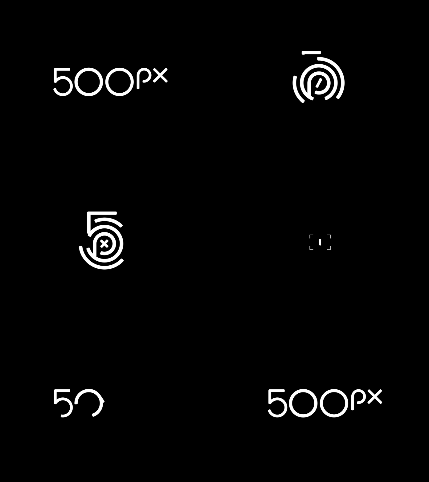
Image Source: Dribbble/William Kesling
On the contrary, in Giant Owl Productions the text is static, whereas other elements are moving. The logo belongs to a production house that creates TVCs, short films, and programmes.
Also, the way this video production logo shows spheres rotating, changing their radius afterwards to represent video reels and then giving an impression of blinking owl eyes is sheer creativity. This is a great example of animation delivering a message in ways that would be impossible to attain if the design was static.
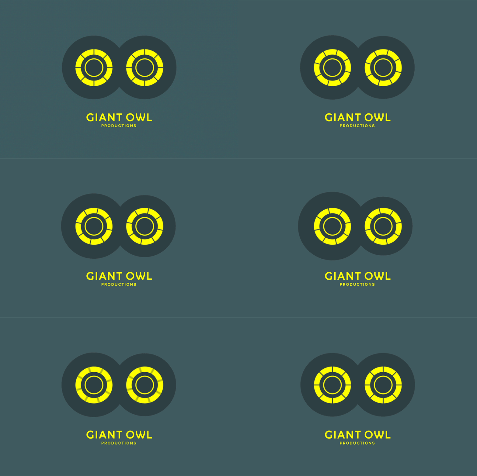
Image Source: Giant Owl/bpando
2. Morphing Logo Designs
Every other designer on the block has tried this! Ask them to blend an elephant into a moving cycle and get wowed by the results. What can be livelier than watching the word “Brikk” transforming into a neon brick? The bricklayers logo works perfectly for a brand that deals with 24K gold-plated iPhones, diamond encrusted watch, and titanium wheels.
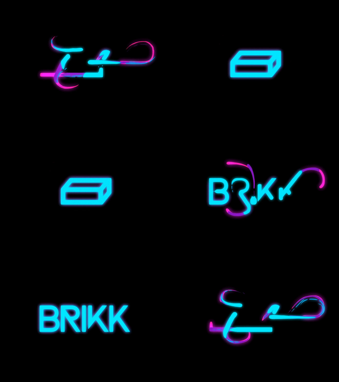
Image Source: Dribbble/Gun Karlsson
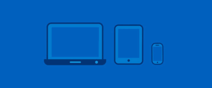
As you can see in the Intel – Look inside design by Nicolas Girard, the tab and phone slides out of the laptop, backslides into the laptop again. Afterwards, the laptop transforms into the signature icon “Intel”. The swirl logo represents the company makes processors for computers, tablets, and smartphones.
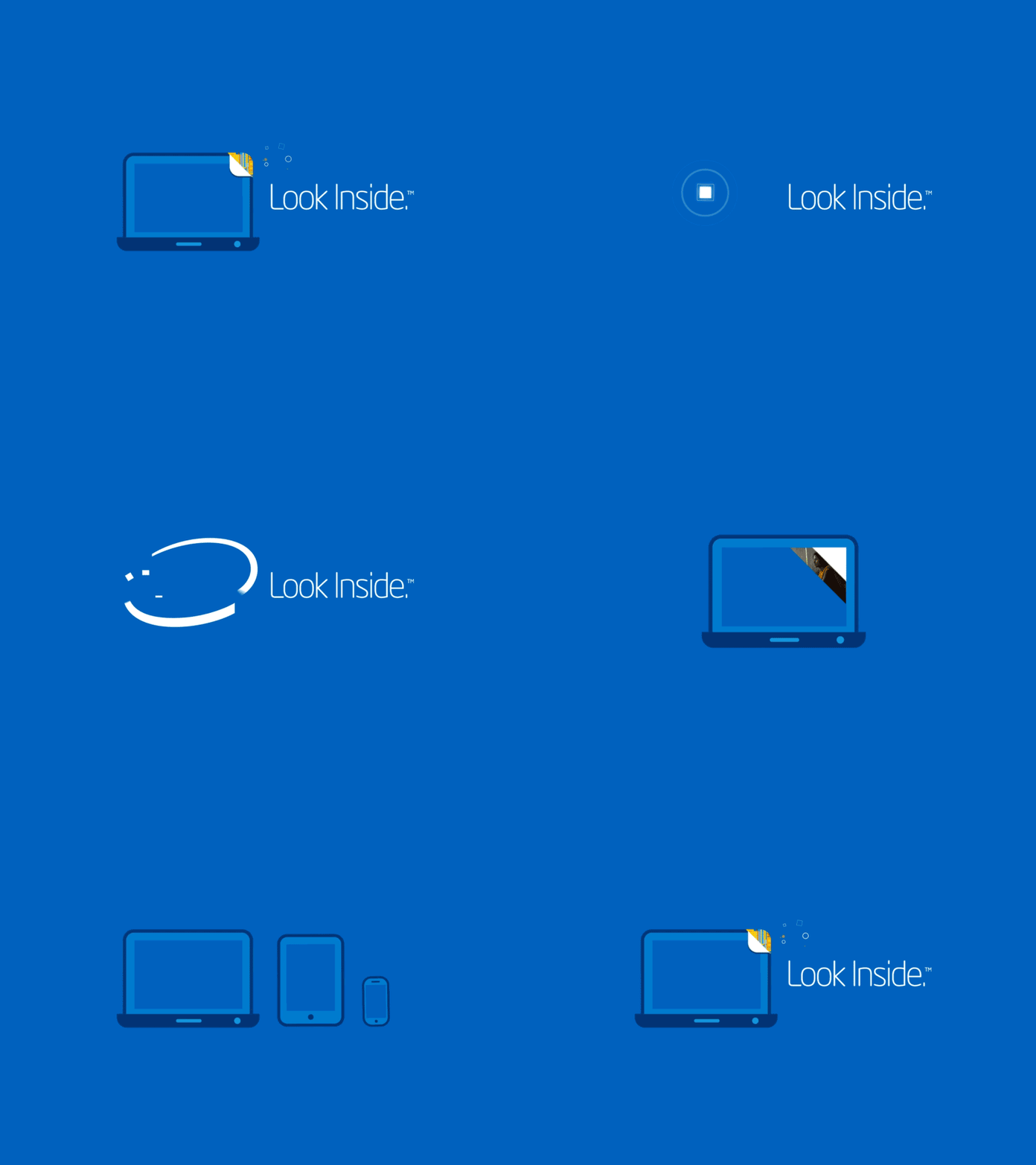
Image Source: Dribbble/Nicolas Girard
Ever noticed the word Google swiftly turning into microphone, a throbbing wavelength, jumping balls or small spheres and the colorful “G” logo.
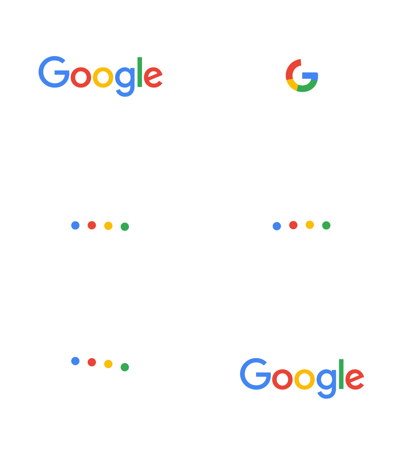
Image Source: Dribbble/Adam Grabowski
The animation in Rocket logo shows irregular pieces falling to the ground and bouncing back to form a rocket shooting bubbles to reveal the complete logo. Rocket graph is a marketplace to get reports and analytics (that extract data from different available APIs) from the developers.
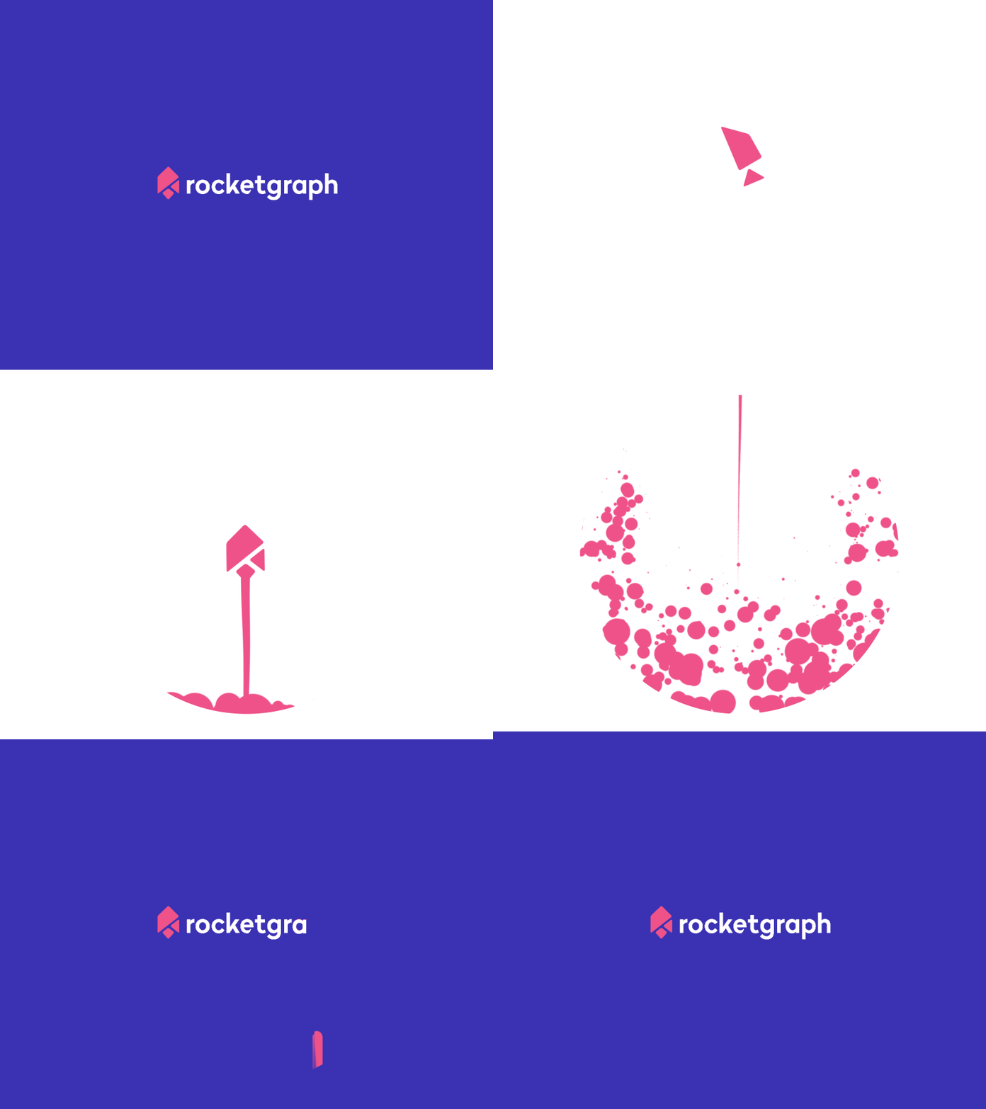
Image Source: Dribbble/Tony Pinkevych
Business logo does not have to be boring and dull. The animation of LinkedIn logo created by Ihor Karas is quite amazing. Ihor tried Disney animation style with this business networking logo as a part of this project held by Motion Design School. He flawlessly turns the businessperson’s suitcase into LinkedIn’s “In” and pops the rest part of the logo.
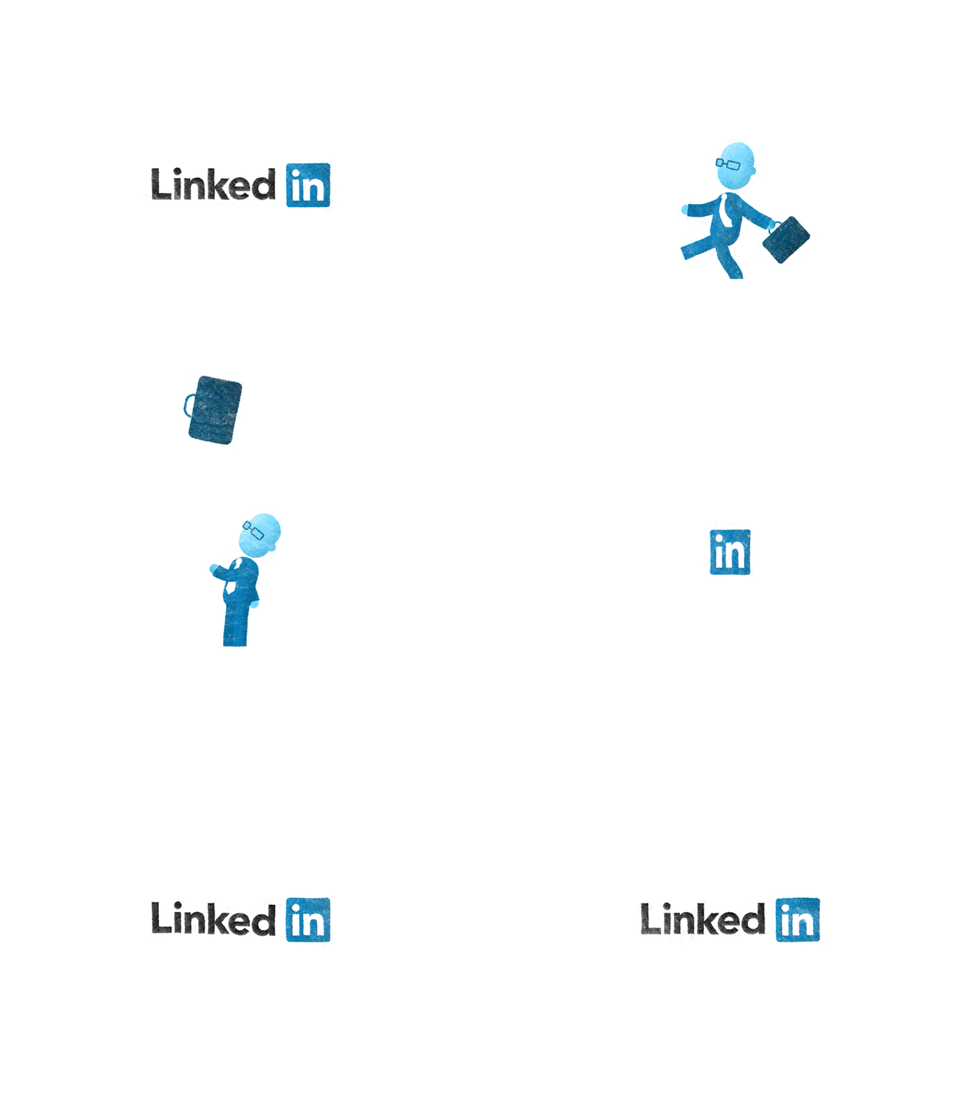
Image Source: Dribbble/Ihor Karas
Apart from LinkedIn logo animation, other worth-mentioning examples of animated social media logo GIFs are Snapchat Logo Animation by Alexander Pyatkov, Tumblr Logo Animation by Ihor Karas, Behance Logo Animation by Iryna Draguntseva (Luzghar), Pinterest Logo Animation by MaxKravchenko, and Instagram Logo Animation by Alex Goo.
3. Hiding And Revealing Logo Designs
We love the curiosity comes before a big revelation, don’t we? Be it a magic show, a story climax, or a game show, we love getting surprised.
These types of logos generally get Initials to take the center stage and then reveal the full name using simple motions, and sometimes vice versa. OpenView is a very typical example of such logos. The initials O and P stick together at the start before being parted into the opposite direction to reveal the complete brand name. This technique makes the logo get easy transitions between its full name and shorthand.
Delfina Foundation, nonprofit foundation, chose a classic monogram logo to make a statement. Designed by Spin — London-based design agency — the design logo shrinks to an underline, then vanishes completely to reveal his sanserif initials “D” and “F” again ultimately.
Biber Architects design by the same agency is a bit tricky. The designer knows how to dot his i’s. The logo keeps animation to the minimal. It reveals the hidden “i” in the second “b” by using the negative space judiciously.
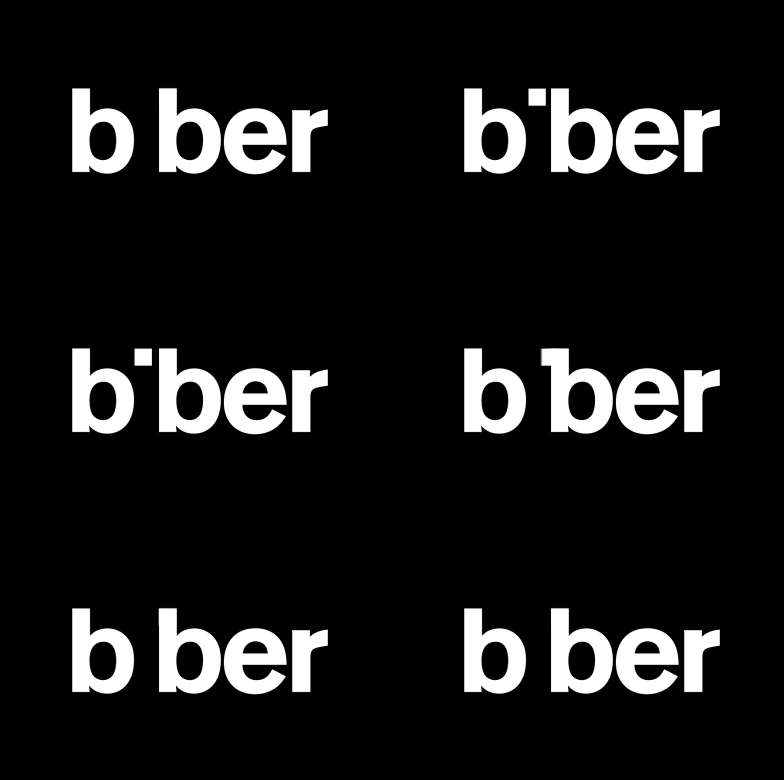
Image Source: 99designs/Biber by Spin
Kevin Yang’s logo animation and brand identity, which he designed on his own, is out and out creativity. He represented what his design stands for by expanding “Y” to display the complete logo.
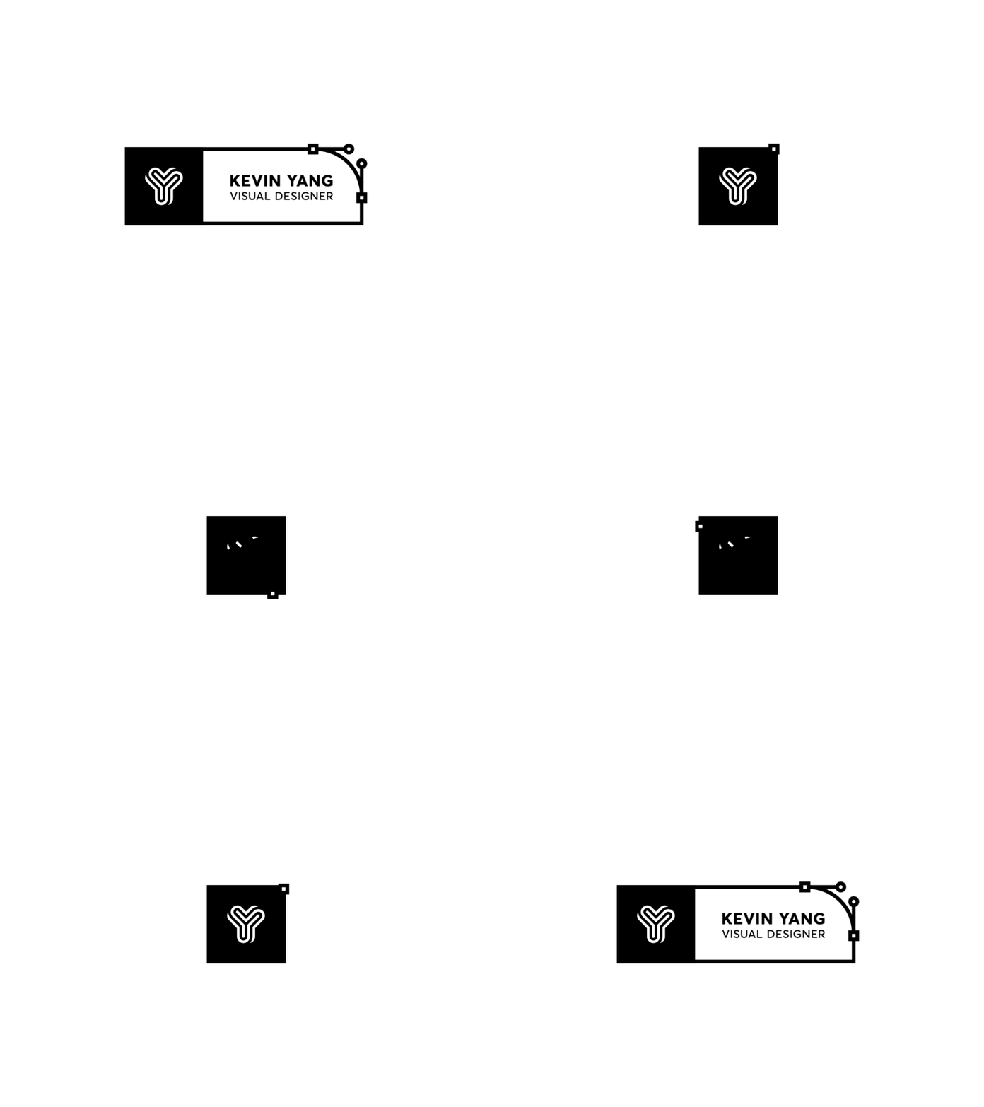
Image Source: Dribbble/Kevin Yang
Reddit’s Ask Me Anything Logo Intro animation is modern, lively, and fun. The animation starts with “A”— exploding onto the screen along with multiple objects and shapes—and then proceeding to the complete name. The animation culminates into initials, AMA into a fun logo design.
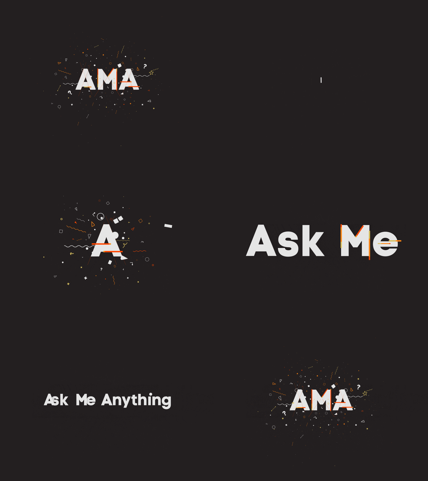
Image Source:Dribbble/David Stanfield
4. Expanding Logo Designs
While designing a logo, you have to be sure it looks equally awe-inspiring in small, congested space as it will look somewhere with lots of negative space in logo design. With animation, you have the power to use expand or shrink your logo to any scale or dimension.
Exhibiting the idea “maximum of flexibility”, the logo of Ideo Architekci is devised and designed to stay adjustable to any size or shape. The yellow-colored logo shape and size varies from medium to medium and looks equally amazing all across. The design is based on modernistic well-rendered sans serif typeface, grid-based framework, and a bright color palette.
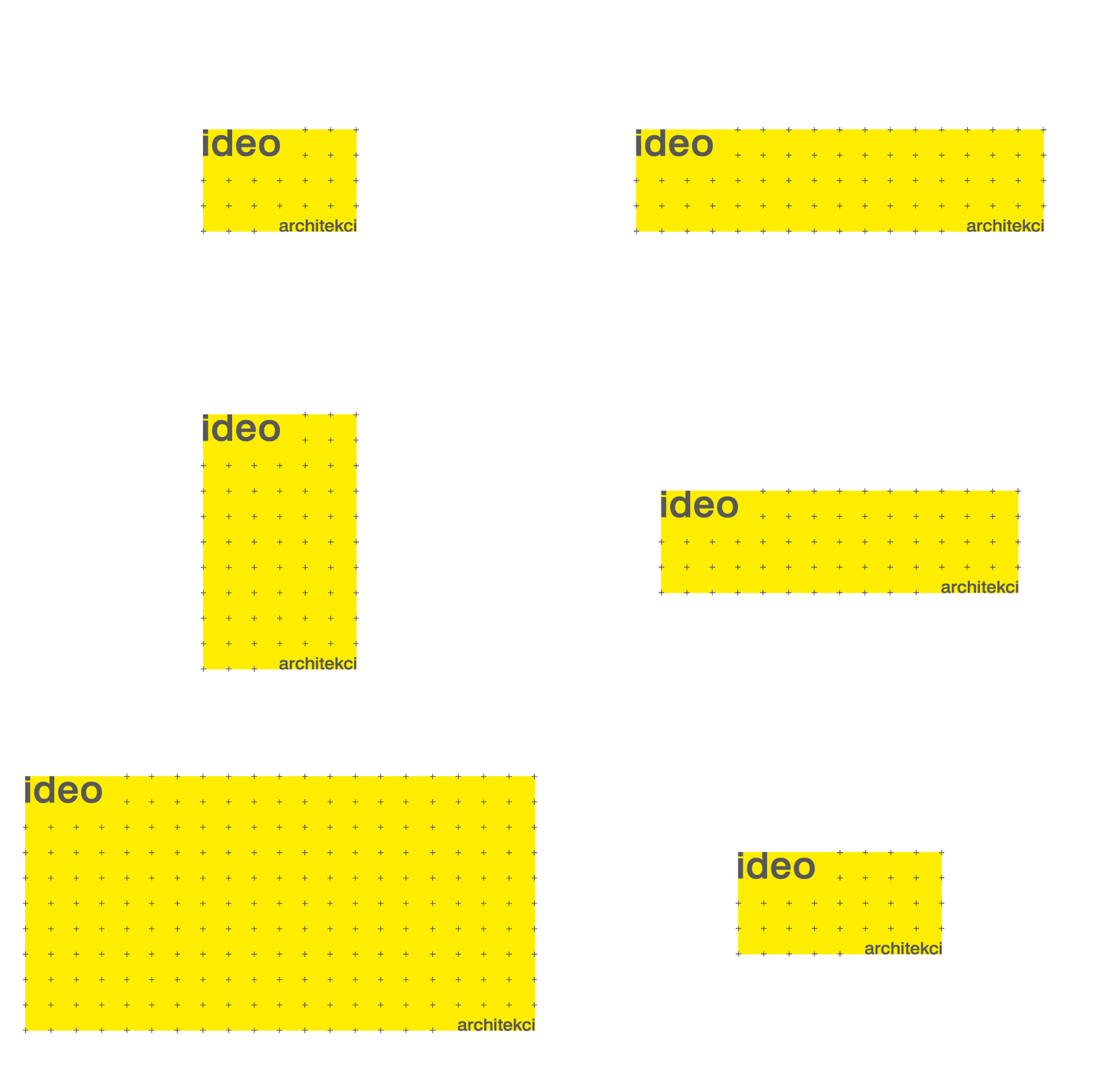
Image Source: Ideo Architekci by For Brands
Meanwhile, there are other brands taking a simple approach to expansion, like Eat logo by Fable. The font becomes fatter with each bite as it is fed continuously. The shift from Light to Regular, to Semi-bold, to Bold was seamless. For some milliseconds, E becomes F and turn “Eat” into “Fat”.
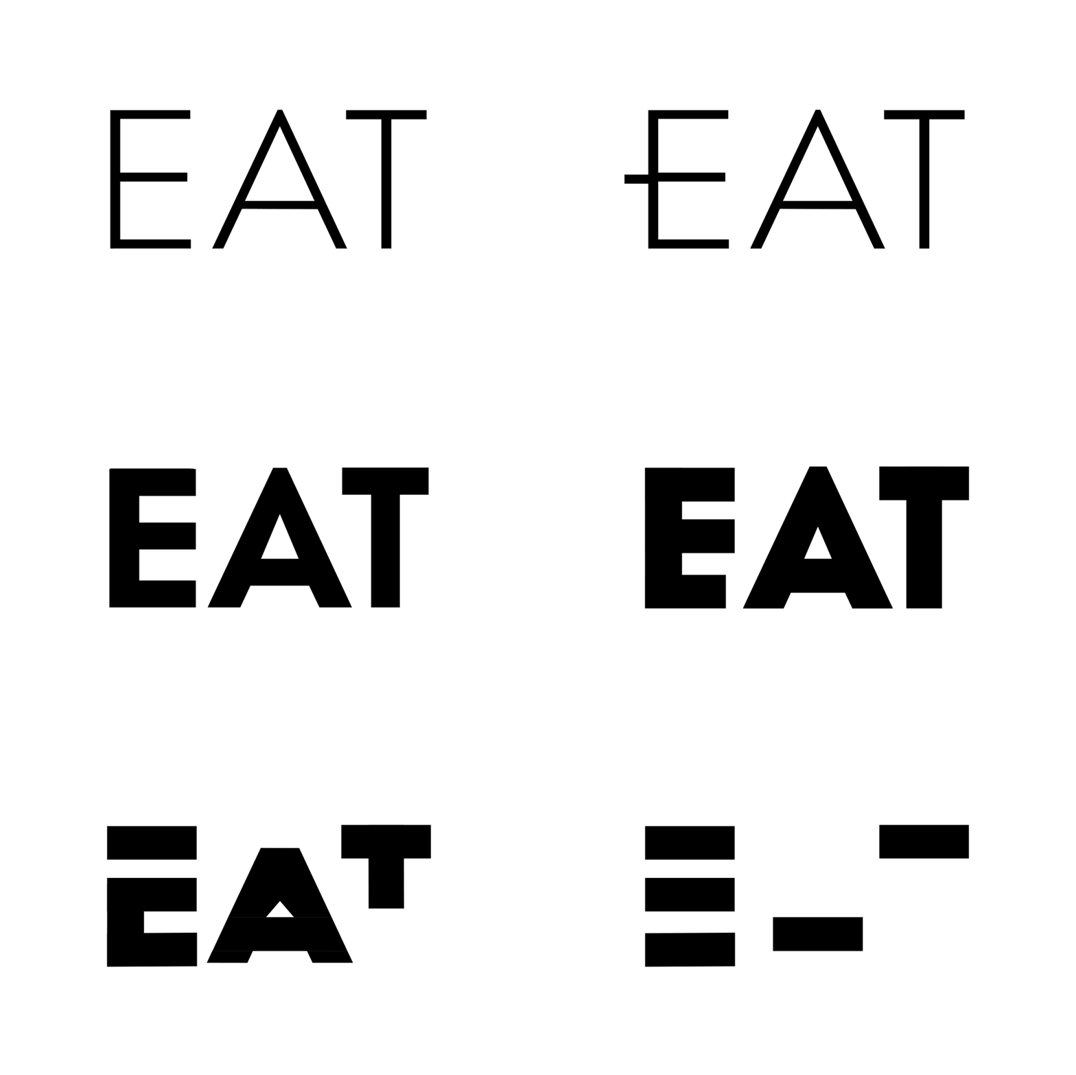
Image Source: The Brand Identity/Eat by Fable
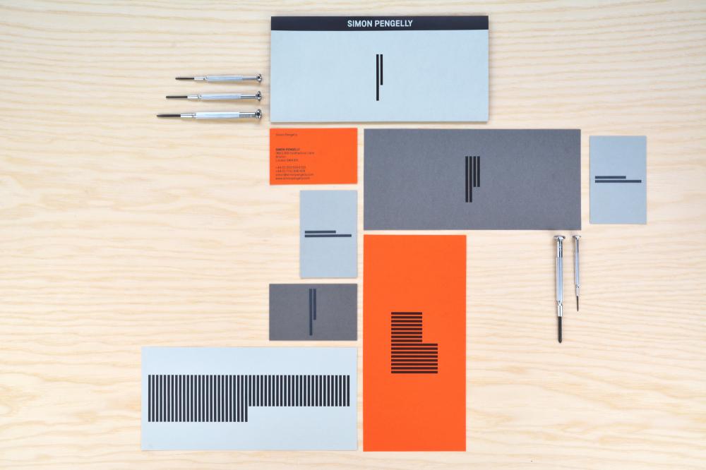
Another excellent example is the logo of Simon Pengelly, the furniture designer. The capital P logo is based on capital P made up of vertical streaks. The number of strides can be changed to create different iterations of the design as per the space on hand.

Image Source: 99Design/Animated Logo Simon Pengelly by Spin
5. Hard-Drawn Animated Logo Design
Hand-drawn logos are known for emitting a more personal and human-like feel that can help a brand connect with its audience. Many designers are blending animation into the hand-drawn logos, putting out some really satisfying designs.
From blotchy marks to smooth strokes, the possibilities to create handwriting logos are limitless. Burnt Toast Creative by Mantas Gr, Free SWISH for you by frametouch, Faymus by Brave, Yondr Studio by Nathan Yoder and Tangles by Henrique Barone are some cool examples.
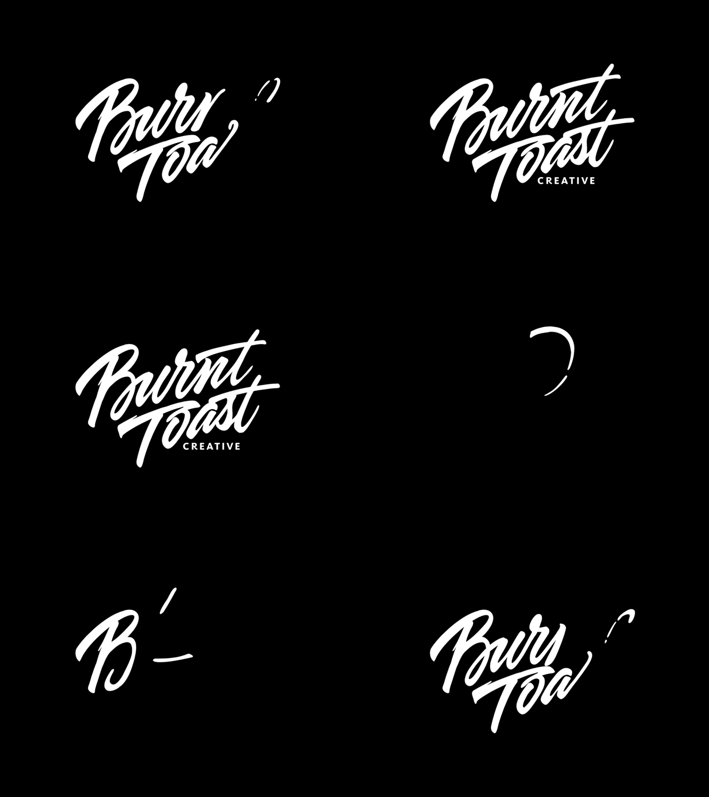
Image Source: Dribbble/Mantas Gr
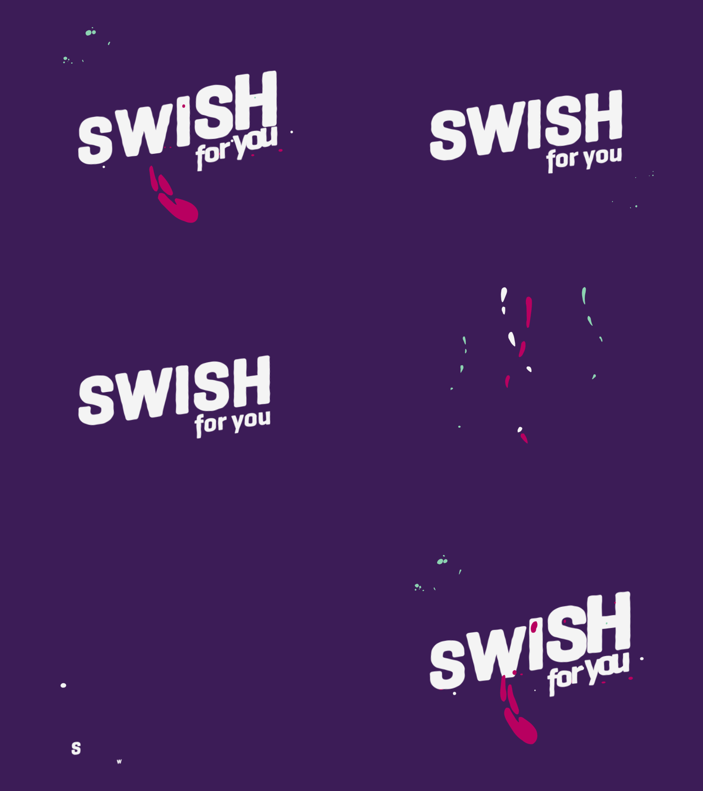
Image Source: Dribbble/Frametouch
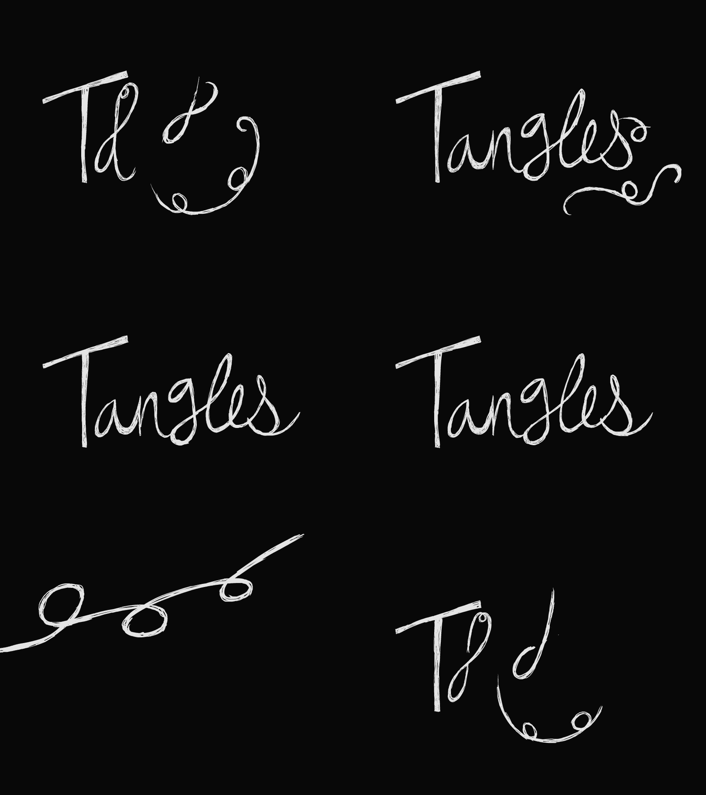
Image Source: Dribbble/Henrique Barone
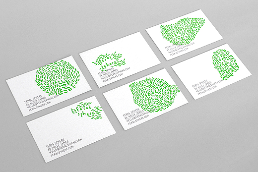
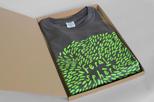
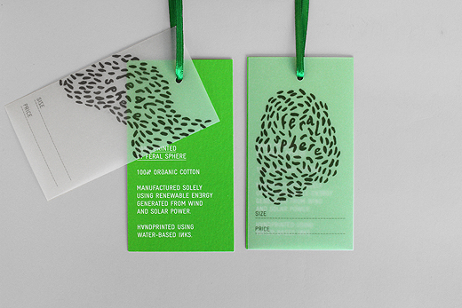
Hand drawn approach never limits the designer in terms of ideas. Feral Sphere – UK-based fashion brand— take hand-drawn animated logos up a notch. The logo comprises of different hand-drawn characters shifting into one another in a buttery smooth way. The logo is perfect for a brand that uses organic materials made up of renewable energy to create the products.
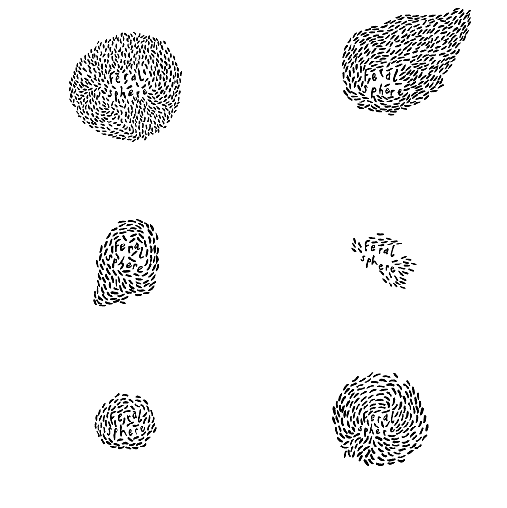
Image Source: Feral Sphere by Mind Design
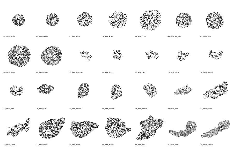
Image Source: bpando/Mind Design
6. 3D Animation Logo
3D graphics have quenched the thirst of dimension hungry eyes for quite some time now. Sooner or later, the 3D and even 4d logo animation have been shifting more to the mainstream, and we are going to love it!
Campus by MultiAdaptor is a three dimensional, animated logo that serves well as a static visual and gets an edge in terms of animation. The design features a rotating cube, spinning on 3D axis.
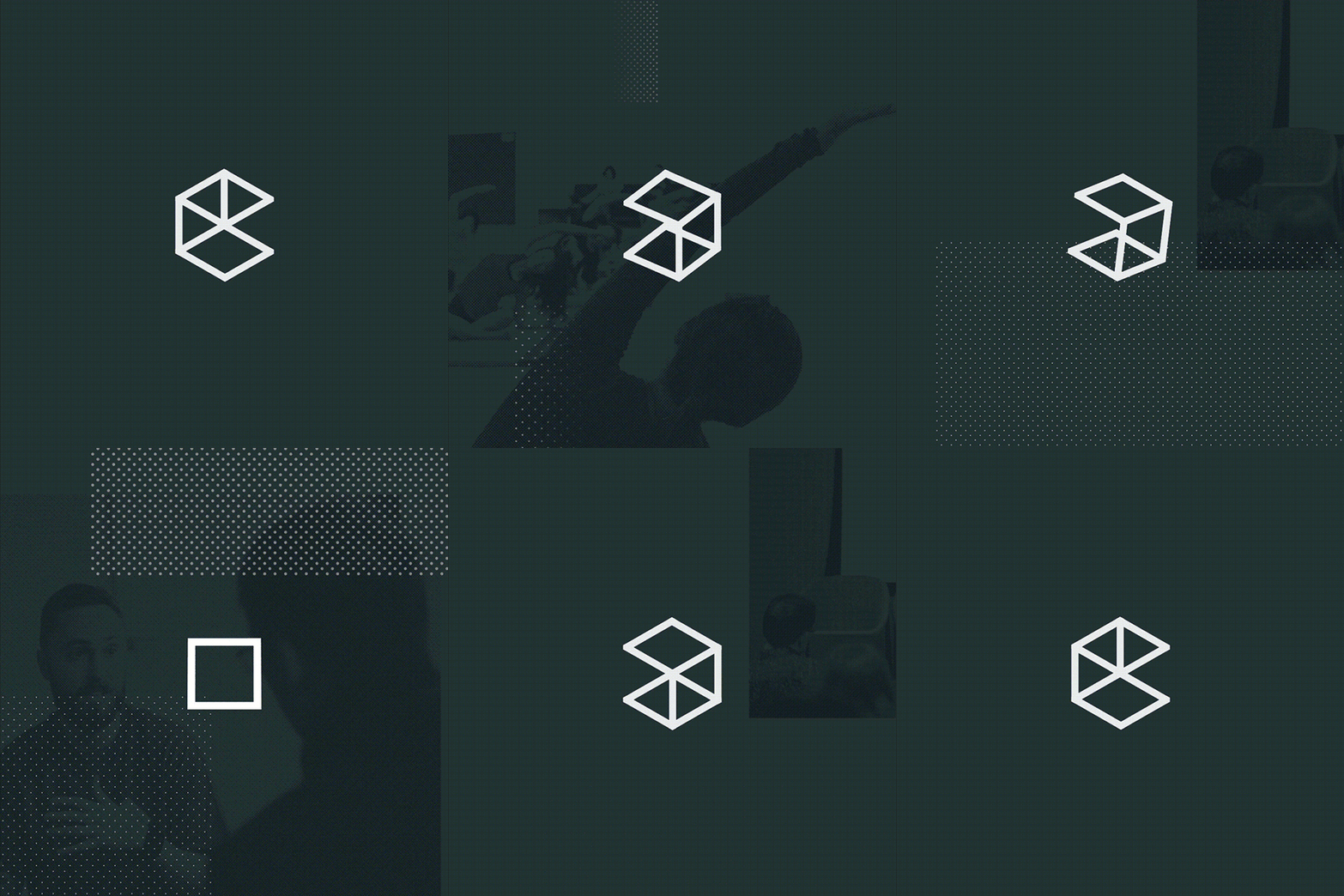
Image Source: Underconsideration/Campus by MultiAdaptor
4B Arkitekter is a similar masterpiece, but unlike Campus logo, it flaunts crisp uppercased, sans-serif typography — 4B.
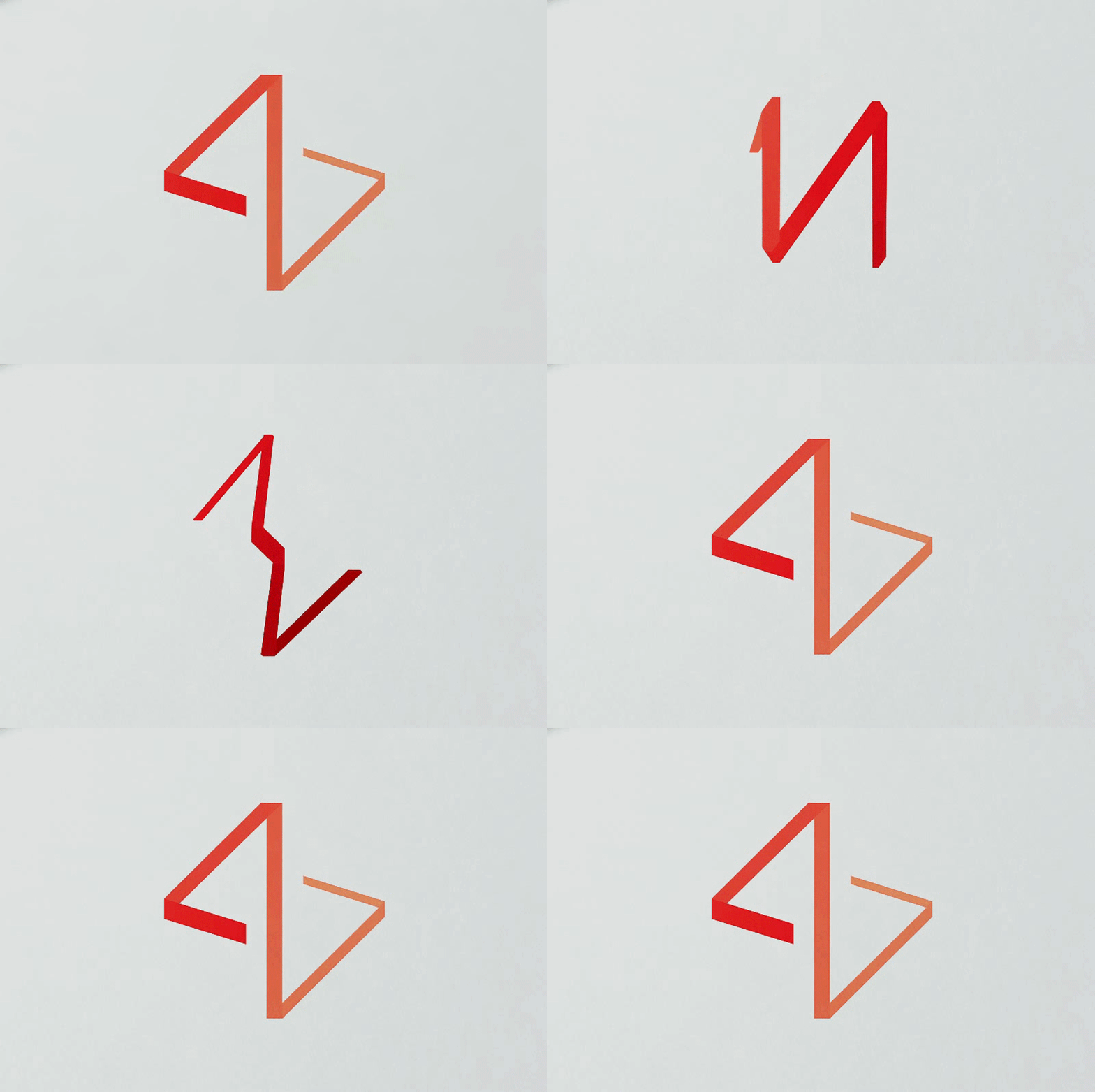
Image Source: 4B Arkitekter by Commando Group
And That’s All Folks!
Animated logos entertain and engage the users, which makes them appropriate in an era of short attention spans. Whether you choose the animation to be subtle or obvious, it is important to come up with a logo that conveys your business story. Most importantly, keep it short!
We hope these animated logos have moved your heart; though, if there is any trend you think we have missed here, kindly share it in the comments below. Don’t forget to check our list of 17 creative animated logos used by small businesses and startups!
Try Our Personalized Logo Maker:
Moving Logo Maker
Dynamic Logo Designs
Creative Logos Online
Design Logos with Curl
Make Dancing Logos
Logo Designs For Design Consultants
Modern Logo For Free
Electric Logo Maker
Create Fast Logos
Imbue Feelings in Logo Design
Design Logo with Numbers





I also hope to see more neon logos as Neon colors look great on plain logos with large, bulky elements. It would be interesting to see how professionals will utilize this trend in 2019.