Logo is arguably the true representation of a brand. It is the easiest way to recognize a company and distinguish it from others. Being able to create a successful logo design is a critical step in business development. Although, many businesses understand the importance of creating unique logos; they make some common mistakes. Here is a list of some misconceptions that you should be aware of:
Taboo #1
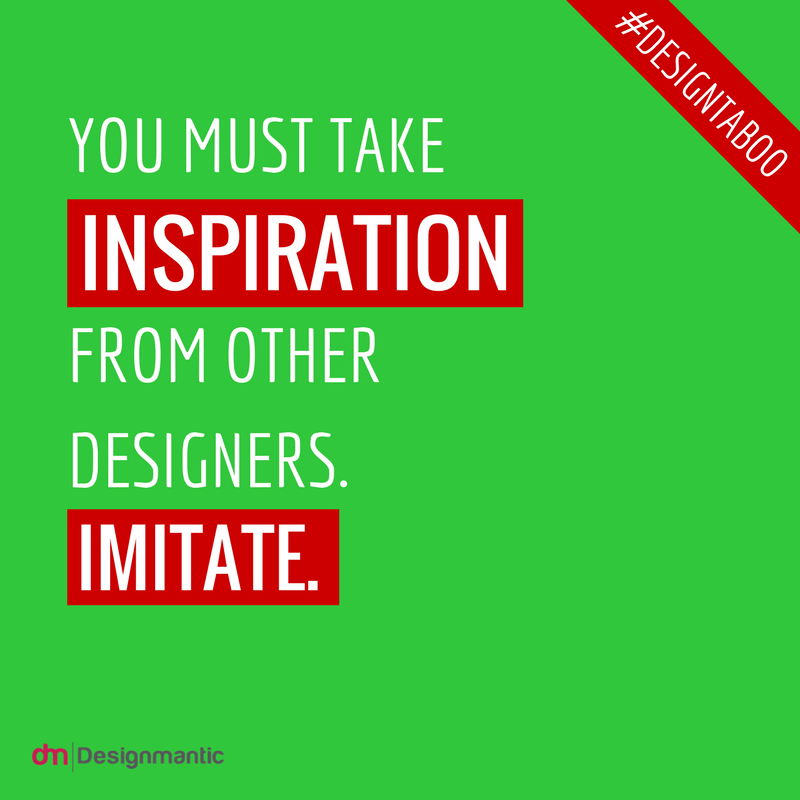
Companies are striving to survive the competition and logos play a crucial role in it. While, many logos are available to provide an idea for creating logo; the key is to be “innovative” and “different”. Do NOT merely copy the ideas of others; rather “be different so that people can see you clearly amongst the crowd”. Hence, come up with new ideas that best represent your company.
Taboo #2
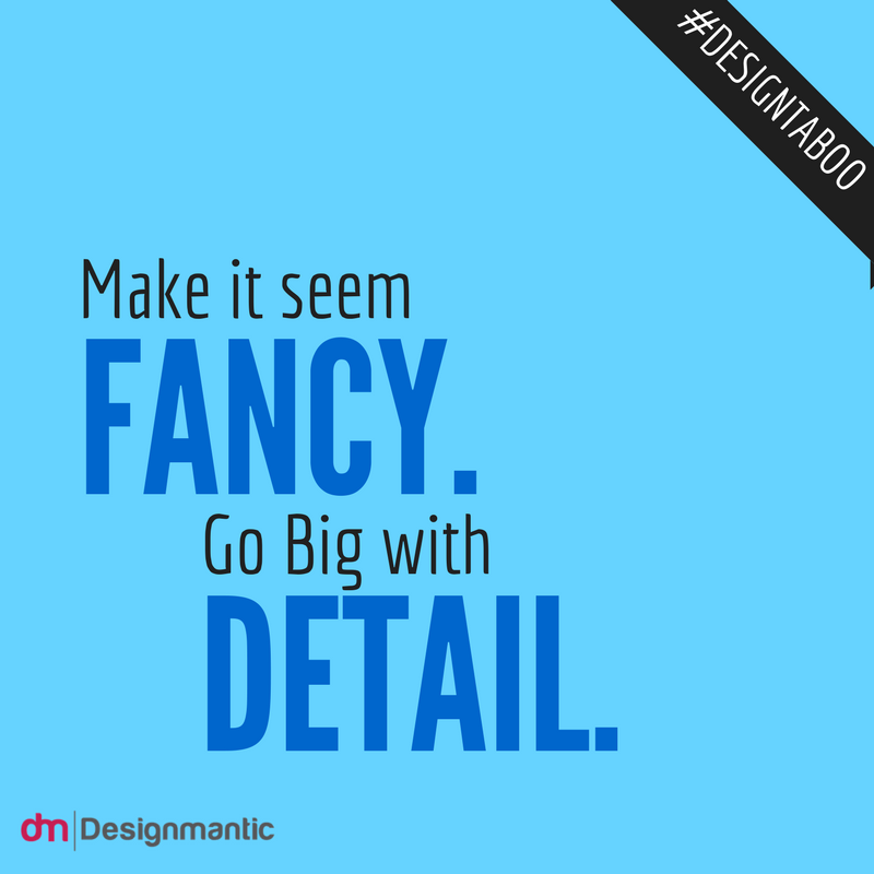
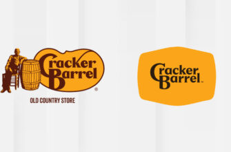
Simpler is always better, for which companies have tried to peel off their logos making it less complicated. Your logo should be clean and refined to avoid adding unnecessary details. It should communicate effectively your ability to excel in the services offered by your company. Often businesses add too many details to make it more appealing, but your logo is not for decorations. Moreover, it is to be used for representing your brand and delivering your business message.
Taboo #3
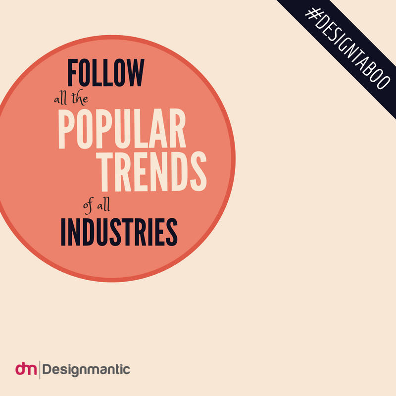
The trend keeps on changing and we begin to follow them blindly considering it as an important step to win the race. But, to follow the trend because others are doing it will kick you out of the competition. To sustain your competency in the long-run, it is crucial to understand that you know the best about you! So make decisions for yourself based on your own creative ideas.
Taboo #4
Although, there are innumerable symbols available to be used for your logos, this may not exactly fit in your brand and its characters. Furthermore, it is also likely to appear in others’ logos later; therefore, you need to use symbols that are NOT generic. Also, using the clip art will lead you to creating a logo that looks cheap and poorly designed.
Taboo #5
As you know your business the most, you can make the best decision for your logo. Since, your company’s logo is the true representation of your business; you need to make the right choices. You can be the expert in designing it yourself and deciding the best for your business. Why should you take others’ help when you are your own boss? Go ahead and design the logo that best fits your company.
Taboo #6
The known fact is that the more you see something, the more familiar you will get with it. With repeated use and exposure, it is possible to get greater attention. But, wait! This does not always hold true; you need to understand that it is not good to get stuck with your once created bad logo, forever. If the initial logo created by your younger brother is not enough vibrant to your clients, then you may decide to redesign your logo. Time is changing and so the need to evolve your logos is getting stronger. Hence, the myth that logo should remain the same for ages, does the most damage for the companies. Be careful, though, the change should not be too frequent.
Taboo #7
Putting in more money does not necessarily mean that you will generate higher returns. It is not necessary to invest a lot of dough to get greater profits. Instead, it is crucial to sensibly utilize your available funds. There are several companies that offer you the services for designing your logos at a much lower cost than what other larger companies would. Go for it, and get a better designed logo for your company without wasting your money.
Taboo #8
Logo that instills emotions or a sense of activity says a lot about the company. People can associate positive feelings with a brand that has a cute character. For instance, the adorable panda featured in the World Wildlife Fund logo evokes positive feelings. Simultaneously, colors also represent emotions; such as, red means active, yellow is energetic, etc. The logo of Red Bull depicts action, trust, aggression and passion. Hence, this shows that emotions add meaning to your logos.
Taboo #9
The key to being distinctive is to be unique with your ideas, and therefore, using a unique font for your logo can be a good idea. Do not fail to understand the importance of the typeface that will make your company name look the BEST. Building a unique custom typeface will help you protect your logo from being copied by others. It will become challenging for the rivals to copy your hand-drawn logos. There are several competitors that may rip-off your design, but the logos that are custom-designed are not easy to mimic.
Taboo #10
Choosing the right color scheme for the logo is imperative for a business. Adding too many unnecessary colors would ruin your design. Therefore, try to minimize the number of colors used in your logo and use a maximum of three colors in it. Just as instilling emotions in logos can add meaning to them; similarly, colors also have meanings that say a lot about your business. Therefore, avoid using colors that are irrelevant and do not add any meaning to your logo. What is important to remember is that versatility should be maintained in logos, and hence, a colored logo should look equally attractive on a grayscale.
Here we are, with a list of 10 taboos that need to be dispelled if you want to avoid mistakes and focus on building a more effective and attractive logo for your business. Which of these taboos are you guilty of practicing? Leave us your opinion in the comments below!



Nice information. Simple logos always looks better.