What is nostalgia and how it affects our inner selves is known to all. We all have some nostalgic values and are attached to them in one way or the other depending on how we perceive things and ideas. A slight change in these values occur as time changes and it largely depends on how welcoming we are to these changes.
Same is the case with the brands that we are familiar with since our childhood. As we recognize these brands by their logos, the relationship is more of a logo-based than the brand itself.
Keeping True To The Roots
Nostalgic logo redesigning is one question that has been hammering the heads of marketing and graphic geniuses all around the world. Whether to opt for it or not is highly debatable. As the brands get old, they start working on their rejuvenation process and revitalizing a logo is the first step in this process.
The trend of using authentic handcrafted logo designs from the 1960s and 70s is on the rise. It is considered to be more refreshing in a world where consumers are being bombarded with digital logos. Different brands in this tech savvy age have bid farewell to their traditional aesthetics in designing their logos by succumbing to modernization. Where many, in this process, have lost into oblivion, there are many more who have opted to come up with their historical hand-made logos to ignite consumers’ nostalgic sentiments.
When And Why Nostalgia Is Effective?
Redesigning a logo is crucial for a brand when attracting a new target audience, while still attaining loyalty from its old customers. It is by infusing old memories that the new logo design can have any sort of connectivity.
Here, the consumer perception is of more value since it is the most influential factor in determining the fate of rebranding, which, thereby, breeds brand loyalty. A complex design does not always have a desired effect on consumers. Remember that familiarity is a decisive factor in determining the fate of your logo as consumers must be able to recognize your brand amongst the plethora of other brands.
The Challenges
Redesigning a logo is rather a sensitive and complicated a process and needs a lot of time, clear vision, critical approach and a thorough marketing strategy. And why is it important to study your competition when designing a logo is a question that every marketing guru surely knows.
Bruno Kocher, a marketing and brand management strategist, says, “The challenge for a brand is to appear distinctive while also being a perfect example of all the products in its group. Every product category has aesthetic conventions (for example, black and gold for luxury products) that, when crossed, can easily create confusion among brands.”
The Pricing Factor
Apart from coming up with a retro-styled logo, there is another problem that comes with redesigning, the pricing. Rebranding has always been a costly endeavor. What Kocher has to say about logo redesigning and its repercussions is rather more interesting.
While renewing their logo, brands will be faced with a lot more hurdles than just standing out from the competition. Apart from redesigning a logo, which could cost between a hundred to thousand euros, brands have to account for other places where their logos usually appear; billboards, businesses cards, t-shirts, letterhead, store signs, etc. Put simply, you’ll be spending a lot on materials as well as logistics. Overall, we believe it is better for a company to either let their brand gradually wane away, or hold on to its original look for nostalgic purposes.
Over the years, various brands have gone through the different phases of rebranding or redesigning their logos where some opted to stick to their nostalgic values with a few amendments and are sheer success.
The Co-operative Group

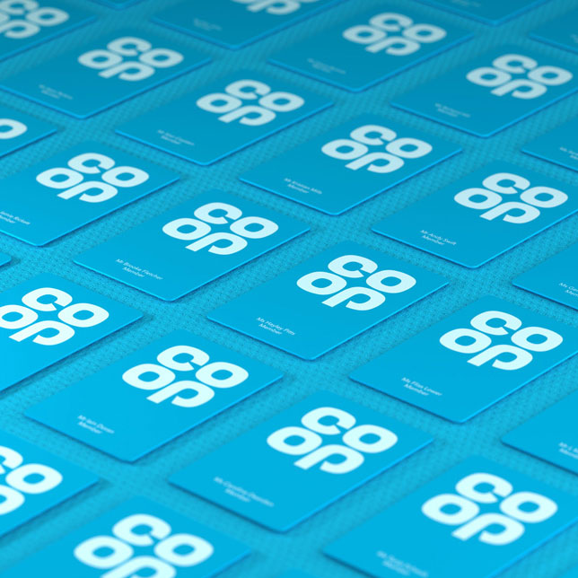
Images: Co-operative Group/North Design
In March 2014, design studio North was given the task of redesigning the logo and it decided to play with nostalgia by creating a new identity for the world’s oldest Co-op, based on a modernized version of their iconic 1968 cloverleaf logo. Founder of North, Sean Perkins explains his design strategy:
“Returning to the familiar can be a radical act, but it is the timeless quality of this iconic logo that makes such a move possible – it is distinct, recognizable, approachable, and dynamic, giving us the opportunity to signal a shift back to the ideas that made the Co-op special for its customers.”
NatWest
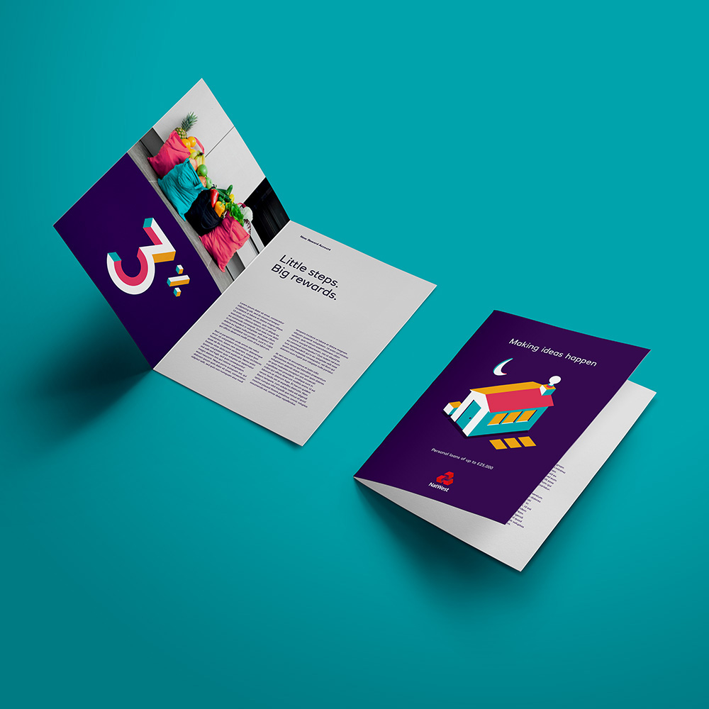
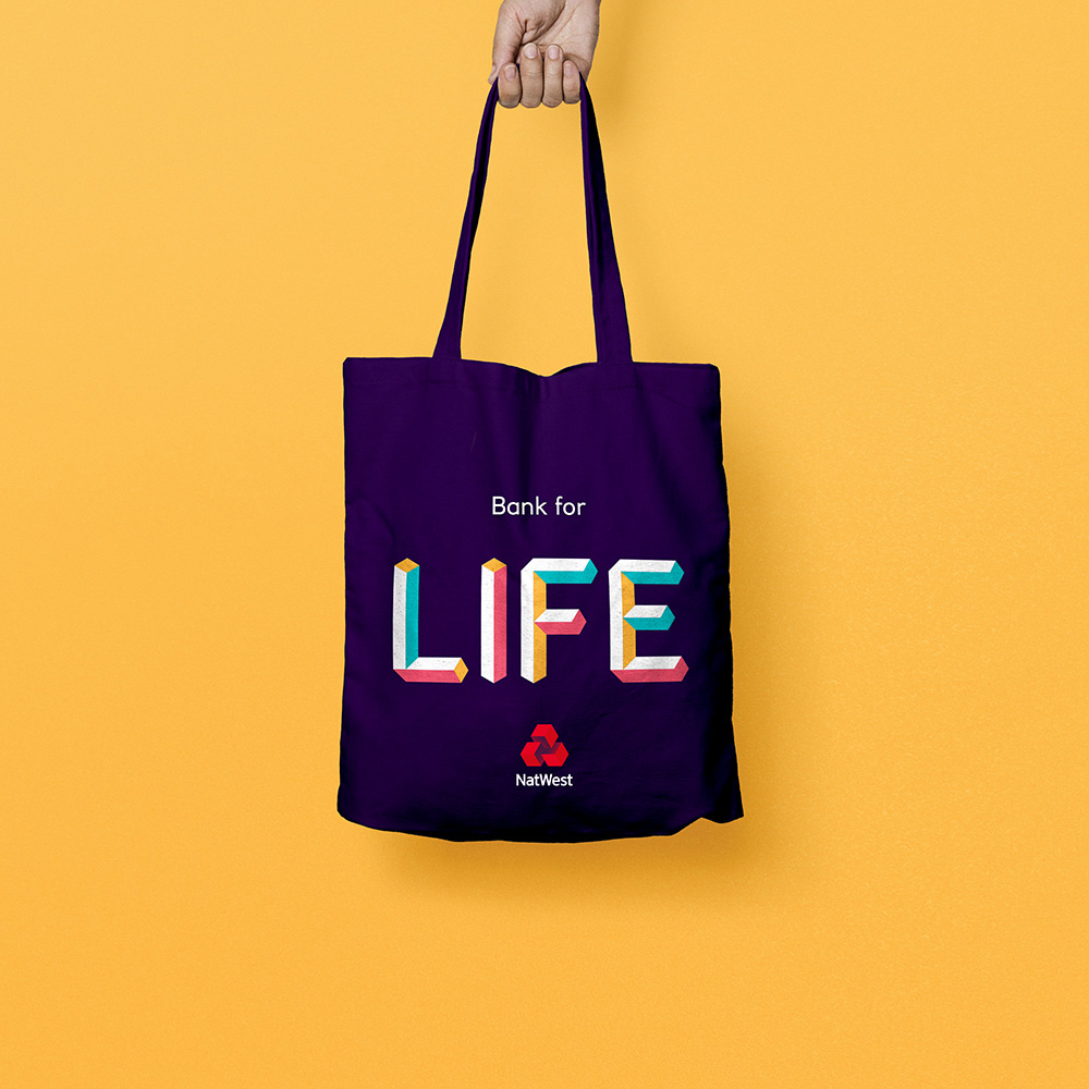
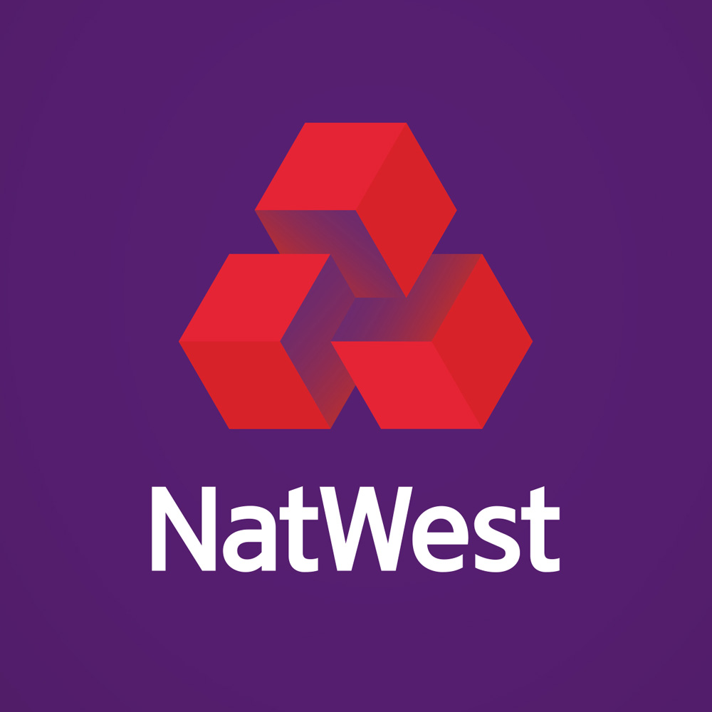
The bank introduced a newly designed logo by the design studio, FutureBrand. The new 3D graphic design is bold and colorful. It takes the overlooked cubes from the heart of the original identity of 60s and invent like a true 21st century brand.
“From a humble cube we’ve literally got the building blocks to tell all manner of compelling stories. Our visual identity uses this simple idea to illustrate almost anything imaginable – to build a unique world for its customers.” – FutureBrand PR
Kodak
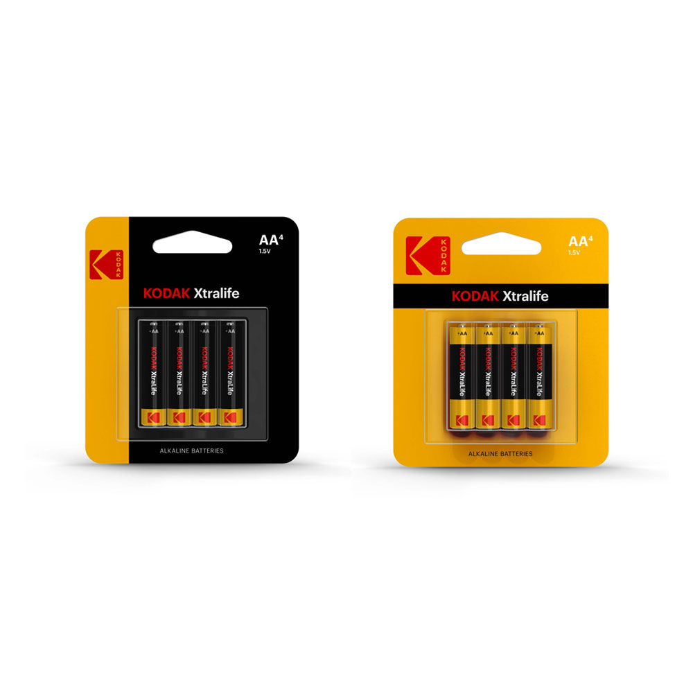
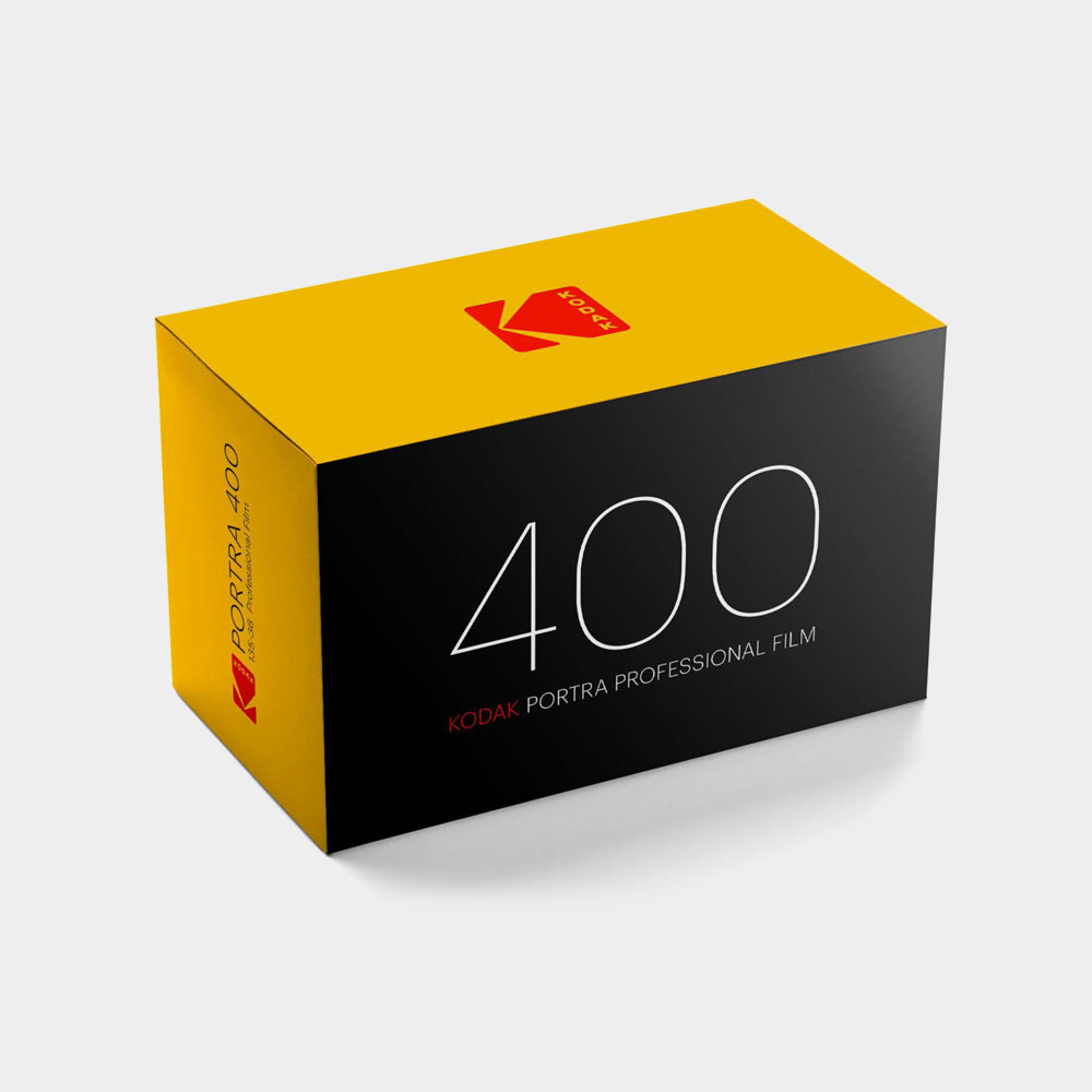
Kodak’s official symbol which Peter J. Oestreich had designed back in 1971, that used for about 35 years, is modified by Design team Work-Order by having the Kodak lettering stacked in landscape form.
Co-Work-Order designer Keira Alexandra. says it’s purity and integrity that go hand in hand with a brand’s establishment.
“It’s a return to a company’s foundation and roots, showing a commitment to mission,” she says. “If the foundation is strong, and has a valuable legacy, use it.”
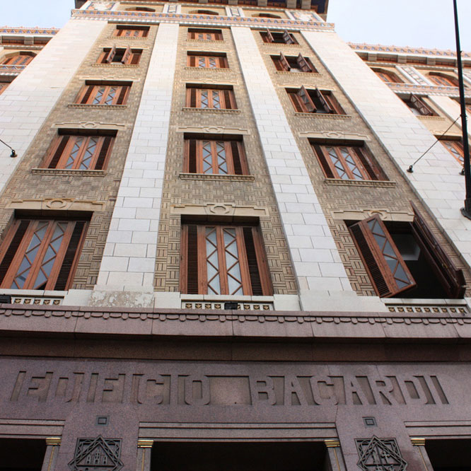
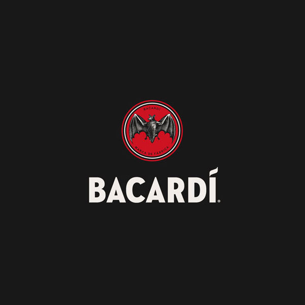
Bacardi
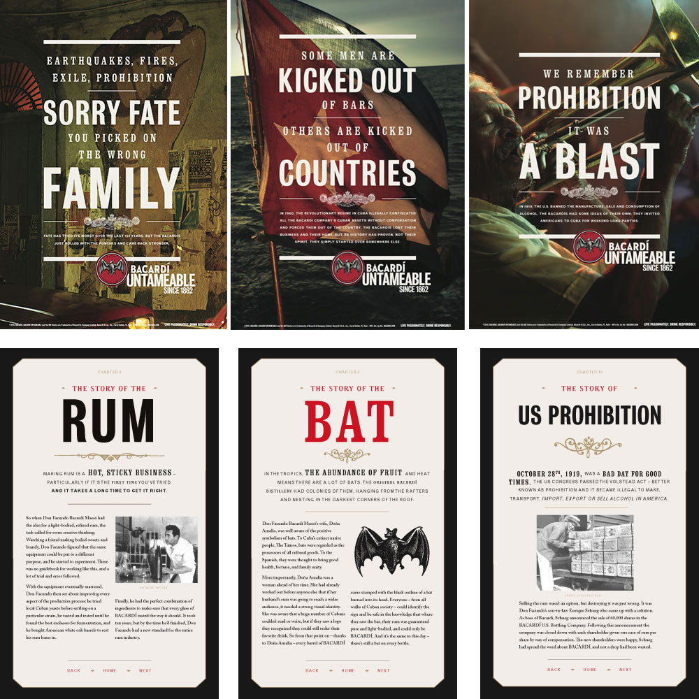
Design studio HereDesign took Bacardi’s bat logos from early 1900s in order to tweak it into a unique design. The studio says,
“We wanted Bacardi’s rebranding to be established in the family’s history and to have all of is typographic treatments and design details inspired by the family’s design archives.”
Whatever the world has to say about redesigning the logos, rebranding the old business or establishing a new one, one thing in all is common and that is connectivity with the masses. Even if you spend a fortune in getting a correct logo designed, if it lacks the much needed punch and a sense of connectivity, it is the job unaccomplished. So, the safest path is to stick to the originality and history of your brand and nostalgic logo is one element to start with.
YOUR SAY
What do you think about incorporating nostalgic values in redesigning logos? Are you a fan of hand-made logo styles or you a tech junkie who believes in graphically painted world? Don’t forget to leave your say in our comment box.


