Once business owners and designers get their design brief in their hands, they think it is time to explore their options and embark on the logo design journey immediately. However, it’s highly imprudent to run off into the forest of creativity too soon, before you have had a chance to conduct a thorough research into the industry, and unearth the perfect idea for the task at hand.
If you are wondering what type of research you need to carry out, the answer depends on which stage of the logo design process you are at. While most designers and DIYers tend to focus on research that centers on the logo, and not on brand strategy or marketing, a thorough comprehension of all available research methods ensures versatility and helps you progress.
In addition, learning about your competition reaps great benefits, as it gives you an idea of the types of identities your intended audience is already acquainted with in the sector, and lends you a sneak-peak into their preferences. Furthermore, this information will thwart your creativity from running rampant, lest you inadvertently imitate the identity of an already established brand and face the legal ramifications.
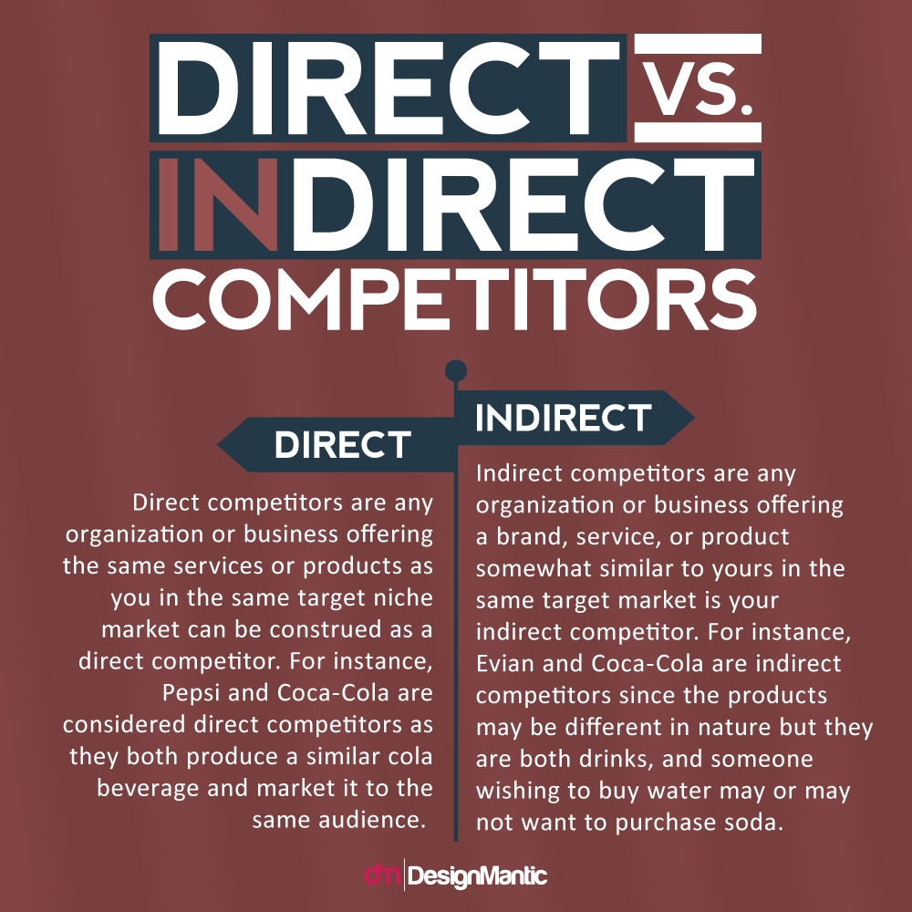
However, narrowing down your list of competitors isn’t always an easy task. While you may be drilled in your competitors, your assessment may be way off at times, as it is impossible to take all your contenders into account without in-depth research. It is imperative to assess the identities of not just your direct competitors (the ones that proffer the same service or product to your audience), but also your indirect contenders (those that offer a similar service or product to a different audience or demographic).
Your ultimate goal is to glean a logo for your business that makes it stand out over your competitors, instead of unintentionally mimicking an existing brand. While art is all about inspiration, it’s your job to navigate the thin line between inspiration and imitation. A valuable exercise to stick to is to keep a visual record of both the competitors’ identities and logos to reference your identity at any point during the design process. Ample research is one of the most potent tools in your design arsenal, which will help you become a more knowledgeable person and a better designer.
Focusing On The Competition
When researching your competitors, you would do well to identify the current identities which people are acquainted with within the market, so that you are able to design an identity for your brand that makes it unique and imprints it in the minds of your audience. To put it in a nutshell, you want to make your business or organization look different from what’s already out there.
When scrutinizing the identities of competitors, instead of simply concentrating on their logos, try to focus on any assisting imagery that they use and the color schemes they employ. This would help you decide on a popular color palette for your logo, one that is apt to the industry and is commonly associated with the niche. Depending on the nature of your business, you may or may not have the time or resources to root out every existing direct or indirect competitor, but try your best to locate the primary ones and pay heed to any proliferate trends that catch your eye, so that you can steer clear of them when designing an identity for your brand.
Researching The Market Leaders
You may be a small startup, aspiring to compete with organizations and businesses of a similar size or level, but that doesn’t mean that you should discount industry leaders as probable competitors. After all, who’s to say that you won’t live to see your business reach that kind of a market-leading position in the future!
Well-known and reputable brands constitute as market leaders. For instance, when it comes to courier services, FedEx and UPS are the market leaders on a global scale. Your business may be running a local courier service operating in one city, but market leaders continue to loom over the horizon as competitors. You need to identify all market leaders to:
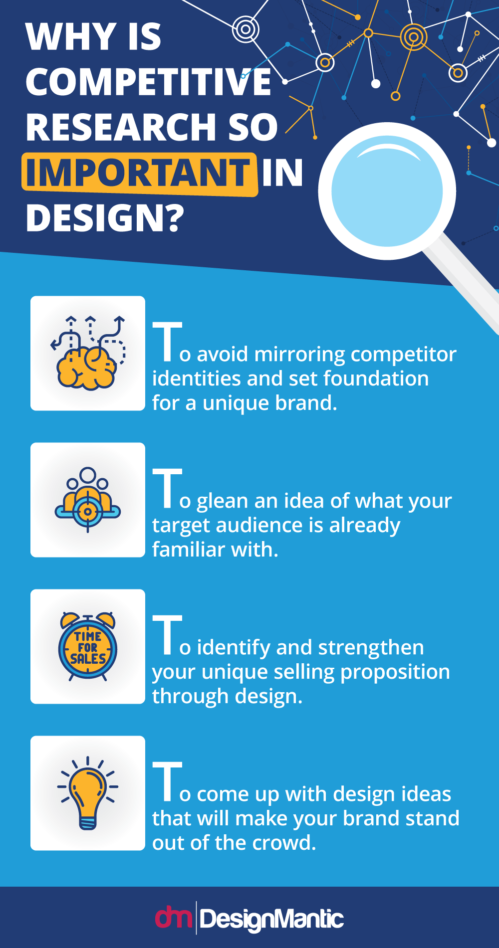
- Avoid mirroring their identities: If you create a logo for your business that conjures up recollections of a famous or massive brand in the minds of your audience, they are bound to perceive your business as a counterfeit or a cheap version of the original brand, resulting in a negative brand image. This in turn only serves to fortify the integrity of the market leader’s identity.
- To glean an idea of what your target audience is already familiar with: This in no way means that the identity you are designing for your business should in any way bear a resemblance to that of your market leaders. On the contrary, it should be completely different. However, by scrutinizing the logos that have already made a mark on your target audience helps you narrow your focus for exploring exciting and new avenues for the project.
Design Elements That Might Inadvertently Get Ripped Off Competitors
The ludicrous sums of money the world’s largest corporations are willing to invest in their marketing materials is staggering to say the least. One such event, the super Bowl, is enough to prove just how much money is squandered off the back of the hands of huge brands when they wish to reach a huge audience. Given the decadent outflow of capital, it’s only natural to expect an over-the-top brand identity, unique to the very core.
Which is why, it comes as a disappointment when even the most massive brands in the world come out with logos that are somewhat less than startlingly unique. While countless logos coming out of the woodworks year after year might exhaust the creative pools of designers, it’s exasperating to see large companies ripping inadvertently off their competitors, despite the amount of money they tout to have put into the creative work. Here are some of the most common design elements that are easy to imitate from your competitors, mistakably of course, which is why you keep to keep a strict eye on them:
1. Shape Of The Logo
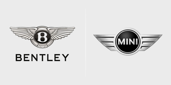
For two gigantic companies in the same industry, the logotypes of Bentley and Mini look too similar to be passed off as a mere coincidence. The company name is enveloped in an inclusive, friendly circle in the Mini logo, flanked by wings to allude to speed and movement. A black and silver color palette in the car logos connotes the luxury associated with the automobile industry. On the other hand, if you securitize the Bentley logo closely, the single initial of the brand name is also enclosed in a warm looking circle, compounded by a pair of wings to convey a similar message.
To be fair though, there do seem to exist some notable differences, such as the fact that the Mini logo is sleek and ultra-modern, with rounded edges and simple lettering to exude a lovable yet modern feel, which has become synonymous with the brand. The Bentley logo, on the other hand, is more ornate and detailed, with its bold initial sufficing to represent this iconic brand. Since these brands market to very different customers, they have been able to get away with the stark similarities, but you would be wise not to garner such obvious inspiration from the logotype of a competitor.
2. Wordmark
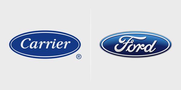
Another design element that you might accidently choose similar to your competitor is the wordmark of your brand identity, as is evident by looking at the logos of Carrier and Ford. Well for starters, they both have white text, italics, and are enclosed by a white outline, against a blue oval background. Unearth 5 differences between the two logos and you might just win a lottery! It’s startling to see how much the two concepts have in common, though of the duo, the Ford logo is clearly more classical and well-defined. While both companies were launched in the early 1900s, they didn’t adopt their current logos until years later, thus thrusting their history into murky darkness, making it hard to decide who copied whom.
3. Color Scheme
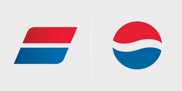
Color palette is one of the most common elements that you might inadvertently choose similar to a competitor or perhaps even another brand not in your niche, as is evident by the logos of Pepsi and Auto trader. While the logos are mercifully shaped quite differently, their color scheme is entirely a replica. Even if we ignore a similar negative space separating both logos across the middle, such a similar color scheme can greatly alleviate the uniqueness of the logos. Since Pepsi had this iconic logo for a long time before they changed it, we think that Auto Trader clearly ripped off it.
4. Logo Concept
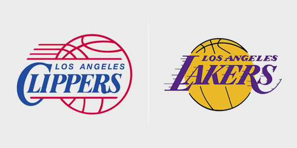
Sometimes it’s common for brands in a similar niche to inadvertently work across a similar design concept, most often due to a scarcity of options. Take NBA for instance. Since the inception of NBA, the Los Angeles Clippers have been the notorious copiers of the logo of the Los Angeles Lakers, a team that has been around decades before anybody even heard of the Clippers. As in evident by the logos, they share the same design concept and layout, down to the placement of “Los Angeles.” To avoid such “happenstance”, it’s important to compare your logo to that of your competitors to steer clear of copyright infringement.
5. Typography
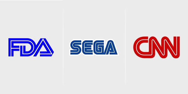
Especially with wordmarks, it’s easy for logos to look similar if they share the same typeface. Looking at the logos of FDA, SEGA, and CNN, for instance, it’s surprising to see that such major (and highly esteemed) organizations would have logos that are so closely related. Beginning with the intercepting white lines, the letters in the logo even bleed together to appear as one. To circumvent such crisis, you can consider using a custom typeface so that your logo remains unique and distinguishable.
How thoroughly do you research your competitors before making major design decisions? Do let us know in the comments below!


