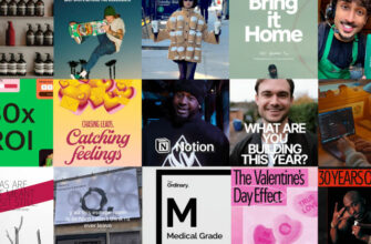
When you are working with a well-developed brand, it will continue to widen its scope going from one screen to the next, and then beyond. Exclusively digital brands that achieve a certain level of fan-following often have to jump screens and go on hard book covers, glossy magazine ads, company fliers, posh business cards, and fun brand merchandise.
All of this happens through the magic of print.
Creating digital brand assets in conjunction with their print counterparts adds a layer of complexity to the work. In this post, we are learning about some simple tricks that make the process more straightforward.
8 Tips for a Print-Ready Design
If you’re new to print design, welcome to the messy (and exciting!) world of working with paper. It’s rough but you’re gonna love it. Here are some tips to make that easy:
1. Work with a grid system
A grid system helps you present your information on the page with coherence and structure. Printed materials significantly benefit from grids because it becomes easy to scan the page quickly when structured in a clear hierarchy. The design improves immensely because you can organize text and images in a way that tells a layered story.

Instead of dumping the entire information in a vertical block, breaking the grid into horizontal, vertical, and angular lines allows you to create more depth, interest, and flow. Multi-page brochures and large-size posters especially work really well with grids.
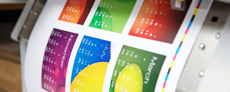
2. Image resolution must be at 300 DPI
Your print design must follow the 300-DPI rule. DPI refers to dots per inch, meaning the number of ink dots that can be placed inside a space of one inch. The higher this number, the higher the image quality you’ll get in print. If you set the resolution lower, such as 72 DPI which is standard for digital formats, you’ll get a massively pixelated image in print that’ll reflect badly on your brand.

Please note that 300 DPI is the minimum rule. Aim for more if you are looking for a truly crisp image for your print assets.
Please also note that some components on your print design will be in vector format. Vectors are created with mathematical calculations and they can hold on to their resolutions no matter the size, so you won’t need to worry about them.
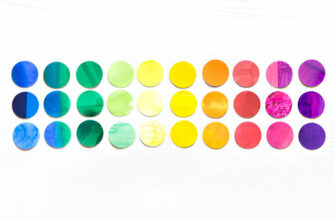
3. Work in a CMYK color environment
If you are used to working with digital design environments, you’ll probably choose an RGB color palette out of pure habit. In print design, however, the CMYK color model holds the court.
To start strong, and avoid any redesign debacles later in the project, begin with your design software’s given CMYK color environment. This will ensure that when your design goes to the printer, they have the right color information to print your design most accurately.

Keep in mind that final color results may vary. Depending on the ink manufacturer, the type of ink and toner, and the type or finish of the paper, etc., your chosen colors may look different in the end. Prepare to make slight changes to your color details, and account for such changes when establishing a project deadline.
4. Use a legible typeface and embed it in your file
A digital screen can be zoomed but a printed paper cannot. It may seem redundant to say that to a designer but you’d be surprised at how frequently this detail is overlooked during print projects.

Since print design is often read from a distance, use a typeface in a size that’s legible from far away. Choose fonts that are easily available so your printer doesn’t have to look for a substitute typeface. To avoid that, embed your font files with your project files when sending them to the printer.
5. Account for bleeds
All printers by default add a white border on all sides of a printer paper. You don’t want that when you are designing a brochure, business card, poster, or another brand asset in print. You want your design to be printed fully on all sides of the print surface. To make that happen, printers trim those white areas from the finished product.
To ensure no valuable part of the design is lost to that trimming, designers account for bleeds in all their print designs. It means giving your printer the cut-off marks on the design. The common standard for bleed is 1/8 inch (0.125 inches or 3mm) on all sides of the document.

To account for bleeds, set up your document size that includes the bleed area. For example, if your final trim size is 8.5″ x 11″, your document size with bleed might be 8.75″ x 11.25″. Inside the document, create a ‘safe area’ within which all design elements must be kept. This area should be at least 1/8 inch from the trim edge, ensuring that important text and graphics won’t be accidentally cut off during trimming.
6. Consider paper finish and other details
Choose a professional printer who can provide you with a large variety of print products. The finish, quality, and weight of the paper matter when you are designing printed branded materials. A lightweight paper will not only produce your design in bad quality but will be a poor reflection of your brand too.

A well-resourced printer on the other hand can turn your outstanding design into even more mindblown. With embossing, die cutting, thermography, etc., a good printer can make your brand look better.
7. Print a proof
Before finalizing any part of the design — shapes, colors, fonts, whatever — see how the concept looks when finished. Print a sample of your intended design so you can know if the colors you’ve chosen are the right kind or if the typeface size looks okay.
Having a printed sample means you can catch and correct mistakes early on, and leave no room for surprises when the design goes for mass printing.
8. Design with deadlines
The printing company you choose for your project will likely have more than one project going at the same time. They may also have to consider what are their inventory positions in terms of the type of paper, finish qualities, and print embellishments that you need.
Therefore, check in with your printer to get an idea of the situation on the ground, then map out your project phases keeping those details in mind. It will help you finish your project with enough time to account for any mishaps as well as additional print runs.
The Takeaway
Unlike digital design, print design depends a lot on external factors. Your print company’s workload, printer quality, the type of ink they have, the type of paper and finishes they have, and so much more.
Therefore, your print project has to work under the constraints of those realities — but that’s part of the allure of print design. It challenges you to get creative and see how innovative you can be.
So, continue to be creative, and don’t stop until you’re proud. (That last bit should go on a poster, don’t you think?)