Six days. That’s how long it took one of the world’s biggest retailers to launch a new logo, get mocked by 14,000 parody versions, and quietly bring back the old one.
The instinct to redesign usually starts small: the logo looks dated on a pitch deck, or a competitor just launched something sleeker, and suddenly a Friday afternoon feels like the right time to call a designer. That instinct is rarely wrong about the feeling. It’s often wrong about the reason.
Most redesigns don’t fail because of bad taste. They fail because nobody stopped to ask why the change was happening, who it was for, and what the business stood to lose.
In this blog, we’ll discuss a cautionary example, followed by the ten questions worth answering before a single sketch gets made, each grounded in a real brand that got it right or badly wrong.
The $100 Million Warning
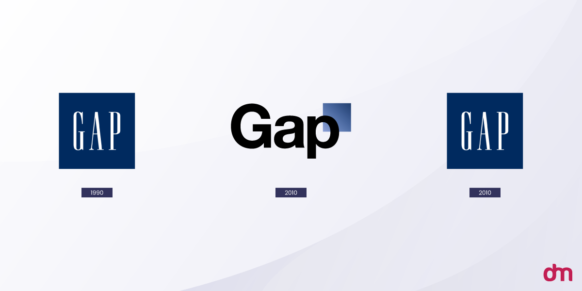
In 2010, Gap swapped its 20-year-old blue box logo for a plain Helvetica wordmark. No announcement. No rollout plan. No explanation for why. The backlash was immediate and loud enough that the company reverted within six days, and the whole misadventure is estimated to have cost close to $100 million once you tally agency fees, marketing spend, and the reversal itself.
Plenty of designers actually defended the new mark on its merits. That’s the part people forget. What sank it wasn’t the artwork; it was that Gap had no answer ready for a single one of the questions below, and customers could sense that absence within hours.
Fifteen years on, marketing courses still open with this story. Not because the logo was uniquely ugly, but because it’s such a tidy example of a process gone wrong from the very first step.
1. What Problem Are You Actually Trying to Solve?
"It feels old" is a mood, not a problem. Before anyone opens a mood board, write down the specific, nameable issue the current logo creates.
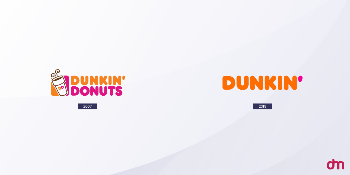
Maybe it turns into mush at 16 pixels on a favicon. Or maybe it still says "Donuts" while coffee drives most of the revenue, which is exactly why Dunkin’ dropped the word Donuts from its name and mark in 2018. That’s a positioning issue that happened to need a visual fix, not a visual itch looking for a justification.
And if the justification sounds more like "our competitors redesigned" or "honestly, we’re just tired of looking at it," that’s worth naming for what it is: internal fatigue. Before committing to a redesign, use an ultimate visual identity checklist to determine whether your current branding is truly underperforming.
A real brief should hold up in one sentence to a customer who has never once thought about the company’s branding.
Spotting a Fake Reason
If the reason keeps shifting depending on who’s asked, or if it only holds up in a room full of people who already work there, that’s a signal worth taking seriously before any budget gets approved.
2. Has Your Business Genuinely Changed, or Does It Just Feel Stale?
A logo is supposed to track what a company does and who it’s for. When either one shifts in a real way, the mark eventually needs to catch up, but the shift has to come first.
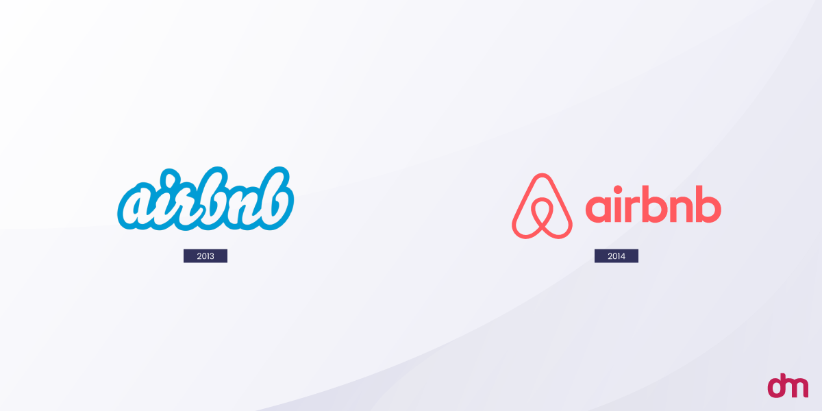
Take Airbnb. Its 2014 move from a plain wordmark to the "Bélo" symbol wasn’t a cosmetic whim. The company was repositioning itself from a listings website into something closer to a global belonging platform, and that pivot touched product decisions and messaging long before it touched the logo file.
Compare that to a company whose customers, product, and market position have barely moved in five years, yet leadership still wants a fresh look. That’s not evolution catching up with reality. It’s restlessness, and it’s an expensive habit to indulge.
Many modern brands evolve their identities gradually by adopting modular branding strategies instead of completely replacing recognizable assets.
A Quick Way to Check
Try describing the company today in one paragraph, without mentioning the logo at all. If that paragraph reads almost the same as it would have three years ago, the business hasn’t moved enough yet to justify a new mark.
3. What Equity Are You Willing to Risk?
An established logo carries recognition that took years of marketing spend to build. Change it, and some of that equity gets spent whether you meant to or not, and it doesn’t always come back.
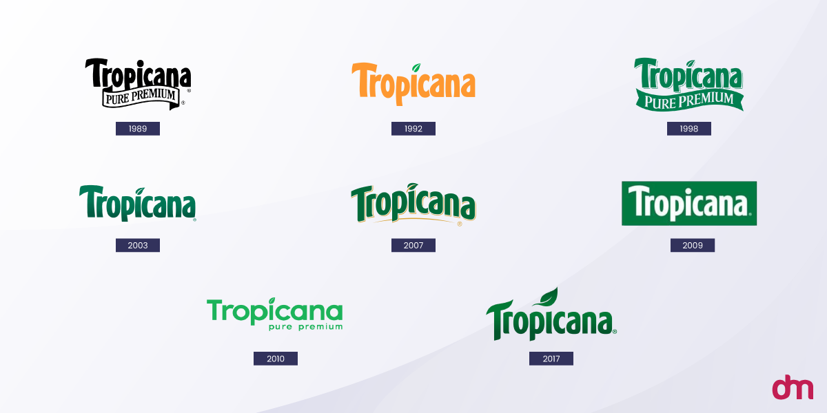
Tropicana learned this in January 2009, when it swapped its familiar straw-in-an-orange imagery for a minimalist glass of juice. Sales dropped roughly 20% over the following two months, and the company reverted to the old packaging after burning through an estimated $35 million.
Scale matters here. A three-year-old startup simply has less equity at stake than a grocery-aisle staple people buy on autopilot every week, so the level of caution should track how deeply the current mark is wired into daily habits, not how bored the internal team happens to be.
One rough gut check: how fast could a customer name the brand from the logo alone, with no wordmark, no tagline, nothing else on the page? The faster that happens, the more there is on the table.
Estimating What’s at Stake
One rough gut check: how fast could a customer name the brand from the logo alone, with no wordmark, no tagline, nothing else on the page? The faster that happens, the more there is on the table.
4. Are You Solving This for Customers, or for Your Own Boredom?
Design teams and executives look at a logo every single day. Customers glance at it for a few seconds, occasionally. That mismatch in exposure is exactly why internal fatigue so easily gets mistaken for a genuine problem.
Research from the Ehrenberg-Bass Institute for Marketing Science makes a related point: brand assets like logos, colors, and characters take years to build recognition, and a sudden change can erase that investment almost overnight, especially when the decision was made by committee rather than tested against how actual customers respond.
Who’s Actually Asking for This
A quick gut check worth trying: if the people pushing hardest for change are the same ones who see the logo in every meeting, every slide deck, and every internal doc, weigh their opinion accordingly. By definition, they’re the most over-exposed audience the mark has.
5. Does Your Current Logo Actually Work Across Today’s Platforms?
Here’s the one genuinely technical reason to redesign, separate from taste altogether. A mark built for print decades ago tends to fall apart as an app icon, a watch face, or a single-color embroidery patch.
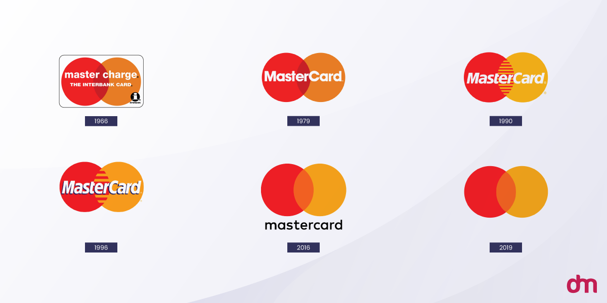
Mastercard‘s 2019 update is a clean example. The company dropped its wordmark from the primary mark entirely, leaving just the interlocking circles, a response to a world where the brand now shows up at app-icon size far more often than on a billboard.
Reviewing the ideal logo sizes for websites, social media, and print can help determine whether functionality, not aesthetics, is the real issue.
A Quick Functional Audit
Before assuming this is your problem too, run the logo through some real use cases:
| Context | Does it hold up? |
| App icon at 60×60 px | Yes/No |
| Single-color favicon | Yes/No |
| Black-and-white fax or embroidery | Yes/No |
| Circular social media crop | Yes/No |
| Dark mode background | Yes/No |
Most boxes unchecked? That’s your actual justification, not a rebrand chasing a trend.
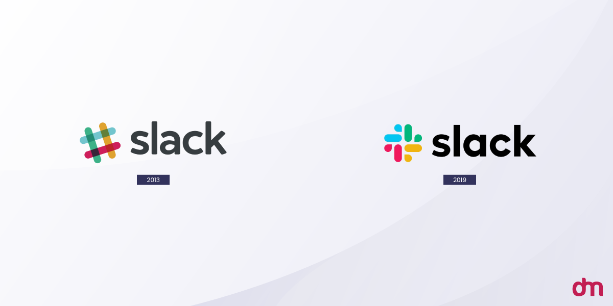
Slack hit a version of this same wall in 2019.The original hashtag-style icon looked fine blown up large, but got noisy and hard to read once it shrank down and landed on inconsistent backgrounds, a functional problem worth solving, not a taste problem dressed up as one.
Strong logos are designed for versatility across platforms, formats, and use cases from the start.
6. What’s Your Realistic Budget and Timeline?
Redesign costs swing wildly, and where a company lands on that spectrum says a lot about the process behind it. Before setting a budget for your redesign, understanding how much a logo costs can help you make more informed branding and investment decisions.
What Redesigns Actually Cost
| Redesign | Reported Cost |
| Twitter’s original bird icon (2010) | Under $15 |
| Nike’s swoosh (1971) | $35 |
| Pepsi’s 2008 refresh | Roughly $1 million |
| BP’s 2000 rebrand | Around $211 million |
That spread exists because cost was never really about the artwork itself. It’s research, testing, trademark clearance, and rolling the new mark out across every touchpoint a brand owns. A $500 logo and a $500,000 logo can both turn out fine; the difference usually comes down to whether either one was actually tested before launch.
Some of the world’s biggest brands have spent millions on their logos, proving that the real investment often extends far beyond the design itself. Whatever figure gets landed on, build a timeline around it with real room for testing, not just design and delivery.
A six-week rush job with no testing phase is how brands end up repeating Gap’s mistake on a fraction of Gap’s budget.
7. How Will You Test Before You Launch?
Skipping this step is precisely what turned Gap’s redesign into a punchline. No leak, no beta, no customer panel; the public met the finished product for the first time on launch day, and reacted the way you’d expect.
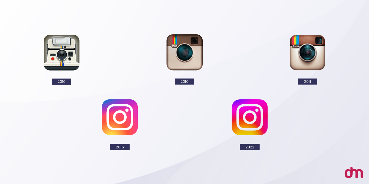
Instagram took what looked like a riskier bet with its 2016 flat, gradient icon and came out fine anyway, largely because the decision leaned on internal data about how the mark actually performed at small sizes across app-store thumbnails.
The initial public reaction was loud and mixed; people compared it to everything from a camera error to a sunset filter, but the company had already tested for the metrics that mattered to its business, not just for aesthetic approval.
Low-Cost Ways to Test Before Committing
A few things worth trying before anything goes live:
- Show the new mark to existing customers, not just internal staff
- Check recognition at small sizes and in single color
- Get reactions from people with zero context on the reasoning behind it
- Place it next to competitor logos and see if it still holds its own
8. What’s Your Rollout and Communication Plan?
Announce a redesign with no explanation, and people will happily write their own story about why it happened. That story is rarely flattering.
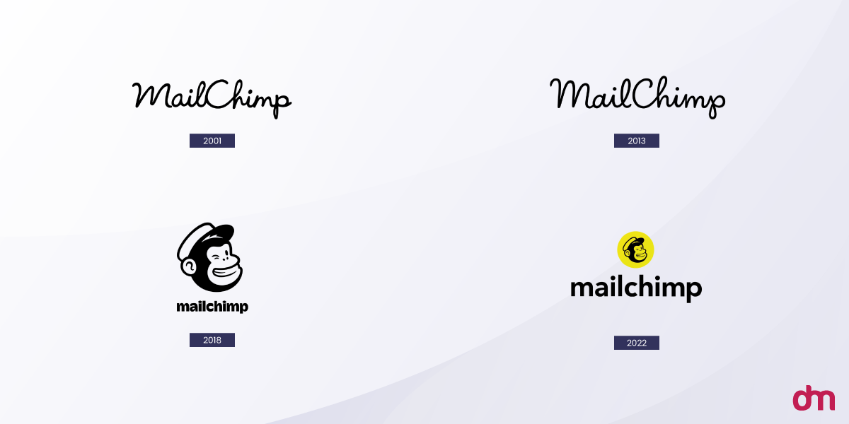
Mailchimp took the opposite approach with its 2018 overhaul, built around a hand-drawn identity and its mascot Freddie. The company published extensive writing on the reasoning: the brand had simply outgrown its buttoned-up look as it expanded well beyond email marketing. Customers had context before they ever had to react, which is precisely the step Gap skipped entirely.
Keep the Explanation Simple
None of this needs to be elaborate. A short blog post, a note from the founder, even a simple explainer graphic can do the job. What actually matters is that the explanation shows up before the criticism does, not scrambling to catch up after.
9. What Elements of Your Old Identity Should Survive?
Few successful redesigns are total reinventions. Most are careful, restrained edits that protect whichever parts are doing the heaviest recognition work.
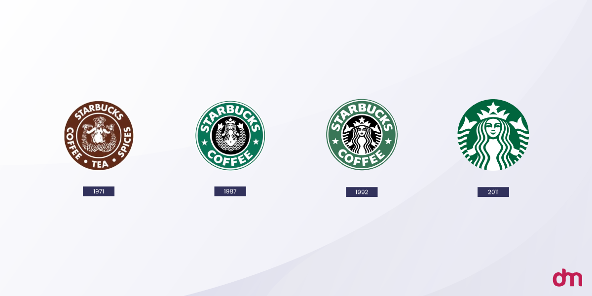
Starbucks is the clearest example around. Its siren has been simplified again and again since 1971, losing the surrounding text ring, gaining cleaner linework over the decades, but the siren herself has never once left. Each version reads as a clear descendant of the last, which is exactly why none of them ever triggered a Gap-style revolt.
The world’s most recognizable brands rely on evergreen logo designs that evolve thoughtfully over time rather than chasing trends.
Decide early which single element is genuinely non-negotiable, whether that’s a color, a symbol, or a shape. Everything else tends to be far more flexible than founders usually assume going in.
Longevity as a Strategy
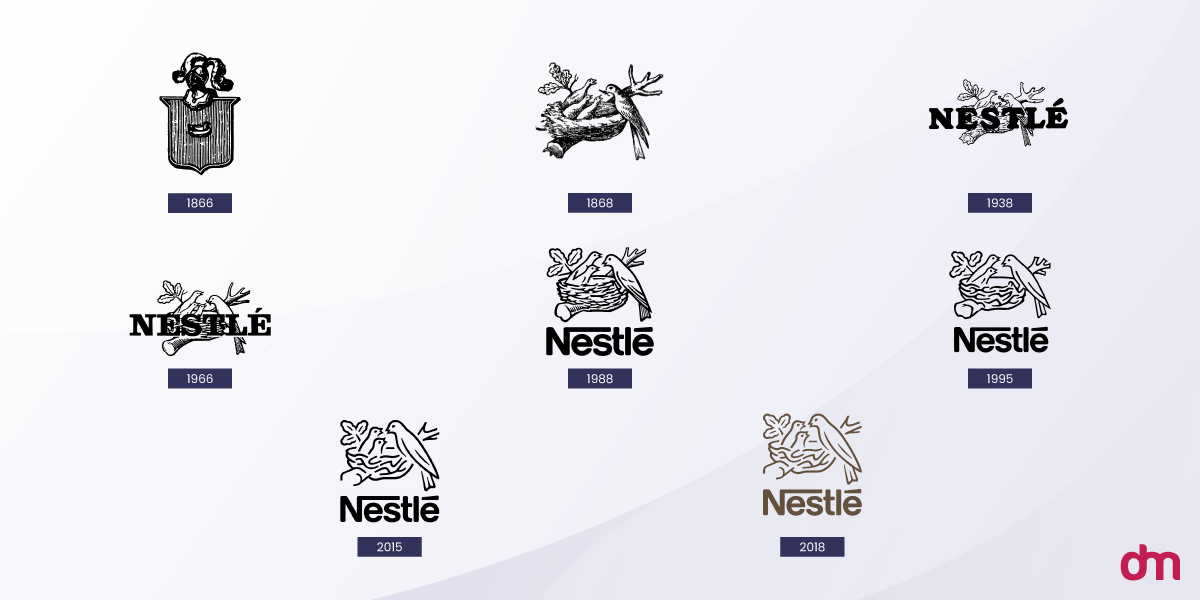
Nestlé makes the same case from a different angle entirely. The bird’s-nest imagery has held its place for well over a century, with only the linework and level of detail shifting along the way. Longevity became a selling point of its own, rather than something the brand felt any pressure to design its way out of.
10. How Will You Measure Whether It Actually Worked?
A redesign with no success metrics attached is just a guess wearing a decision’s clothes. Define what "worked" actually means before the new logo goes live, not six months later, once everyone’s opinions have already calcified.
What to Actually Track
Worth tracking: brand recall surveys run before and after launch, sentiment on social mentions in the weeks that follow, and, where it’s measurable, any shift in conversion behavior. Set a review date on the calendar now, while it’s still easy to be honest about the answer.
A redesign that quietly underperforms and never gets reviewed just sits there, bleeding goodwill nobody notices until a customer finally says something out loud.
The Checklist Version
Before greenlighting anything, run it against this list.
| # | Question | Red Flag Answer |
| 1 | What problem does this solve? | "It just feels old" |
| 2 | Has the business actually changed? | No, but the team is bored |
| 3 | What equity might you lose? | Nobody has estimated it |
| 4 | Who’s driving this decision? | Only internal stakeholders |
| 5 | Does the current mark work technically? | Untested across formats |
| 6 | What’s the real budget? | Undefined or open-ended |
| 7 | How will you test it? | Launch and see |
| 8 | What’s the rollout story? | Silent overnight swap |
| 9 | What survives the change? | Everything is up for grabs |
| 10 | How will success be measured? | No plan to check |
Conclusion
Every one of these questions comes down to the same test: could you defend this change to a customer who’s never once thought about your branding? If the honest answer is no, the logo probably isn’t the problem worth solving yet.
A redesign built on a clear reason survives contact with the public. One built on restlessness usually doesn’t, and the fallout tends to cost far more than the design fee ever did. Answer the questions first. Everything after that- the sketches, the testing, the rollout- gets a lot easier to get right.
Once you’ve answered these questions, the right design process becomes much easier. Our logo design services can help you turn your branding strategy into a logo that works across every touchpoint. Studying lessons from major logo redesigns can also help brands understand what separates successful rebrands from costly missteps.