Balance is the key to happiness they say. Stability, attractiveness, cohesiveness – all these elements are better conveyed by a balanced composition in design. This phenomenon can be better classified as symmetry in design. And it relies on the strategic as well as artful placement of positive elements as well as negative space in such a way where the whole composition works marvelously. Even the rules of visual hierachy are prominently enforced here.
Focal elements get their prominence because adept designers know how to make symmetry in design work for them. They know how to direct the audience’s attention and where. No space seems like wasted roadkill, since the design is nicely laid out for every visual and psychological element that’s present in your composition. Unbalanced compositions however seem like confused messes.
So without further ado, let’s take a look at symmetry in design and how it all works as a design principle for artists and professionals.
Balance – Physical vs. Visual
Picture a see-saw. One with people or objects of equal mass at each ends. This is what is meant by physical balance. If one mass tends to be greater than the other, then the perfect balance simply won’t hold.
Balance is a good thing. Even these rocks agree.
Similarly, when it comes to visual balance, the viewer might feel uncomfortable as they look at design that’s all over the place and a pain to decipher. When your creation is visually balanced, each and every part of it is deemed interesting.
To better illustrate the use of symmetry in design, we will be focusing on web design and logo design both.
Symmetry in Logo Design – Talk about Making a Point
Logos convey a thousand things and with symmetry woven in, they can say those thousand things without the viewer left scratching their head as to the meaning and direction of the logo.
Let’s take the example of an extremely well-done logo that incorporates symmetry to make its point:
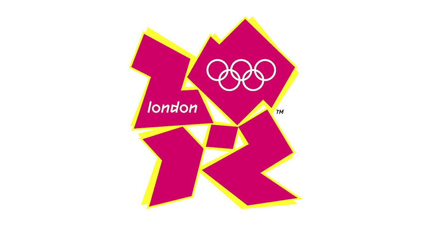
And then we have this ‘monstrosity’ to thank for showing us what’s a design with no symmetry nor direction or focus:
Symmetry in Web Design – Its all about the Presentation
Paragraph formatting. Grids. Website Layouts. There are so many elements to consider when making your website usable and attractive for your audience.
Once again, symmetry comes to the rescue, ensuring the correct placement of website design elements throughout the pages. You want your website to present the right information in the right way.
We need Symmetry in Design not the Leaning Tower of Pisa
Based on the examples you just saw, symmetry in design, be it in logo or websites, isn’t supposed to be an afterthought. It can also be augmented further by the golden ratio in design. Symmetry is an important design principle that allows you to make use of human perception to your advantage. There are focal points and then there are contrasting elements. Both work together to convey information visually and make your audience arrive at their conclusions positively.
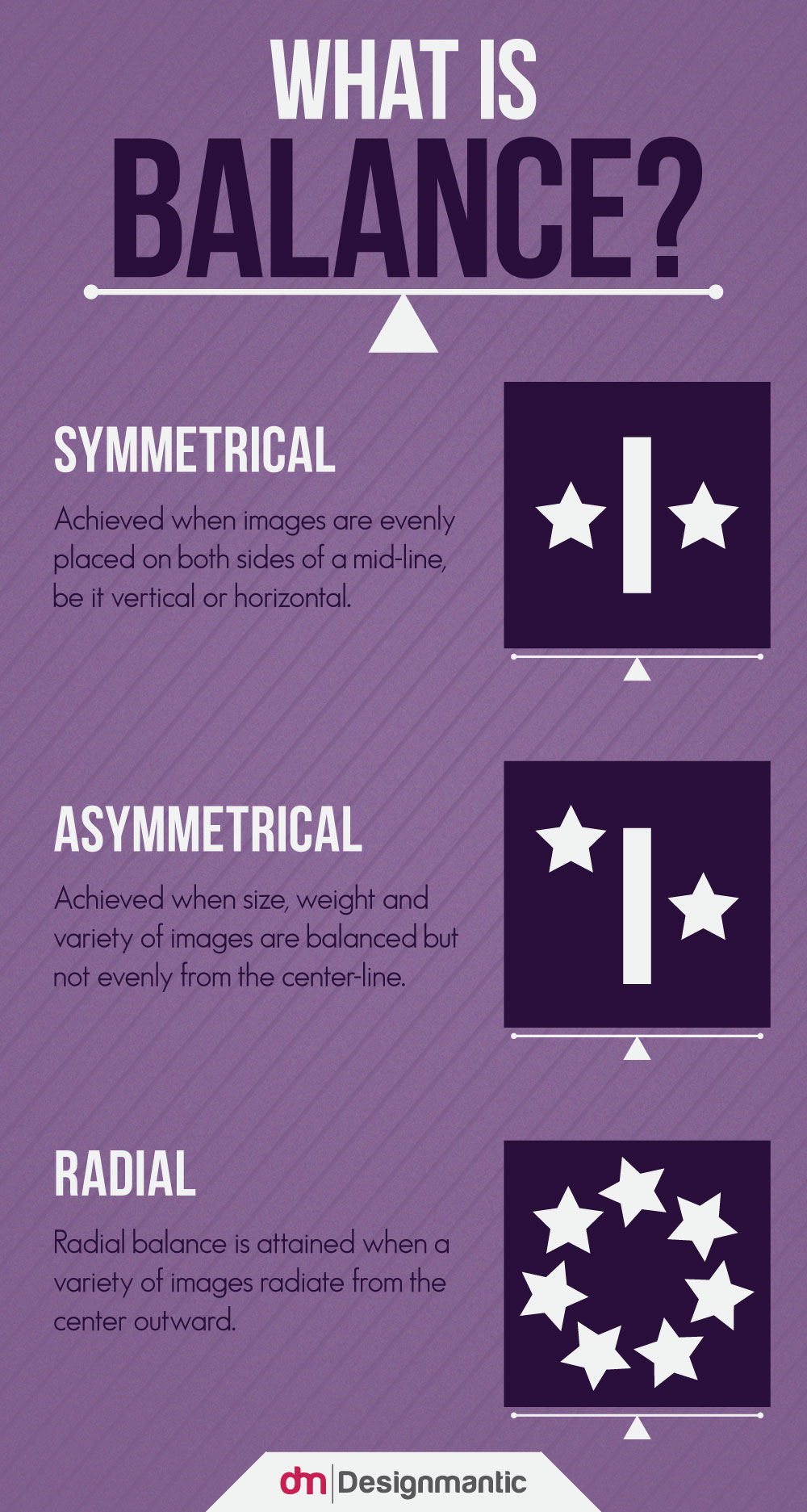
Designers agree that the concept of balance in their works makes their audience more attracted to what they’re trying to convey. Usually designers achieve symmetry in design by taking the image’s central axis, and reproducing them on the other side so that the whole thing feels like a spitting image of two halves. Really doesn’t matter what the image orientation is, as long as the image is the same at both sides of the central axis.
Still not sold on the merits of symmetry? Take a look at most consumer products packaging out there and you’ll see that symmetry remains the dominant organizational concept in the goods you buy. Research and marketing studies have both attributed the balance in visuals to increased consumer interest in their favorite products. Therefore, its paramount for the designers of today to incorporate the themes of balance in their creations for maximal appeal and focus.


