Planning a trip or manifesting it? Either way, TripAdvisor is a great way to get started. If you have opened the website in the last couple of days, you might have been greeted by the new and improved Ollie.
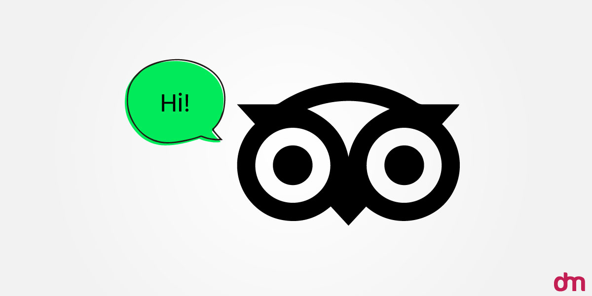
If not, visit the website when you’re done reading this article.
What Is Tripadvisor and What Does It Do?
If they’re something synonymous with travel, it’s Tripadvisor. It is undoubtedly one of the most visited travel websites worldwide in 2025. And the Tripadvisor craze is not new. The company began operations in 2000, and since then, it has been the first choice for travelers all over the globe.
Tripadvisor provides online travel information and has a booking website with honest reviews, information, and even photographs of several hotels and resorts worldwide. With Tripadvisor, you can be sure that the destination you are travelling to and the hotel you’re staying at are precisely as they claim to be.
Do you want to launch your very own travel platform? Check out some of our travel company logos to get inspiration. And don’t miss out on our tour logo designs to help you visualize your brand’s identity.
What’s New At The Tripadvisor Headquarters?
The team at the Tripadvisor headquarters is celebrating its 25th anniversary, and what a fantastic way to celebrate it with a rebranding. The Koto Studio has been appointed for this collaboration.
The rebranding efforts include an entirely new advertising approach and slight logo changes.
Now, Tripadvisor’s branding actively uses actual travel photos shared on the forum and user reviews from real users.
As for the logo, that’s exactly what we will be discussing today. The Tripadvisor logo is one of its kind with a distinct personality that matches Tripadvisor’s new polished identity. In a press release, Koto announced that “Tripadvisor’s new identity is built to showcase travel as it really is: personal, textured, emotional.” Are you curious to see the new logo? So are we.
Let’s see how the logo captures Tripadvisor’s new identity.
Meet Ollie 2.0
Tripadvisor took to Instagram and in a not so direct post announced its rebranding. The post was anything but serious and used memes to male the big announcement. And we’re all here for the memes.
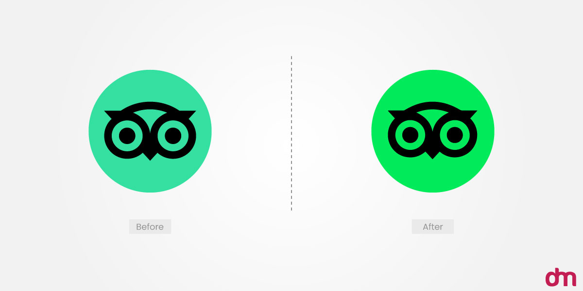
Ollie, the Tripadvisor mascot, was getting summer-ready while the rest of the world was planning their trip. In the new logo you can see that the owl had a massive makeover with Koto being the plastic surgeon.
In the Instagram post, Tripadvisor announced that the owl had a rhinoplasty, lip filler, cheek implants, jaw shave, chin implant, face lift, blepharoplasty, buccal fat removal, eye lift and finally cheek fillers. The owl looks much younger, refreshed and ready to travel.
But Why Did Tripadvisor Change Its Logo?
While the change is a big success, many people are still curious why Tripadvisor actually made the change. Well, we have some informed guesses as to why the logo was refreshed:
25th Anniversary and Future Direction
Tripadvisor wanted to celebrate its 25th anniversary with a bang. That’s when they brought the new logo to life. But that’s not it. They used it as the perfect time to set the pace for the preceding years. The brand wants to be more relevant with the changing world and how the people of today see travel. It can simply be seen as an effort to stay on top of the market.
Authenticity and Relateability
Nowadays brands need to go above and beyond to show that they are authentic. Originated out of necessity, the new logo features a more animated Ollie that follows travelers wherever they go. This concept can also be seen in Tripadvisor’s most recent user generated content centered branding.
Global Planning and Booking Powerhouse
Tripadvisor has branched out and is no longer a forum for travel reviews. It will now allow users to plan comprehensive trips with the help of its tools. It is now positioning itself as your travel partner, much like Harry Potter and his owl, Hedwig.
Therefore, a more animated mascot logo conveys the message perfectly! With the travel industry expanding, many creative travel startups are entering the game with innovative ideas, and Tripadvisor’s evolution is a great example of staying relevant.
Modernity and Digital Compatibility
Too old to be a Gen Z and too young to be a Millennial, Tripadvisor is trying to stay with the times. With the changing times, logos need to be adaptable and modern. It is important to remember that we now use multiple mediums to get information, and a logo that looks good on one and botched on the other is just a miss.
Travel agencies must step up their game and refine their branding for digital success.
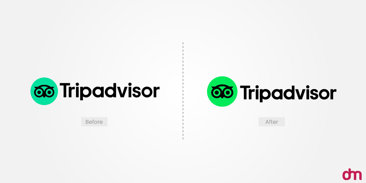
The new Tripadvisor logo is evolved to fit the audience and digital requirements today. With more life and a sharper green this logo is getting attention for all the right reasons.
Making Travel Personal
Everything now is a lot more personal than it used to be. Traveling used to be a recreational activity but now people are travelling to different places in an effort to find themselves. This shift in mindset calls for brands to rethink their branding.
With a fresher and more relatable visual identity, Tripadvisor has retired its dated logo. Do you want to see how far it has come? Let’s see the evolution of the Tripadvisor logo.
The Evolution of The Tripadvisor Logo
In 2025, the Tripadvisor logo returned to the drawing table only thrice, but each time, the end result ticked all the boxes. Here are all the Tripadvisor logos over the years.
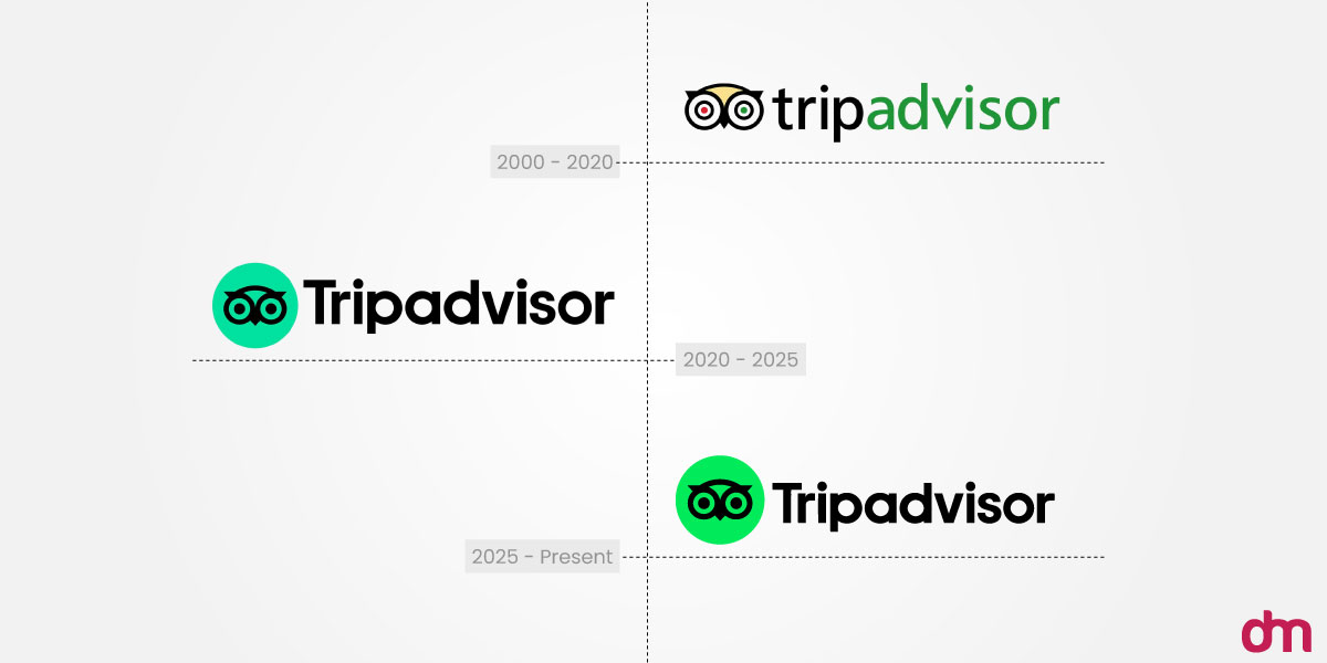
2000: The Original Logo
To understand the story behind the very first Tripadvisor logo, you must understand the thought behind the brand. According to Mother Design, Tripadvisor’s first logo designer was built on the premise that real humans give the best advice.
Conveying that to the audience was not as easy as we’d like to believe. To humanize the brand, Mother Design used a mascot logo; hence, Ollie the Owl flew into the picture. This was the most distinctive feature of the logo.
Ollie The Owl
It’s all in the eyes. Ollie had mismatched eyes, and no, it didn’t have heterochromia; the mismatched eyes were intentional. One green and one red eye gave Ollie an unmissable personality. It is often believed to symbolize the red and green lights, meaning to stop or to go.
If you want a mascot logo for your own travelling brand or a destination you want to put on the map, explore all destination-themed and tourism logo designs to see what works best for you.
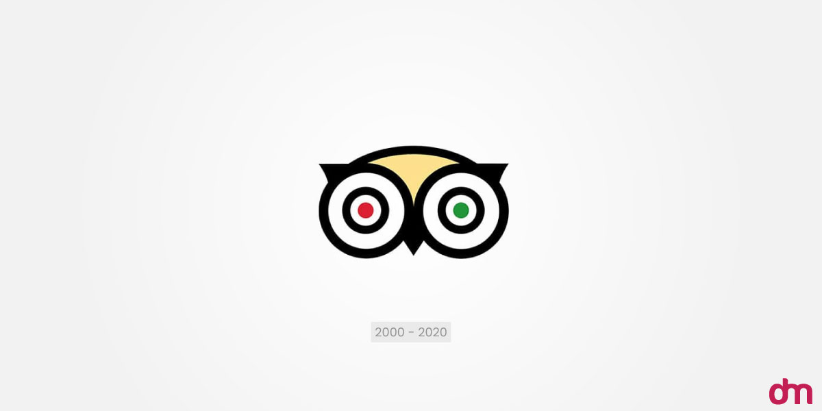
Olle’s forehead was yellow, a great way to add more color to the logo. It is also widely agreed that the first logo had great detail about Ollie.
Wordmark
Moving on to the wordmark, the Tripadvisor logo was spelled against capitalization rules to add more depth and visual harmony to the logo. The designers used a sans-serif typeface, and the color choice for the wordmark was black and green. The word ‘trip’ was written in black and ‘advisor’ in the signature green. This emphasized that the company serves as an advisor in your travel journey.

The original logo had successfully embodied Tripadvisor’s brand identity and made it memorable. The wise owl presented itself as the only guide you need to have a stress-free travel.
2020: The Strategic Rebrand
After using the same logo for 20 years, Tripadvisor decided it was finally time for a change. And who did they call to do the honors? Mother Design yet again.
By 2020, Tripadvisor understood that the nature of travel had changed, and they needed to change with it. This time around, Tripadvisor came to Mother Design with the intention of making the brand more modern and human.
This is when the brand evolved from a review site to a brand that wanted to promote’ People-Powered Planning’. This was intended to show that Tripadvisor was now a service provider and offered travel planning advice.
Ollie Continues To Thrive
Ollie survived the 2020 rebranding and was refined to make it sharper. But it was stripped of its colors. The designers bid farewell to the mismatched eyes and yellow forehead to keep the logo monochromatic. This change was intentional as it rid the logo of needing more colors and could be more versatile.
If you like colorful logos, don’t shy away from using colors, sometimes, colors can be a great contributor to your brand story.
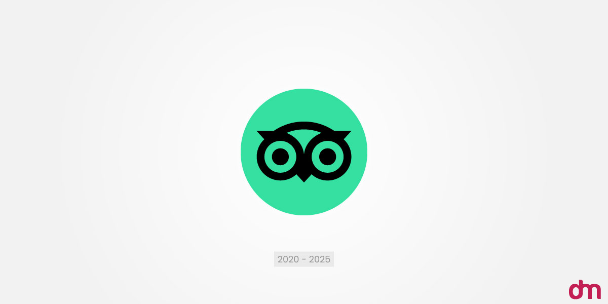
The owl was resized, and its geometry was refined to improve reproduction of different sizes. The head was made into a perfect circle, while the ears and beak were bolded. This design was exclusively to make the logo more recognizable and legible enough to fit anywhere, especially the Traveler’s Choice Award’s physical signage.
Wordmark
One of the biggest changes in the wordmark was the spelling. It wasn’t Tripadvisor anymore. The designers finally decided to follow capitalization rules and kept all letters lowercase except the initial T.
As for the typeface, Moher Design collaborated with Colophon Foundry and custom-made a font for the Tripadvisor logo. The font sans serif typeface, and the font is called Trip Sans. The font was designed to match the geometry of the owl and give it a friendly touch. On the other hand, the color was optimised for digital usage by brightening it. Here are some of the best color tools you must have in your arsenal.
The designers came up with the 2020 logo as a logo for the future. They wanted it to reflect the brand’s human approach and evolution to service based business. But the world changed a lot more in the last five years than it did in the 20 years before that. So, the logo and the rest of the branding needed to change and evolve or they’d be outdated.
2025: The Anniversary Rebranding
This is the most recent iteration of the Tripadvisor logo. This time around, the Koto Studio was called in for the rebranding. However, Koto didn’t stray too far from the 2020 design and subtly built on it.
Ollie’s Alive
Koto proposed one small change that breathed life into Ollie. The eyes were now designed to be animated and would follow you as you scroll. This change made a huge difference as the owl now seems more alert and always ready to assist travellers.
While the geometry of the design has not changed much, Ollie seems a lot more lively and like a true mascot. An expressive logo imprints in people’s minds, and Ollie is on its way to being a branding marvel.
Wordmark
The custom sans-serif remained the same but was slightly cleaned up to scale better across different platforms. And the rest has remained more or less the same.
These changes have made the brand more relatable at a glance and even translate their ‘chronically online’ personality.
How Is The New Logo Better? Or Is It?
With so many brands changing their aesthetics, one may question, ‘Are these changes purely aesthetic, or do they serve purpose?’ Focusing on the Tripadvisor logo evolution, there may be two sides to the story. Let’s first see what makes the new logo better than the ghosts of logo past.
The New Logo Is Better
More scalability
It was difficult to use the previous logo across platforms as the owl would lose impact at smaller scales. A logo should remain the same at every scale so it does not give a messy look. The 2025 logo looks absolutely amazing on billboards and even on paper because of its simplified design.
Better Readability

Sometimes all it takes is a custom font to ensure readability. This is because the designers especially designed the font to be digital friendly. This is very important for brands that have a text heavy logo.
Strategically aligned

The brand’s latest strategy is to be more human centric and that is achieved by Ollie’s animated eyes. This tells the audience that Tripadvisor is here and it’s listening to what you have to say. Static icons cannot really achieve this which is why the logo was kept dynamic.
Moreover, the subtle changes in the color and lines have also made the logo crisper and less complex.
Contemporary Edge
Many brands are still hungover on static logos with complex designs and hard-to-read wordmarks. But Tripadvisor has been able to break away and use the contemporary edge to appeal to its audience more than its competitors. If you’re a travel agent looking for a logo, make sure that you also have a contemporary edge over your competitors.
Design Unification
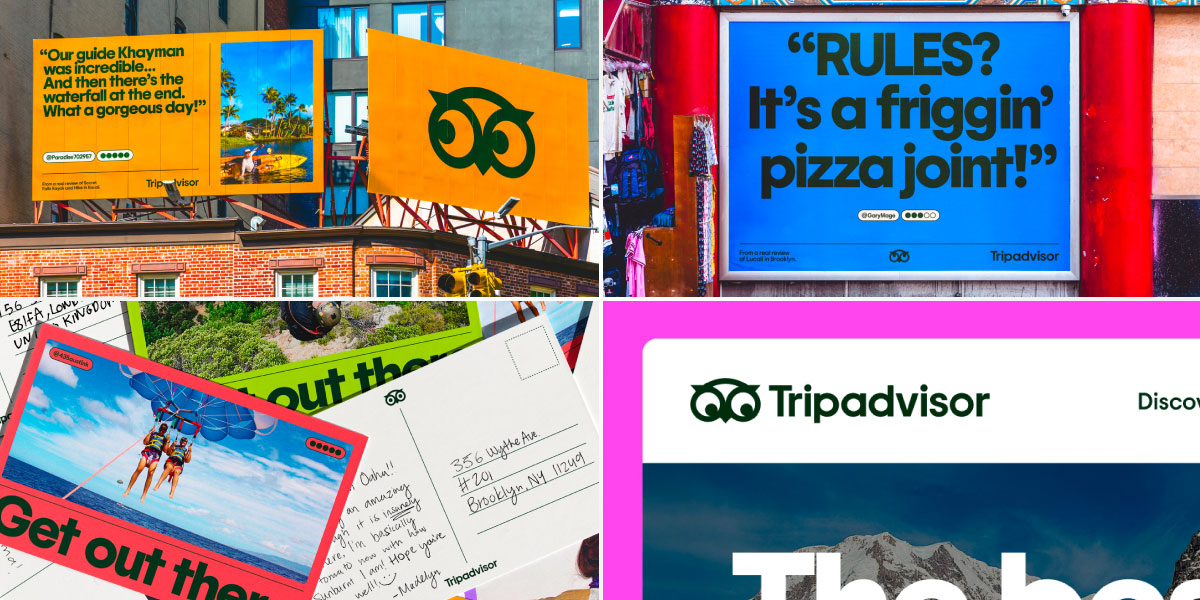
The latest logo design continues with the circular shape language, unifying the rebranding of the Tripadvisor logo. The previous iterations had too much going on at the same time, which can be very distracting for the digital audience today.
Vibrant Color
The original logo used a dark and muted green, which was not very appealing to the audience. Then came the monochromatic rebranding in 2020, which brightened the green color in the wordmark for a better and sharper display.

The latest rebranding has made the color palette even sharper and more vibrant. This intensified shade of green was designed to be extremely visible and more vibrant than the previous logos.
Legible Typography
Over the years, the typography of the Tripadvisor logo has been refined to improve readability and add a modern look. The 2000 logo used a simple sans serif font with a lowercase ‘trip’, which is followed by a capitalized A in Advisor.
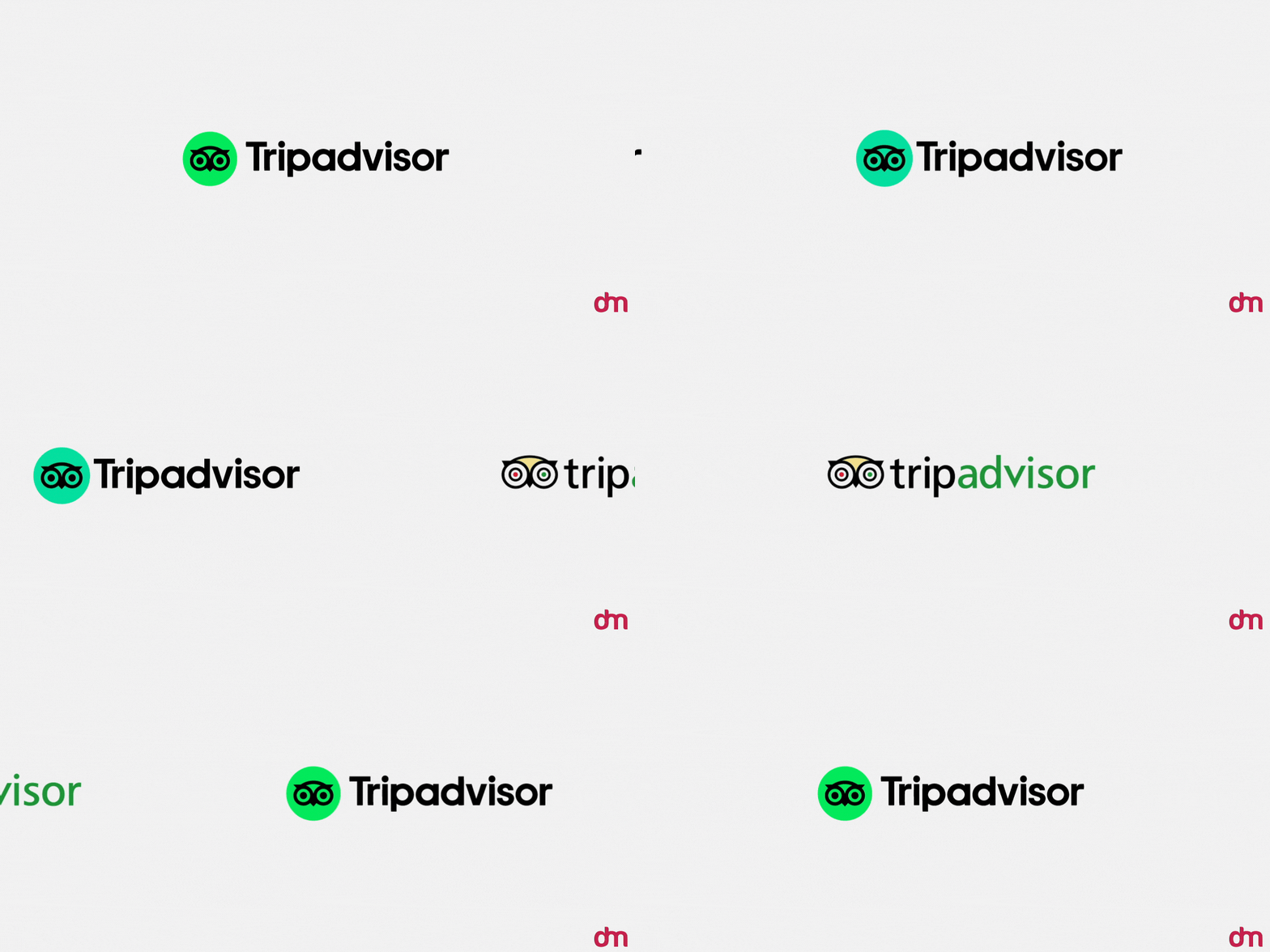
Then, in 2020, the brand collaborated with Colophon Foundry to create a custom font called Trip Sans. This typeface was specially designed to match the new owl icon’s geometry and be friendlier.
Lastly, in 2025, the custom font was cleaned up to scale better across all digital and physical formats, keeping the logo crisp and relevant.
But?
On the other hand, it is noteworthy that Tripadvisor’s logo has had many quirks along the way. Some brands are loved because of their quirkiness, and the mismatched eyes with a yellow forehead gave the logo a distinct personality that the new logos haven’t been able to replicate.
The logo seems more polished, some might even say too polished. Imperfect designs aren’t always a bad thing, and the same can be said for the Tripadvisor logo.
Similarly, it may also seem that Tripadvisor has jumped on the minimalistic logo bandwagon and left its personality behind. Many companies are opting for minimalist logos, which often end up looking the same.
While the new logo is a definite upgrade, there are still some concerns the company must address, possibly on their 26th anniversary? Let’s see what happens next.
The Takeaway
Tripadvisor is one of the most successful brands out there, so they must be doing something right, and it’s definitely their logo. If you want your brand to speak to the audience like theirs does, hoot at us! (See what I did there? Iconic!) Our logo maker for travel and tourism brands will get yours the attention it needs.
Create a logo that embodies your brand identity and scream it out to the world!

