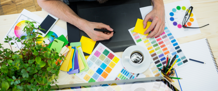
A plethora of technical terms are thrown around in the world of graphic design, and most of them are enough to leave an aspiring designer biting their nails in apprehension. Working as a graphic designer without being drilled in its lingo is like drinking coffee without a cup or attempting to ride a bike without wheels. Littered with phrases and jargon, a career in graphic design might seem daunting to most people, but we are here to help you make sense of it all. Peruse through our glossary of graphic design terms for newbies and professional designers alike and learn the vernacular to survive the cut throat competition in the industry! From a handy color glossary for noobs to more technical terms for professionals, we have got you covered!
Color
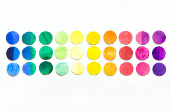
Choosing a color scheme for your design isn’t as simple anymore as picking out a crayon from the Crayola set. The deeper you delve into the intricacies of the world of colors, the more confounded you’d feel by the plethora of terms involved in it. This glossary would make it easier for you to understand key concepts and jargon pertaining to color when picking out a color scheme for designs.
1. Color Theory
The color theory successfully arranges color into a logical structure. Color theories fall under three basic categories: color harmony, the color wheel, and the context of how colors are used. Comprehension of leveraging different colors to infuse meaning in your designs is an indispensable aspect of marketing.
2. Hue
Hue denotes an object’s color and is one of the most basic of color terminologies. Every time we say that an object is “red”, “green”, or “blue”, we are talking about its hue.
3. Opacity
Opacity is the characteristic of a design element which defines its transparency. The higher the opacity, the less transparent a design object becomes. For instance, an object is solid at 100% opacity.
4. Chroma
The purity of a hue is defined by its chroma. A color with high chroma has no gray, white, or black added to it. Adding these tints reduces its chroma. Chroma can be construed of as the brightness of a color when compared to white.
5. Gradient
A gradient is a color fading into transparency or a gradual change of colors (such as blue slowly melting into green). The two most commonly used gradients are radial gradients where one color sits at the edge while the other protrudes outwards from the middle, and the linear gradients where different colors lie on the opposite ends of the frame.
6. Saturation
Saturation refers to the appearance of a color under certain lighting conditions. Saturation can be thought of in terms of pale vs. pure or weak vs. strong hue. In order to ensure more cohesive-looking designs, always opt for hues with similar saturation levels.
7. Tint
A variety of a color is known as its tint. In order to create a tint for any hue on the color wheel, add white to it. This de-saturates and lightens the hue, diminishing its intensity.

8. Tones
Tones are softer looking or duller versions of purer colors, created by adding grey to a hue. Tones infused with a higher intensity of grey can give a particular vintage feel to websites, or even lend an elegant or sophisticated look, depending on the hue.
9. Shades
A shade is created when a hue is made darker by the addition of black to it. While some designers erroneously use it to refer to tone or tint, shades only apply to the addition of black to a hue.
10. Cool Colors
Cool colors evoke memories of colder temperatures, such as violets, greens, and blues. Such hues create a soothing and calming ambience when used in a design. Cooler tones can be implemented within a photograph or an image by enhancing the blue tones in the design.
11. Warm Colors
Warm colors, such as oranges, yellows, and reds, instigate feelings of warmth and heat. These colors tend to feel more cheerful, friendlier, and cozier than cool colors. Warm tones can be implemented within a photograph or an image by enhancing the orange tones in the design.
12. Contrast
Contrast refers to the degree of difference visible between juxtaposed elements, such as dark vs. light.
13. Value
The relative degree of darkness or lightness is known as the value of a color. We know most colors in their wide gamut of ranges, for instance everything from the darkest maroon to the palest pink is identified by us as a form of pink. While different values are assigned a different name, they are recognized as a derivation of red.
14. Pantone (PMS)
When it comes to a standardized system of hues for printing, the Pantone Matching system is your go-to guide. Each Shade in the PMS is numbered, helping people to identify and reference precise shades of color without a confusion.
15. RGB
The ‘Red, Green, Blue’ or more commonly known as RGB color model is best suited to on-screen purposes, such as viewing images or photos on websites and online/onscreen. RGB follows an additive color process where in you start with black and add more color until it eventually transforms into white.

16. CMYK
‘Cyan, Magenta, Yellow, Key’ or more commonly known as the CMYK color model best caters to print purposes. As opposed to RGB, this is a subtractive color model, meaning that you start with the color white and eventually end up with black by removing color subsequently. Adding color to this model makes the design turn darker.
17. Analogous
Colors that are right next to each other on the color wheel are leveraged in the Analogous color schemes. They generally create comfortable and serene designs since they go together harmoniously.
18. Complementary
Complementary colors are hues that sit opposite to each other on the color wheel.
19. Triadic
Colors that are evenly spaced around the color wheel, such as in a triangular formation around the wheel, are said to constitute a triadic color scheme.
20. Palette
All the colors that have the potential to be utilized for any design work or illustration representing your brand are included in your brand’s color palette. The chosen colors for your brand palette should work harmoniously with each other.
Typography
The intricate world of typography is distinguished by its own language, replete with swashes, strokes, and serifs. Especially for aspiring designers or general typography enthusiasts, sorting out the terms or making sense of them can be confounding in itself, so a glossary that can guide you through the vernacular will make things a little easier. Getting to grips with these simple building blocks of typography would come in real handy when it comes to picking a suitable font and applying it effectually across your design projects.

21. Body Copy
Body copy includes the main part of text in your publication or design- the book contents, the written website content, or even the paragraph you are reading right now is included in the body copy.
22. Character
A character is a symbol from the full set of characters that make up a typeface. It may be in the form of a punctuation mark, number, or letter.
23. Leading
Leading (pronounced as ‘Ledding’) denotes the vertical space between subsequent lines of type. If you want to glean a legible body text, make sure that your leading value is greater than the font size; as a rule of thumb, somewhere between 1.25 to 1.5 times.
24. Kerning
Kerning refers to the spacing between any two consecutive characters in a text. Adjusting the kerning decreases the occurrence of white spaces between certain letter combinations and creates the appearance of uniformity.
25. Tracking
Traditionally known as letter spacing, tracking denotes the horizontal space between letters in a sentence or a complete word. While tracking is commonly confused with kerning, kerning is only concerned with the horizontal space between individual letters in a word.
26. X-Height
The height of the lowercase letter ‘x’ is traditionally known as the x-height. Generally speaking, x-height is the average height of lowercase letters in a typeface, minus the descenders and ascenders. The x-height varies between typefaces at the same point size.
27. Descenders
The part of a few lowercase letters in a font face, such as q and p that drops away below the baseline of the other lower case letters is known as descenders. Apart from lowercase letters, the Q and J in certain typefaces also descend below the baseline.
28. Ascenders
The part of some lowercase letters in a typeface, such as d, b, and k, which rises above the x-height of the other lowercase letters is known as ascenders.
29. Baseline
A baseline is an invisible line on which rests the upper and lowercase letters, excluding the space occupied by descenders.
30. Serif
Serifs are short, ornamental strokes generally extending from the top and bottom corners of letters and run the gamut from square and small to large and rather ornate. Type families that have serifs on each letter are known as Serif fonts.

31. Sans serif
Also referred to as Gothics, typefaces devoid of serifs are known as San Serifs.
32. Tail
A tail is an end stroke that is marked by a certain decorative feel. While people often mistake descenders with tails, a tail doesn’t always fall below the baseline.
33. Stem
Stems comprise full-length strokes in characters, sometimes having a diagonal slant like the letter “V”, or having a perfectly vertical stroke, such as the letter “T”.
34. Ligature
Ligatures comprise of two or more letters tied together to form a single letter. Character combinations such as ‘fl’ and ‘fi’ tend to overlap in some typefaces, leading to an unappealing shape. The ‘fl’ and ‘fi’ ligatures were brought forward to enhance the appearance of these characters.
35. Double Story
In stark contrast to the single-story versions, a double-story is a letter having two counters, such as the double story lowercase ‘a’, which contains a closed bowl at the bottom and a partially enclosed area formed by the stem with a final arm hanging over the top of the bowl.
36. Swash
An ornamental stroke or an extension on a letterform is known as a swash. A swash maybe available as an add-on to the standard character or an additional glyph, or even be part of the letter by design.
37. Apex
At the junction where two strokes meet, the uppermost connecting point of a letterform is known as an Apex. It may be blunt, flat, pointed, sharp, or rounded.
38. Font family
A font family is a collection of font faces that are intended to be used together, such as the Garamond font family consists of bold weights, semi-bolds, and regular in addition to Italic and Roman styles. Each weight and style combination constitutes a separate face.
39. Word Spacing
Word spacing includes altering the distance between consecutive words in a sentence to accommodate a block of text with in the available space or to boost legibility.
40. Bold or boldface
Every stroke of a typeface can be rendered in a heavier weight to lend more emphasis to each letter. Boldfaces include all the weights in a typeface that are heavier than the regular or standard variant of the font.
Graphic Design Terms
Getting caught into the world of graphic design is like learning a new language for most people, especially given the wide array of technical terms thrown around that might at times confound even the most professional of designers. Here’s a breakdown of some common graphic design terms for you to understand.
41. Rule Of Thirds
This theory dictates that if your image is divided with two horizontal and two vertical lines, the area falling within the intersection of those lines would become the focal points of your design.

42. Aspect Ratio
The proportional relationship between the height and the width of a rectangle is known as its aspect ratio. It is defined through a mathematical ratio, such as the width: height.
43. White space
Commonly known as negative space, a white space refers to the blank area of a design. It’s the space between copy, images, graphic elements, and anything else on paper. Despite the name, white spaces need not necessarily be white.
44. Vector
Vector images are made up of curves, lines, and points. Mathematical equations are leveraged to calculate all the shapes within a vector, which means that they can be easily scaled without compromising on quality. Unlike Raster, Vectors remain unscathed during scaling.

45. Raster
Raster images constitute a set grid of pixels, which translates into the fact that stretching or altering the size of a Raster image can result in a loss of clarity.
46. Skeuomorphism
Skeuomorphic design is where digital elements are designed to mimic physical works. For instance the Apple’s newsstand, where the magazines and bookshelves actually look and feel real.
47. Flat
As opposed to a Skeuomorphic philosophy, this minimalistic approach of design focuses on usability and simplicity. It features an abundance of dimensional illustrations, bright colors, crisp edges, and open spaces.
48. Knolling
Arranging an assortment of objects until they are perpendicular to each other, and photography them from above is known as knolling. This technique is used to create a symmetrical look that pleases the senses.
49. Texture
The surface characteristics of your image are known as its texture. Graphic designers often leverage texture such as brickwork and cloth to mimic the visual look and feel of the original texture.
50. Resolution
As a rule of thumb, the resolution of an image is a direct reflection on the quality of the image. For higher resolutions, the quality of the image is enhanced manifolds. A low resolution image appears blurry, while a high-resolution looks crisp and clean.
Graphic Design Techniques
All aspiring or budding designers are required to ace the graphic design techniques to make it big in the world of designing. Here is a breakdown of common jargon pertaining to graphic design techniques that all designers should understand.
51. Blur
Blur makes images less distinct or unclear. Blurring can be a great technique to make text legible when it is superimposed over an image.
52. Grid
Design programs have a two dimensional tool called the grid, which assists in structuring content by providing a set of vertical and horizontal lines.
53. Bleed
The part of the page which is expected to get trimmed off during the printing process is known as the bleed. A document may have elements or images that extend beyond the page or touch the edge of the page, leaving no white margin. A large sheet of paper should be used to print a document with bleed so that it can be trimmed off.
54. Alignment
Alignment is the position of graphics or text, whether fully justified, centered, right or left.
55. Proximity
Proximity is the way in which design elements are spaced out or grouped on a page. Grouping like elements together is a sign of great design.
56. Scale
The size of an object when compared to another subject is known as scale. Scale can be leveraged to grab the attention of the viewers and create interest in design.
57. Hierarchy
Organizing design elements by level of importance is known as hierarchy. Movie posters, Magazine spreads, and Newspapers use the perfect example of design hierarchy. Headlines are located at the top, while body copy and subheadings fall underneath.

58. Repetition
Sometimes designers repeat design elements to maintain a unified look throughout the design.
59. Thumbnail Sketch
When designers sketch rough drawings of potentially viable solutions or design concepts, they are known as thumbnail sketches. These sketches help designers grow and visualize numerous ideas and concepts before they are rendered on an actual screen.
60. Composition And Layout
Arrangement of design elements forming the complete image is known as composition. When done successfully, composition guides the eye of the viewer across the screen. Composition constitutes numerous design elements such as alignment, proximity, contrast, and negative spaces.
61. Crop
A designer may be required to crop or cut out unwanted parts of an image from time to time to alter the aspect ratio of an image, highlight a specific subject, or improve framing.
While great design entails hours and hours of diligent work and great skill, it also boils down to a clear comprehension of graphic design terms and terminologies to make sense of your work surroundings. We hope this glossary would be a stepping stone for you to excel in your career. Have we left out any key concepts and jargon? Do let us know in the comments below!


Ow! EVAN, Big writing, I highly appreciate your writing about The Visual Design Glossary Explained For Aspiring Designers. You really made out many points about Visual Design with nice picture, Thanks bro for such a great article.