With 2018 reaching its denouement, we felt it necessary to turn back and have a flashback of the year’s most note-worthy rebranding projects.
2018—in a nutshell—was amazing and full of rebrands. For non-designers, rebranding would be just having a new logo or color theme; whereas the design fanatics consider the process as a strategic, insightful makeover carried out to change the overall public opinion and brand persona.
While reminiscing this year, we also dug into our archives of the past 12 months to find everything – from inspirations to design podcasts and new palette logos – we shared with you from time to time. Don’t forget to check those out.
Many renowned brands are not going to look the same way they did at the year’s start. The industry witnessed new logos, new fonts, and even new names (jaw dropped). Let’s quickly jump to some of the biggest rebrands that occurred in 2018… before the year ends!
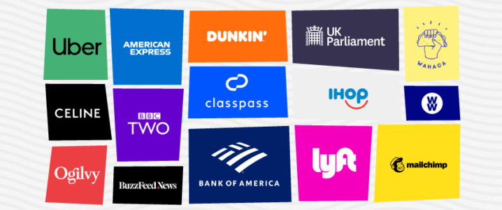
1. Uber
Previously based on a circular icon-based design, the well-known ride-hailing app has turned its icon-based logo into wordmark design, showing just the company name in white against black backdrop. Just two years back in 2016, Uber had its logo revamped and weathered a lot of criticism. This time travel app’s logo looks quite minimal and simple.

The design stars an uppercase “U” that gels seamlessly with the “b” on its right, whereas the letters “b” and “e” exhibit two strong round shapes in the middle. The word ends with “r” complimenting the shape of “U”. It may not be a very good logo, but considering the history of Uber’s rebranding, this is by far the most decent one.
2. Ogilvy
Two years of backbreaking efforts and restructuring struggles, Ogilvy revealed its new face to everyone. Removing the “& Mather” from the design, the revised marketing logo showcases a new font hued in a bright coral combined with a more elusive secondary palette exhibiting gray, pink, blue, and yellow. As stated by a press release, the alterations reflect company’s motto of being modernized while keeping its strong heritage as the crux.

The typeface is custom-designed as Ogilvy Serif and Ogilvy Sans. Besides, Ogilvy’s website is also revamped to demonstrate agency’s breadth and depth of creative portfolio, proficiency, and principles it revolves around.
Brands make logo mistakes all the time. Learn about the 13 Logo Design Mistakes To Dodge At All Costs
3. American Express
The 43-year-old logo of the American Express underwent a minimal tweak, and for a good reason. Since the blue boxed, wordmark logo was representing the brand since 1975, it was easy to recognize, and thus, it was safer to enhance the design subtly, rather than changing it completely.

The new look polished off the gradient from the design, whereas the font was designed to be more crisp, bold, and legible. The logo looks flawless on smartphones and app, boasting an off-center “Amex” on the small screens.
4. Lyft
Lyft is also a notable mention in our list of 2018’s rebrands. The brand now has a new look, although it is not as extensive as its competitor’s. Keeping up with its signature crooked font, the brand exhibited a more colorful design accompanied with a secondary palette comprising of its usual black, pink, and white.

The rebrand has also introduced a new typeface, Lyft Pro, whereas the application logo shows very subtle changes done to enhance its legibility and usability. Being the ice on this colorful cake, lively photography and iconography fairly complement the overall theme and branding.
5. Mailchimp
Standing out of all the sans serif wordmark logos, mailchimp’s typeface has always demonstrated a personal feel and originality. Ignoring the worldwide liking of its branding, the brand made a bold move and revised its logo, types, color, and sentence case. “MailChimp” turned into “Mailchimp”. The revision was, as obvious, quite extensive; it dropped the script and embraced the renowned mascot, Freddie the chimp.

With a cheerful yellow as Mailchimp’s main theme color and winking mascot, the brand continues to stay friendly and humorous in its own unique way. The typeface used is a tweaked up, 1920s, pre-digital font—Cooper Black. The new email logo has brought human-like touch to the brand.
Also read: 25 Creative Fonts By Designers For Designers
![]()
6. Burberry
Besides a homogenized san-serif, the famous luxury brand has many interesting things to talk about. Burberry collaborated with Peter Saville (the designer behind different remarkable rebrands) to come up with the new luxury logo, removing the much-known Burberry Equestrian Knight Logo entirely from the sight.

Meanwhile, the brand also revealed its monogram, created by Riccardo Tisci (Italian designer). Tisci used the initials of Burberry’s founder, i-e., Thomas Burberry and threaded it into an intricate, interlocking design.
![]()
Image Source: UnderConsideration.com
7. Bank Of America
Slenderizing the typeface to showcase a simpler and sleeker look, the Bank of America also refreshed its logo design. The font changed from a tightly-spaced, sentence-case form to an all-caps, more symmetrical block-like font. The new bank logo features cleaner lines and fairly spaced letters decked up with darker blue color.

8. BBC Two
For the first time in 20 years, the terrestrial channel has experienced rebranding. Designed by the in-house design team of BBC (BBC Creative), BBC Two got a series of colorful televisual alternatives to a restyled television and radio production service logo.

Each identifier is produced by a different animator and demonstrates a distinctive visual representation of “two” (2). The masterminds behind the animated indents include Kenneth Robin, The Mill, Mainframe, FutureDeluxe, David McLeod, Conlan Normington, Helmut Breineder, Kijek/Adamski, and Ari Weinkle.
Trend Flashback: The Most Inspiring Logo Design Trends For 2018
9. Battersea Dogs & Cats Home
Conforming the notion, less is more, the animal welfare charity simplified its name to just “Battersea”— dropping it gratuitous “Dogs & Cats Home”. The new identity showcases playful, watercolor icons representing different breeds of the canines and felines.

Image Source: UnderConsideration.com
The series of hand-drawn icons are water-colored into the brand’s official blue color. The brand, furthermore, introduced its tagline, “Here for every dog and cat”. The tagline is presented in the Franklin Gothic typeface to reflect the “authority” factor of the charity.

Image Source: UnderConsideration.com
10. Weight Watchers
Being a far-famed weight loss program since 1963, the company felt the need for something more than weight and calories to magnetize the elusive audience. Therefore, Weight Watchers underwent rebranding and boiled down its name to WW in order to shift their focal point from mere calorie counting and weight loss to healthy living. The brand further brings in a new tagline, “wellness that works”.

The rebrand attracts mixed emotion. The advocates regarded this rebrand as a holistic conception of health and wellness, whereas many critics claimed that playing with acronyms has not suited the brand and it’s probably going to be the same old Weight Watchers.
11. Houses Of Parliament
Moving towards digitization, the UK parliament embraced a new identity and logo design. Designed by studio SomeOne, the government logo showcased a name change to UK Parliament from Houses of Parliament. The main idea behind rebrand was to enhance its applications on digital platforms.

The logo comprises of a cleaner version of crowned portcullis present in the previous logo, along with its new name inscribed in the sans-serif font, ‘National’. Dark purple, mint green and white tints constitute the primary color palette to keep the logo simple and distinctive. Whereas ‘Register’, the secondary typeface gives a more traditional vibe.
![]()
12. Dunkin Donuts Aka Dunkin’
Maintaining the portfolio of making the finest donuts since 1950, the transition of the brand from Dunkin Donuts to Dunkin’ freaked many people out. The coffee-shop logo features same old rounded typeface contrasted in orange and pink hues with a more minimalistic approach.

According to a press release by Dunkin’s, the objective behind eliminating the “Donuts” to increase their footfall in the daytime too. Many Twitteratis don’t see the name change move making any difference to the brand; they have posted some uproarious reactions on Twitter.
For past few years, the coffee shop chain has been expanding its menu and beverage options, and is said to decrease the donut variety from 30 to 18 (that justifies the dropping off of “Donuts” from its name) by the end of 2018. However, the donuts are going to stay the menu staple.
Related: The Abstract Logo Design Guide – What To Do And What Not To Do
13. Celine
Goodbye Céline, Bonjour Celine. The French luxury goods brand debuted its new logo. Based on the brand’s original logo (that dates back to 1960s), Slimane got rid of the accented “e” in Celine and decreased the space between the letters in Typeface, making them look more balanced.

This is the second time that Hedi Slimane, who previously led Yves Saint Laurent, tweaked a legacy logo of a renowned brand. The reactions are mixed across the internet.
14. Wahaca
The Mexican chain, Wahaca defined its mission statement and refined its image from startup to a chain with a rebrand. The taco logo exhibits line-art showcasing a hand clutching the taco defiantly. The typeface runs in small, all caps, bold Sans-Serif curled upwards to form a semi-circle.

Besides representing the brand’s growth, the personalized font (Wahaca Bold), reduced color palette, and an urbane tone add an upbeat and simple feel to the design.
15. Toys ‘R’ Us
After being bankrupt in 2017, Toys ‘R’ Us has made a comeback with a new branding as Geoffrey’s Toy Box. The new look used the backward “R” to bring the most nostalgic affinity. The “R” that looks like a fluffy plush animal, turns into a pinewood block in the next second, and brings playfulness to the design.

Image Source: Amazonaws.com
It is a great attempt, but brands do not run on branding alone. Whether the new brand can capitalize on rebranding to amplify its sales or not, it has set a great inspiration as to how a retro brand can modernize its offerings without sacrificing its beloved features.
16. IHOb
Previously known as IHOP, the brand has changed its name to introduce its new hamburgers. People mock the IHOP’s branding and typography choices, but they still tried the new line of hamburgers and actually liked it.
![]()
The rebrand is temporary and looks more of an online troll aimed at grabbing attention towards the new additions on its menu. It was wise and it worked!
The Very 2018 Logo Moment: Why We Woot Melania Trump’s ‘Be Best’ Logo?
17. ClassPass
The fitness class subscription service unveiled its new look on its 5th year anniversary. Started in 2013, the brand has got a new typeface, logo, and brand. The objective of their modification was to highlight upcoming phase of ClassPass in which the brand will be expanding its cutover base and reach untouched markets.

The fitness logo comprises of a new bespoke, rounded and sporty font called Circuit and a logo based on the initials (C and P) blended together. The brand’s new branding is clean and minimalistic.
18. BuzzFeed News
The finalist for Pulitzer Prize, BuzzFeed launched the official, formal-looking website for Buzzfeed News along with a new logo design. The new logo design reflects the casualness, much credit of which goes to edgy, serious-ish, thick serif typeface.

The website design looks similar to that of a traditional news website and shows a tagline “Reporting to you” accompanied by a black and white arrow, which distinguishes it from the BuzzFeed look and feel.

The Final Word
As the year sums up, we are delighted to share this collection of some inspiring rebrands that every professional, especially in the design industry, must know. Businesses are growing, their branding will too, but it is important to do it well. Branding, if done right, can add stars to your business, but when it goes wrong it will blow up in your face. That was all for now!
Out with the old, in with the new: may all businesses and brands have success the whole year through.
Happy New Year!
Try Our Online Logo Maker:
Create Floral Design Logos
Trend Logo Maker
Logo Designs For United States of America
Upwards Logo Maker
Utility Logo Generator
Make Woman Development Coaching Logo
Youth Organisations and Centres Logo Creator
Design Digital Media Services Logo