Creativity and simplicity are two of the most compelling qualities of a company logo design. The most unique logos are the ones that aim to target their specific audience by demographics – cultivating a recognizable corporate presence – and the ones that are seemingly timeless. Meaning, no matter in whichever era you judge that logo, it’s always going to look fresh in the market.
Beauty brands are getting popular these days because an array of businesses have branded their salons and beauty related products intensively through traditional and digital marketing mediums. As beauty products are getting profound traction in the industry, and a whopping 24% market share for hair care segment is to reach by the end of 2017; to enter that section, we assert branding your first ever beauty enterprise with an attractive beauty logo is as important as wearing your ostentatious dress for your wedding.
Spread Joy In Your Beauty Brand By Adding Color
The first essential element to galvanize your beauty logo is a perfect balance of colors – indicating a soothing experience, subdued tones like green, yellow, pink and blue are a good pick – since your colors will drastically strike out on your branding such as letterhead, business cards, social media covers and so on. The choice of color will determine whether your logo design is attractive enough for your audience and motivate them to purchase your products. This is how, beauty icons can add zing your beauty business.
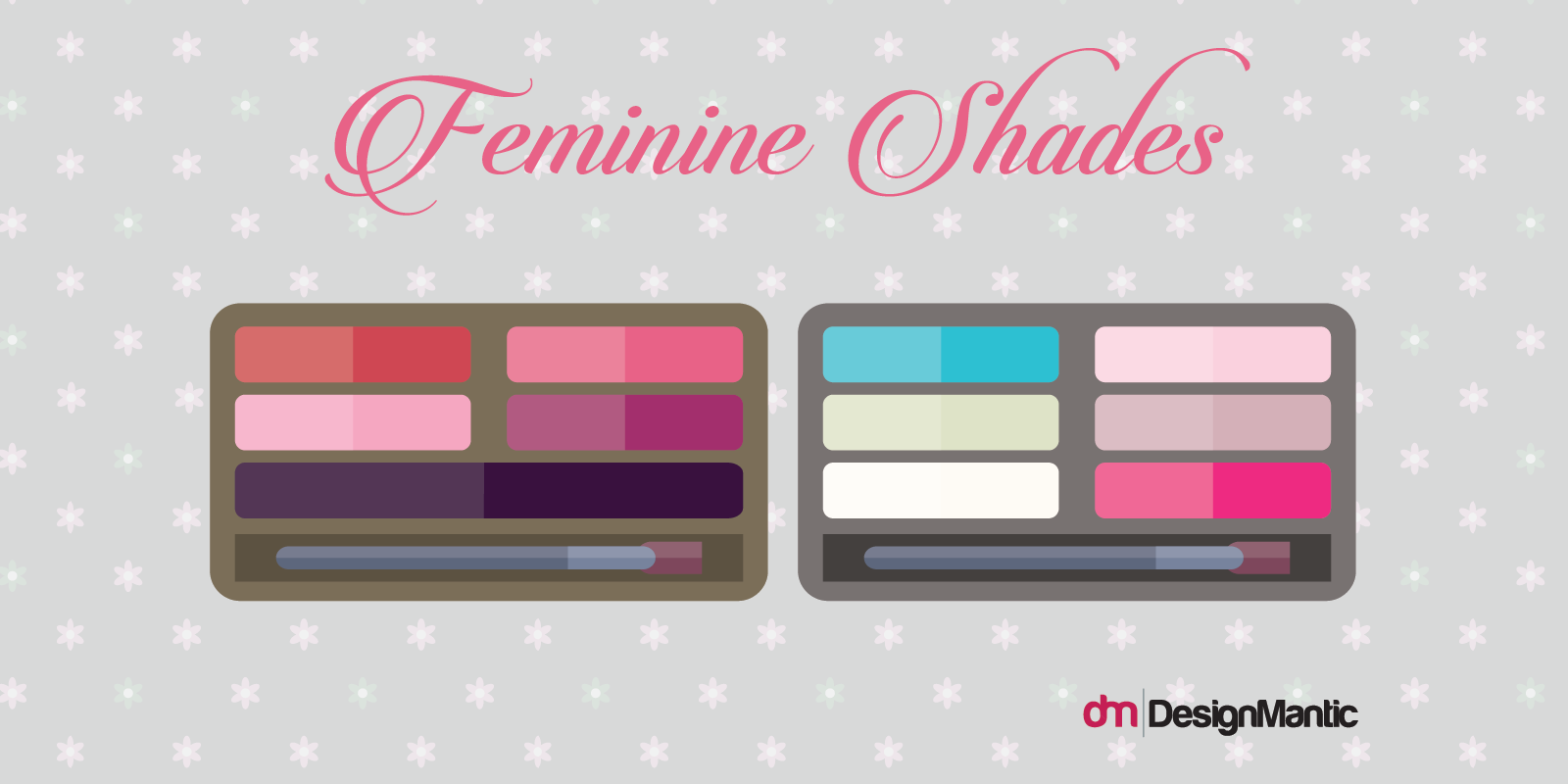
For example a logo for your makeup company should be elegant and graceful and have a feminine color combination if you’re targeting that audience. Suggested female gender-based colors schemes you can adopt for a feminine look are as follows:
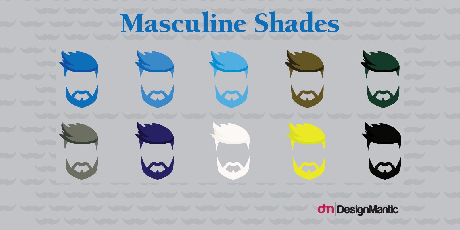
Or a strong, sharp feeling to the logo with bold elements infused can give a boost to the masculine look with these color schemes.
An invigorating look will surely appeal to the audience, and they will prioritize your product and test it out even if it’s unheard-of.
Furthermore, as the majority of other businesses can experiment with masculine and bolder artworks, logo identities for beauty products are branded more towards the feminine side. They mainly portray delicacy and sensitivity in the form of fonts and images that bring soothingness to the eyes.
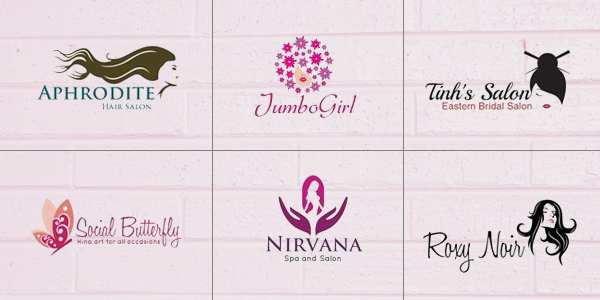
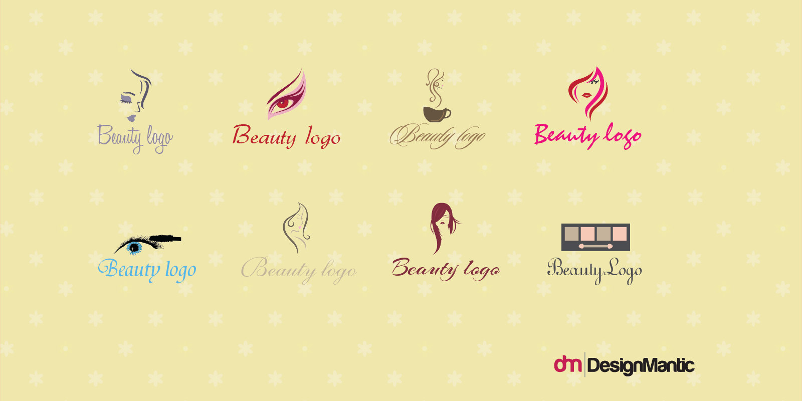
By incorporating ornaments including a variety of flowers, jewellery, hands, butterflies, body shapes and intricate patterns the desired look can be achieved. Let’s just take these logos for example:
These impressive designs have one thing in common. Simplicity. This method portrays your business as classy, modern and prime renderers of supreme quality beauty care services. So, don’t underestimate the value of getting a simple but classy logo for your beauty brand today.
Choosing Your Favorite Font
Have you ever complimented somebody the nicest way possible but they felt as if you were sarcastic? Your voice, pitch variation, pauses all matter in your deliverance of those words which will make the other person feel your legitimacy. Just like that, your choice of fonts speak to your audience about your logo. The scaling, kerning, thick, thin and much more add to the authenticity and authority to your beauty logo.
If we dissect the beauty typography sphere, we see a variety of feminine fonts that bind the whole essence of the logo together – from a more technical viewpoint of choosing the curvy font till the very norms of readability.
Slab Serif Vs Script
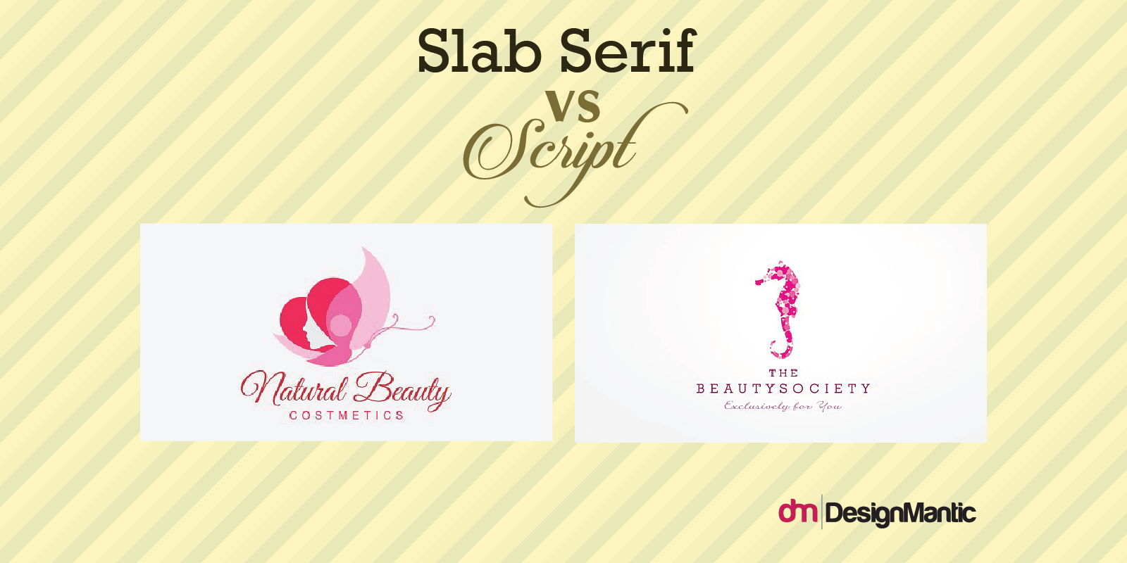
Slab Serif and Script typefaces pack a lot of variation and usability benefits. If you plan to advertise through traditional marketing mediums, then slab serif will give the most coherent look.
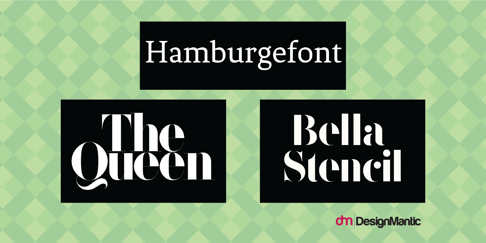
Whereas script typefaces will give your logotype a more intriguing and softer look. You can incorporate serif typefaces on your business cards and make it your company’s creative logo. However, make sure you use script fonts mildly and avoid using them in all caps since they make readability more difficult. Let’s take a look at few script examples:
Moreover, there are a variety of crisp fonts that you can use to enhance your salon or spa identity to look outstanding. It could be as clean as F37 Bella or the most peculiar touches of elegance from Fenix. Both of these and few other eye-catching fonts are traditional and an exceptional choice for your selection process.
Treating Your Logo With Kerning Parameters
Often known as letter spacing, technically known as kerning, is the space between two separate characters within a font. If you don’t get this part of the puzzle right, then your logo will look far from being professional. A few tips on analyzing your logo’s kerning:
- Automatic kerning can put your logo offset. Consider manual tweaking for great results.
- Always flip your logo upside down to identify kerning errors.
- Dissect your logotype into blocks of 3 – it’s easy to fine tune in smaller segments.
If you want a guideline on how to kern with basic software principles you can take a look “Kerning in Typography” and get a sense of it.
Font Licensing
It’s relatively easier to borrow a typeface and use it for commercial purpose, but don’t forget, you’re putting your integrity at stake. It’s always the safest move to purchase any font within a family and get creative with your beauty logo. You will legally own it, and avoid anyone else from plagiarizing your brand identity.
Incorporating Symbols
When it comes to the most essential elements, that logo designers focus the most e.g shape, fonts and color of a beauty startup, giving a memorable symbol classification to the logo is also very important. If executed correctly, symbols can be maneuvered tactfully to exploit the unconscious level of human thinking patterns – making the logo design graceful and create associations between the organization and the target audience.
Iconic Mark Symbols
The iconic mark symbol lends an image to your brand which is recognizable later on as the brand develops. Make sure that your services remain the same as the symbol will become your company’s identity forever.
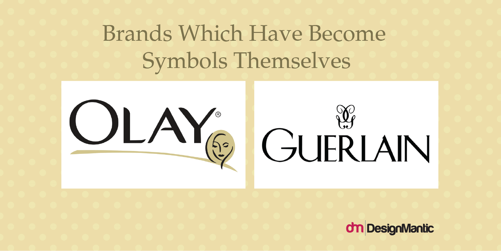
Brands Who Have Become Symbols Themselves
For some fortunate brands which have symbolized their icons – have gained massive popularity throughout the years by providing luxurious beauty products. Beauty brands like Guerlain, Chanel, Rimmel have all sustained their icons to become the symbol of their brand image.
Showcase Your Specialities Upfront
One of the foremost facets in substantiating your services is designing your logo in a way you highlight your trendier services.
Whether it’s organic skin care remedies that benefit customers by the use of natural herbs, aloe vera, beetroot, mud and a plethora of plant extracts; or isolating methods of treatment, like cosmetic resurfacing and photodynamic therapy, flaunt your specialties within the logo.
So showcasing your arsenal in a subliminal or explicit way is always going to show boldness and confidence in your brand image. Hence, your audience will feel they are in the right hands and ready to get pampered.
To put it in another way, burying down your primary specialties is always a bummer. Instead, keep them up front and flaunt them efficaciously in your brand identity, and inevitably in branding materials.
Make Way For The Gentlemen
Similarly, have you noticed the trend of male patrons growing interested in liners and exquisite hair-dos? The excessive flaunting and publicizing their unfettered charisma everywhere is no longer a fad but a reality in the beauty industry.
Yes! Makeup with whole new wide variety of products has evolved drastically catering to contouring for men to the application of face primer. And since business models are now focusing on the masculine side of the makeup industry and revamping their logo designs to subcategorize their portfolio, altering your logo for masculine niche is a must.
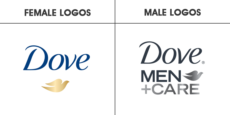
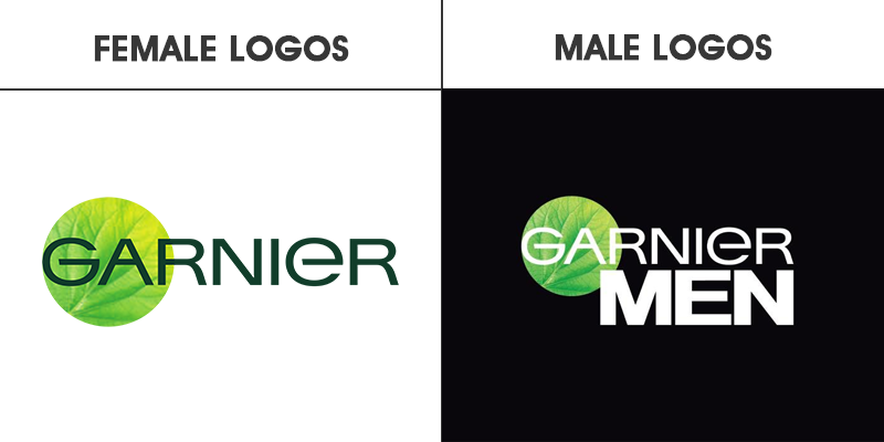
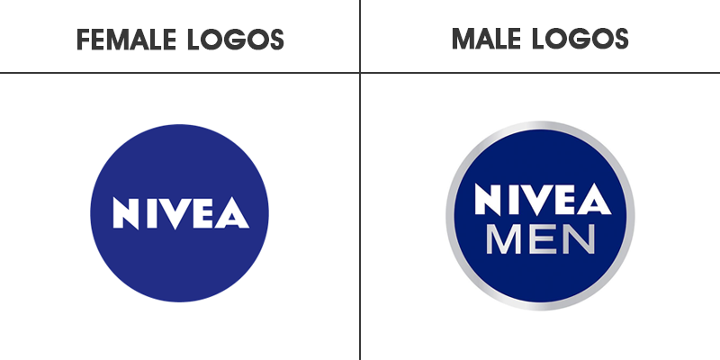
But what differentiates class and style among male and female logo types? There is a subtle, bold sub-classification in beauty logos which caters to the male target market. And to prove this theory, here are some of the few best examples:
Comparing both of these logo types – the masculine side of Dove portrays a chrome effect of black shade showing dark and bold iconic view. The categorization also indicates that the symbol for dove in both of the cases remains the same to show consistency.
Garnier’s men categorization has embodied a circular shape within the wordmark logotype in a rectangular black shade. The color scheme of the women’s bright green is replaced with black and white, and a muted green leaf included in the logo.
Related: Do’s and Don’ts of Wordmark Logos
There is not much of a difference between the female and the male version of Nivea logo design as the only pinch of masculinity in the logo is a subtle gray gradient encompassing the blue circle with “MEN” added to show the product difference.
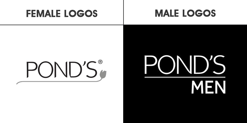
For Pond’s Men the masculine aspect of the logo is presented by eliminating an important symbol which is the floral element. The logo resonates a bold and classic feeling whereas the feminine logo has a touch of simplicity, delicacy and an overall soft look.
Final Verdict On Logo Design For Beauty Businesses…
In the end, beauty logos are the most versatile logos. You can experiment with a lot of lettermark and iconic variations – making a solid visual branding that your business can bank on.
Now that you know the secrets behind a successful beauty brands why not try your skills here with our free logo maker.


