When a popular brand rebrands, you can bet that it is for some very good reasons. A couple of these reasons are –
- It wants to refresh its image
- It wants to promote itself to a global audience
Coca Cola’s foray into logo-less branding achieved both flawlessly when it removed its labels from its cans. This time, it takes a rather different approach to its branding strategy – it unifies four of its products under one umbrella. And that umbrella is a Red Disc and color coordinated packaging.
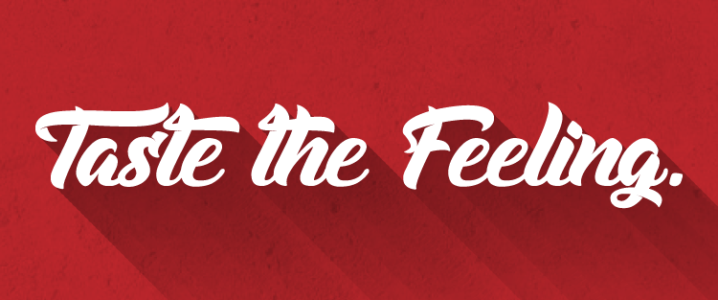
The move is a part of Coca Cola’s “One Brand” unification strategy and its “Taste the Feeling” campaign. The campaign currently focuses on four of the brand’s products – Coca Cola, Coke Zero, Diet Coke, and Coca Cola Life.

Image Source: coca-colacompany.com
As you can see, all four are colored differently and each of the colors spreads to a can tab or bottle cap. And the brand’s Red Disc enjoys center stage in all of the packaging.
We witnessed how Pepsi fizzled in the smart phone race, and Coca-Cola simply couldn’t sit back and let itself be overshadowed. However, What does this strategy mean for the brand? We asked our panelists to throw some light on Coca Cola’s foray into its unification strategy.
Our participants for today are –
- James Sommerville, VP of Global Design at Coca Cola
- Marcos De Quinto, Chief Marketing Officer at Coca Cola
- Judith Snyder, Spokeswoman from Coca Cola

• One Brand, One Strategy And One Identity
Coca Cola’s unification strategy might be an attempt to make consumers recognize that all of its offerings belong to one brand. It certainly seems to be the case if you look at the Red Disc in the middle of each packaging. The design seems to unite the four products.
Coca Cola’s VP of Global Design James Sommerville echoes this view. He explains that the plan this time is to unite the entire Coke family under a single marketing identity –
“My specific role within this campaign is with the visual identity system, and the graphic application of how that works. So what we did is use the Coca-Cola Red Disc, which is synonymous with Coca-Cola, as a device that represents all of the variants – not just the classic, but also Zero and Life, as that unfolds.”

• Taste The Feeling With Customized Packaging
Coca Cola is the biggest beverage brand on the planet. And you don’t get to be biggest beverage brand without having huge ambitions. It’s why it attempted to end cyber bullying as part of its “Make it Happy!” campaign and bring peace between India and Pakistan as part of its “Open Happiness” Campaign in 2013.
Chills all over. @CocaCola India/Pakistan video is a must watch. Thanks for sharing, @JayMoye1 #ragandisney #openhappiness
— Tom Liszka (@TheAirUpHere) April 4, 2014
What unites us is stronger than what divides us. Bringing India & Pakistan Together http://t.co/VyKnTfINLi #Cocacola #world #openhappiness
— Berta Aneas (@BertaAneas) June 25, 2013
Love this campaign: latest @CocaCola #OpenHappiness aims to bridge gap between India & Pakistan #smallworldmachines http://t.co/cdrC6ry1ls!
— Justin Luk (@JLuk) May 20, 2013
The Coca cola india , pakistan ad ! Wow ! #CocaCola #OpenHappiness
— Rohan Shah (@rohanshah6) May 20, 2013
Its “Open Happiness” campaign was incredibly popular as well.
#Makeithappy Gold. Pure gold.
— Intrepid vixen (@NightNas) April 26, 2016
The #MakeItHappy campaign by @CocaCola is a good example of leveraging #Twitter for planned marketing initiatives. https://t.co/u98IRC6HZo
— Shruti Rawal (@shrutsays) April 5, 2016
The coke commercial about bullying is really good 😓 #makeithappy
— emily (@emilyyy097_) September 27, 2015
Its “Taste the Feeling” campaign, on the other hand, focuses less on world peace and more on the brand itself. You can see why the packaging is customized this time. The purpose is to help consumers make more informed choices about their choice of Coke. Coca Cola’s Chief Marketing Officer Marcos de Quinto explains.
“Packaging is our most visible and valuable asset. By applying the Coca Cola Red Disc to our packaging in such a bold way, we are taking the next step towards full adoption of the ‘One Brand’ strategy, uniting the Coca Cola family under one visual identity and making it even easier for consumers to choose their Coca Cola with or without calories, with or without caffeine.”

And the Red Disc in each packaging gives them a single visual identity, which according to Judith Snyder was introduced in the 1930’s on Coca Cola’s advertisements –
“In 1947, the creative director at D’Arcy Advertising, Archie Lee, designed the contemporary version of the Red Disc that was the inspiration for our approach to the ‘Taste the Feeling’ campaign signature that we introduced in January.”
I get even more excited everytime I look at pictures of the new @CocaCola packaging design! #TasteTheFeeling 😃 pic.twitter.com/2KQdLkAt7P
— Jose Ramon Marquez (@joseramonmarmtz) April 20, 2016
Brave new design by Coke https://t.co/zb9sp2YvrH – expect #digital campaing soon
— Andreas Claudi (@andreasclaudi) April 19, 2016
.@jamesommerville, Rodolfo Echeverría, @MarcosdeQuinto y Francisco Crespo, presentando la campaña #SienteElSabor. pic.twitter.com/1wGYe8I078
— Somos Coca-Cola (@SomosCocaCola) April 19, 2016
The new packaging will roll out in Mexico in May and globally in 2016 and 2017.
Branding With A Purpose
What will be the impact of unified branding on the Coke brand? Overall, it seems to be a good idea. The new packaging might bring consistency to the brand’s packaging across the globe. It might also help the brand promote less popular products like Coke Life and Coke Zero in new markets. Marketers shouldn’t have any problems adapting the minimalistic design of the Red Disc to different marketing mediums either. Only time will tell how successful this strategy is after the new packaging is launched worldwide this year.