Have you ever noticed how a single color can set the tone of any image?
Yes, that is what color theory is all about. It can influence not only the overall mood of a place or a design but also an emotion. However, when it comes to wedding monograms, things are different than creating a business monogram. Here, the color goes far beyond decoration. Different shades have different potential and you must choose wisely to correctly project your love, express your passionate feelings, and set the tone for your whole celebration.
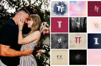
Notably, wedding monograms now represent more than just two initials joined by a decorative symbol. It signifies unity and imposes a mark on your journey. Be it on invitations, signs, or souvenirs, the monogram can serve as a trademark of your story, and that is where color can play a stellar role in bringing that narrative alive.
In this blog, we will cover the role of color and how each one impacts the appearance of your wedding monogram. Moreover, we will explain how to choose the right palette that complements your wedding theme, how various colors work, what they represent, and how you can achieve a sense of harmony with design. Let’s dig into it.
Importance of Color Theory
We can say that color theory is a language that can dictate your vision to the people. It can impact the overall look of your wedding monogram, and, the most significant thing, you can tell your exclusive story and create depth in your designs using different color contrasts.
Furthermore, there are psychological impacts of colors. For instance, blue colors usually emit a feeling of trust and serenity, whereas red speaks of enthusiasm and excitement. Other than that, when you put these principles into designing your wedding monogram, you begin designing not only a logo but also an emotion. People will connect with your design and feel it emotionally before they even read your name.

The 10 commandments of color theory by DesignMantic
Tying the Knot with Splashes of Colour
Above all, blending is what matters in the theory of color. Using a mismatched color in your monogram can disrupt the theme, while a well-balanced palette creates a sense of unity.
The following points highlight different aspects of color theory.

- Parallel colors: These are the colors that are next to each other on the color wheel. For instance, peach, pink, and coral colors. They provide a calm, harmonious impression.

- Complementary colors: These colors are contrasting, like navy and blush. When applied in moderation, they will enhance the overall appeal.

- Monochrome color schemes: They focus on variations of one color that work best when you want a modern and a classical wedding theme.
Additionally, when developing your monogram, you should take into consideration the consonance of the tones you prefer. Opting for pretty colors and being about keeping an equilibrium make it more eye-catching.
Pro tip. A classic navy and gold monogram could be an indication of class. A rosy gold indicates softness and affection. Each color speaks. Lastly, when combined, the palette becomes a symphony of emotion, appearing balanced and beautiful.
Colour on Your Own Story
Wedding monograms are not all about the letters. It expresses your style and excitement on your wedding day. The colors that you choose are to be in line with the mood that you want to convey to your guests.

If you are planning for an outdoor wedding then soft greens, browns, and warm oranges would be the right choice. Sandy colors and calm blues are appropriate for a beach wedding. Additionally, traditional weddings can incorporate rich navy gold or burgundy to create an old-fashioned look. Warm yellows, dusty pinks, and burnt orange are good for Boho weddings.
The monogram is your guests’ first impression of your wedding. The colors that you select define the theme and perception of the party.
What Each Colour Represents?
Every color carries its own meaning and can project varying feelings. Here are different color shades along with their meaning, so you can give an additional dimension to your monogram.
|
Color |
What it represents? |
|
Love and passion |
|
|
Pink |
Softness and romance |
|
Blue |
Confidence and restfulness |
|
Green |
Growth and tranquility |
|
Purple |
Royal and imaginative |
|
Gold |
Feeling of opulence and coziness |
|
White |
Innocence and naivete |
|
Black |
Elegance and power |
Choose colors that will indicate the theme you would like to create at your wedding. Your colors are a way of telling your story, either bright and bold or soft and gentle.
The Balance of Font and Color
Combining font and color serves different purposes and approaches. It is so because of the meaning and interpretation of information in different ways. Match the design by aligning the style of letters with the colors you choose.
Furthermore, soft, flowing script fonts have a beautiful touch when used with pastel colors. The dark or rich color is a good match with strong and classic fonts. On the other hand, simple and neutral or metallic colors go well with clean, modern fonts.
Let’s Do a Quick Colour Combination
The following are some of the trendy combinations of colors that you can use in wedding monograms to improve their aesthetic appeal:

- Rose gold and blush pink to create a light, fluffy effect

- Champagne and navy blue to achieve a classical and sophisticated image

- Sage green and ivory for a fresh and natural feeling.

- Silver and dusty blue give a peaceful and contemporary touch

- Cream to warm up earthy colors to follow a rustic theme

- Light grey and lavender to give an impression of a dreamy and soft appearance
- Deep green with gold to get the rich lifestyle impression
In addition, you can mix and match the colors to suit your personal style by combining a third color or metallic tones.
Tips and Tricks To Make Your Monogram Last
Creating your monogram is all about balance. It does not have to be about choosing pretty colors but about choosing pretty colors that get along.
- Choose colors that are right and not what is popular
- Consider the way the colors will appear on wedding cards, signs, and other items.
- Include neutral colors such as white or grey to prevent the design from getting overcrowded.
- Use contrasting colors sparingly to highlight your monogram without overlapping.
Your monogram will become part of your wedding experience. Selecting the correct colors ensures that it will remain beautiful and significant over time.
Consider that your colors are the story and style you represent. Your monogram can never be a simple assembly of letters; it must be the badge of your affections and your day. It will take time and effort to get the best results possible. However, if you are short on time or sitting blank and searching for some inspiration,a wedding monogram maker will help you out. It does all the heavy-lifting for you and delivers beautiful results in a short time.
Conclusion
In your wedding monograms, color is the brush that paints your love story. It should be used in the most beautiful way so it reflects in every detail and every smile on your big day.
Moreover, choose soft blushes or gold emeralds, as they show love, unity, and hospitality. Go wisely. Blend beautifully. Make your wedding monogram glow with colors that speak right to your heart.