Update 3 JAN 2020 : Check out our Logo Design Trends For 2020!
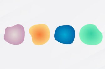
Every color has a meaning, a purpose, and a long history that dates back to centuries ago. In Ancient Egypt, the color ‘blue’ was used to represent jewelry and decoration, thanks to the Azurite (a vivid deep blue colored, naturally occurring mineral, mostly used in amulets). Back then, anything green signified life and vegetable; whereas, black exemplified death, dark spell, evil and doom, explaining why the medieval paintings usually showed devil in black.
This little chunk of the color history demonstrates that no color was pulled out of the hat; rather, every selection has an important underlying meaning and purpose. That’s why colors have been so powerful from the outset. Even in today’s world, choosing the right color for your website and CTA section can increase the conversion rate. They own the power to thrust the psyche of our customers towards the path we want them to take.
Every year we see new color trends steering the bandwagon of graphic designers and UI experts. In this article, we have predicted some color trends that possibly are going to rule the industry in 2019 and impact the use of colors in logo design, web design and graphics. The creativity is expected to be high; the design perspectives, revolutionized. Let’s not spare much time and skip to the trending colors of 2019.
Earth Tones:
Earth tones are originated from the natural things we are surrounded with, like brown soil, lush green grass, yellow leaves, taupe wood, blue oceans, just to name a few. These tones influence our subconscious and provoke the nostalgia, giving the viewer a flashback to their previous trip to the beach or hill station.

Source: LightSpeed Boot Camp Website by Kira Butler
Designers can select the colors like green, corals, browns, yellows, and blues and experiment them in different tones to give an earthy feel. Green logos are just eco-friendly and make the audience feel more at home. Similarly, earthy brown logos emit pleasant positive energy and inspire trust.
![]()
Source: These logos are created by DesignMantic’s online logo design tool
Vivid Color Contrast:
Tired of hedging your bets with the muted tones? 2019 is all about stepping out of the comfort zone; an example of which is the present supremacy of vibrant, tricky color contrasts. Designers can juxtaposition the colors that face each other in the color wheel and fine-tune them so that they can complement each other and create colorful logo designs, graphics and print collateral.
While playing with vivid colors, using different patterns and shadows can make your piece creative and multi-dimensional. Spotify has also used the vibrant color contrast in its marketing campaigns featuring its bizarre playlists.

Source: Adobomagazine
Apple sent invitations for its October 2018 event aiming to launch its new iPad Pro. The invitations flaunted a colorful and tweaked up version of Apple’s fun logo. The colors used in each version were excessively eye-catchy and bold.

Source: The Verge
Also read, “The Good Book Of Colors: The Essential Guide For Business!”
Gold:
Gold may not be the new black, but it surely carries significance in the graphics field. Present on medals or across golden logos, this victory representing color can imbue a rich, lavish feel to your design. The color can be used in any intensity and saturation ratio. Bight gold grabs attention while the duller, metallic tone of the color represents warmth and richness.
Designers can also add to the riches of dark purple and burgundy red palette by using it with glittery gold. Also, the metallic gold can accentuate the background and typography when used with a subdued tone of grey.

Source: Gentlemen-BarberClubs.de
Living Coral
Pantone’s color of the year 2019, the living coral, has been defined as “an animated, life-affirming shade of orange, with golden undertones”. The color is louder than the pink hues but subtler than the red. It evokes warmth and pleasant feel that reminds the audience about the coral reefs. Living coral is often used with the brighter and aqua shade, giving the logo design a beach look.

Source: Gustave – Risoprint
Pantone’s announcement has taken the internet by storm and urged many designers to experiment the color in their designs. To add depth into the design, designers can also conflate living coral with patterns in logo design and photo filters rather than restricting its use to just plain color swatch.

Source: 2019.January- Living Coral by John Harman
Minimalism In Colors
The minimalism approach in design has reigned the industry for long and is continuing to do so. This year, we are expected to witness designers using a limited amount of color to make the design striking. Limited use of color attracts the audience, helps the design accentuate important information, and steers the viewer’s focus through the design. This practice makes the design look bold and trendy. Besides, having multiple colors can confuse the audience and prevent them from having a remarkable color idea when designing a business startup logo design. In short, when you emphasize everything, you’ll emphasize nothing.

Source: store.google.com
The Neon Trio
In late 2018, Shutterstock assessed the pixel data and the HEX codes to identify three globally popular colors (UFO Green, Plastic Pink & Proton Purple) among the people and entitled them as “the Color Trends of 2019”.

UFO green elicits the feeling of freshness and liveliness, owing to its close association with nature. Thus, green is the popular color of choice for eco-friendly logo designs. According to Shutterstock, it is the most searched color in the United States. In addition to these three colors, Shutterstock’s report also revealed the most trending color for twenty countries across the globe.
To Wrap Up:
The list here has clearly demonstrated that 2019 has something for everyone. Whether you are a fan of loud colors or subtle hues, minimal use of colors or vibrant contrasts, 2019 has all options in its basket. Design Mantic wishes all the best to all the designers reading this post. If we have missed any of the color trends that you think should make it up to our list, do mention them in the comment section below.
Try Our Personalized Logo Maker:
Red Color Logo Designs
Blue Color Logo Maker
Purple Logo Generator
Sky Blue Logo Ideas
Orange Logo Designs
Logo Designs in Black
Brand Identity in White
Make Yellow Logos
Create Pink Logo Designs
Beige Logo Ideas
Design Dark Red Logos