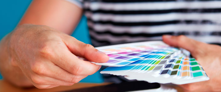
Predicting the color trends of the future is a road lightly tread upon by designers. Depending on a number of factors, besides the age and gender color preferences, it’s never an easy feat to say for certain what colors the New Year will bring (no pun intended). Be it logo designing, graphic industry, web designing, or any façade of the art realm, colors can make or break the design. Thus it is prudent to keep up with the Joneses when it comes to the most trending color palettes.
Colors Of 2017; Same Colors, New Hues
Color stories for 2017 exude a striking contrast between colors that are “present” and “absent”, “unreal” and “real”, and a mixology of what lies in between. On one hand, designers are aspiring to return to the unassuming, honest, and the simple, and on the flip side, they house a deep desire to be seen and stand out. Here’s what our favorite colors have in store for them in 2017:

Since we are moving fast towards the holiday season heralding the New Year, we decided to put our brains together and venture a guess on the color fads which will dominate the graphic design industry in 2017. Brace yourselves, the color vortex is coming!
1. Playing The Monochromatic Card
Keeping up with the minimalist sensibilities of 2016, the popularity of monochromatic color palettes will carry over in 2017 and soar to unprecedented heights. This means you’ll be seeing more of sites that are decked out in varying tones of the same color. Monochromatic schemes in vibrant hues will make a dramatic entry at the onset of 2017.
Less contrast among colors and lack of distractions will allow designers to make more experimental and bold color choices in the future. For instance, in the web design below, lime green has been used consistently. Since the color doesn’t play well with other hues, a monochromatic scheme allows the interface to accent, instead of compete for attention, with the familiar Muppet.

Image: QVC + Muppet
In conjunction with other minimalist design elements, such as ghost buttons, and white, bold lettering, the monochromatic scheme takes over the visual dominance of the design to make it aesthetically pleasing and easier to comprehend. Vibrant hues are eye-catching and flashy by nature, which means cramming together an assortment of bold colors can create a chaotic design. The monochromatic treatment takes care of this dilemma before it takes root.
2. Contrast With Dull Colors

Image: Tinke
A constant apprehension with minimalist designs is the risk of the design appearing stale. However, extreme contrasts can work to prevent that, even as an aesthetic choice alone. The design example below uses strategic bursts of turquoise against a stark black background to form a visually striking pattern. The repetition of turquoise in the graphics, logo, and the letters strengthens the colored elements against the powerful monotony of black background.

Image: Studio Stylistik
3. Hovering And Blocking

Image: Column Five Media
Despite being a little old, the trends of hovering and blocking will remain popular in 2017, especially with card style interfaces, for both their usability and appearance. Hovering refers to any element that changes its color when hovered over, while blocking translates in to a grid-based layout in which the cards and blocks are distinguished with dramatic and intense colors. While hovering and blocking techniques were previously used on their own, they are predicted to be used in conjunction more and more often in web design.
In the example below, the vibrant tones of some of the cards fare well against the sterile background, and some of the cards become tinted when hovered over and display the number of hearts. This technique is deemed an apt signifier, as it gives cues on hovering that the element is clickable.

Image: Dish
Even in graphic design, blocking is a practical and chic design choice. The vibrant blocks of colors pave way for a layout that invites interaction and promotes ease of organizing and understanding information, without cluttering the design.
 >
>
Image: Fruit of the Loom
4. Marrying Texture With Bright Colors
While texture has always been popular with neutral backgrounds, under the right circumstances, 2017 will use more of it combined with vibrant hues for striking and wow-worthy results. The website design shown below employees foreground images and a full background with texture. The treatment goes a long way in softening the bright colors. The texture renders the graphics a unique aesthetical value, so that it doesn’t overly embody skeuomorphism.

Image: Taco Spillet
The website design below is also a testament to how texture accents the interface. While the green-blue lines in the logo take up most of the initial attention, the subtle shadow under the main header throws in a measure of separation. The fun and light use of texturing here perfectly reflects the ambiance of the restaurant.

Image: Joyride
5. Highlighting Text With Eye-Catching Pops Of Color

Image: Meris Theme
Apart from colorful trends such as monochromatic affairs and color blocking, another trend is on the rise that uses color sporadically but strategically. Bright hues have a certain eye-grabbing quality, which renders them useful in highlighting and accentuating certain important words within a block of text, especially when contrasted with more lackluster backgrounds. Brightly colored text has an impact on how the message comes across and adds a natural emphasis to a crucial piece of text.
In the design example below, only the word “Love” is accented in bright hues. The clever color trick automatically draws the eye towards the bright pop of color. Since the call-to-action is accented in the same hue, the trick delicately cements a connection between the two.

Image: For the love of the Reef
6. Making It Work With The Color Overlay Maneuver

Image: WunderKind
While an illustrated or patterned image can add a lot of zest to your designs, it can also render the text illegible or make the design seem too busy. Semi-transparent color overlays are the best solution in this case and one that you’ll be seeing a lot of in 2017. The overlay is usually opaque enough to tone down some of the details of the image but transparent enough to allow a glimpse of the texture and composition underneath. This ultra-chic and modern look will be quite popular in the year to come so gear up!

Image: Facebook/Christian Pannicke
7. Flamboyant Navigational Aids
The unquestionable organizational benefits of colors have been popular since time immemorial, as can be seen from the colored tabs of filing cabinets and books, where different colors are used to separate sections. Naturally, the extension of this phenomenon to web navigation and other design elements that entail hierarchy and a semblance of order is only a logical progression.
Content-intensive websites and graphic designs will benefit the most from this fad, where every effort must be invested to simplify organization and navigation. Without a doubt, this fad will be making big waves in 2017.
For instance, the web design shown below employees the rainbow spectrum to separate the various pages of their website. While this fad may be a bit unorthodox as we are still getting acquainted with burger menus and linear hierarchy, it definitely makes things a lot simpler and aesthetically pleasing.

Image: Coloured Lines
8. Turning Over A New Leaf; A Shift Towards A Unisex Palette
Colors in 2017 are predicted to transcend gender and cultural norms. Vivid bright hues pave way for optimism and excitement, while the color palette is expected to exude quiet stability. The color aficionados and designers are not setting any perceivable distinctions in color choices between the sexual orientation and gender of the audience, both of which focus on the desire to reflect, breathe, and play. Here are some of the new shades we will get to see a lot of in 2017:

Orange is the New Black: Another color that graphic design and fashion communities are falling head over heels for is orange. However, in 2017, the color coming out in full vogue isn’t orange, but its tampered, and all-encompassing progeny “Peach Echo”. The hue emanates friendlier qualities and evokes accessibility and warmth.

Violet Verbena: The color is simultaneously as modern as it is nostalgic. In a world that seems so temporary at times, the color is a pop of luxury in a harsh world that needs pampering.

Fiesta: As a harbinger of excitement and stimulation, this high energy hue encourages free-spirited exploration and ignites passion. A fiery and strong yellow-based red, this vivid shade lies in stark contrast to the softer, calming nature of the palette we have seen so far.

Green Flash: This brilliant color shouts of escaping the mundane and pushing the envelope. Green flash exudes an openness that blends in with the palette in serendipitous but unexpected ways. The popularity of this shade speaks volumes about the persistent influence of nature, even in urban environments.

Iced Coffee: Iced Coffee manifests itself as yet another neutral for the 2017 color palette. When combined with the other vibrant colors of this palette, this transitional color, with its subtlety, softness, and natural earthy quality, creates a stable foundation.

Lilac Grey: The needs of neutrals arise in every palette. Essentially a basic, Lilac Grey imbues the subtlety of the lilac undertone, which adds a certain distinctive edge to an otherwise classic gray shade.

Limpet Shell: The defined, clean, and clear shade of Aqua leans more towards the greens. Suggestive of freshness and clarity, its modern and crisp influences evoke a mindful, deliberate tranquility.

Rose quartz: “Rose Quartz” is expected to be prevalent in the calming and soothing nature of 2017 color palette, especially in the spring spree. The gentle, yet persuasive tone conveys a sense of compassion and composure. Like a budding flower, a flushed cheek, or a serene sunset, Rose Quartz in a design reminds the audience to reflect on their surroundings during the lighthearted and busy summer and spring months.

Serenity: Airy and weightless, like the vast blue horizon stretching above us, serenity brings a feeling of respite and has a calming effect, even in turbulent times. A transcendent blue, this shade offers us a naturally connected sense of space. We can’t wait to see more of it next year.

Snorkel Blue: Snorkel blue is a maritime-inspired blue, belonging to the navy blue family, but emanating a more energetic, happier context. Even the name encourages escape and implies a relaxing feel. The color is still, while striking, with its undertones hinting at a lot of activity.

Buttercup: While most of the 2017 palette is geared towards serenity and calmness, the palette incorporates a few diversions from the theme to provide some contrast. The “buttercup” shade is a shining beacon that can transport your audience to a sunnier, happier place when they see your designs.
9. Artistic Graphics; Playing with Colors
Despite the subdued slant in the color palette, the graphic industry is still expected to witness an onslaught of patterns and colors for 2017 designs. Here are the most prevalent predicted color patterns you can expect to see the next year:
- Spiral: Being a story of refined tenderness, the spiral theme is geared towards the idea of “beautiful roughness”, using transparent elements, unusual shapes, and textures with a lot of finishing. Neutral colors and geometric texture patterns will play a significant role in this futuristic look.
- Embryonic: With its interesting textural effects, evolving patterning and blurred patterns, and its palette of natural colors, the embryonic trend is imbued with a new gestation energy.
- Boundless: The earth’s ochre’s blend in with the vibrant sky in this boundless theme. Multi layered patterning awash in color vibrancy and dissolving colors, are expected to make an appearance.
- Changeling: This state-of-the-art color pattern is a field for innovative combinations. Harmonious and soft iridescent color clashes will be seen in this color story.
- <Progression: A gradient of blues and greens that are both futuristic and fundamental color up this design story.
- Assemble: This theme is all about the earthier utilitarian shades blending in with the delicate pastels. Looks will take on modern updates of traditional and historical patterning, and divergent personalities to appeal to a new, and youthful audience.
- Mutation: The trend will be designed to reflect a freckling of colors. Bold statements with minute color accents will be manifested in the design trend.
Favorite COLOR Palettes Heralding 2017
Since Pantone believes that the rather bleak but rich colors of 2016 would evolve into something more vibrant, the designer Ingrid Holtermann worked diligently to put together 6 color pairings. Based on 29 unique and diverse colors, these palettes incorporate a mix of vibrant varieties and toned-down hues to make your audience reflect and think outside of their design zones. Here’s the inspiration for your next futuristic designs:

Yay Or Nay?
Handing the center stage over to you now. Did you fall head over heels for the upcoming color fads or wished somebody would wake you up from a bad dream. Do let us know in the comments below.


Compiling these wonderful colors for graphic design is very impressive. It is a very valuable and helpful collection indeed. I am trying to gain information from all these. Really helpful post. Thank you..!!