Valentine’s days come and go and so do logo design trends. In both cases, some stay and endure, and others lose their way in the wind and we forget about them in the glare of the morning-afters. Some of the design trends that remain alive include designing for emotions and love. Emotional branding is at its most powerful when it’s used in dating and matchmaking logos. With more and more dating sites and matchmaking apps launching every day, it is important to stay different than the rest and still be relatable to your key audiences.
In the following collection of love and heart logos, we have tried to bring you designs that can do both. Let’s start perusing and see if we’ve succeeded.
1. Feet Facing Forward
Look, when it comes to love (or anything else in life, except for when you’re reversing the car and other similar situations) always keep looking ahead. The movement of life is always forward; mimic that in your love life too. If you are too-you for anybody, listen to what Queen Elsa says and let it go.
Related: How To Cash Your Social Media Presence The Right Way This Valentine’s Day!
This logo does a good job of capturing the essence of this concept. With feet facing forward, there’s movement and direction in the logo. Add in the red color, make the footprints overlap each other and you’ve got yourself a dating app logo. Easy peezy, right?
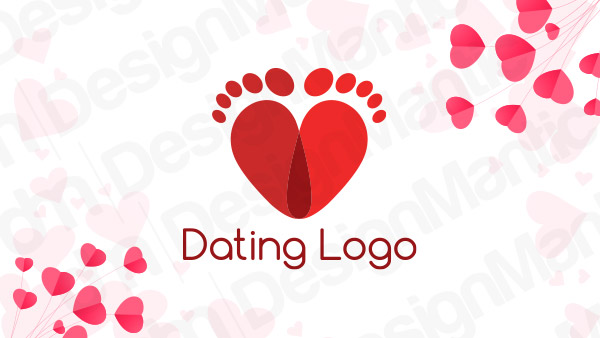
Heart logo design shaped into footprints for dating app
2. The Steady Wins The Love Race
Nobody wins in love as the steady do. Learn to appreciate people who deserve your time, energy, and affection. Know if a connection is worth fighting for. And if it is, jump in the arena fully prepared. A lot of love is about deciding to be in love every day. Make that commitment daily. Passion is exciting but has a very low shelf-life; commitment can be everlasting, so invest in that.
In the dating logo design below, the tortoise signifies the commitment of love that goes beyond any particular day. If you’re designing a match-making app or something similar, this logo design can be an absolute fit.
Tortoise with a heart logo
3. The Essential Cupid
Cupid and love logos are eternal. The only time a cupid may look unappetizing as a love logo is when it’s being gaudy and cheesy. But here, it’s being neither. The black efficiently camouflages the cheesiness of the cupid while his round shape looks comforting and assuring instead of loud and scary.
As the modern love life becomes more and more confusing, step up with this reassuring black cupid logo to calm your dating app users.
Image Source: Behance/Dmitry Stolz
Related: Let Customers Fall In Love With Your Logo This Valentine’s Day!
4. The Sexy Berry
Berries are a sexy fruit anyway, but the designer has made it even more appealing in this logo design with the soft arrow on top of the fruit, giving us such a deliciously violet color.
For a modern dating app or site, aimed at bringing young love together in a fun and fresh way, this strawberry logo is a match made in heaven.
Image Source: Dribbble/Type08 (Alen Pavlovic)
5. Hearts. Infinity. Connection. You Get The Gist
I feel like I’m a sucker for infinity designs. I love the symbol’s easy shape, smooth curves, and continuous movement. It truly signifies infinity. In this logo design, you can see how the infinity shape beautifully captures the two hearts in its two loops, with black comfortably offsetting the loudness of the red color and enhancing the shade of peach simultaneously.
The arrow-heads further add movement into the design, creating a dynamic and agile logo.
Infinity logo containing two hearts
6. Paving The Way
This logo design concept was recently created by Nour Oumousse over at Dribbble, and if you cannot see it immediately, it’s two pairs of hands holding each other. For a dating site, it is one of the most professional logos of the bunch and says friendship, connection, and ‘holding on’ to me. We love the fact that the designer chose to include both pairs of hands instead of the usual two hands touching each other. We love this design.
If you want to create something similar, look for ways how you can make something old new again. Look for the simple solution everyone else is missing.
Image Source: Dribbble/Nour Oumousse
7. Sometimes, It Requires A Bit Of Magic
Actually, a lot of times. You know the time when in the middle of a heated argument with your partner, you look at them and start laughing? It can be so annoying. But do you know why it happens? Because underneath the fight, there may be disagreement but there’s no resentment. You still very much love the person and respect them.
And that’s the magic of love. You can fight and argue and disagree but in words of Celine Dion, love will go on.
To capture this magic of love in your dating site logo, why not use a real magic hat with a rabbit? This logo is so simple and adorable. To evoke the feelings of innocent love and optimistic love through your logo design, a magic-hat may be just the trick.
Image Source: Behance/Valentine Logotypes
8. And Just A Little Adjustment
What we love the most about this logo is how it makes me want to go get its source file and adjust the two pieces of heart and join them together. The fact that how close these two pieces are and how just a slight nudge can bring them together, makes me love this logo.
This feeling of just being inches away or a few clicks away from your soul mate is what every dating and matchmaking business logo aims for. It’s perfectly captured in this logo and you should seriously think about using it as your own if you are running a matchmaking website.
Online dating logo with two pieces of heart
9. To Make A Perfect Match!
Ah finally. The two pieces of the puzzle are together now and everyone can rejoice. Puzzle pieces are a classic symbol of love logos. They not only provide a sense of connection but a sense of belonging too. Of how perfectly one piece clicks with the other and fits well.
If the puzzles are your thing, consider this logo as your emotional branding tool. You can tone down the brightness of the colors in the customization window if you like. We like the design as is. We’re a fan of pink (shocker) and the blue doesn’t hurt either. But you can aim for a more unique color combination, especially if you rely heavily on color psychology and such for your design decisions.
Puzzle logo for an online dating app design
10. Unlock The Feelings; Let It Go!
Though most dating app logo designs are symbol and icon-based, some designers like to play with words. We included. We’re a huge advocate of lettered logos and believe that with some careful tweaks and obvious considerations, letter marks and wordmarks can work for all the industries.
This Key to Your Heart Logo uses heavy lettering wrapped around a tiny icon that becomes a secondary design element in this instance but adds a level of depth in the design. We love how the color theme is almost monochromatic, easing the pressure on the eyes and looking so rustic and beautiful.
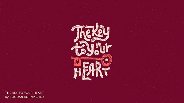
Image Source: Behance/Valentine Logotypes
11. The Heart And Its Many Connections
The heart forges many connections over its lifetime. Every time a new connection is formed, a thread overlaps other connections of threads, creating a complicated web. These connections are exemplified in this logo design in the other half of the heart shape. If this heart could pulse, you could see the connections multiplying, breaking, and reconnecting.
The logo is exceptionally simple in its concept and so flawless in its execution. Hope it’s successful too in bringing you closer to your business goals and becoming your favorite branding device.
Heart and connection logo for a dating website
12. Hang In There!
This is one of the cute ones. Since love life can sometimes be a minefield, it’s important to remind yourself to just hang in there a while longer till you figure this maze out.
For a modern and upbeat dating app logo design, especially if the brand has a tongue-in-cheek humor style, this logo can be perfect.
Red heart logo for online matchmaking services
13. Who Else Likes Pink?
We’ve already declared that we like pink. And while the rest of the logos here may be heavy on the red, this little pink symbol here tones down the narrative. It’s a simple art line logo that lends a much-uncomplicated feel to the whole dating business. With continuous lines, it adds symmetry as well as movement to the logo design.
Image Source: Behance/Jovica Krstić
14. It’s Literal Match-ing
Sometimes designers create such lateral designs that they make you chuckle. This design, for example, adds the ‘match’ to the matchmaking. It adds quite a lot of matches, to be honest. If, as a dating business, you want to seem fun, easy-going, and possessor of a sense of humor too, this is the design for you.
Matchmaking logo with literal match sticks in the design
15. The Logo With A Bit Of Move On
We are a fan of logo designs that show some movement, some life in them. This beautiful design of multiple hearts not only looks perfectly designed but also adds depth and layers in the logo template, too. We especially like the choice of colors here. Alternating brown, red, and yellow hearts make the design balanced and prevent it from becoming scattered all over the place.
Heart in a swirling logo for an online dating agency
16. Let’s Talk!
OK, now let’s talk about some design concepts that are immediately representative of the online dating market. These chat bubbles shaped into hearts and interconnected seem to do a good job.
See, the very first task a logo must accomplish is to tell the audience immediately what business it’s supposed to represent. Looking at this logo design, the first three words that’ll pop into your head are chat, love, and online. The three things your online dating app logo must always convey to the audience at first glance.
Chat logo for an online dating website
Related: #GivingTuesday Roundup: 21 Valentine’s Day Icons That Are Not Heart – Download Now!
17. Well, If You’re Going To Be Struck, It Better Be By Love.
Do you see that lightning bolt struck smack dab in the middle of the heart? That’s what happens when common sense leaves your system as you fall in love. Nah, just kidding.
But if the 50s movies have taught us anything, it’s that lightning and emotions have a very strong connection. And being struck by love is something very real. So when Dalius Stuoka was given an art brief to design a logo for this particular online dating brand, well, he made sure the lightning bolt was a part of the final logo sheet.
If you’re unable to see it yet, it’s in the negative space in the heart symbol.
Image Source: Dribbble/Dalius Stuoka
18. The Love Connection
It is another logo that signifies what industry it belongs to the first time you look at it: the little blue mouse wired around the red heart. It nicely brings technology and love together without being too chummy and keeping the professional look of the branding intact.
To be honest, We think the blue mouse looks a little redundant here. If it were me, I’d make it a warmer peach or perhaps a muted orange. However, We understand the design intent here. Blue is the color of technology and keeps the tech part of the logo in one piece.
Red heart logo with blue mouse for online matchmaking business
19. Birds Of A Feather…
Though we believe logos should be simpler and to-the-point, we’re willing to make an exception in this case. The love birds look picture-perfect here, nestled in the peach heart. The plum of the background is exquisite, and normally not used in logos much, here, it looks made-for-this-logo.
For a dating app logo that’s lesser about the swipe culture and more about the good old love, we present to you this flawless gem.
Image Source: Behance/Valentine Logotypes
20. Give Us A Hug
The reason I’ve included this logo here is the fact how effortlessly it transforms its letter into subtle icons that are not only just there but have a sort of movement in them, too. The T and I are about to hug each other and it adds a truck-load of character in the logo design that otherwise could have been lost in the simple logotype.
Image Source: Dribbble/Filippo Gasbarro
And That’s A Wrap!
So this is it. Tell us how you like our logo collection. If you have a dating app or a matchmaking site that you’re going to launch this Valentine’s Day, raid our article and take whatever you want. All the DesignMantic logos are available for sale and we hope you make use of the offer.
Try Our Customized Logo Maker Tool To:
Create Valentine’s Day Logo Design
DIY Logo Design App For Flower Business

