It is by no accident that business logo designs often follow a limited number of graphic design styles. We have our 3D logos, flat logos, pop art logos, art deco logos, and some other special few. The reason brand logos consort with only these handful of styles is very simple: they strike the perfect balance between ingenuity and familiarity.
A logo design, though a creative endeavor, cannot stray too far into the land of experimentation. It has to be distinct but instantly understandable, engaging but without a puzzle-like mystery.
Therefore, all these styles we have mentioned above work great with identity design projects. Simple, easy to understand, communicate the message well, and are great to look at.
There’s only one downside though.
Going with the flow makes you a part of the crowd. You run the risk of looking like everyone else, talking like everyone else, and in time, due to a lack of distinct identity, forget who you were when you first started.
There is a simple solution to all of this.
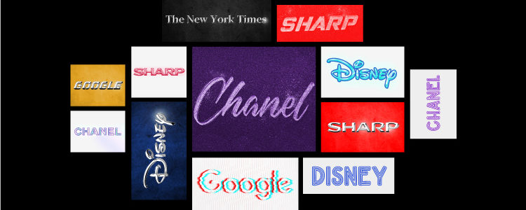
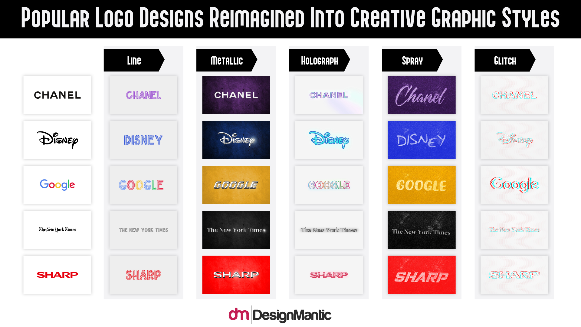
Try your hand at graphic design styles that are underused and see what they can do for your brand. Metallic, line art, holographs, so much to dabble into. To see the attempt in action, here are our redesigns of the world’s 5 most famous logos.
But, first, take a look at the 5 under-valued graphic design styles that need more representation.
Creative Graphic Design Styles
- Metallic: it’s a style that’s dominated by how light interacts with different metals; there’s a lot of sheen in it. Gold, silver, and bronze are often used in metallic logo designs.
- Line: it’s straight or curvy lines that continue and/or repeat to form distinct shapes, forms, words, and icons.
- Spray: it’s a graffiti style of design with lots of natural wrist movement. The end results are often more rounded, raw, and organic.
- Holograph: as light reflects from an object, this style captures its movements and presents it in a 3D display that’s very fluid and mesmerizing. Lots of light and shine work in it.
- Glitch: a very 80s look, sufficient light distortion, ideal for both futuristic and edgy retro designs.
1. Chanel
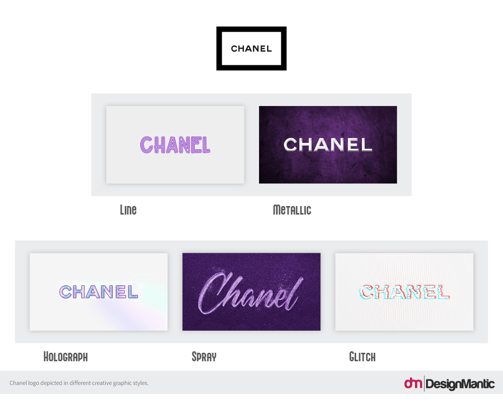
While business logos continually go through changes, some brand marks stand the test of time. Chanel is one of the most remarkable of them. Its logo has remained unchanged since forever – both the wordmark and the world-famous intertwined twin Cs.
So, what would it look like if we buzzed things up a bit?
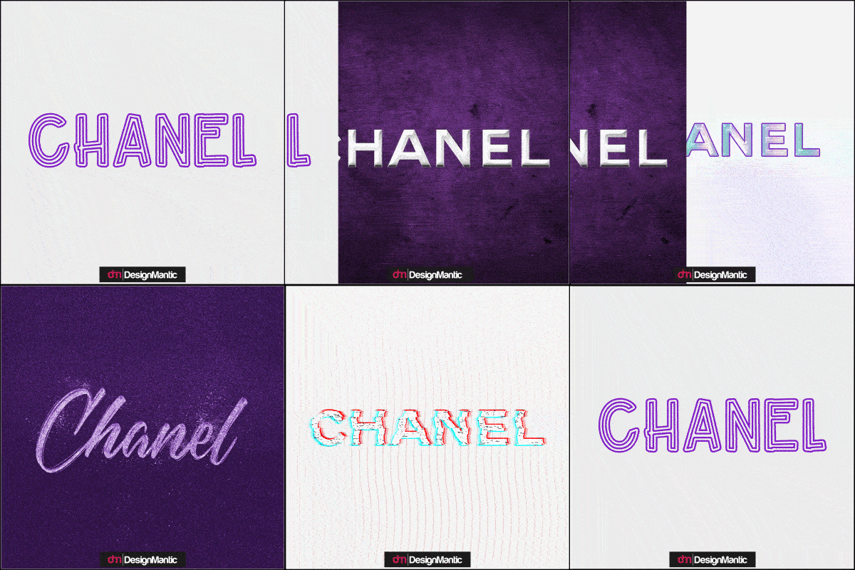
In its original black and white, Chanel is the epitome of sophistication and luxury. The spray paint version and the line art version, replicate that sense of finesse quite closely. The metallic logo, we can let that go. The real surprise here, however, has been the glitch design. Close to the original and with a very tasty twist.
2. Disney
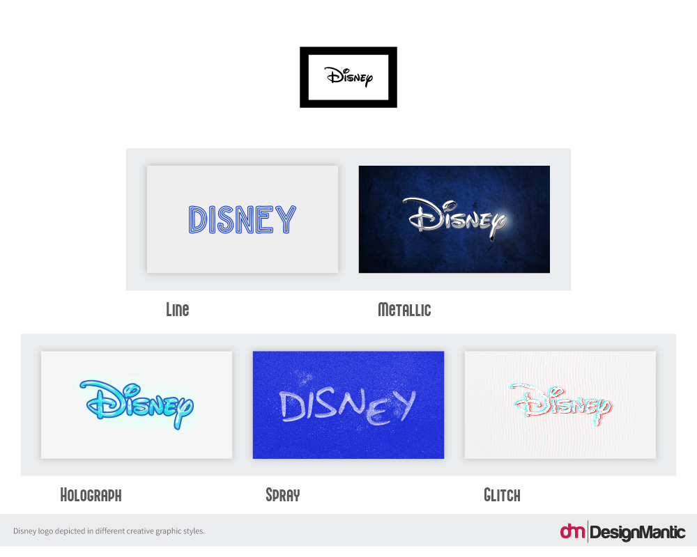
The Disney logo has always been animated to show the great things the studio was doing in the field of motion graphics to bring creative visions to life. Again, a largely unchanged logo from its original rendition, it has become a famous symbol of all things wonders, magic, and dreams coming true.
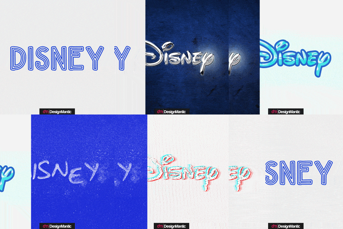
While we love what the holograph technique has done to this beloved logo, the line art version is a great lesson in how there are certain things that you cannot separate from a brand’s true identity. With Disney’s logo, it is its custom, well-known, whimsical font that brings the brand to life.
3. Google
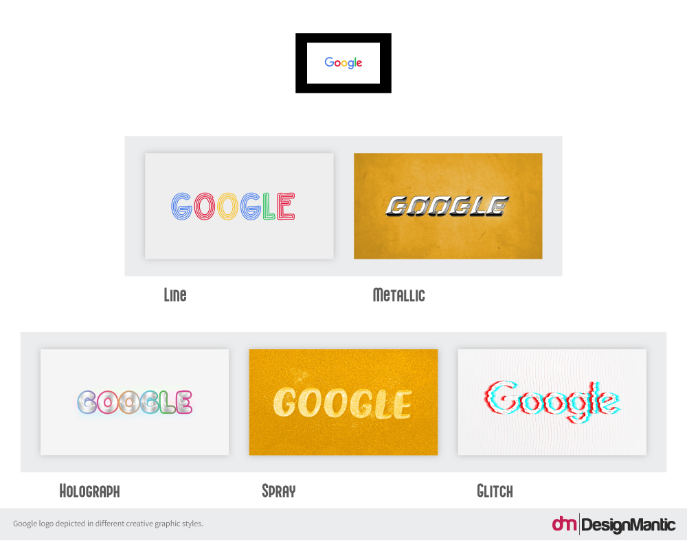
Google has always served us with the best of technology and the best of identity style over the years. It started off as a bold brand with confident colors in its logo. Even now, after many changes later, the colors remain a huge part of the global brand’s identity. As a fun tech brand, with every redesign that we attempt with Google, the brand’s core message of fresh-at-heart keeps shining through.
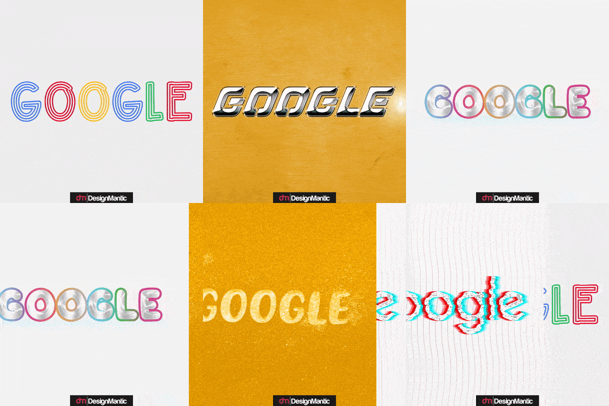
Take anything from metallic to glitch, the styles pay homage to how solid the brand is. Though, we especially want to mention the beauty that’s the holograph version. It is pink, has bubbles, and might pop soon. Can we present it to Google as their future video intros animation?
4. The New York Times
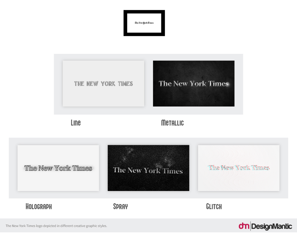
Another brand with a strong identity that can withstand visual manipulations done to it is The New York Times. And it comes as a surprise. But only because the original logo uses such a strong, and well-known font. You’d think the brand will lose its appeal if those detailed turrets and towers are gone, but it holds firm as we take the logo from metallic to line, and from glint to glitch.
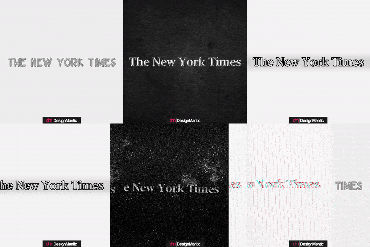
It’s hard to say which redesign is the best of the bunch. The definitive lighting dot in the metallic logo that prepares you for something great to come, or the holograph one that’s giving off intense dark vibes? You be the judge.
What I love most about this logo redesign is that because the font has been simplified, the logo has become more accessible and lightweight. Not only is it great for digital marketing but will also render itself perfectly readable on screens of all sizes.
5. Sharp
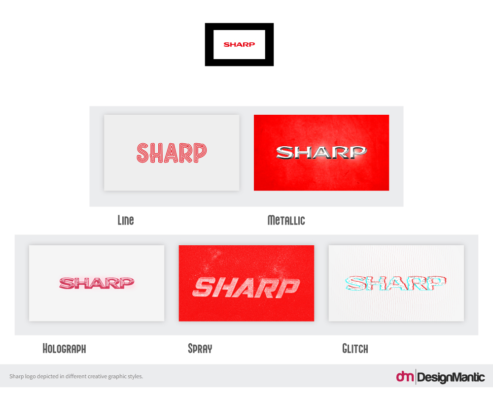
The Sharp logo, representing the Japanese consumer electronics good company, needs a lesson or two in how to sync its name with the most industry-appropriate visuals? The logo, in its original as well as current form, is stodgy and stumpy. Two words that you don’t want anyone to associate with your tech business.
Our bold redesigns help you see if a radical redesign can help the company in its branding?
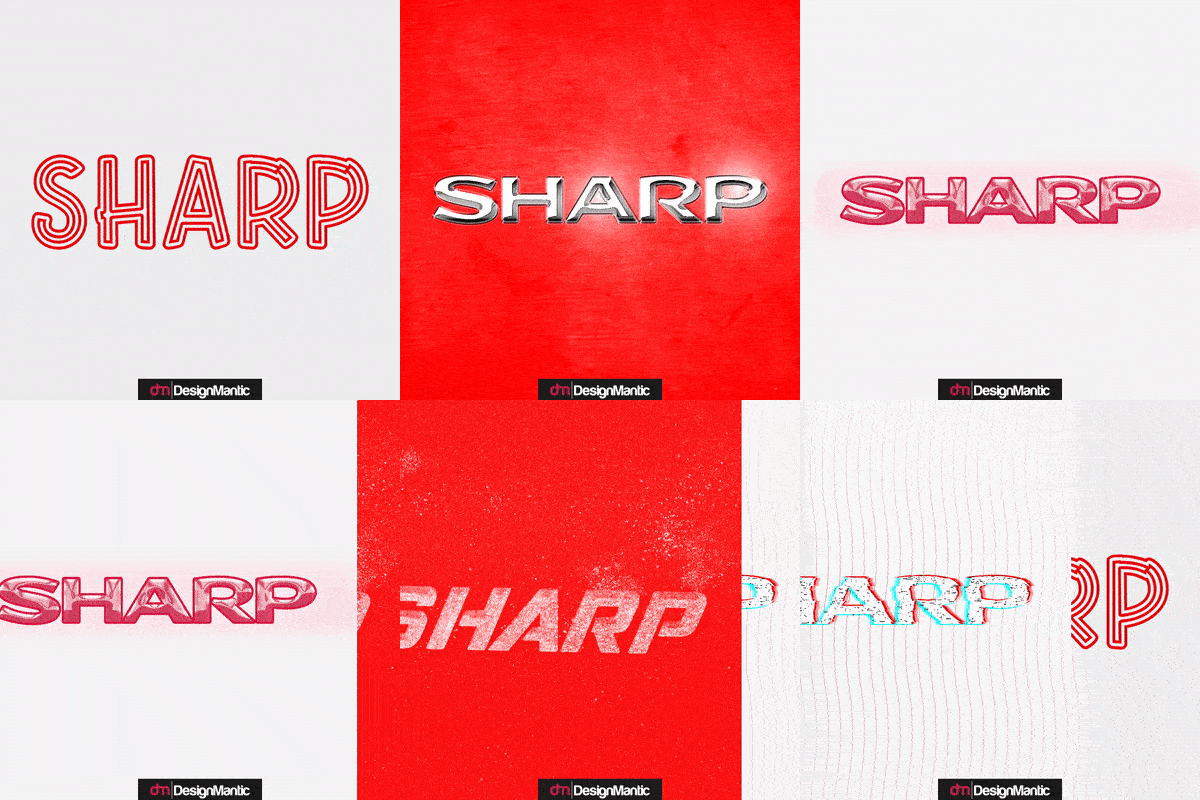
The most likely candidate for an official redesign is the metallic logo with its brilliant shine that makes the brand look dazzling but also strong. Our next favorite, the glitch makeover, is another bold contender, with jazzed-up letters and colors. Even if we let go of the line art effort, everything else looks completely on point if ever Sharp decides to go for an appropriately modern rebrand.
Conclusion
Corporate logos often use only certain styles of graphic design when creating brand identities. Dominated by flat and minimal designs, these styles look simple, nice, and instantly understandable. But they all also look too similar to each other.
To break the mold, we have designed the world’s 5 famous logos in styles that are not highly utilized in the brand identity world. Let these redesigns work as your inspiration for future projects, and determine when a more against-the-flow approach is more suited to separate you from the crowd.

