For years we have been designing for an audience that doesn’t exist. According to the data from the CDC, 1 in 4 adults in the United States has some type of disability. Meaning, there is a large portion of people coming to your website or social media or podcast, etc., that cannot enjoy what you are offering to its fullest. Technology that does not benefit all is fundamentally lacking.
People with disabilities use a variety of helpful devices – screen readers for visually impaired people, for example – to access stuff online. Blurry images, vague text, unhelpful navigation labels, invasive videos and audios, CAPTCHAs, and other such design elements that we either ignore or navigate around, become serious hurdles for people with challenges. Creating an accessible website design helps provide a fulfilling experience for all internet users.
An important thing to remember as you learn about accessible design is that disabilities that impede a person’s online journey do not just include visual and/or auditory challenges. It also includes cognitive, speech, physical, or neurological impairments.
So, how do you go about creating a meaningful design that everyone can access and consume?
To simplify things, we have WCAG 2.1.
Web Content Accessibility Guidelines 2.1 is a set of guidelines created by W3C (the World Wide Web Consortium), the international body responsible for developing standards for the World Wide Web. The WCAG 2.0 standards make things pretty straightforward and standardized, so you can easily implement the best practices needed to create accessibility at every stage of the design.
To determine the accessibility level of any given website, there are three sets of standards: A, AA, and AAA.
A popular guideline for accessibility level: A
Provide clear and descriptive alt text for all non-text-based content (e.g.: alt text for images).
A popular guideline for accessibility level: AA
Show audio description for prerecorded video content.
A popular guideline for accessibility level: AAA
The text and images of text are presented with a contrast ratio of at least 7:1.
Now, as we delve deeper into the accessible design, let’s get the terminology right.
Accessible design is often used as a blanket term to define a lot of design approaches that are related to making the design better for everyone. But there’s a distinction and to make accessible design impactful, we need to understand what it is.
Design that makes things easy for everyone is referred to as user-centered design, user experience design, or simply ‘usability’. It does not include or address user disabilities that can hinder a person’s online journey.
Accessible design is specifically about disabilities. It’s about visual, auditory, cognitive, speech, physical, neurological, or even situational disabilities that can make a person’s interaction with a website difficult. Design accessibility encourages people to create digital spaces where ‘equivalent user experiences’ can be created for those who face any kind of disability.
Do we need an accessible design? Honestly?
Only if you are serious about your business. The fact is that accessible design benefits everyone – your customers, your product, your strategy, and your bottom line. It helps you grow and expand your business, innovate, and make better profits.
Benefit 1: Accessible design is simply good business. Like any sensible entrepreneur, it’s about expanding your customer base and ensuring you reach the maximum number of your potential buyers, one way or another. If your design is inaccessible, you aren’t getting to all your customers – it’s as plain as that.
Benefit 2: By not following accessible design practice, you are also hurting your SEO. Design that isn’t accessible provides incomplete data for the search engine to index. With that incomplete data, the server does not fully grasp the potential your product offers – so it either skips your page completely or ranks it much lower.
Benefit 3: Another way accessible design is beneficial for business is how it adds longevity to your digital space. WCAG’s accessibility standards are not bound by device or technology. By following them, you create a website that isn’t dependent on certain devices or certain technologies to run smoothly.
Benefit 4: Similarly, accessible design isn’t only useful for people with permanent or temporary disabilities. People with situational disabilities also benefit from accessible design. For example, the optimal and responsive background to foreground contrast ratio makes your website readable and useful even in the glare of the sun. Or consider the example of an accessible logo design where everyone who looks at your brand colors can spot them correctly. That’s a goldmine in terms of brand recognition.
Benefit 5: An accessibility advantage report by Accenture states that businesses that include accessible design in their policies earn higher than their competitors and overall stand out in their industries for their leadership.
Related: Addressing the Design Needs of Disabled People – The Invisibles
The benefits of accessible design to any business are multilayered and far-reaching. It produces better design, helps everyone, and profits the business, too.
So, what’s the deal? How to get started?
Employ this three-pronged approach. Start with the basics.
- Research
This is the first step in knowing what you are up against. Disability is more common in our country than you think. With 1 in 4 American adults faced with some form of disability, it is likely you know a disabled person even if you are not consciously aware of it. So, start looking around you; if it isn’t one of your friends, it’s probably you fighting with a disability. It may not be permanent, it may even be situational. But learn about it. Research is your best friend when you want to get familiar with how a person with disability functions around the world and what are their specific sets of needs.
Here’s a helpful resource to start learning about disabilities how artists with cognitive disabilities are contributing to make design accessible, and how it impacts design.
- User Personas with Disabilities
We hardly keep people with disabilities in mind when creating buyer/user personas. Because most of us, erroneously, think that this is not a large part of the consumer group to be concerned about. Truth is that people with disabilities, globally, are about a billion-member strong group. So, if you aren’t catering to their needs, what are you even doing?
Include people with disabilities in your focus groups and beta tester pools. Know what they are looking for in your design and product and learn how you can create it for them.
- User Testing with People with Disabilities
No good design can be launched without user testing first. If you have created an accessible design, consider it half-baked at best and a shoot-in-dark at worst if your testing group does not include people with disabilities. Using devices and tools that stimulate disabilities is not only offensive and harmful but just simply doesn’t work. So, do your accessible design a favor and let real people with disabilities interact with it.
Next, let’s discuss the practical ways you can implement accessibility into your design practice. Here are 14 ways.
1. Background/Foreground Contrast
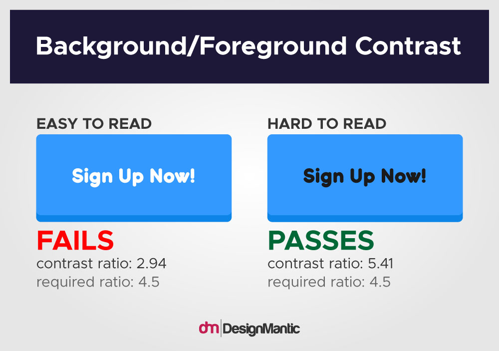
The colors you are using for text and its background need to have sufficient contrast between them. WCAG 2.1 recommends a contrast ratio of a minimum of 4.5:1. If your contrast ratio is not enough, it affects readability for everyone, not just people with disabilities. This standard applies to every surface and design element that uses a combination of text and color, such as text on images and buttons, etc., but is not compulsory for logo design.
2. Choose Colors Carefully
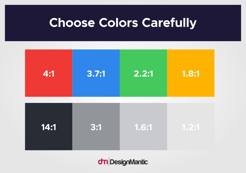
People with different kinds of visual impairments, such as weak eyesight or color blindness, can only consume certain colors. If you are designing an inclusive website but using colors that color-deficient people can’t see or see properly, your design isn’t inclusive.
This is a list of colors that people with different kinds of color blindness challenges can consume easily. Use these colors to design your brand color palette. Remember to finalize your colors before you start composing your style guide for the brand.
3. Don’t Rely On Colors Alone
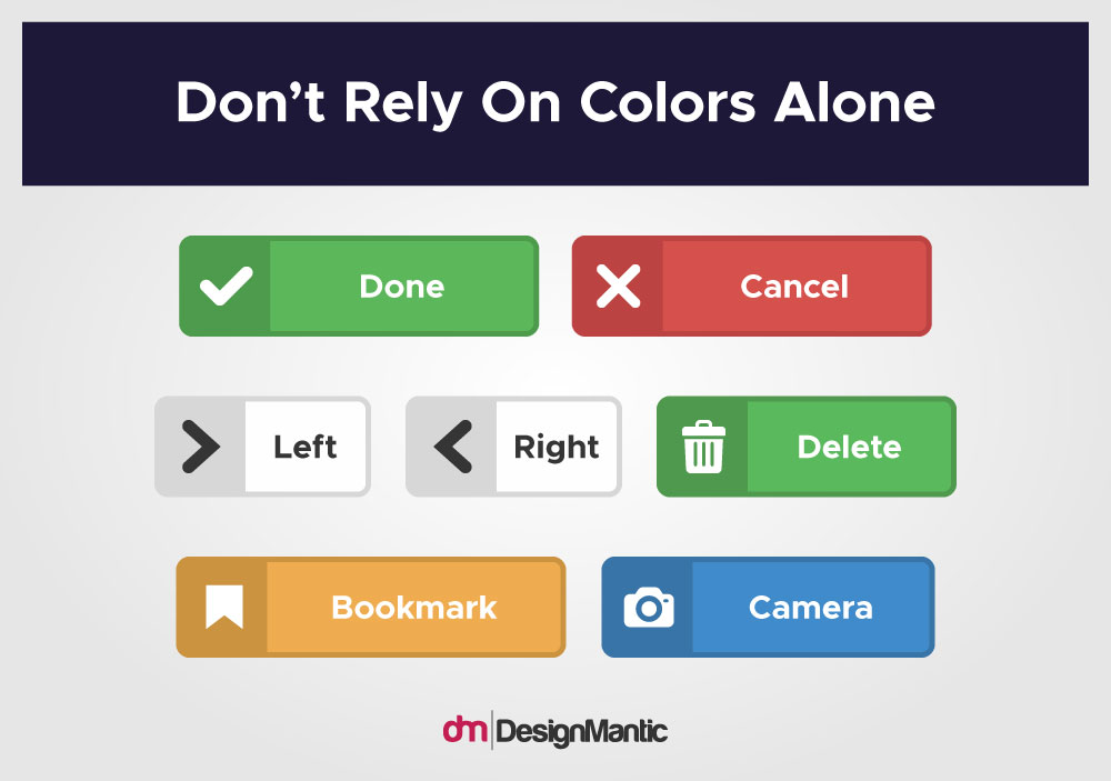
Colors alone are not effective communication tools when thinking about accessible design. Empower your design by using other elements that amplify your intent and meaning. Borders, underlines, and icons, etc., all act as additional tools that help your audience identify various parts of a web page and how to use them.
4. Clear and Descriptive Labels for Forms & Navigation
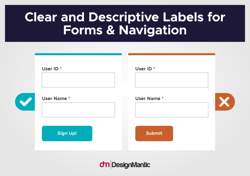
Use short, clear, and concise labels for your navigation buttons and form labels throughout the design. Descriptive labels help devices such as screen-readers to understand the content better. When adding labels to forms, ensure they are either adjacent to or placed above the field. With navigation, do add substitute ways to browse the website. Sitemaps, search buttons, and such help with this task.
5. Clear and Descriptive Alt Text for Images
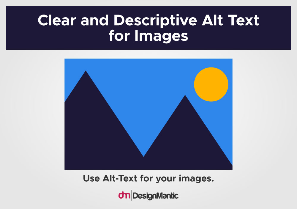
All the images and other media in your content should come with alternate text. This not only includes alt text for images but things like captions and transcripts, too. It keeps the content consumable in multiple ways and formats. Clear text that explains maps, tables, and other complex media also enhances a website’s accessibility.
6. Unique Names for Links
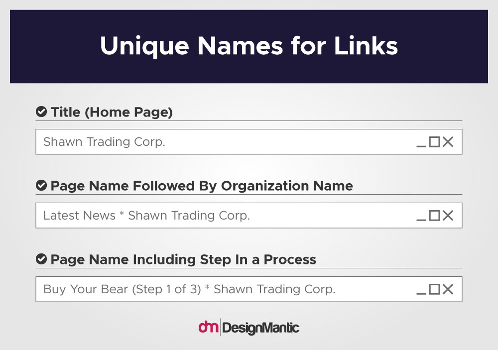
This applies to the names of different web pages. Instead of using a long string of words and numbers to name a web page, use short and clear names. This should be done in URLs as well as headings and subheadings for content throughout the website. It not only helps automated devices such as screen readers but people with weaker eye sights or those with cognitive disabilities or learning disabilities, too.
7. Feedback That’s Easy to Identify and Understand
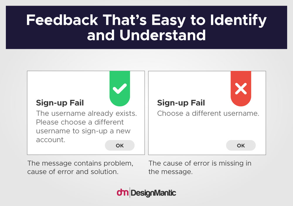
The error messages and feedback messages on your website and other digital media must come in simplified words. Use short sentences and describe in simple words what went wrong with the user’s input. Also, explain how they can make it right. Simple feedback that’s easy to understand also improves user experience.
8. Clear Instructions
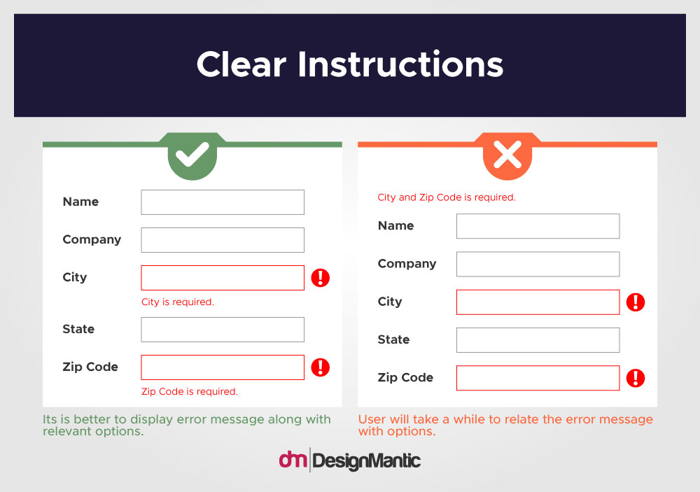
This point is tied to the above one. Whenever your content uses a set of instructions, whether on forms or CTA buttons, use simple language. A CTA most often is a verb that only contains a maximum of two words. It helps things remain neat and concise. It also helps your members know how you want them to proceed without annoying them with technical jargon and long instructions.
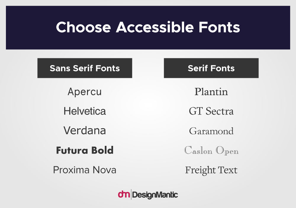
9. Choose Accessible Fonts
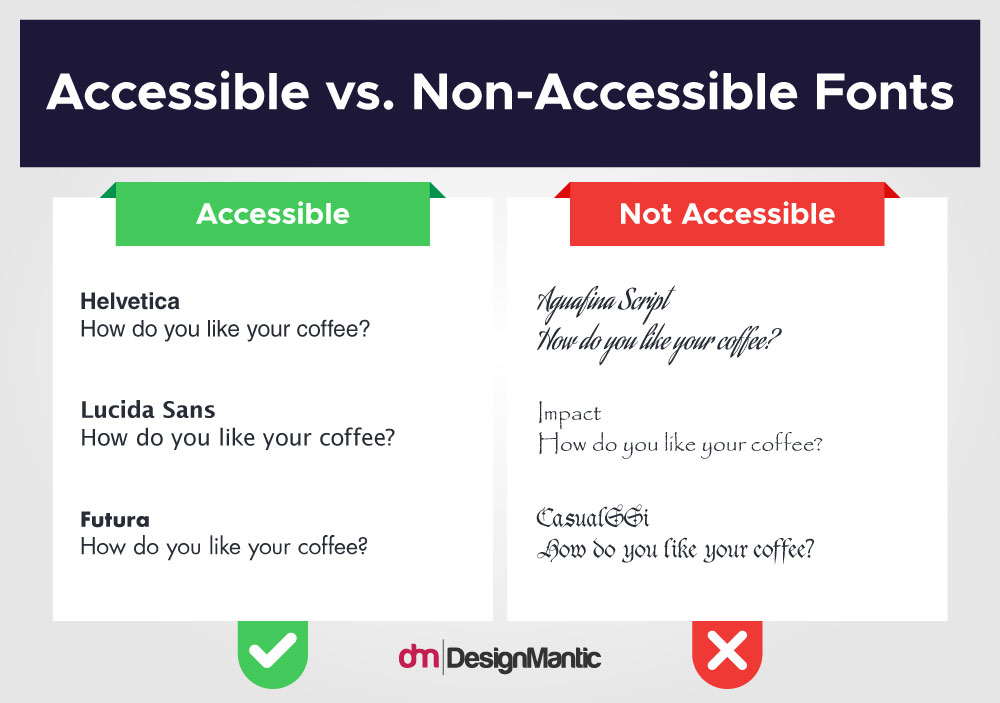
Using fonts and typefaces that are accessible and improve the reading and browsing experience is much appreciated. Since not all fonts support accessibility, invest in learning about typography that supports web accessibility.
A good rule of thumb is to avoid italicized letters as they are not the most suitable fonts for Dyslexic people. They are the hardest to read and must only be used for amplifying or simplifying the meaning – in limited measure.
10. Headings & Subheadings for a More Meaningful Text
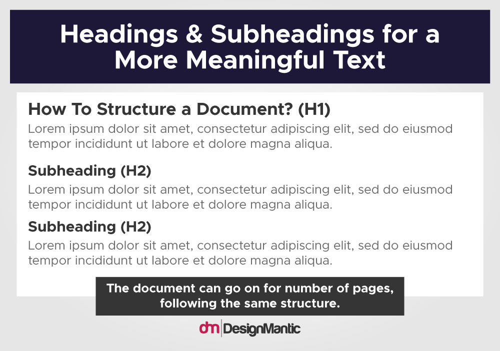
Divide your content into segments. H1, H2, H3, and so on. The segmented text helps readers categorize the information they are learning. It also helps them understand the relevance/connection of the text-content and media-content you’ve used in your article/post, etc.
Additionally, also use shorter sentences in clear language. Avoid technical language at all costs. Most people are only skimming through your content, looking for the most relevant information. Therefore, get to the point quickly.
11. Control Options for Invasive Audios/Videos
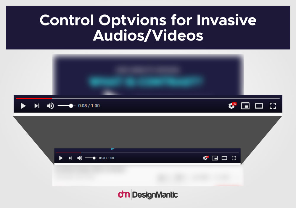
If you have included any media in your website content that starts automatically – promo videos or a relevant podcast, for example – add controls in the video. These controls – pause button, sound button, etc. – help people use the website without getting distracted or annoyed. Such media can also affect the functionality of the web. A popup ad that does not have a close button clearly placed can increase your site’s bounce rate.
12. Transcripts and Captions
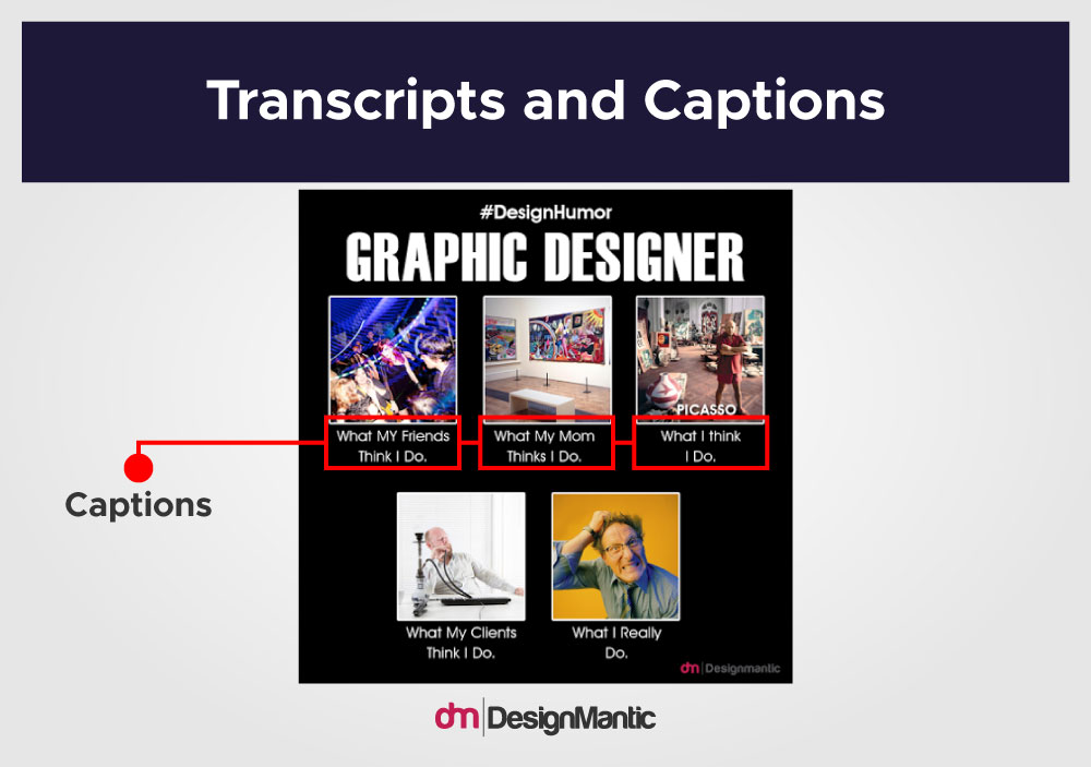
If you want your media-rich website to start become more accessible for a wide range of audiences, start adding transcripts and captions to your media. Ideally, these helpful resources should accompany every audio and video file available on the site. But if that isn’t possible right now, do make sure that all necessary videos like introductions, tutorials, pitch videos, and discount promotions, etc. come with helpful captions. Adding localization to your website can also greatly expand your website accessibility.
Captions should also be available for pauses in the videos where an important but silent event takes place (e.g.: “Annie hides the knife behind her back”).
13. Sufficient Size of Design Elements with Enough Space
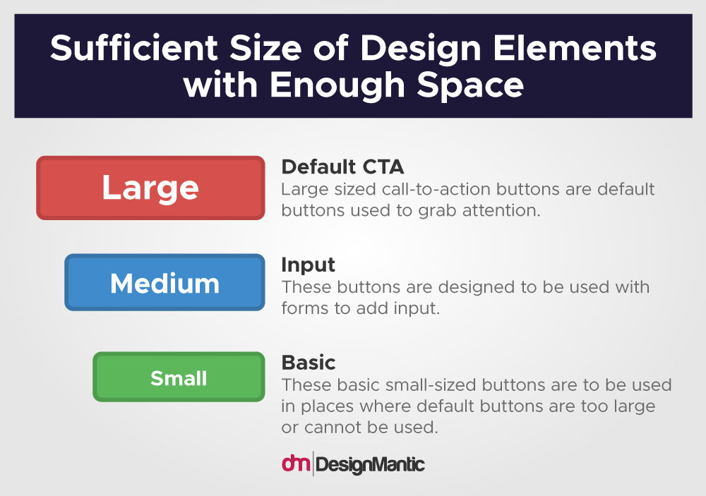
This is one of those standards of accessibility that help everyone. Design elements, such as buttons, must be of enough size that they can be clicked on easily without accidentally pressing another button. Design elements that are cramped together or are of really small sizes affect the site functionality quite badly. Take care of spacing issues when working on the text. Place sections of text with enough space between them that readability is improved while still maintaining their relevance to each other.
Related: Negative Space In Graphic Design
14. Create Responsive Design
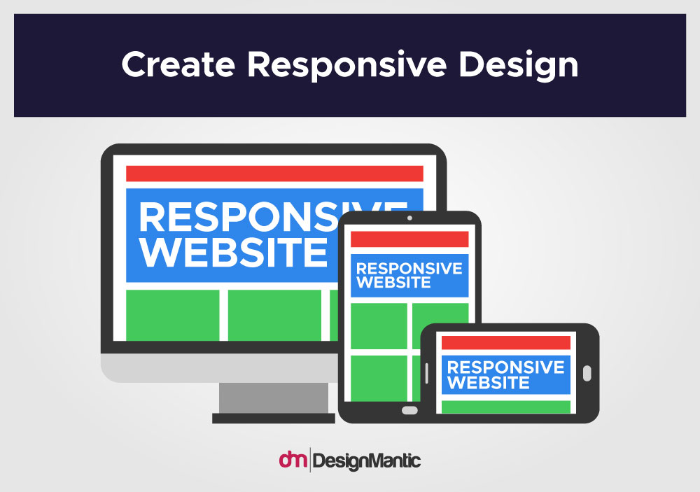
Responsive design allows you to create websites and other digital media that can be consumed on various screen sizes without losing any of its functionality or design aesthetics. The non-reliance on screen sizes is also a cardinal rule of accessible web design. Since most of us are likely to be using a website on our smart devices, knowing how to create a mobile-first design can help with web accessibility too.
The Takeaway
The great thing about accessible design is that it’s a win-win on multiple levels. It’s great for communities and users. It helps improve the design. It is morally and ethically correct. It’s better for business. And since creating accessible design is becoming law in many countries, it helps you follow all the necessary legal protocols to survive in the market, too.
People with disabilities remain a large part of the American adult population as well as the world. The number is even higher in the developing world. Forsaking accessible design is simply narrowing down your potential clientele. So, start considering accessible design a serious part of your design strategy from now on, and begin your journey as a ‘woke’ and a successful entrepreneur.