Have you ever come across the term negative space while in conversation with some fellow designers? If so, you must be wondering what negative space is, how you can integrate it into your designs and what the advantage of adding it is.
Negative space is the blank space or area surrounding an image or text, which is integrated into a design to highlight the body of text or object in question. Not is negative space known to increase logo recognition and improve text readability, but it also enhances the aesthetics of a design.
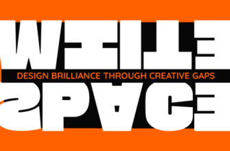
However, the incorrect use of negative space can pretty much destroy a design. Therefore, you need to be careful about how much negative to add and where. In fact, if you’re not careful, then the negative can very easily turn into positive space and divert the entire focus of the design unto itself, instead of highlighting the main image or text. Thus, we have created an infographic to guide you on how properly infuse negative space in a design… see below!

Icons:
- Marion Boddy-Evans
- Flaticon
Be sure to comment or to send us some brilliant examples of negative space you have come across on the internet.