
Welcome to another episode of our Creative Branding series of posts where we get the experts to opine, chime in, critique and discuss everything from design faux passes to wow-inducing design techniques. Previously, we analyzed the YouTube-KitKat collaboration making news over the internet and how that went down with the design folks and ordinary consumers alike. Today we’ll look at something new, something fresh and something controversial that deserves some intense scrutiny from the design industry leaders.
So, let’s get this show on the road with today’s question.
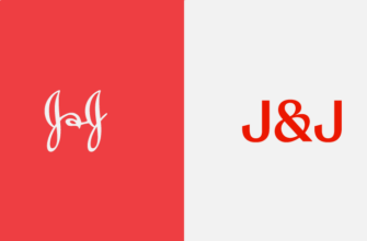
Does the Tennessee State Logo seem worth it for the price it was designed for?
What is a client thinking when he hands over an incredulous $46,000 to a designer? He expects something like the McDonald’s golden arches design or the Nike logo; both poster boys for long-lasting and memorable brands. That’s what you’d want if you forked over nearly $50k of taxpayer’s money to highlight your State, isn’t it?
Recently the state of Tennessee did exactly that. And the results?
Take a look at it for yourself here:
![]()
This really doesn’t belong in a Before and After magazine.
We thought we might be missing something, so we gathered some panelists for the purpose. Our 4 panelists scrutinized the Tennessee State logo and offered their professional insights over this hot-button topic.
- João Garzón de Albuquerque, Founder & CEO at Workaboutdesign, always looks for the deeper meaning behind design.
- Henk C. Meerhof, specialist in visual communication and independent designer. He has an eye for design and has been in the business for a decade.
- Eileen Wu, Technical Solutions Consultant, takes a look at things from a matter-of-fact point of view.
- Sean B. Jamshidi, Founder and Creative Director at DesignFacet, deconstructs the co-branding phenomenon with a design, marketing and aesthetical standpoint.

Mr. Albuquerque had a lot to say about how people generally regard logo design and how people in professional circles regard the same craft. He then proceeded to give his thoughts on the TB logo itself with the eye of an experienced designer.
The “a fifth-grader could easily produce” quote, shouldn’t be the measure of the task or of the result. I surely don’t think that the capacity to technically do something is how we are to evaluate logo design and there are many successful logotypes out there to prove that. The recent GAP soap opera around the restyling and drop of the new for the old, shows exactly that. A quick look at the forever known GAP logo, and you could almost say the same, “a fifth-grader could easily produce” that… or not. The doubt is just between, could have done, have though, or more, how long would have taken it.
This said, we can move on to evaluate the TN logo for its own qualities, or… not. Because even that is subjective, since we are not provided with the original briefing or process that ended with what we have to look at. Ok, enough going around the bush, you might say, just say it for what you see. This is everybody’s position when expressing thoughts on such a subject, the difference will just be concerning the experience, trained eyes and aesthetics sense. With that in mind, I say poor design, indeed, the challenge was not won, if I may say, the result looks old, gone and without any sense of today and for the future. TN, ok it reads Tennessee to any US citizen and it stops there. It is probably a waste of opportunity. Ah, not to go without mention there’s the raised price issue. Sorry not an issue, good or bad has nothing to do with value or quality. Thumbs down for sure.

Mr. Meerhof goes about the TN logo issue with his trademark humor that’s carefully interspersed with crucial design lessons for old and new designers alike.
The article about the YouTube-KitKat collaboration has hardly hit the screens, when I receive the next panel topic from Evan. The Tennessee State Logo need our attention. So I’m prepared, dressed up in fancy jeans, cowboy jacket and blue suede shoes. Nothing can happen to me now, I thought…
Then I saw the Tenessee State logo.
Boy, was I wrong! There was nothing else to do than to re-dress for this occasion, so I changed into my Dutch wooden clogs, put a tulip in my hand and take position next to a windmill on a dyke.
Yes I’m from the Netherlands, famous for its Dutch Design that has influenced visual communication between government and citizens from the late 1950s. Today I live in another famous design country, Denmark. So what do I, as a European, know about Tennessee? Is it as boring as a red square with a blue bar underneath it? Two letters TN in a not so inspiring typeface, what is this state trying to tell me? That it loves Adobe app-icons? I could not believe my eyes!
If I had submitted Danish license plates, I would have had a better design.

Image Source: Wikimedia
License Plates in Denmark are better than that
Wait! Before you fall off your chair from amazement or from laughing. I did only get this one logo. No briefing, no history about how it came to be, no extra information about demands for using the logo. So I’m only shooting at the logo presented to me.
Curious as designers are I fired up my computer to ask Wikipedia to inform me.
Tennessee is 2.5 times bigger than European Denmark or the Netherlands. The list of state symbols contains 23 sources of inspiration and a rich history. Unlike Denmark and the Netherlands, Tennessee doesn’t need royalty to hold its banner or deliver a coat of arms. The tree starred flag is witness to more creativity than the new design shows. Also I would have asked for more, if my motto was ‘Agriculture and Commerce’. Then I had a look at the stately logos of the countries I know best … typical here you find nothing to be excited about either. Denmark uses its crown as logo for its ministries and the Netherlands the state coat of arms. Stylish, yes. Creative and exciting, not really, but still more interesting than those sad two letters on a red square.
State Coat of Arms courtesy of the Netherlands Gov.

All beauty is subjective. And Eileen Wu certainly seems to think that a lot of thought was given to the design here. Eileen does have a lot of important points that are worth going through as to what constitutes a logo design.
I’m going to buck the trend here and say that I like this logo. It’s clean, professional and authoritative without being overbearing; the kind of feeling you would want to convey as a government organization.
After just a little bit of digging, it was obvious that the agency took their cues from the many disparate logos and transformed them into the one design, appropriate for all the different departments. Yes, it’s simple, but to say that a 12 year old could do it? That’s harsh. Too often we see design downgraded to something anyone can do. What people neglect to consider is the thought behind the design, the number of ideas generated and discarded, the purpose of the redesign. Simple is actually really hard. Simple is what many logo designers strive for. After all, it’s the simple logos that are the easiest to recall.

Our last panelist, Sean, certainly felt that design is about the visual AND the marketing element both. Here’s what he had to say about the TN logo’s success and its failure.
“Slap on blue, red and white and your already half way there to represent the United State of America. But what amazes me is that the same company that designed this also designed the LP logo which is strikingly similar. Bottom line is the marketing and how well a logo is exposed that defines its popularity and success. Take for example the Nike logo. From the looks of it, this one had heads turned and eyes rolled with a great start. But I have a feeling that another 46k will be wasted in a years’ time to revise this logo. Btw logo was 9 months in making.”
So, What’s Your Take?
That concludes another interesting post about Creative Branding. As you can see, some designers think that it’s not about the money but rather about how great a logo is in communicating its core elements to a wider audience. The TN logo design is similar to the NEXT logo, designed by the legendary Paul Rand for Steve Jobs. He shot down Jobs when the Apple Inc. founder told him to change it. And, we all know how venerable Jobs himself was in matters of design. Feel free to give us your insights on the logo here. We’d love to hear back from you.


I think the agency (GS&F) is taking an unfair beating on social media about this logo design. People who have no idea what the process is like for doing this kind of work are armchair-quarterbacking this thing and criticizing the outcome without knowing anything about what took place, how many designs were created, what sort of direction the client gave, what they rejected (or why), etc.
It’s no wonder designers have such a hard time getting paid fairly for their work. Everyone thinks they can do it better, cheaper, faster, or that the final outcome is so simple and easy to come up with. It doesn’t matter if you spend a month (or 9 in this case) working with the client, designing things, presenting ideas, incorporating feedback into the designs, refining the concepts, etc., the perceived value of the job seems to only be in whether or not someone’s nephew could make the same red square and white text in Photoshop.
This might be the case Mike. Perhaps there were more to the process than we, audience, can understand. But we have been into design industry long enough to know a logo must deliver what it is expected to deliver i.e. vision and value. One that fails to deliver is a failure indeed. And I fear TN logo missed the mark, completely.
From having some experience in designing I’m embarrased that our goverment .would even consider spending $46,000.00
.on changing our state emblem without our voting on it. Not only that, but there are so many other areas that money could have been spent on.I THINK BILL HASLEM PICKED THAT COMPANY TO DESIGN IT BECAUSE: no.1 he must be part owner in the company , or he plans to profit from it later on, or his family or buddy’s needed money. Remember tho, this is only my opion.
I completely agree with you Cheryl. The new logo has no class. It is plain dumb and boring. And on top of it, understanding why government paid outrageous $46,000 on this logo is far from sense. I would have been content if the logo had any real value to offer. But unfortunately, it’s got none.