A good composition is imperative to a successful logo. You can design the best logo elements, have the greatest selection of fonts at your disposal, but if your logo composition is not up to the mark, everything goes out of the window.
A composition dictates how the shapes, fonts, and colors are arranged in your logo. It defines the proportions of different elements with respect to each other. It also governs the use of negative space and filled space. In a nutshell, the composition defines how your business logo will look at the end as a cohesive whole. When the different elements of your logo come together to form a harmonious whole, you know you have made a good composition. A successful composition does not only look good but is also very functional and effective.
If you are wondering how to end up with a good composition for your Family Insurance logo, there are many ways. One of the ways is to use some measurable tools to help gauge the quality of your composition. There are numerous insurance logo design grids that help designers form a good composition. These grids are also helpful in assessing the quality of your already-made composition. One of the most popular grids is the Rule of Thirds Grid.
In this article, we will discuss what the Rule of Thirds is and how it can help you in designing a medical insurance logo.
Rule Of Thirds –A Basic Compositional Grid
It is common knowledge that designers use a lot of grids to help align their designs. While many of these grids may involve more complex grid systems, a very basic grid structure that the designers and artists have been following for hundreds of years is the Rule of Thirds. Rule of Thirds is a basic compositional guideline that helps designers and artists place their key elements across the intersections of the grid.
How Does Rule Of Thirds Work Exactly?
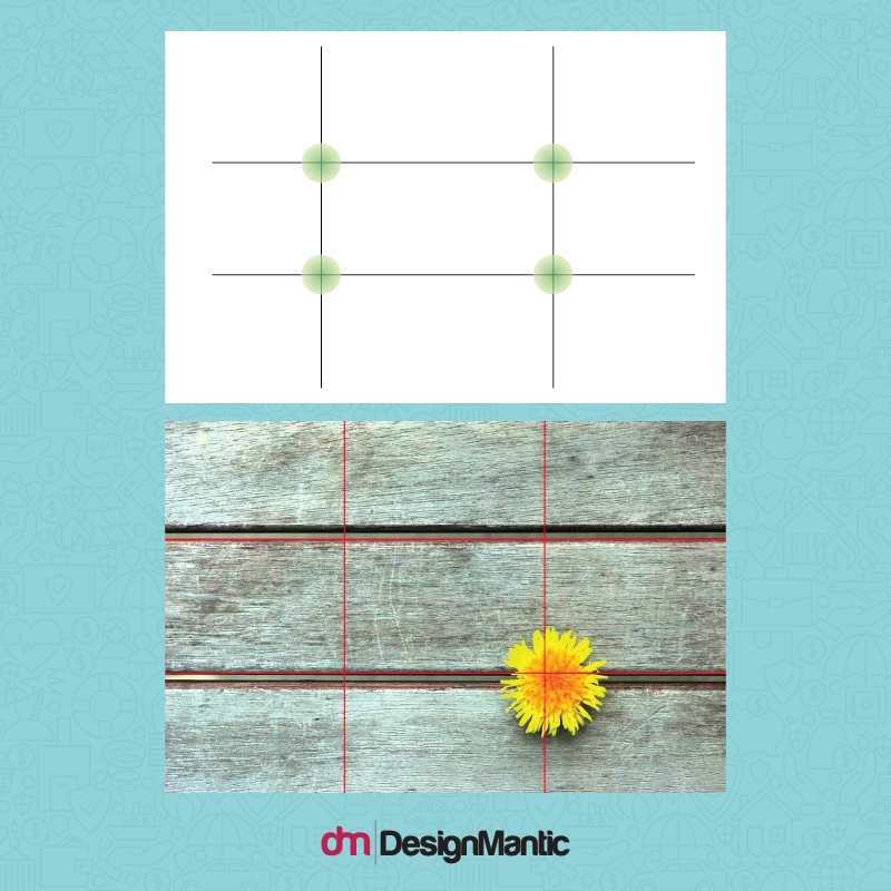
Rule of Thirds basically dictates to divide the image into nine equal parts to obtain a grid which will help you align your primary and secondary elements in a proportionate and balanced way. This is done by placing two equally spaced horizontal lines in an intersection with two equally spaced vertical lines. It creates a grid of 3×3 which looks something like this:
The intersections of the lines are known as the “hot spots”. Placing your design elements on or along these spots will make them the focus of attention without making them uninteresting. Often, when designers choose to center an element in a creative logo, it can create a boring, uninteresting look. However, if the logo elements are arranged according to the Rule of Thirds, the result is an interesting composition!
What Is The Benefit Of This Grid For Your Logo Design?
Well, the most significant benefit of the Rule of Thirds is that it tells you how the viewer’s eye is guided within a frame. What does it mean for your logo design? It means you can figure out where to place the elements of emphasis!
The Rule of Thirds tells us the following things about how our eyes travel through a design:
- The Overall Path of The Eye: It tells us that the common eye first travels top to bottom and then left to right through a composition. In a Rule of Thirds grid, you will often see the eye traveling from the top left to the bottom left and then from the left to right of the grid.
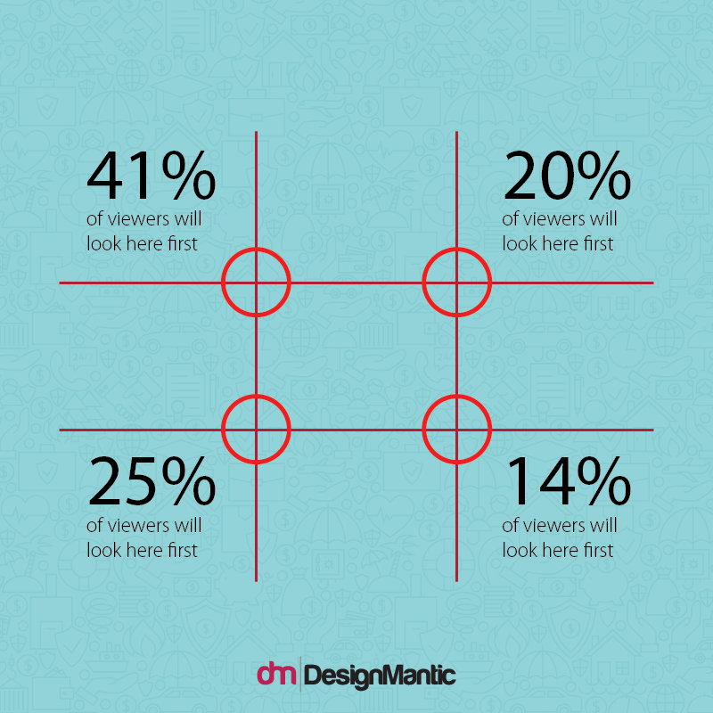
- Center is Not Always The Focal Point: It tells us that the centered location is not always the most viewed location! In fact, according to research, it has been found that people focus most on the top left intersection of the Rule of Thirds grid. This means the center actually goes unnoticed in this case!
- Symmetry is Disregarded by the Brain: One of the reasons why the eye focuses on these hot spots is because symmetry is familiar for the brain and is often disregarded by it. This means, an image that is slightly off the symmetry, for example when an image follows the composition along the Rule of Thirds, is more likely to catch the attention of your brain because it is different.
- The Importance of Natural Focus: Because these intersections are points of natural focus, it is beneficial to utilize this in your design and to place your key elements on them.
This image shows how the eye focuses on a composition. 41% of the people at once zoom into the top left intersection, then drop down to the bottom left intersection, followed by moving onto the top right and then bottom right.
How Does The Rule Of Thirds Look In Family Insurance Logos
In health insurance logo design, when you use the Rule of Thirds it allows you to form clean sections out of your logo that flow in harmony. Here is an example which shows how the elements can be aligned in a logo using the Rule of Thirds.
Notice how the logo is cleanly divided into three sections that flow like a narrative. This creates movement and balance in the logo. Using this movement and balance can make your Family Insurance logo stand out.
American Family Insurance Logo & The Rule of Thirds
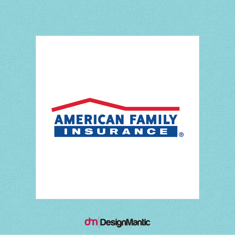
Here is another logo that uses the Rule of Thirds. If you notice, the line-based logo is cleanly divided into three horizontal sections, with the first section having the red roofing line, the second section having the words “American family” and the third section having the words “Insurance”.
All of the sections flow cleanly and harmoniously, like a narrative, creating an overall image of a “house”. The logo is made in the shape of a house because the house represents shelter and a safe place. And every family insurance company wants their customers to know they are safe and reliable. To further compound this message, the roof of the house is rendered in red to illustrate how this shelter is a strong and effective one. It has the power to stand through any storms of life.
Family Heritage Insurance Logo & The Rule of Thirds
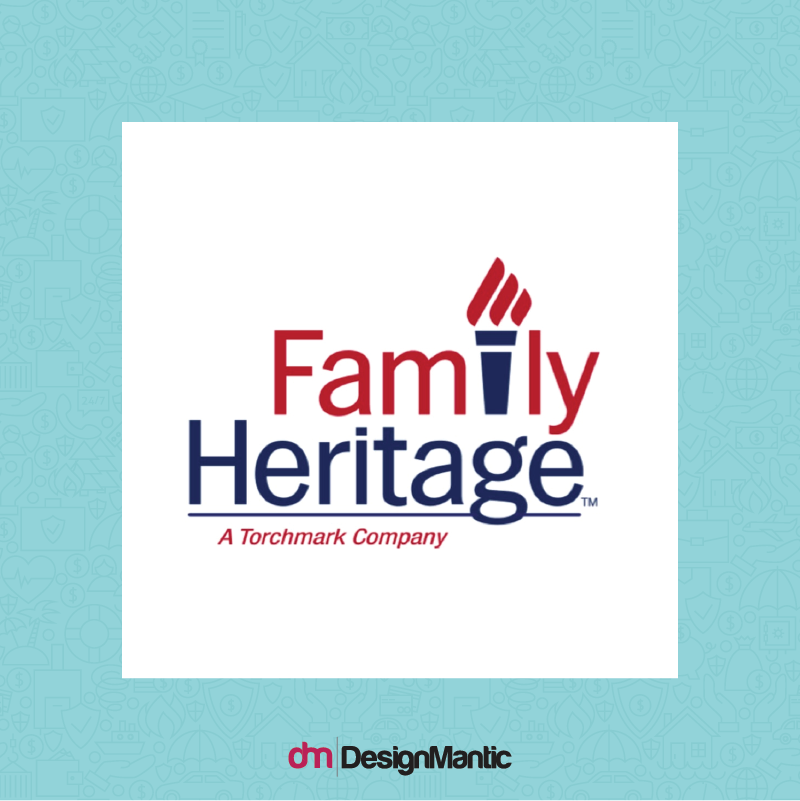
Similarly, if you look at the logo of the Family Heritage Insurance Company, you will see it uses the Rule of Thirds as well. This design principle helps in creating a balanced and visually appealing logo, which is crucial for any company, including those in sensitive industries such as funeral services. For such companies, a well-designed logo can convey professionalism and trust, essential attributes in the field.
The flame torch in the logo can clearly be seen to align with a vertical line and the letter “F” with the other vertical line. The letter F is placed along the first vertical line and on the top left hot spot so it can draw the most attention. This leads the user to read the word “Family” instantly. The eye flows smoothly from the letter “F” to the flame torch. And then to the word “Heritage”.
Similarly, the logo is also divided into thirds horizontally. The top most third houses the flame of the flame torch, and the much needed white space. The second third section houses the word “Family” while the last third houses the word “heritage”. This makes the logo appear balanced.
Here is another example of a Family Insurance logo where the overall composition and spacing is guided by the Rule of Thirds:
Other Benefits Of Rule Of Thirds For Your Insurance Logo
While helping you figure out the best focal points is one benefit of the Rule of Thirds, designing your creative logo with the Rule of Thirds will help your design task in many other ways too. Here are some of the benefits of the Rule of Thirds:
1. Helps Create Motion
The Rule of Thirds helps you break away from the symmetry. It allows you to place your elements at 1/3rd of a distance, which creates an interacting space between them. And often, the Rule of Thirds allows you to leave the much needed 2/3rd negative space.
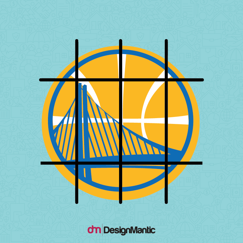
This means, your overall composition gains a sense of motion and flow, and this is imperative to good design. Rule of Thirds can help you create a natural sense of motion. Here is an example of the logo elements can be placed in the frame to create a sense of motion:
Notice how the bridge post is placed on the 1/3rd of the frame, keeping the other 2/3rd free. This creates a sense of motion.
2. It Makes Your Job Efficient
Using the Rule of Thirds grid gives you an instant idea for the placement of your elements. You don’t have to randomly figure out the placement of your shapes, negative space and fonts. Instead, you know how the grid works, what your primary elements are and where to place them for the maximum impact. This makes your design job less tedious and a lot quicker.
When you use the Rule of Thirds, you spend more time on deciding where to actually place the elements, instead of figuring out where they “could” be placed.
3. It Works In Favor Of Your Typeface
The Rule of Thirds works to enhance your typeface. Every designer knows grids work in favor of fonts. They make fonts appear neater, organized and more legible. They also help the heavier fonts appear softer and more aligned. This means you can maximize the effect of your typeface with the use of the Rule of Thirds. Here is an example of how this works:
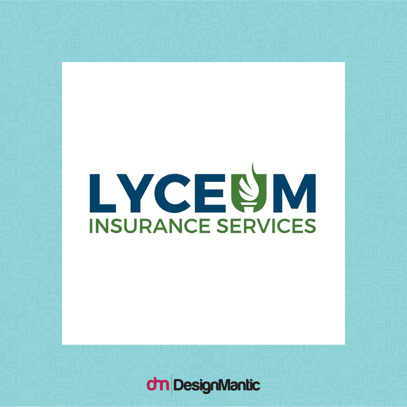
The Lyceum Insurance Service logo uses the Rule of Thirds. The logo is placed in the horizontal middle third section while the horizontal upper and bottom sections are devoted to negative, white space. The employee benefits logo is also vertically aligned according to the Rule of Thirds with the flame torch placed on the top right intersection. This makes the typeface appear organized, neat and aligned.
4. It Prevents A Cramped Up Feeling
The Rule of Thirds is an excellent guide for space placement. Whether this is the white space around the design, the space between the elements or even the spacing between the fonts. The Rule of Thirds helps you place the elements in the optimum space, preventing you from cramping up the design. With this natural grid, you will always have your logo looking fresh and breathable.
5. It Provides Consistency
A logo that is based on a grid system is a logo that is structurally sound. This means that not only will such a logo be easily scalable –it will retain its proportions and impact whether it is scaled up or down – it will also be easily modifiable in the future.
A structurally sound logo is a logo that can be easily reinterpreted or changed in the future. This is because it is based on a solid foundation which can be played with in a very consistent way. When you tweak a logo that has been designed on the Rule of Thirds, the logo will still retain its overall integrity, and thus, it will still appear well put together and connected to its old version.
Skew The Rule Of Thirds Sometimes!
According to design experts, all good design will ultimately follow the Rule of Thirds. Whether the designer intended it to or not. This is because the human eye and natural design sensibility guide us towards the arrangement of the Rule of Thirds. But while this rule can be very beneficial, it is important to not get stuck with a specific design technique. The best way to use the Rule of Thirds is to first start with an intuitive design placement, and then use the Rule of Thirds to check and guide your placement. This helps prevent your insurance brokers logo design from becoming too rigid or predictable. And at the end, just remember that all rules are meant to be broken –but only when they have been mastered!
Try Our DIY Logo Maker Tool:


