The Thanksgiving turkey leftovers aren’t even finished and 2015 is just about to end. Some businesses decided to fulfill their New Year resolutions early and opted to give their websites full blown makeovers with fabulous results. Here are some web redesigns that are worth looking into this year.
Why Website Redesigns Matter
A company’s website is its online representative. In other words, it is the face of your business. Everything from the type of font you use to optimization and logo has an effect on your target audience. Of course, times change and so does demand. The fact that Google has the tendency to change its algorithm on a whim also has most businesses scrambling to redesign their online presence before the ball drops for every New Year. 2015 isn’t any different and some brands have taken the initiative to make their websites more user friendly and look a whole lot better as well. If you want to design sticky websites, take a page from these ingenious web designs that stood out this year –
1. “The Toast” Offers Visitors More Value
The Toast is a daily blog website that publishes posts on themes that run the gamut and pays freelance contributors for its blogs as well. It recently redesigned its entire website to make it easier for users to browse it by placing popular content together. Content that comes in recirculation or “recircs” as The Toast’s design team calls it, organizes content that a visitor may want to read after being done with a previous post.

Source: The-toast.net
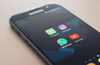
2. “Instagram” Launches Bigger Photos
Instagram introduced a web and mobile desktop design that makes photos much bigger than what they used to be and cleans up the page as well. For example, one of the most noticeable changer is a modified user profile page. The page now displays three large images in a row rather than the five smaller ones that were present before.

Source: DesignMantic Instagram
3. “FontShop” Wins Redesign Of The Year
FontShop.com won the coveted Gold at the European Design (ED) Awards in the category of Digital Self Promotion at the Mimar Sinan University in Istanbul. It was up against a lot of other website redesigns as well. The website scores points due to the simple nature of its functionalities. For one, not only does it invite users to buy fonts it allows them to interact with them as well. Secondly, it uses state of the art technology which simplifies purchases and in turn makes functionalities fast as they are fun.

Source: Fontshop.com
4. “Wonderful Machine” Changes Its Logo And Then Some
Wonder Machine started off with a fairly simple logo but when it realized that it had outgrown it, designers did a complete revamp. The website also teamed up with Sparkbox for a total redesign that is geared towards the needs of the photographers that the website caters to. Designers introduced a new set of primary icons for photographer facing content. The aim is to make the site easier to use for member photographers. For example, designers created icons to represent each department in its photographer consulting section.

Source: Wonderfulmachine.com
5. “The Guardian” Incorporates Seamless Integration
The Guardian is a UK based news website that has reached as much as 110 million users in the country especially after it redesigned its website to cater to audiences regardless of the type of devices that they use. The new visual design came into effect in January of this year and is geared to give visitors more visual clues about each story in terms of importance as well as aspects such as its editorial tone. All of the interactive elements, videos and photo galleries are now seamlessly integrated into everything that it published. For example, videos can now be played anywhere within the homepage or articles.

Source: Theguardian.com
6. “Pelican Books” Feathers Its Nest Online
The UK based publisher teamed up with Fiasco Design to bring its own web design to the twentieth century. The new appearance is optimized for the reader and is specifically meant to improve reader experience. For designers, one of the main aims of the redesign was to create a website that was not only accessible but also distinctive; aspects that define the brand itself. A notable feature consists of in-browser reading which now allows users to read Penguin Publications on devices like Smartphones, tablets and other mobile devices.

Source: Pelicanbooks.com
7. “AirBnB’s” New Website And Logo Want You To Belong
AirBnB is already known as one of the best travel websites on the web. The travel website just proved that you don’t need a logo guide to create a logo that really sticks. In order to promote its culture of “belonging”, the short term rental and vacation site revealed an ever more interactive experience in which users could create their own versions of the brand’s signature Belo symbol. It also updated its mobile apps to incorporate its theme of belonging as the brand emphasizes, “We imagine a world…Where you can belong anywhere. This needs its own symbol. One that can be drawn by anyone.”

Source: Airbnb.com
8. “Bloomberg Media” Boasts A Colorful Redesign
It seems that Bloomberg Media is set to attract more users with a design that is not only fast to navigate but bold in colors as well. New features adopt a modular approach which also makes it possible for journalists to change the layout of a page in order to make it suitable for certain content. By partnering with Code and Theory, Bloomberg focused on making its brand faster than ever before. Here is what Chief Digital Officer and Editor of Bloomberg Digital had to say about the new design, “Bloomberg has always been very avant-garde and bold in pushing the limits of how to tell a story. The site is a reflection of that.”

Source: Bloombergmedia.com
9. “The Huffington Post” Turns 10 With A New Web Design
The Huffington Post also chose Code and Theory to celebrate its tenth birthday with its first major redesign. The award winning online news agency incorporated visitor patterns or trends such as when they access news or how they choose to share content in the new design; all in a bid to adapt the site to changing mobile behavior. This is especially when it comes to international users. The design team at both ends considered diital ergonomics in the “mobile first” design; an aspect that according to senior editor Kia Makarechi “is how people actually thumb or scroll or tap through the content.”

Source: Huffingtonpost.com
10. “White House” Makes Its Home Page More Responsive
WhiteHouse.gov recently released its first ever responsive web design in order to keep pace with an increasing mobile user base. Users can now find relevant content more easily in the White House home page such as informational pages about Presidents and First Ladies which also receive a lot of traffic.

Source: Whitehouse.gov
11. “The New Republic” Has Millennials In Its Sights
The one hundred and one year old liberal political magazine shows no signs of stopping and redesigned its web design to appeal to millennials. The new TNR is fast and is mobile first. Gone are the banner ads and a homepage that was just a grid of latest stories; a feature that is typical of most political sites. All navigation elements are now hidden away. The content now enjoys center stage which is why it is basically all you see regardless of the device that you are using.

Source: Newrepublic.com