Think designers in America are not pushing the envelope when it comes to highlighting and affecting positive change as far as racism is concerned? We showcase some of these designers who believe in social design – helping bring about wide-scale awareness and educating people about why its not ok to be racist in 21st century America. In the backdrop of major societal changes and happenings that have occurred in the run up to the 240th Independence Day of America, it is time we looked back at history and drew some important lessons for American society as a whole. There’s only one way to march but forward.
Let’s take a look at these artists with a conscience.
John Lee for ‘A Story about Chinese Americans’
Some designers and illustrators excel at telling stories about people. John Lee wanted to do exactly that in the case of Chinese Americans and their role in the Civil Rights Movement. Not many are aware of the fact that how Chinese immigrants have tried to acclimatize with American society since the days of Martin Luther King. A truly symbolic and educative pieces of illustrations chronicling the journey of Chinese American citizens in one of the most socially transformative phrases of modern America.

Source: Behance/John Lee
Guy Seese and Corianton Hale for #WrongToRefuse
Discrimination can also be on the basis of religious beliefs. According to Guy Seese and Corianton Hale, a 2 man design team from Seattle, the passage of religious freedom laws in Indiana and more states represents a form of legalized discrimination. In order to illustrate their point, they have designed a whole campaign #WrongToRefuse to highlight the fact about what it means to be an American citizen enjoying equal rights and liberty.
Kade O’Connor for Cleveland Red Indians logo change
Sometimes even sports teams go with a logo that portrays an ethnic group as a stereotype. The Cleveland Indians logo features a cartoonish caricature of a Native Red Indian. Kade O’Connor from Durham saw how racist and offensive that logo would be perceived to be. He researched the history, was even a huge Indians fan as a kid growing up in Cleveland. But then he thought about how wrong he was about the team mascot Wahoo, and why that logo needed to go. In order to highlight this issue, Kade decided to turn the logo into a social message. It’s his hope that people around Cleveland understand what’s going wrong here.
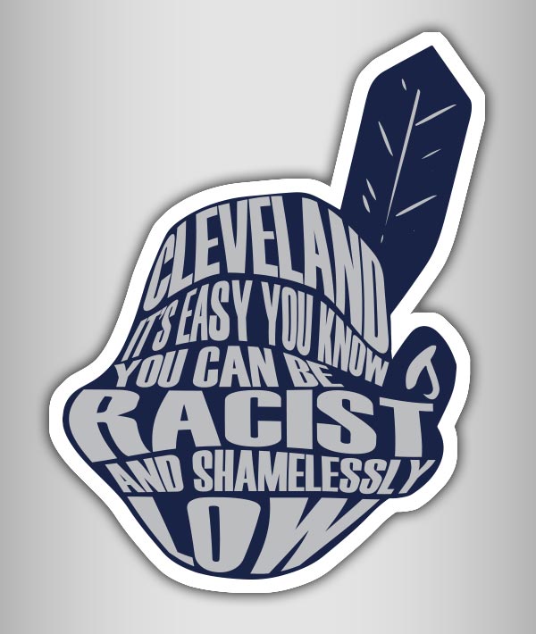
Source: Behance/Kade
Bonus Mention: Stephen Tompkins for Wahoo Variation
Staying on the theme of racism when it comes to sports logos, Stephen Tompkins came up with his own unique interpretation of how the Red Indians logo should look like. The Lakewood-based graffiti artist reimagines the logo in street art graffiti form, leaving only the outline from the original logo intact while changing everything else about it. It’s a reminder of how some things are so much in bad taste as they exist.
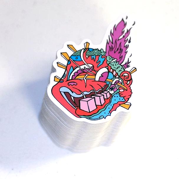
Source: Behance/Stephen Tompkins
Daniel Townsend for Racism – A Motion Graphics project
Daniel Townsend is a graphics artist based in Pooler, GA. This American artist wanted to highlight how racism still continues to exist and fester in all walks of life in America. His short video explaining the extent of racism in modern-day America serves as a wakeup call to policy makers and society alike.

Source: Behance/Daniel Townsend
Dianna Nicholette for Trouble City
It’s not everyday you see a work of fine art that captures the essence of racism quite well. But that is exactly what happens in Dianna Nicholette does here. The Honolulu based designer tries to capture apartheid, racism, war and other disparate elements in her canvas with the artful use of melancholic colors and line work in Trouble City.
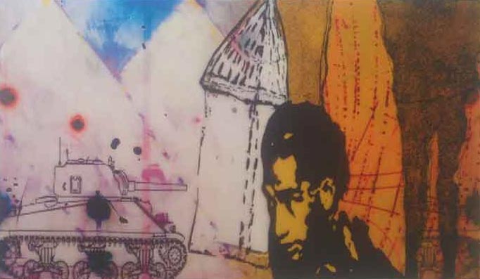
Source: Behance/Diana Nicholette Jeon
Yumna Ali for CAIR Discrimination Poster
For Arabic, Somali, Bosnian and other Islamic minorities residing in St. Louis, Yumna Ali came up with these posters so that they can come visit the Council on American–Islamic Relations (CAIR) community centres to seek help with their problems. The posters proved so popular that CAIR decided to use them countrywide in an effort to raise awareness about Muslim rights in modern day America. In a landscape where racial and religious intolerance is at an all-time high, Yumna’s work has proved instrumental in letting Muslim seek professional help with a renowned religious, cultural and community-building organization.

Source: Behance/Yumna Ali
Eddie Kihm for Hipster Racism
Sometimes the most powerful messages are those that can be derived from history. Eddie Kihm combines Nazi Germany symbolism with modern day white supremacists in his illustration, making for a potent commentary on how racism still exists in contemporary America and how people might take it as a ‘cool’ thing. One needs not look too deeply in his illustration titled ‘Hipster Racism’ to grasp the central idea of his piece.
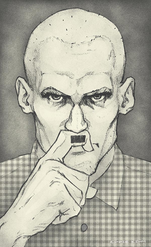
Source: Behance/Eddie Kihm
Courtney Vitale for End Discrimination Poster
Immigration reform has become a hot-button political issue, with some of the most xenophobic politicians vowing to keep people out of America since ‘they are stealing our jobs.’ Not to be outdone by the racism-laced messaging on part of public representatives, Courtney Vitale wants to set the record straight through her typographic creations. The Philadelphia-based designer wants to put an end to prejudice against other cultures in her own way, culminating in a project ‘End Discrimination.’
Ryan Dix for Perspective
Nothing makes a visceral and profound impact in the American public consciousness like street art. Ryan Dix had exactly the same idea with his racially-motivated creation titled Perspective, a fine arts project. This project took inspiration from retro-looking American advertising design in the 70s. If one looks closer at his creation, a mental image begins to form inside the viewer’s head about how far America has come along when it comes to racial, gender and other pertinent social issues of the day.
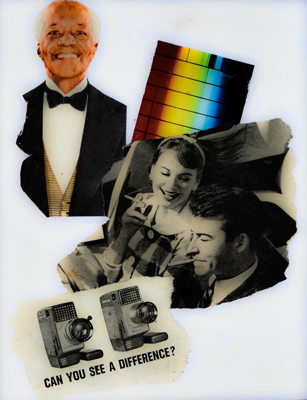
Source: Behance/Ryan Dix
Nate James for The Rising Sun
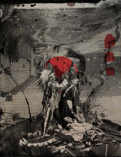
Digital art can be rich in symbolism if the artist behind it has an excellent grasp about a multitude of historical and social issues. Nate James from Toledo, Ohio, weaves and evokes a particularly powerful imagery about how America came into being. Using themes of usurpation and discrimination against the indigenous Red Indian tribe, this piece makes no bones about history. Though Nate’s piece was meant as a tribute to the victims of the Japanese tsunami, the depiction of Red Indians vs. the original colonists in America is sure to stir up debate about why nations need to remember the genesis of their creation.
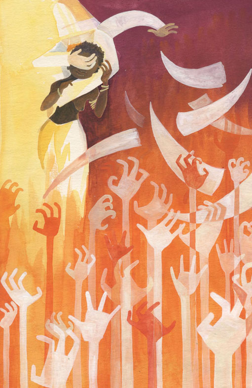
Maggie Wauklyn for The Heart of Darkness
Joseph Conrad’s ‘The Heart of Darkness ‘ remains a literary masterpiece to this day, mostly due to its depiction of the vileness of human nature. Portland-based Maggie wanted to translate and portray this complex emotion visually to a new generation of fans who might not be familiar with Conrad’s work. The end result? An artistic ode to a literary classic that captures the central idea of the book concerning man’s inhumanity to man.
Source: Behance/Maggie Wauklyn
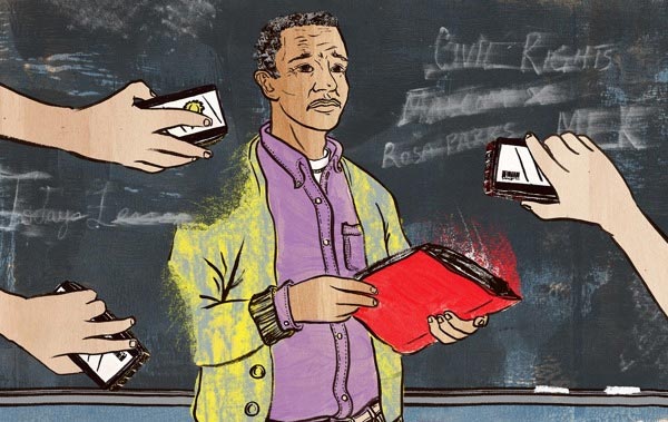
Daniel Fishel for Teaching Racial Inequality
Daniel FIshel wanted to do an illustration that could accurately capture the following idea – How do you, as a African-American teacher of history, teach in the racially intolerant region of South? Daniel’s task was one of immense responsibility, especially keeping in mind the social and racial implications of an illustration that would be published in the Teaching Tolerance Magazine nationwide. Suffice to say, the end result more than captured the fears, the unknown, the huge responsibility that African-American teachers would face in their classrooms down south.
Source: Behance/Daniel FIshel
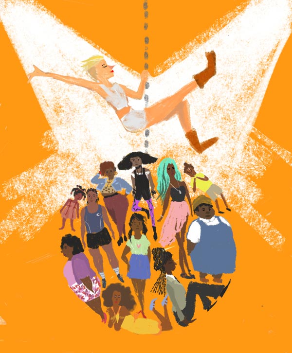
Sarula Bao for Wrecking Ball
Sometimes pop culture has the audacity to throw up uncomfortable imagery at the unsuspecting public. Miley Cyrus’ Wrecking Ball music video is one such example due to its use of black female body. Sarula Bao wanted to highlight this issue, and she turned to art to make her point known. The Wrecking Ball illustration by Ms. Bao succeeds in portraying the racist undertones present in the music video, the underlying message being that Hollywood needs to be more sensitive to the plight of its racially-diverse polity.
Source: Behance/Sarula Bao
Design – A Harbinger of Change?
Design can be an effective catalyst for change and positive change at that. America is going through a lot of changes recently and designers will always throw an interesting light on how social, political, religious issues continue to affect ordinary Americans day in and out. Human creativity, after all, knows no limits and graphic design is a way to reflect that. Fourth of July has also proven to be a designer’s mecca amongst many other events and occasions. Can design change the world for the better? You decide.

