A few years back, as I was wasting my time on Facebook, I came across a video. It was a girl going around the streets of NYC asking people riddles. One of the riddles was, “a father and his little boy are in a car crash that kills the dad; the son is rushed to the surgery. The surgeon takes one look at the boy and exclaims, “I can’t operate on him! He’s my son.” Now explain the surgeon’s relationship with the boy.
My immediate answer was, “Duh, the surgeon is the boy’s other gay father.” But I knew the answer was wrong – it was too obvious. After getting similarly wrong responses from people in the street, the girl in the video laughingly says, “The surgeon is the boy’s mother.”
I was ashamed. And stunned. The unconscious gender-bias goes deep. As a feminist, it told me that I have a lot more to learn to be a true ally.
Researching for this post, I went through similar feelings and as you’ll start reading, you will come across at least a couple of entries where you had no idea who had birthed this particular piece of popular graphic design.
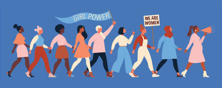
So, in celebration of International Women’s Day on March 8th, let’s talk about 5 of the most talented, and trailblazing female artists who are doing graphic design proud for years!
1. The Nike Swoosh: Carolyn Davidson
Nike is a Greek word. It is the name of the Greek goddess of victory. When Carolyn Davidson – a design student at the University of Portland – was hired by her professor to design an original logo for a sports-shoe company that he was co-founding, Nike emerged as Carolyn’s inspiration.
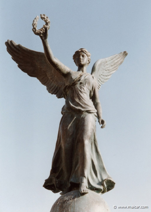
Image Source: Maicar
It took her nearly 18 hours to create the stylized tick-mark, popularly known as the Nike Swoosh today. Her professor, Phil Knight, was not really impressed with the design. But after initial misgivings, he, along with his business partner, Bill Bowerman, the university coach, decide to go for it and register it as their company’s brand identity. They also adopted the new brand name.
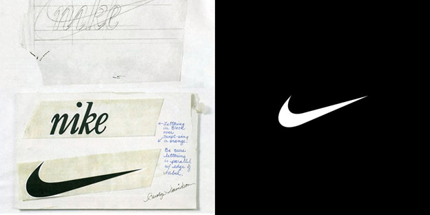
Image Source: Milanote
Carolyn was paid $35 (about $226 today).
The design was an immediate hit. It gave the brand the perfect direction to establish itself as a champion in sportswear. In a few short years, Nike was a force to be reckoned with in the industry. It emerged as the company that was on-par with times, its ad-campaigns always on-point, and its reputation as a champion infallible.
Carolyn Davidson stayed with Nike till 1975. Recognizing her contribution, she was given the certificate of ownership of the logo, 500 shares of the company, and a diamond ring made of gold that was engraved with the Swoosh.
So, the next time you see this iconic symbol or hear the words ‘Just do it’, think of Carolyn Davidson and bow down in recognition of her talents.
2. Posters For NYC’s Public Theater: Paula Scher
What’s with theater posters and woody, blocky, all-caps letters? They look less like typography and more like street graffiti. Well, we’ve got Paula Scher to thank for these dazzling and unapologetically commercial displays of cultural institutions.
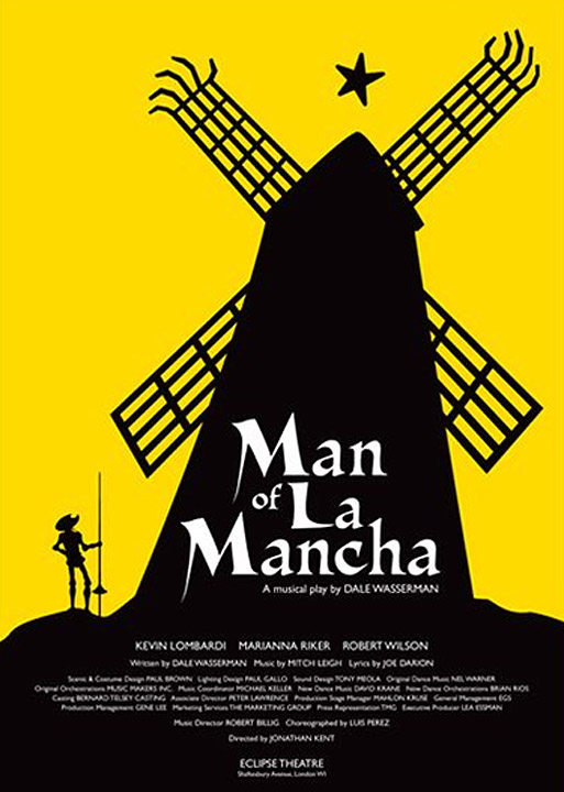
Image Source: Pinterest
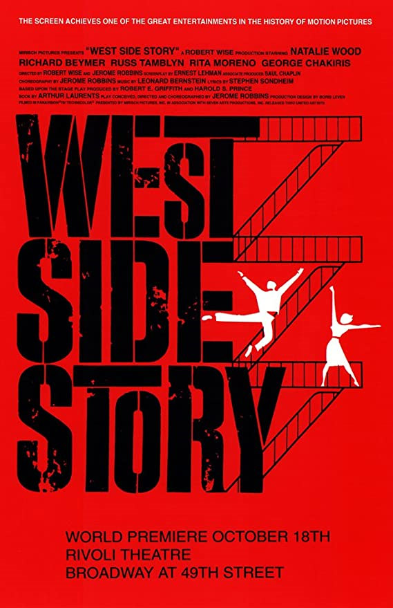
Image Source: Amazon
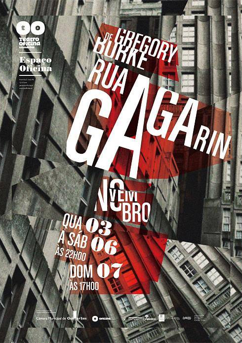
Image Source: Neat Designs
In the mid-90s, NYC’s The Public Theater approached the famous design agency, Pentagram, and commissioned them to create new theater posters for the production ‘Bring in ‘Da Noise, Bring in ‘Da Funk’, in a bid to revive people’s interest in the institution.
The agency’s senior partner, Paula Scher, the formidable goddess of blazing typography, took the lead and started creating designs that captured the spirit of the play through the strokes of the letters. When she was done, a whole movement was born. The posters were such a huge success, such a drastic shift from the tradition that they birthed a whole new era of graphic cultural identities.
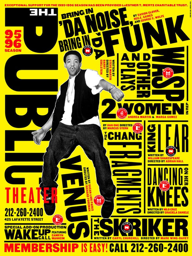
Image Source: Pentagram
So, if you’ve grown up watching alive, dynamic, and pulsating posters for theater productions, you’ve got Paula Scher to thank for it.
3. The Lettered Airport Terminals: Jane Davis Doggett
If you’ve ever been to an airport and noticed how the signage all over the place has a single font, and taken it for granted, don’t. It wasn’t the norm till Jane Davis Doggett arrived on the scene and made it so. She invented a new typeface, Alphabet A, which was highly readable across long distances, and advocated for the use of a single font throughout the airport signage to help way-finding better.
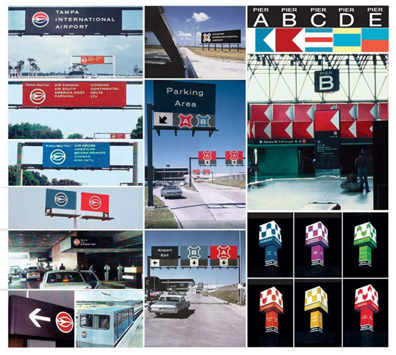
Image Source: Jane Davis Doggett
She also came up with the idea to name airport terminals in the English alphabet (A, B, C…) for easy approach and access. Her first airport project was the Memphis airport in 1969, but in a career spanning many decades, she has created way-finding systems for 40 major airports, the Philadelphia Subway System, Madison Square Garden, and so many more.
According to experts, each year 20 million airplane passengers find their way around the airports, all thanks to Jane Davis Doggett’s innovative way-finding systems.
4. Hilary Clinton’s Presidential Campaign: Mina Markham
Another great designer whose work was accessed and consumed by millions of Americans and others around the globe during Hillary Clinton’s presidential campaign is Mina Markham.
She’s a front-end architect who was responsible for creating the UI system, Pantsuit Library, upon which the whole digital presence of Hilary Clinton was built. The pattern library worked as the single, unifying container that supported multiple micro-sites for various causes that Hilary Clinton was campaigning for. The work was fast-paced, needed to be open and dynamic, and had non-negotiable deadlines.
What’s more, the design was according to the WCAG 2.2 AA guidelines and everything from content to graphics and from navigation to forms was accurately accessible.
So, if you were one of the millions who voted for Hilary back in 2016 and went to her website to participate in the campaign, it was Markham providing you a digitally finesse and responsive experience.
5. Google Maps: Rachel Inman
Have you checked out the new Google Earth? The look is refreshing, real, and extremely stirring.

Image Source: 9to5 Google
It was also created by a female designer, Rachel Inman, a lead designer at Google. There, she heads the Google Maps team and has worked on countless important updates.
But the reason we are going to talk about her in this list is her groundbreaking work on the latest Google Earth update. Through this new update, you can now view global landmarks, from all over the world, in real-time, in 3D.
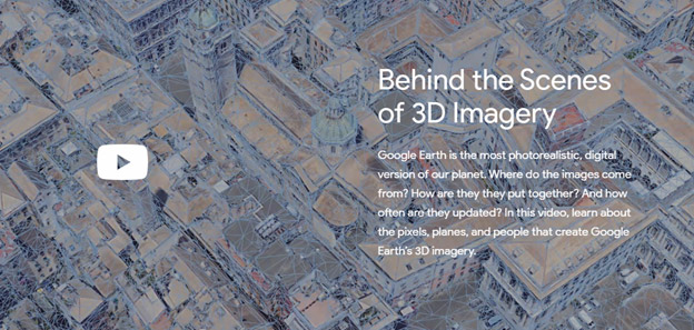
The 3D imagery allows you to see the locations as if you are present there. You can then decide to explore the areas and checkout the streets by switching to the Street View. The experience is exhilarating.
The Voyager feature is a gallery of curated stories maintained by prolific storytellers such as BBC and NASA where you can explore the world, virtually travel to areas you’ve never been to before, and even create and share postcards from all your virtual travels.
So, go on now. Give yourself a treat and launch Google Earth. Thank Rachel Inman and us later.
It’s Your Turn
We know the list is far from over. We still haven’t talked about Es Devlin, Zuzana Licko, Astrid Stavro, Marianne Brandt and so many more. But through this post, we have tried to divert your attention to popular and specific pieces of art and design that have been birthed by females, and are routinely used by consumers, with no idea of who the original creator is.
So, use our comment section as a tribute platform and tell us of your favorite graphic design works produced by a badass female designer.
Keep it rolling, people.

