Keeping up with holiday colors is not that hard of a job, frankly. The palette has been the same since the dawn of time (or so it seems). A lot of red and green, chunks of white, sprinkles of gold, and an occasional blue.
No, keeping up with holiday colors is not the task. What tests a brand’s creative mettle is how to use this same palette again and again without boring your audience to sleep.
Many brands turn towards extreme shades of these colors to keep their brands fresh, but also connected to the spirit of the cheer. Some opt for minimalistic, winter themes; while we also have those that shun the whole thing altogether and go for something more dramatic and powerful.
But first…
Red and Green: Why are they dominant colors for Holiday Season
It has a lot to do with the holly plant, and a bit with Coca-Cola.
See, ancient Celtic people celebrated the winter solstice by decorating their homes with red and green holly plants. The plant as well as its colors were considered omens for beauty, bounty, luck, and protection.
During the 14th century, when the Christian faith was going through major developments, holly and its colors started to become associated with christian church. Partitions that separated the priest from the congregation were painted in red and green. Later, in the Victorian era, the colors became a symbol for the change of seasons and the turn of a new year following the Christmas holiday.
In the most recent history, the red and green palette became a solidified symbol for the birth of Jesus, thanks to everybody’s favorite soda company, Coca-Cola.
At this point, the associations become less religious/spiritual, and more corporate.
In 1931, the company hired an artist to draw a Santa Claus ad for the brand. Important to note, before this time, Santa Claus came in all shapes and sizes — thin, elf-like, with robes of all colors such as blue, green, and more.
But this artist, Haddon Sundbloom, drew a fat, jolly Santa, with Coke-red robes. The ad was a success, the new Santa was well-received, and over the decades, that picture of Santa with a fir-green background became our archetype.
And now, in 2022, these two colors are such a strong part of our Christmas holiday understanding that we’re ready to throw a collective fit if a company dares celebrate the holiday without these colors. Something that’s happened to Starbucks in the not too-distant past.
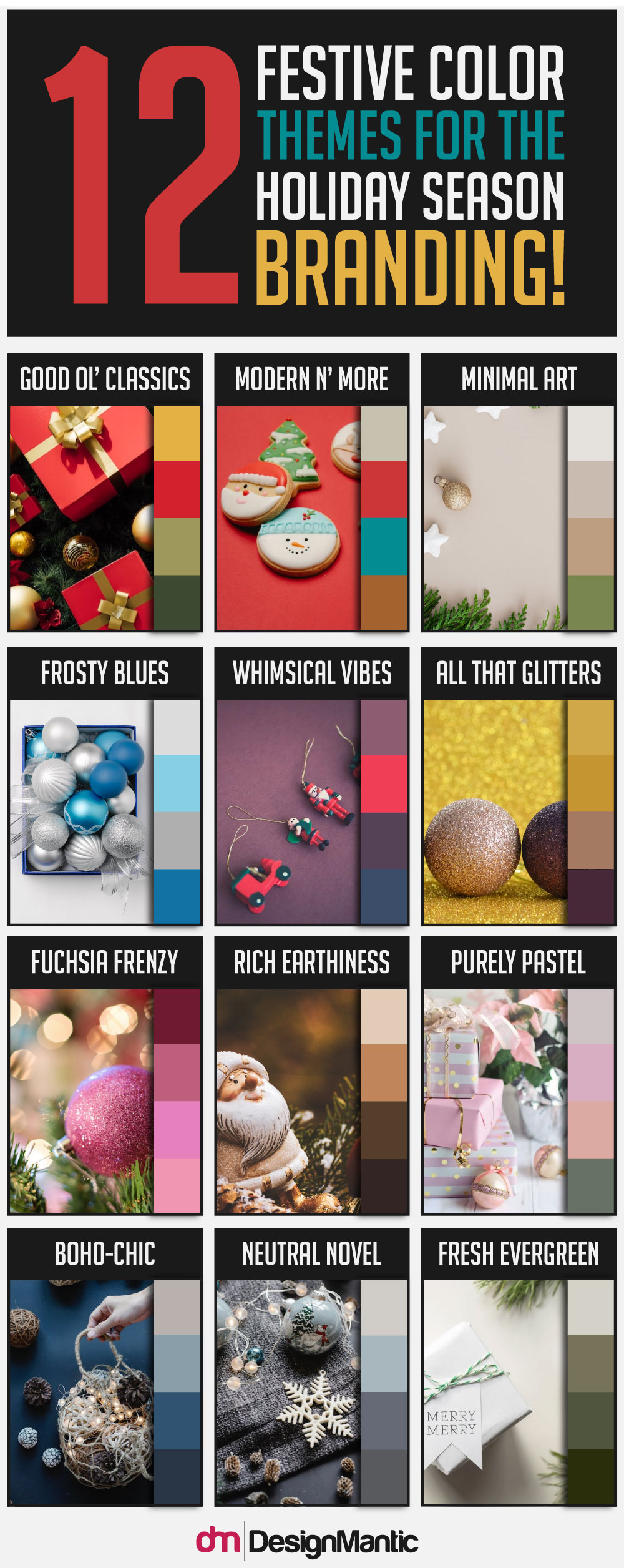
Here are 5 holiday branding themes that brands usually choose from and that never go out of style.
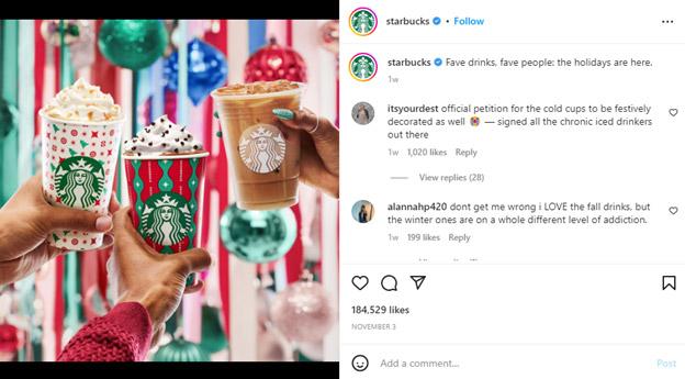
● Traditional Color Combo by Starbucks
The Starbucks red cups have become a Christmas staple. Every year since 1997, Starbucks has released limited-edition holiday cups that are usually red. They come with all sorts of Christmas-related drawings and graphics and really add to the spirit of the holiday.
The decorated cups have become such a significant Starbucks tradition that the one year the brand made a simple, minimalis red cup, the entire world went into flames. Or so the internet would have you believe.
But seriously, it did create an uproar. Articles were written about it. Social media went insane. And people declared it a war on Christianity. So, really, a regular 4pm on social media.
Here’s the cup that was responsible for it.

With thanks, from Starbucks
Learning its lesson, the brand now releases illustrative red cups every year. Its color palette remains the same to leverage the power of nostalgia, anticipation, and consistency. And the bright, cheerful colors do their job of ringing the holiday season in with great flair and aplomb.
● Rich and Earthy Colors by Whole Foods
Whole Foods keeps its color palette food-centered for the holidays. You’ll see a lot of mustard-yellow, rich browns, hearty greens, and earthy goldens.
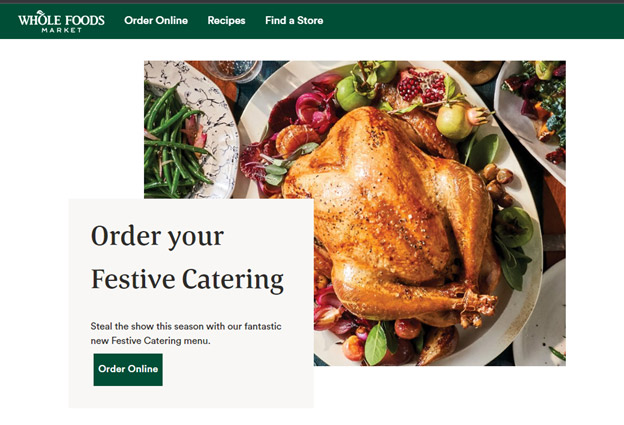
With thanks, from Whole Foods
The colors represent a variety of food. Everything from green vegetables to golden meats. It’s all there to see and the final images are quite appetizing.
Now it isn’t a stretch for a food brand to use food-focused colors in its branding, but this is how it stays a notch above other food brands: it uses deeper hues.
For comparison, look at international food brands such as McDonalds. Sales-wise, the two may not compete neck-to-neck but in branding, Whole Foods is doing a much better job convincing the audience how authentic its food is. While the reality of McDonald’s food also works against it, talking about branding alone, the color they are using for their food imagery looks too shiny to be real.

With thanks, from McDonald’s
If it doesn’t look bland, it looks artificial.
But with Whole Foods, colors make the pictures come alive. Food looks delicious and you can almost taste the meal in the photos.
If you’re new in the branding business, let this be a lesson. When working with food brands, insist on using high-saturation with food imagery to make it look real and more appealing.
● Dramatic Color Palettes by Victoria Beckham
Even Posh Spice goes with a festive red when it’s time for Christmas.
Victoria Beckham, the pop fashion icon of the 90s, is known for her ultra chic, ultra minimalist style. Under her luxury fashion brand, VB, she now creates clothes that represent her personal style. Clean lines, solitary colors with deep saturation, and unpretentious sophistication.
Yet, to celebrate holidays, the brand often embraces brighter hues. This year, they have chosen to release its winter specials on Instagram with a shiny red background and a deep maroon ribbon.
The effect is quite celebratory, and in this post, with a fuschia pink gown, the contrasting colors give a dramatic flair to the brand’s holiday celebrations.
● Stark Color Contrasts by H&M
Speaking of delicious contrasts, how cool is H&M with this gorgeous post.
The colors are nowhere near the typical shades that we see on holiday posts but this shows you that branding does not always have to be so literal and obvious. Keeping things hidden always leaves people wanting more. And subtle hints are so much better at it than glaring details.
Using these dynamic colors in its holiday posts, the brand also taps into a demographic that most others always ignore around the holidays: people who have to attend corporate events and can’t show up in flashy reds.
Seeing these contrasting shades kind of cleanses your palate too, breaks the noise, when all of your feed is swarming with varying shades of christmas green.
● Sugary Shine Colors by Too Faced
Now, will holidays be really holidays if you don’t have a bit of sweet to celebrate it with?
If the holiday color palette for Too Faced is anything to go buy, you need a lot of saccharine to properly celebrate christmas.
Now, to be fair, Too Faced is known for its OTT shiny packaging and these sugary colors. But for holidays, the glam has been upped.
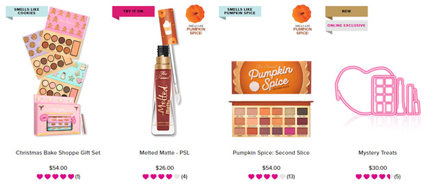
With thanks, from Too Faced
The shades are brighter, colors more frank, and even some holiday flavors have been attributed to the gift sets, too.
If you are looking for perky holiday gift ideas, Too Faced may have you sorted.
Learn more about holiday colors
Tweaking your color scheme a bit for the holiday helps you set the tone for seasonal branding. With colors being such loaded elements of design, you want to make sure you get them right.
Fortunately, DesignMantic is a rich source of color-centered content. But keeping it strictly limited to holiday branding, here are two articles that we strongly recommend:
Check them out and get familiar with what it takes to color your brand right for the seasonal celebrations!

