Words may be powerful, but have you ever listened to silences? No sound is more telling than a silence revealing what you’re not saying.
It’s the same thing with spaces.
Spaces in design are the pregnant silences amid a crescendo of colors, shapes, and fonts. An expert designer uses these spaces to tell the brand story with more wit and meaning.
Working with white space in logo design is nothing new. It’s been done since always. Designers use white spaces to balance other elements in the area, keep the design clean, and achieve a modern, polished look for their brands.
Yet, in recent years, with more and more designers discovering the potential of negative space, do we see the tide turning. Negative space is now used more as the hero element than a background character. It is being used to leave clues in plain sight, entice the audience, and keep everyone engaged with the design longer. If you’re lucky, you even get a chuckle or two out of people when they finally see what you’ve hidden in the logo. How come I never saw that before? It’s right there! Can’t ever unsee it now.
Kind of like when I first saw that arrow in the FedEx logo.
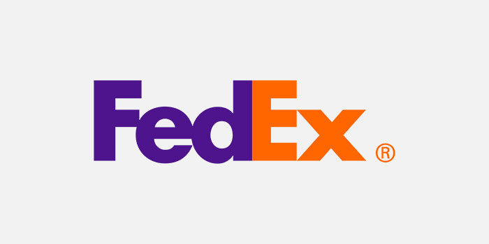
It’s literally right there, and not just for the kicks. It refers to the company’s forward movement and hints at its core offer of transporting goods.
To create these lasting impacts, negative space proves more and more effective every day. Here are 21 examples of creative designers using white space to make their logo designs more thrilling and eloquent.
Related: Music And Entertainment Logo Ideas
1. A Plane Made Of Clouds
The plane makes the perfect use of the space available and is formed to separate the two slabs of N most naturally.

Image Source: Behance
2. Reflective Letters Create The Medical Sign
Mirrored or reflective letters always come bearing gifts. Instead of just stacking them up on each other, see if you can stack them in a way that uses their gifts most prudently.

Image Source: Behance
3. There’s A Home In There Somewhere
This is a housing society logo and uses a home symbol right under the brand initial P, giving off the effect of being safe, under protection, and secure.
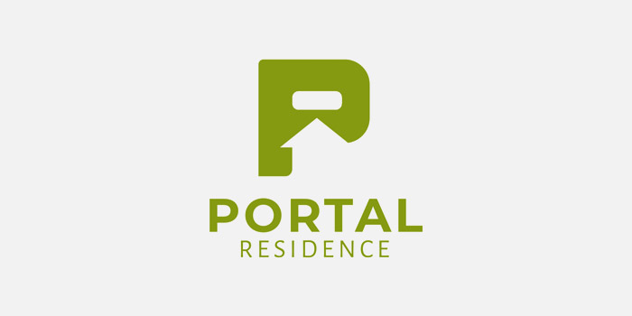
Image Source: Behance
4. A Drop Of Life
I like how interestingly the designer has let the blood drop symbol remain in white while the majority of the design is red. Giving the drop of blood all the negative space makes it stand out more and easy to see.
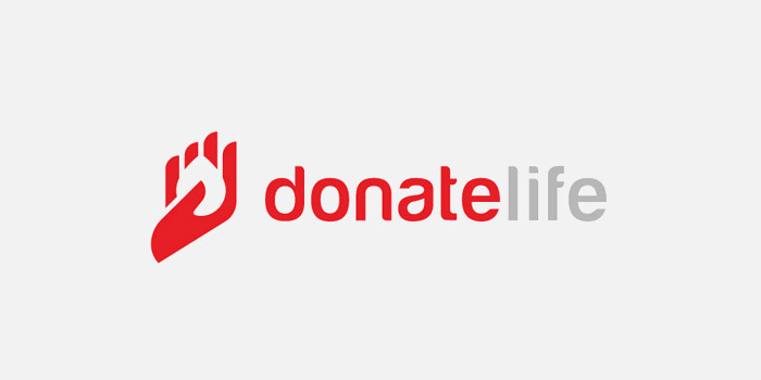
Image Source: Behance
5. The Way Beyond The Space
Here, the arches of the letter M don’t exactly meet, allowing you to create a door out of the available space.
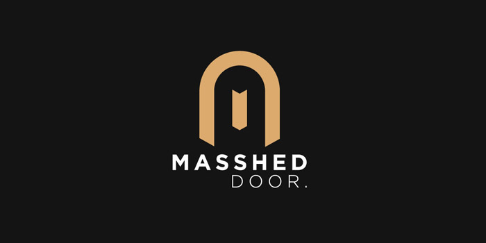
Image Source: Behance
6. Can You Spot The Gator?
Negative space logos often use shapes and letters to draw each other out. Instead of cramming your logo full of necessary symbols, let the negative space do its magic seems so much better.
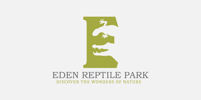
Image Source: Behance
7. A Dogged Space
Though this isn’t the greatest logo on this list — too many different fonts — the canine between N and Z saves this logo.
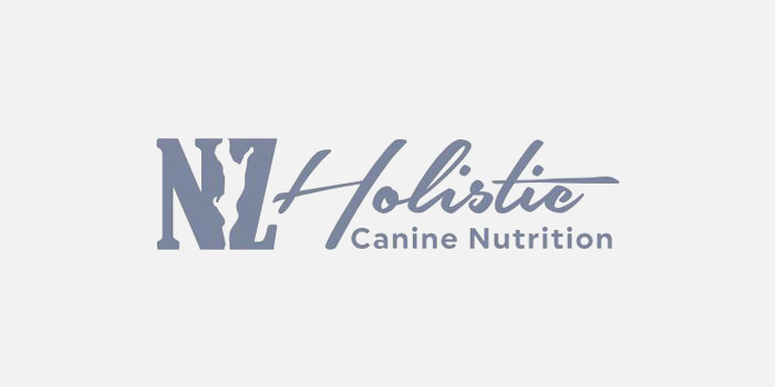
Image Source: Behance
8. A Striped Space
Using the space between letters to create symbols and shapes out of smoke is all good, but look at this logo: it’s a striped space. Did the stripes come first or the space? Who knows. Its glorious.
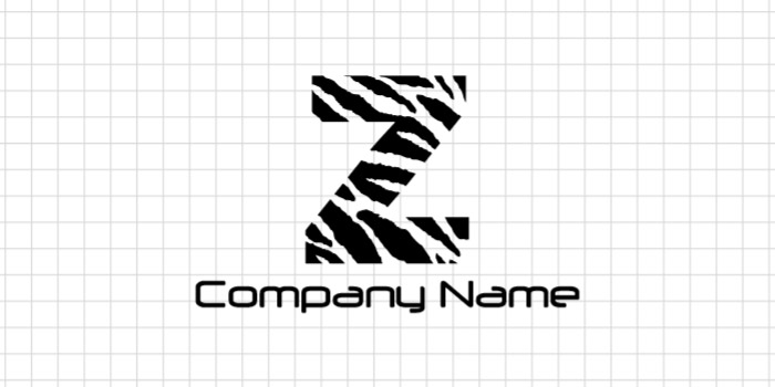
Image Source: DesignMantic
9. Claim The Space
When users are creating a barber logo, the focus often shifts to elaborate artworks that contain the profile of a face or hair style sketches. If your barber logo is mostly going to be typographic, the logo below is a great example to use just a tiny hint of symbolism to make the design more interesting.
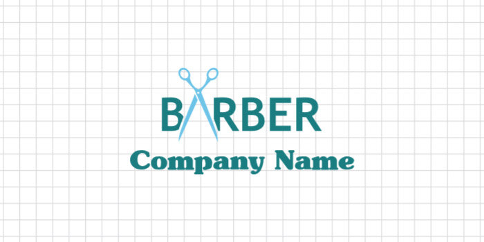
Image Source: DesignMantic
10. Faces Where There Are None
Human beings are psychologically wired to see faces in inanimate objects. We see faces in car headlights, in power sockets, sliced vegetables, and more. This tendency even has a name: pareidolia.
Designers often use this evolutionary trick to make their graphics have humanistic qualities. In this law firm logo, you can see a bull’s face jutting out from the white space. The face, and the animal it represents, symbolizes power, strength, confidence, and determination.
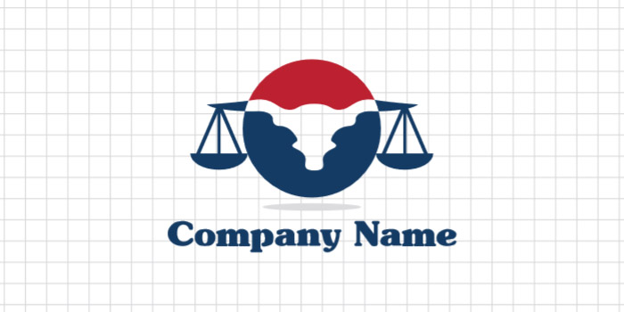
Image Source: DesignMantic
11. Mirrored Symbols
Do you see an S in there? Nestled between the arrows, the white space makes room for the letter S in a very subtle, sneaky way. When designing, you always have to think about information compartmentalization. Which part should be in the background and where the main character should go? When you want audience to spot the brand symbols as the most important part of the brand, it makes sense to kind of hide or tuck away the brand initial, while still keeping it a part of the overall design identity.
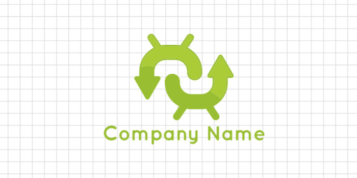
Image Source: DesignMantic
12. Add High Color Contrast
Bold color contrasts that are too powerful to miss are a staple of negative space logos. They allow these logos and their details to seem more profound and meaningful. Since you’ll usually work with a limited color palette on your negative space logos, try to use colors that offer rich contrast. Black and white, black and gold, and green and yellow could be your starting points.
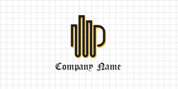
Image Source: DesignMantic
13. Perfect For A Lyricist Or Songwriter Logo
A white space logo isn’t used for aesthetics only. It’s your chance to add important details about your brand in your logo design, without stuffing the ‘main’ logo with too many images. Here, the music notes juts out of the nib of the pen, and makes your music logo more layered and meaningful.
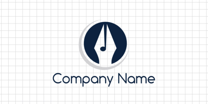
Image Source: DesignMantic
14. Your Brain Fills In The Gaps
Perhaps the main reason why negative space logos work at all is because of something called Gestalt Principles of Perception. These rules highlight the ways our brains perceive visual information. One of these principles — closure — refers to our brain’s tendency to ‘finish’ sentences and ‘close’ gaps.
When it perceives the following eye glasses logo, that are nearly finished but not exactly, it ‘completes’ the drawing by applying the last few strokes itself. It’s why the following image looks recognizable to us, and why we are able to see things in the white space to begin with.
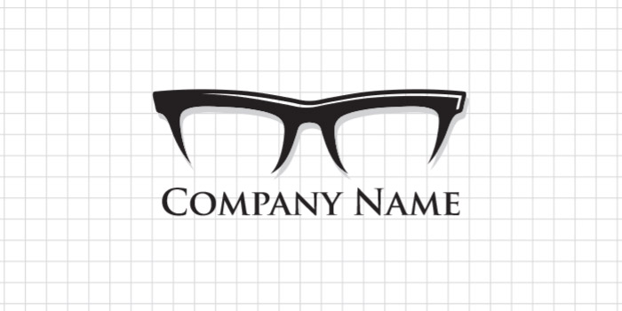
Image Source: DesignMantic
15. A Shielded Home
Clients from the real estate or construction industries need a potent dose of trustworthiness and reliability oozing from their logo designs. These occupations directly relate to people’s ability to build or buy homes where they can live with their families in safe and happy environments.
As you can see in the housing logo design below, the S is heavy and thick. It surrounds the house image that’s emerging from the purple negative space below and communicates protection and safety.

Image Source: Dribbble
16. Lens Form The C
Contrast is a part of this logo in more ways than one. First, the most visible, we have the color contrast of light and dark. We then move to the all-caps and all-small cases in the two fonts, and lastly, how the opening of the letter C is closed off by a similarly-shaped albeit a much thicker lens symbol.
Sure, there is a space for subtlety in design, but when you plan to go big, go gutsy.

Image Source: Dribbble
17. The Rise Of The Gradients
Color gradients have been a logo design trend for some years now. They add the much needed drama that was missing from the flat designs of the early noughties. The letter T that you see in this design comes as much from the gradients as it does from the negative space.

Image Source: Dribbble
18. The Illusion Of The Central Column
Design real estate is precious and negative space allows you to make the most of it. Even when you don’t use it consciously, things can emerge out of nothing, and then it’s your duty to tweak them a bit here and there and form an exciting illusion.
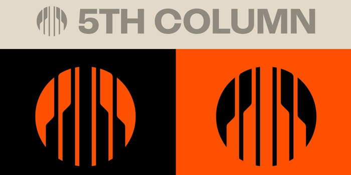
Image Source: Dribbble
19. Making The Muted Colors Work
Normally, logo designs that use white space creatively work with a color palette that is rich and bright. You don’t want the entire design to mishmash into each other and details be lost, do you? Bright and bold colors prevent that from happening.
But the Mushroom Basket logo does a pretty decent job with its subdued color palette too. Though, I think the brown could look much more delicious with a bit of more saturation, but hey, if it works for the audience and brand, I’m not judging.
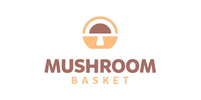
Image Source: Dribbble
20. Arrow Points The Way
Arrows are one of the most popular logo symbols that people choose to sneak into their negative spaces. As arrows are highly communicative signages, they work great for a variety of markets, such as transport logos, airline logos, car brand logos, tech logos, and more.
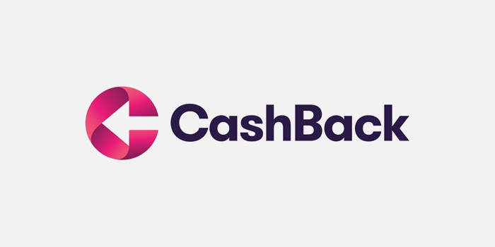
Image Source: Dribbble
Wrapping Up
Logo designs are weighty brand assets. When communicating critical brand information, they can’t leave important details out. But adding too much in a logo can overwhelm the design as well as the user. To keep things balanced, negative space is employed in the work. It sets everything in context, helps balance the design, and works as an unassuming canvas.
Sometimes, however, designers use the surrounding white space to leave in-jokes, subtle clues, and sneaky details. They use the negative space to prioritize the brand information. The important bits surge forward while second-tier information remains tucked in the space. Bold designers flip the script on its head, occasionally. The white space contains the meaty part of the design, the punchline, while everything in the foreground works to support it.
Whichever of these ways you think best for your brand, remember that white space should not be used solely for the sake of it. It’s a disservice to its potential and even lets your brand appear less substantial than you’d like.

