As soon as we begin to feel wisps of Christmas in the air, brands and organizations also commence their special festive season promotional campaigns. There are some brands that have earned the fame to run their particular yearly festive campaigns. Starbucks’ Red Cup campaign is also one of those campaigns that the brand has been running since last eighteen years and every year, coffee lovers and Starbucks fans wait for the festive season to come and taste their festive range of beverages in red cups.
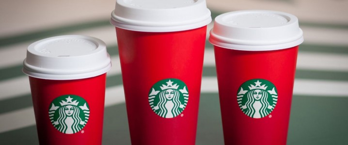
Like every year, Starbucks launched its festive campaign this year too, but the campaign stumbled and created quite a buzz on social media. Each year, Starbucks brings a uniquely designed red holiday cups. From a winking snowman to hand-drawn reindeer, the design of the red cup always signifies holiday and festive season. This year, instead of placing any symbol, the coffee company opted for a rather simplistic design and did not imprint any symbol on it.
Shocked by the lack of an overt holiday season iconography, some Christians expressed their rage on social media and claimed that the company intentionally chose not to put any icons because the organization is against Christianity. The series of tweets and comments soon turned into a furore.
Indeed branding is important in this decade and each and every promotional stunt to spread the name about your brand should be crafted carefully. In this edition of Creative Branding, we are evaluating how sensible this campaign was from the creative branding perspectives. To shed light on this topic, we are including two professionals in our panel to present their point of views.
Today our 2 panelists will be taking a look at Starbucks’s recent Red Cup debacle and how it has stirred conversation on social media. The holiday themed cup that was supposed to show passion and celebration for the forthcoming Christmas and New Year has turned into a controversy that is apparently going nowhere.
- John Brownlee, a design enthusiast and a journalist
- Paulina Vargas, editor of Web Design Ledger and digital marketer

John Brownlee regard this new cup of Starbucks as simple and clean design. He is of the opinion that:
“I love the latest red holiday cups by Starbucks. I love these cups because in my opinion the design of this cup makes a statement. No doubt that these are Christmas cup, but Christmas doesn’t mean buntings and baubles. The design for the Christmas can be a little classy, simplistic and unpresumptuous that can serve as an analog to the chaos of the season. Throughout the Christmas season, we get to see a wide variety of glitzy, lurid and flashy designs that remain ubiquitous. The new festival cups by Starbucks strongly suggest everything festive without being too loud. This design declares the commencement of the festive season in the most simplistic and straightforward way. In the pool of brands, where every brand is trying to catch consumers’ attention with similar designs, these red cups reflect unique and different design. With the 2015 red holiday cups, Starbucks recognized there are subtler ways to celebrate Christmas than spreading spangles all over everything.”

Similar to John Brownlee, Paulina Vargas also thinks that the latest campaign by Starbucks is a perfect epitome of simplistic design and signals that the trend of simple and clean design is going to stay for the time to come. She asserted that:

“Starbucks’ new red holiday cups stirred a lot of controversy. The debate and rage became so fierce that a campaign with hashtag #ItsJustACup has been started. From the design perspective, it can be said that this is one of the largest protests that I have seen against minimal and simple design. With the passage of time, we have seen a continuation of the adaptation of flat design dating back to Starbucks’ logo redesign. This progression toward minimalism makes more sense when considering this latest holiday red cups design. Flat and simple design have been huge over the past few years and this latest designs of red cups also suggests that the trend of flat and simple design is going to be continued for quite some time.”
The Trend of Simplistic Design
#RedCups What if I said you can choose NOT to be offended? #ItsJustACup #ItsNotPersecution pic.twitter.com/two2J96BNG
— Right2Liberty (@Right2Liberty) November 9, 2015
I can’t believe people are upset about the plainness of the @Starbucks #RedCups. What are we going to be offended by next? #itsjustacup #smh
— Jeff Kingman (@JeffKingman) November 8, 2015
SERIOUSLY.. people are offended because @Starbucks chose a plain red cup for the holidays? It’s cute and festive! #itsjustacup
— Christine Matli (@ChristineMatli) November 8, 2015
Seriously?Minimalism and ombré are very popular and a company like @Starbucks thrives on pop culture people need to calm down #itsjustacup
— Kristin Leeson (@KristinLeeson) November 8, 2015
I fixed the controversial Starbucks “Christmas” cup. #merrychristmasstarbucks pic.twitter.com/kCOIPyb9mU
— jamilah (@JamilahLemieux) November 9, 2015
Decoding Lessons from Starbucks Holiday Cups Campaign
Opting for a simplistic design and to highlight a festive season only through colors was a bold move by Starbucks. All the controversy and rage that we witnessed in the case of this campaign is due to Christmas being the holy festival. It’s good to stay away from brand bandwagon and try to attempt different and simple design, but designers should also take into consideration sensitivity of the event.