Welcome to another fantastic episode of Creative Branding, where your notions of designs are dissected and put-together to see what ticks and what doesn’t. Your one-stop place for some design insights and hilarity-filled observations from some of the pros working in the industry today.
Previously we took a look at the issue of politics…. we mean the design stylings of two political candidates and their branding, comparing their campaign logos for a peek at the process that went into designing them.
Today we are going to go for something very different. We are going to ask our group of panelists about which brand in their region deserves the design kudos and why.
- João Garzón de Albuquerque, Founder & CEO at Workaboutdesign, always looks for the deeper meaning behind design.
- Henk C. Meerhof, specialist in visual communication and independent designer. He has an eye for design and has been in the business for a decade.
- Eileen Wu, Technical Solutions Consultant, takes a look at things from a matter-of-fact point of view.
- Sean B. Jamshidi, Founder and Creative Director at DesignFacet, deconstructs the co-branding phenomenon with a design, marketing and aesthetical standpoint.
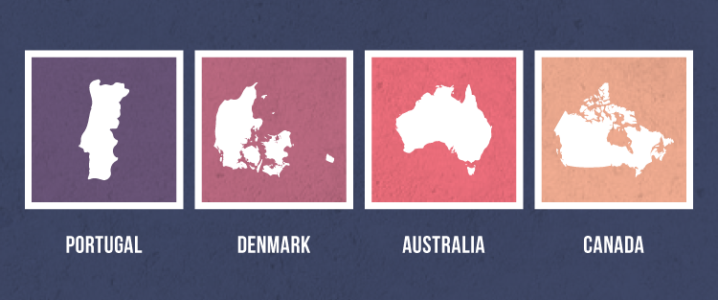
First up we had Mr. Albuquerque nominating Renova as the best brand in his region – Portugal, the country with stunning coastlines. Here’s why he thinks it deserves the top place:
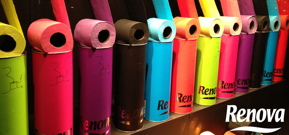
The most creative? Well, “most” is very absolute but this brand certainly caught my attention for a while and also the world by now. I chose them out of utter boldness, not in advertising but where I think the secret always really is, the product. They have reinvented, redesigned, something that we wouldn’t suspect possible to be so, given the time it has been hanging around our fingers, mostly unnoticed. A low profile item unless you run out of it or sometimes scratches your intimacy a little to harshly. Yes the one and only Toilet Paper! The proud brand here is the Portuguese RENOVA.
Suddenly, or not so out of nowhere, they were already a successful and respected soft and gentle supplier of this item. They move to redesign it beyond need and quality into a fashionable stylish product. And… well to short tell a long story, a since-1939 brand with a large range of hygiene paper products, is today the colored toilet paper brand that is read about on Wallpaper design magazine. And yes this completely changed their approach to the market. They are today a new brand, same quality new attitude. Their redesign of a product redesigned them as a brand.
If not yet hanging from your wall, you can find them here.
Renova does justice to vibrant color choices
We asked Henk what is big in Denmark and…. Well… who doesn’t know of LEGO and Maersk? Here’s what he had to say about them both.
For this issue of Creative Branding we were asked about “The Most Creative Brand In Your Region”. As I was swamped with work there was not much time. Evan asked me to choose from to international giants with their roots in Denmark. Maersk and LEGO. I chose for the bricks because I have valuable memories of building my own experiences with this humble building block. To not disappoint Evan too much I can combine the two companies in one building set. Evan, especially for you LEGO set nr 10241.
Marveling at some Maersk Engineering
Denmark, land of fairy tales and imagination.
In this case it is not the great Hans Christian Andersen I am thinking of, but rather Ole Kirk Kristiansen who founded the LEGO Group in 1932. The factory was making stepladders, ironing boards, stools and wooden toys. Already then the motto was ‘the best is not good enough’.
New technology arrived in 1958 in form of plastic molding machines, and the company started experimenting and production of plastic toys. One of them was the Automatic Binding Bricks later to become the most famous brick in the world.
The name ‘LEGO’ is an abbreviation of the two Danish words “leg godt”, meaning “play well”. It’s our name and it’s our ideal.
– From LEGO’s own homepage
In the 1950s Lego already had its own product development team. Doing business with the world meant to be consistent in not only quality of the product but the communication as well.
Looking at the logo, you can see many different forms before the 1950s, in the 50s this developed to a basic design that would last until the 70s when a definite design choice was made. Rounded logotype in white on a red square – red and white being the danish national colors – added with primary Yellow and black outlines to give more contrast and character to the logo.
LEGO define their brand values as:
Creativity – Creativity is the ability to come up with ideas and things that are new, surprising and valuable.
Fun – Fun is both in the process, and in the completion.
Learning – Learning is about opportunities to experiment, improvise and discover – expanding our thinking and doing (hands-on, minds-on), helping us see and appreciate multiple perspectives.
Caring – Caring is about humility – not thinking less of ourselves, but thinking of ourselves less.
Quality – From a reputation for manufacturing excellence to becoming trusted by all.
This can teach all in business something about branding. Like in design in general, also in branding the most difficult thing to do is to keep it simple. LEGO shows how this can be formulated so the whole company can understand the key features of being part of this company.
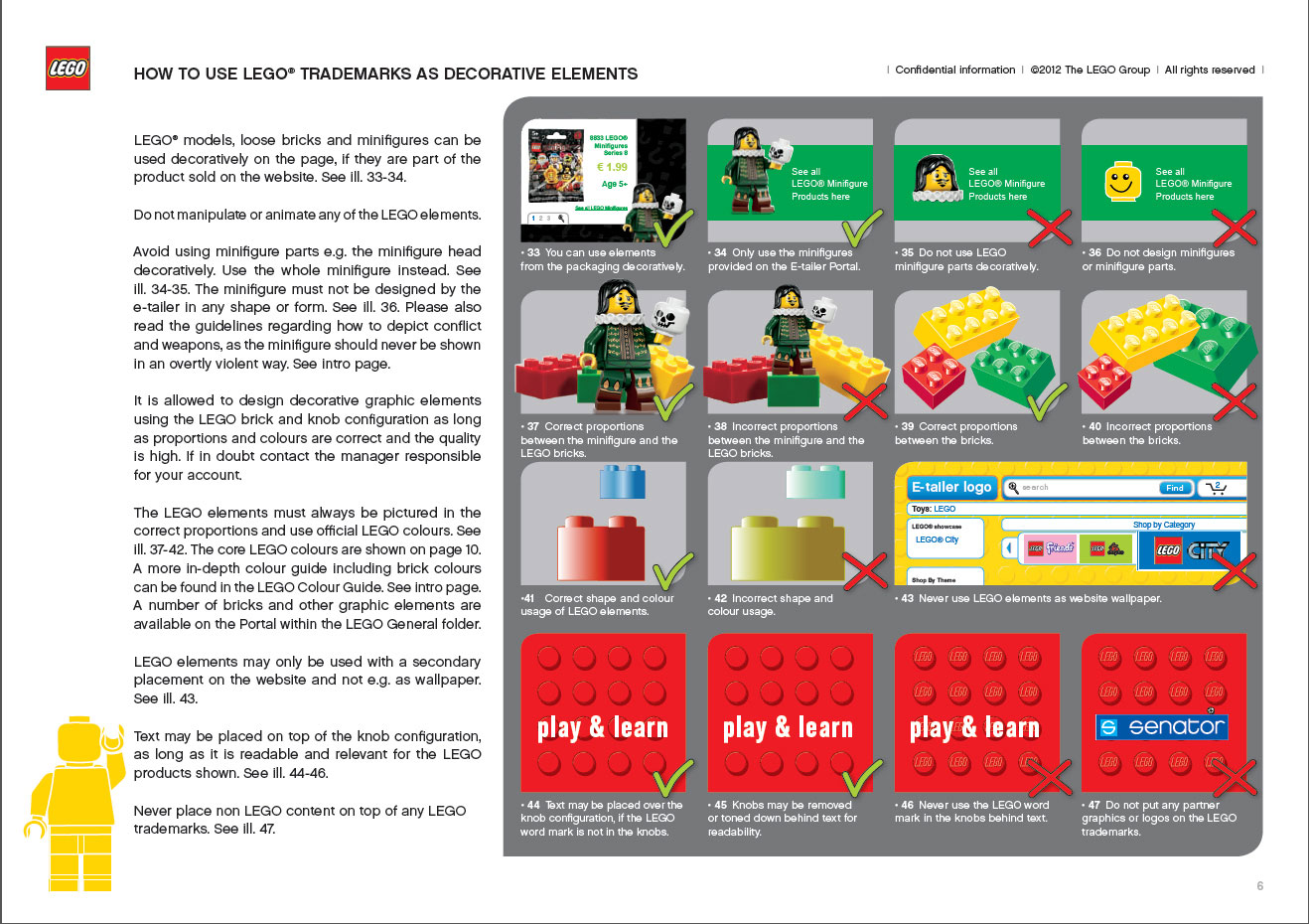
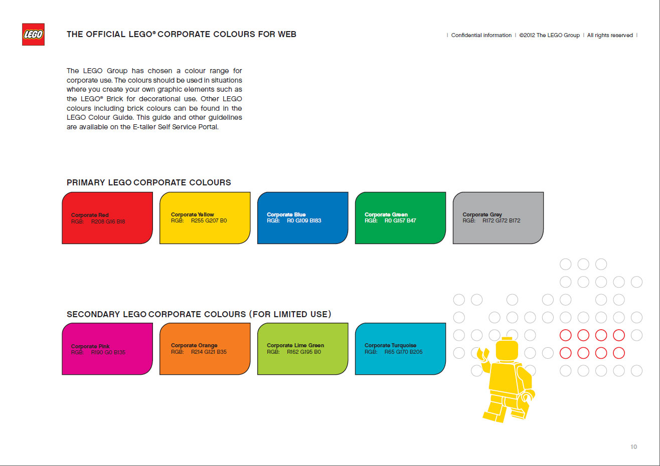
Those values are also visible in the many guidelines regarding the brand. How to make sure the right colors are used and making sure images are showing all details the correct way. As an example to side from The LEGO E-tailer Rulebook for Digital Presence, which is a bit of a mouth full, but the rulebook is pleasant to read and easy to understand because LEGO uses their vast knowledge of making clear (building) instructions.
The Definitely Definite Guide to Lego Bricks and Trademarks
Some good old color theory to rely on
It doesn’t stop here, LEGO doesn’t only create toys. In fact they don’t make any toys at all. They compile a construction kit in such a way that children can build their own toys. In doing so they use all their senses to complete that task. Giving insights about standard life physics and beyond. The building set is never restricted to the one toy that is shown on the package. As the bricks are universal between set, children of all ages can build after their wildest fantasies, and that is not a fairy tale.
At first colors on the bricks where only a few. In the 1960s color bands where added in the typical primary colors of LEGO, funny is that the LEGO-green is absent on the logo. Was this secondary color discriminated? Today the range of colors is vast. Also the range of ‘special’ bricks is huge, enabling more detail in smaller toys. The real LEGO fan will use them all to build what (s)he is dreaming of. In fact LEGO build an entire ‘land’ for them.
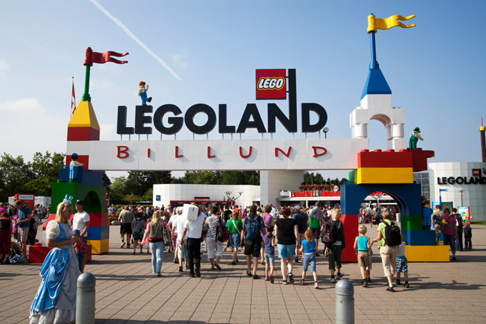
Image Source: iStock/Remus Kotsell
Legoland – Where dreams become reality
In the meantime the LEGO team is busy, connecting all the dots, crossing all the t’s. Their brand may be built on a little plastic brick. This brick, the logo and all forms of communication are thought together. Not only selling building bricks in a bag or a box, whole educational systems are built around this little brick. As the target group is children from all ages, a market that is much whether than for dedicated toys with only one or two functions.
Following the Danish tradition of family life, the children play an important role but also a flat organization. There is not much in hierarchy between parents and their children, the same goes for a typical firm as LEGO. Yes there are managers between the CEO and work floor, but this is only the minimum and international communication is held high, to assure the best possible product, for a sellable price.
This is not where it ends, LEGO is also investing in the future by contributing to charity and research on playful education. An investment that will help future builders and designer to get a grip on the 3D world. Not in a computer program doing all the 3D for you. But by connecting the humble and universal brick, to solutions for tomorrow in for example LEGO MINDSTORMS.
Again a great bit of branding, as you need your mind to work out how to connect the bricks. A system that promote self-esteem by giving the opportunity to self develop.
LEGO has a message for you: Play Well!
Eileen was looking around to replace her old smartphone and that led her to the doorsteps of Optus, one of the biggest telecom brands in Australia. Here are her observations why Optus gets the brand right:
Last year, when I needed a new mobile phone, I did the rounds and visited the stores of all the telcos at my local shopping centre. After comparing plans and a little online research, I settled for Optus.
I have never been a fan of Optus. I worked on the UI design for the ratings and reviews component of Optus’ online store a few of years ago, and still recall how much I disliked their branding. Their website looked dated, they had so many different styles going on, the icons they used seemed inconsistent, etc. Their brick-and-mortar stores were equally awful and their ads were terrible. Luckily for them, they had competitive pricing and the phone I wanted!
So, off I went to my local store to get myself signed up. It was the first time I’d entered their store since the re-branding, and my first impression was that it was a lot brighter than the old one. It wasn’t until all the paperwork was done that I started really noticing the re-brand. My documents were branded a bright and cheerful yellow (bar the boring contract printout). But what I really loved was the bag my phone was handed to me in: a white paper bag with a cute character on it, the character’s arms extending all the way to include the bag handles.
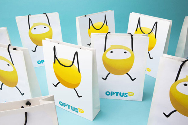
Image Source: graphis.com
Who doesn’t love em some mascot?
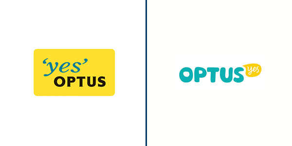
The boring, corporate feel had been completely refreshed with a personable, approachable brand. Their original colours, yellow and teal, remained but seemed to be a slightly different and brighter hue. The italic serif font of their tag line ‘yes’, was replaced with a handwritten font, adding a personal touch. The logotype became the logo; bye bye corporate block caps, hello puffy, balloon text! Lastly, my personal favourite, the introduction of the little yellow character made of a stylised quotation mark. It was a drastic change.
Boring vs. Not Boring
As with all re-brands, they had to come out of the gate strong and get people used to the new branding quickly. Billboards, full page newspaper ads and TV were used to full effect. They followed this up with the ‘Live more yes!’ campaign, which is still in full swing. Whilst Optus might not be the most creative brand in Australia right now, they definitely made a big impression on me, and continue to do so, with the scope and effects of their re-branding efforts. Optus is definitely a poster child for how to do a re-brand the right way.
Residing in Mississauga, Canada, Mr. Jamshidi nominated his city as the brand that has made the biggest impact in his life, offering some interesting insights as to why his home city deserves top billing in the branding game:
Mississauga is the city that I live in and recently it went through some major rebranding.
It is the sixth-largest city in Canada and home to numerous businesses.
The brand project cost the city $170,000 which included research, auditing and testing through focus groups.
The old logo was designed in 1987 and unlike the old logo, the new one does not have a tag line. The reason for this is that the personality and attributes of the city can not be captured in one or two phrases.
The city focus groups indicated that it was time for the old logo to change since it had no ‘brand value’ and since the city has grown since then, it should reflect its modern look.
This noticeable change was introduced just as Mississauga turned 40 years old and it’s long standing excellent Mayor Hazel McCallion completed her 36 years in office.
The new logo although abstract in shape, incorporates an ‘M’ and sharp angles suggest dynamism. The logo/branding materials were designed by graphic designers working at city hall.
Like the newness on the left side or are you ok with the oldie right one?
The logo in my opinion is very similar to other logos that I have seen using the same abstract wire frame style. The price tag is steep but who am I to define a price tag for the value it brings to this city.
Interesting Perspectives on Best Brands. What do you think?
And that’s a wrap on today’s episode of Creative Branding. Do you agree with the panelists and their criteria for adjudging the top brands in their region? It’s interesting when you get a peek into how industry insiders think about design and its role in sculpting a globally-renowned brand. Let us know what you think.

