Hello and welcome to another episode of Creative Branding, where we just cant resist the urge to scrutinize or poke fun at what’s trending in the world of graphic designing. We got the only place where we take a look at the fails and the triumphs of the design industry with wit, humor, seriousness and technicalities thrown in. A place where the criticism is constructive sand the glowing reviews absolutely well argued. Last time we discussed how HP’s decision to split the branding of its consumer and enterprise divisions would be perceived by the industry and the audiences alike.
Today we will be turning things a tad more political. Its nomination season in America and a lot of politicians are competing for the nomination to be the next US President. Who will win? Who will go home? Will any campaign match the seminal highs enjoyed by the iconic ‘Yes We Can’ vehicle that propelled Pres. Obama to the White House?
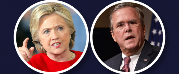
It all comes down to effective political campaigning. And today, we are going to be comparing the branding behind two prominent politicians – Jeb and Hillary.

Which one tickles your political fancy?
- João Garzón de Albuquerque, Founder & CEO at Workaboutdesign, always looks for the deeper meaning behind design.
- Henk C. Meerhof, specialist in visual communication and independent designer. He has an eye for design and has been in the business for a decade.
- Eileen Wu, Technical Solutions Consultant, takes a look at things from a matter-of-fact point of view.
- Sean B. Jamshidi, Founder and Creative Director at DesignFacet, deconstructs the Political Campaign Branding phenomenon with a design, marketing and aesthetical standpoint.

Mr. Albuquerque takes a jab (no pun intended) at both the political campaigns. He mixes political commentary and how the logos aesthetic styles mesh (or don’t) with the message of the candidates.
The Jab&H issue! Sorry but no mistake made it is a jab and no politics intended here. Again I will stick more with the aesthetics of these two for surely I wasn’t present at the debrief of either one.
Starting with the jab at something, it seems to be an evolution of a previous mark by this Bush. Lets give it thumbs up, for it is a happy mark I immediately related with a candy bar, the 2016 just spoils it. So the nice intention is there, so is the positive and immediate connection that the exclamation point assigns and that’s it. Enough compliments because he is no candy bar and therefore this designer believes they should have done better with that font. After all this a US of A presidency that we are talking about, no candy bar for sure. Ok it is good that a continuity of his brand was pursued but the stakes are so much higher now and those letters just wont cut or stand tall enough to the task. Sorry it is a jab.
The H, well I couldn’t help but smile when I saw it for the first time and also already remember trading a few words online about it. I do think that Hilary stands taller here, logos wise, it breaks the common place, if it wasn’t for the arrow protuberance, not the shear existence of one, since I believe she wanted to show direction or going places or forward, yes forward, because the western world does read from left to right and pages are flip opposite to that. If it wasn’t for that sticking arrow aggressiveness I would be totally ok with it. I liked the boldness the difference and the disregard of her party position, she wants to lead America not the left or right wing. Going back to my smile, I think Beirut got Hilary she was always about (H)er.
Do I think the logos will have any effect on the final result? No I do not, the logos started and will point and sustain the way to that, but that’s about it. Stirred not shaken, the brand looks will only get you so far, the extra mile is about substance, perceived or real.

Mr. Meerhof looked at both these campaign logos and walked away from the drabness of it all. He tried to find if there really was anything new or revolutionary going on with these political logos. Here’s how he explains Political Logos 101 to designers out there. He carefully lays out how politics is different back there in Europe and America, giving insight into how logos are designed in both the sides of the Pacific.
My impression of the logo’s for the US 2016 elections, puts me between a rock and a hard place. How do you keep yourself form political comment when commenting political logo’s. In this case I got help of Hillary and Jed, better to say their campaign teams.
To prevent myself from ironic comments on politics I will go just by the book. What should these logo’s do? I have no other comparison than other US presidential campaigns, as in my fatherland, the Netherlands, and the country I live in, Denmark, have a multiple party system. We are talking not two or three, but over ten parties that want to have a say in politics and an opportunity to deliver the prime minister, as both countries have their monarch to lead the nation.
Advantage in multi-party system is that those parties try and develop their own identity, so a logo stands not for the president or prime minister, but for the party and its believes. All those icons we can throw overboard for the USA.
Here it is red and blue, democrat and republican. And maybe some players on the sidelines, but those are less important in European news flashes and therefore often overtaken by how bad the weather was today.
So what do those logo’s tell?
Both tell they are real American, something most Americans already new.
Hillary’s logo adds an H-shape, which we also understand and new already.
A red arrow pointing to the right, now here is something interesting, a lefty gone right? Socialist gone Liberal? Do all a step in this direction? Or does red mean that those things are forbidden? I guess we’ll never know.
Jeb! This is personal marketing at the best. Jeb! Is used by John for a long time, probably it was already embroidered on his cradle. It sure looks like DIY-type from that time.
One should think the USA has issues enough to pic an iconic image from. Using the old red, white and blue is not a stroke of genius either.
I hope for the American people that those candidates have more to offer than a logo that needs billions to promote. Otherwise this street lamp with election posters says it all, it is one big circus.

Image Source: thejournal.ie
Not sure if serious political campaign or a circus….

Ms. Wu offers a unique perspective on both the logos with her matter-of-fact analysis of the two. She deconstructs the elements used in both logos, distilling the messaging behind the two branding campaigns clearly and succinctly.
I, like many, am not a fan of Hillary Clinton’s logo. The colors are strong, and the idea behind it is good but I feel like they could have used a few more iterations. The chunky arrow, intended to represent progression and forward thinking, coupled with the two blue rectangular blocks results in a clunky, dated affair. I’m not very familiar with US politics or the woman herself, but I think it’s safe to say that’s not what she was going for.
The Jeb Bush logo, on the other hand, is likeable and friendly. The simplicity of it gives center stage to the font, and the designer chose well. The exclamation mark is also a cunning addition, adding excitement every time you look at the logo because you automatically read it as a shout.
In the battle of the US presidential candidate logos, sorry Hillary; Jeb! wins.

Mr. Jamshedi gets right to business, separating the design missteps from the political rhetoric with precision. He cuts right to the message that both political campaigns are trying to convey via their branding and how they measure up with the voters.
Usually when designing a logo, it is best to write down the words that one thinks of and then try to visualize them to see if any ideas can stem from them. In this case I will take the reverse approach.
Jeb!
(Cartoon, joke, annoying, repulsive, overbearing, hyper, distracted, unorganized)
The Jeb! logo left me thinking about the middle/poor class that is trapped by the rich and has little to no room to progress. The exclamation mark means ‘An exclamation mark may be used to close questions that are meant to convey extreme emotion.’ excitement, emotion, shouting. None of these emotions are felt in this logo and does nothing to suggest or help in attracting attention. Also there is no need to be reminded of the year 2016, it is almost like a Dah! statement. Conclusion: Possibly this logo represents the candidate well but does nothing to win the race.
Hillary Clinton
(Forward thinking, balanced, goal oriented, purpose, harmony, foundation, stable, controlled, manly, heavy, bold)
I do see that if Hillary Clinton is elected, she will be the first women to be the president of the United States, which is a big undertaking, but her logo really does not represent her as a woman and what feminine qualities she can bring to the table to win the election. She does come across like someone who likes to wear the pants, anyways but in my opinion she could have shown her lighter side as well in this logo.
Now without getting into politics and expressing my views, which I did a bit, I can honestly say that neither of these logos will have an effect on the number of votes each-one gets.
I wonder out of thousands of dollars they invested into their campaign, how much was allocated for each of these logos. Then again this kind of branding is good for a few years until the next election, so I can see why it was more of an afterthought.
Who wins?
Politics are a messy business no doubt. But that doesn’t mean that political candidates are caught napping when it comes to their personal branding. They are in for the battle of their lives, and that means all the more attention should be paid to their branding. Jeb and Hillary sure do need a lot of help when it comes to getting their campaign logo just right.
Now its time to close the curtains on today’s episode of Creative Branding. We hope you enjoyed the incisive yet inquisitive look at how political logos are supposed to be as opposed to the shoddy design jobs that we see before us. If you get the imagery just right, the rest just falls into place. That’s the takeaway from today’s post. Be sure to watch this space for more intriguing topics. Design isn’t dead and there will always be interesting interpretations and iterations on design to draw lessons from.