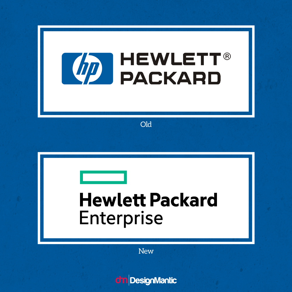
Hello design aficionados and mavens! This is Creative Branding, a place where design pros do the design critique just right. Last time, we got some panelists to deliberate on the high-priced (and ill-conceived for some) logo redesign for the Tennessee state. Boy that sure did not go down well with most of the people who have an eye. For today’s episode, we will be taking a closer look at HP’s decision to split its branding – one for its services-oriented/ corporate hardware division and another for its consumer/printing side of the biz. Based on initial observations this ain’t your granddad’s HP brand anymore.
The underlying issue here is that HP wants to appeal to two target demographics better, both of whom have their own unique considerations. What remains to be seen is that does the company’s decision to cater to both of them in divergent ways work for the better? Is the company banking on simplicity to sell its message clearly to corporate customers? Can it really convince two birds with.. well.. two stones here actually.
Change for the better or more of the same?
Now let’s get to it. Our 4 panelists are raring to take a stab at this issue, offering their inquisitive and incisive design insights over the merits and demerits of the redesign done by a tech giant.
- João Garzón de Albuquerque, Founder & CEO at Workaboutdesign, always looks for the deeper meaning behind design.
- Henk C. Meerhof, specialist in visual communication and independent designer. He has an eye for design and has been in the business for a decade.
- Eileen Wu, Technical Solutions Consultant, takes a look at things from a matter-of-fact point of view.
- Sean B. Jamshidi, Founder and Creative Director at DesignFacet, deconstructs the co-branding phenomenon with a design, marketing and aesthetical standpoint.
Mr. Albuquerque challenges our notions of design minimalism here. For him, minimalism in design isn’t just about the aesthetic side of things but rather about how quickly and discernably the observer would consider a logo and connect with its message. He is of course referring to the HP Enterprise logo and how that stacks up with minimalism as a function.
“I am such a strong believer that it is so much, much harder to make it simple, that it will always be a difficult exercise for me to point something as overly simple. But why is it? Most people disregard minimal design as a simpler gesture than an intricate one, for at simple “naked” eye so it might seem, and I will not duel now about the naked part. It’s the so many times tossed “I could have done that” line.
The way I see it and experienced, while at the wheel myself, sort of speech, the process goes into, clear the noise, set the right tone and shape and slice away all that you can, as to a point to convey the message right into the edge of… but without losing it. The balance. This said, this logo surely can be called simple but that’s today’s sophistication is it not? The undressed server taken to its pure geometric form, one that those who have been around them characters on top of one another, for a while and lately, can relate to.
I wont dispute this result on the symbol side but will do so on the font, even with the so called fantastic symbolic leap of the two merged t’s, as pointed by the HP CEO. Ok, it is Hewlett Packard again and HP no more, but the font is so… lost and past that burned my enthusiasm for the attempted exercise. I see it as if they were bold enough to sail into a new and unknown route but left the anchor down. Sailed nowhere. Still… ok.”
Mr. Meerhof, in his characteristic humorous style, compares both of the HP branding examples in a way that would leave Captain Jean Luc Picard and Slimer from Ghostbusters in a chuckle. And he does it all in a way that’s equal times educative and equal times rib-tickling, with all the pros and cons expertly laid down that is. He likens the consumer-side branding of HP to a labor of love, and the enterprise-centric branding to…. well read on to find out more true believers.
“Now here is something different, the free spirit of enterprise, to boldly go…
Look at that typography, it is made with love. The tt-ligature is not an orphan of too tight letter spacing, it is designed to be a ligature! And from what we can see in the name on the logo, a typeface is designed or chosen that has a visual difference between l, I and 1. A wise choice if you are putting out many manuals with text and numbers.
A firm statement of who they are – the huge space ship passes close to the lens – in a bold/semi-bold the giant letters spell ‘Hewlett Packard’ on the side of the ships hull, and the branch in a lighter tone beneath it. Here can we learn something.
Even the shape of a 19” system rack I can understand, although I have to correct that to a metric 482.6 mm.
I have a look at the HP-logo’s up to now, and get confused. Sometimes round is better, sometimes a square. Is it hp in a circle, in a square or in a circle that is in a square?
Enterprise to the rescue, the answer is square! For me the distance from square to the first line of text is a tat large, as if the square is detached. It is part of the logo, but it is not sure if it belongs there.
Meg Whitman (CEO at HP) described the new logo as “as transformative, flexible and agile as we are becoming, while standing out from the pack.”
So the square is made of a flexible material like rubber so it can be transformative, flexible and agile. I don’t want to be square here, but that logo is. And about standing out from the pack, next take over will result in ‘National GeoPackard’.
The green, the green is good, it’s the colour of money, right? In the US all the money is green (even the coins) and here in Europe 100.- is green. Even in my beloved Denmark there is a green bank note. Maybe it is green as grass, environment friendly, the new kid on the block? Or it is the colour of the ectoplasm those computers are running on. I better stop here, before I get slimed.
With all jokes aside, it is a professional looking logo for a professional firm. It is also a safe image to configure the rest of HP’s communication around. Many firms don’t make it this far.
But setting Hewlett Packard apart from the competition, that quote is a little bold to me.
Enterprise, out.”
For those of you studying logo design, Eileen Wu’s by-the-book approach is guaranteed to strike a approving tone when it comes to discussing the HP Enterprise logo. She explores the relationship between the typeface and the other elements that are part of the logo, and whether each of them (the squares, the typeface) can afford to stand out on their own?
“I’m all for simplicity. The majority of my portfolio leans towards simplicity and minimalism. However, even the Hewlett Packard Enterprise logo took me by surprise. When I studied logo design, I was taught that a logo should be able to stand on its own, without any logo type, and be able to convey a sense of what that company does. Whether it’s an abstract illustration or even just initials, you should be able to get a feel for the company. Hewlett Packard Enterprise’s teal outline of a rectangle doesn’t tell you a lot. If it were presented on its own, I doubt it would even register as a logo.
Based on the in-situ mockups I’ve seen and other commentary I’ve read, I can understand why the rectangle, as a shape, makes sense for them. And as a whole (logo and logotype together), I think it looks ok. But I definitely feel like there is room for improvement on this one, even if it’s just an alignment tweak!”
Sean B Jamshedi takes the debate in an entirely different direction, considering the brand’s longevity and market exposure in his analysis. He opines that a company that builds solid products, one that enjoys great history with its diversified clientele, can afford to take liberties with its branding.
“HP does not need to worry too much if their new logo is favored by all or not. Simple or complex, they can’t care less because already they have the reputation and years of marketing behind them including loyal customers like myself. A new logo for a start-up on the other hand needs to grab attention because they need to anchor their services and reputation based on their logo/image.”
So, What Do You Think?
No matter what side of the fence you belong to, the debate over when brands should be comfortable to opt for a new rebrand or splitting their branding comes down to a lot of factors. Some of these factors relate to the direction and vision of the company. Others might be striving to become relevant in a bold new marketplace of today.
And with that, allow us to close the curtain on today’s Creative Branding post. But don’t worry folks for we aren’t going the way of the dodo. We hope you enjoyed the responses of our panelists and got your views about branding rejiggered, reconfigured or vindicated. There’s never a dull moment in the design industry and we intend to keep an eye on the weird and the zesty going-ons of the industry. Don’t forget to check this space for more mind-expanding issues of the branding industry.


