The aesthetic of contemporary design is clean, open, and minimalist. It is succinct, to-the-point, and intentional. If you want to create a photography logo in contemporary design, take a good long look at what this type of style represents, and see if it matches with your photography brand.
If you specialize in red-carpet or fashion photography or are into expressing cleaner and linear aesthetics in your photographs, then a contemporary logo design is your answer. However, if you take more rustic photos, are into cutesy or artsy photography that’s softer than edgier, then perhaps another style of design will suit you more.
In this article, we are going to share the basics of contemporary photography logo design with you, along with looking at some design examples portrayed in a contemporary style, so you can visualize how the final logo design will look.
Let’s begin.
1. Contemporary Design Essential: Simple Shapes
Simple shapes are the number 1 identifier of contemporary designs. You can almost always spot a contemporary design by looking at how simpler shapes it uses.
Simple shapes are also extremely functional. They leave no room for doubt, they make the design easy to interpret, and there is absolutely no clutter in contemporary design to distract you from the message of the logo.
To design a contemporary look for your commercial photography logo, look at the simple shapes of the designs below. Continuous lines, on-the-spot images, and contrasting colors to add depth in the design. If you look at the blue heart logo here, you can appreciate the clever use of simplicity in design.The tiles are laid down in a way that the shape takes on the form of a heart. But that’s not all. he shape and the tiles allow the contained white space to look like a camera lens, adding another dimension to the design.
Related: Ways To Go About In Designing A Photography Logo
So you can see that in order to strive for simplicity, you do not need to give up creativity. In fact, simple shapes demand you to be more creative in your design if you want to stand out.
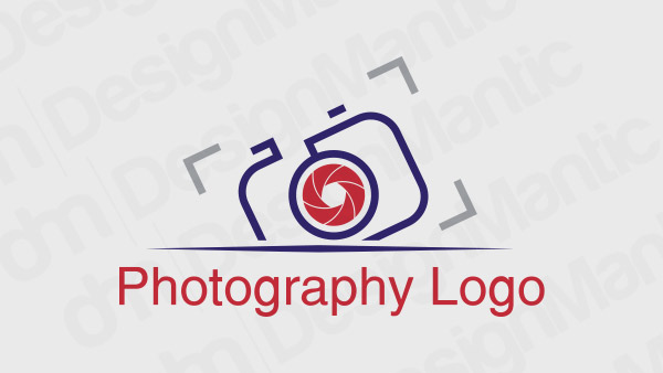
Contemporary camera logo in red and blue
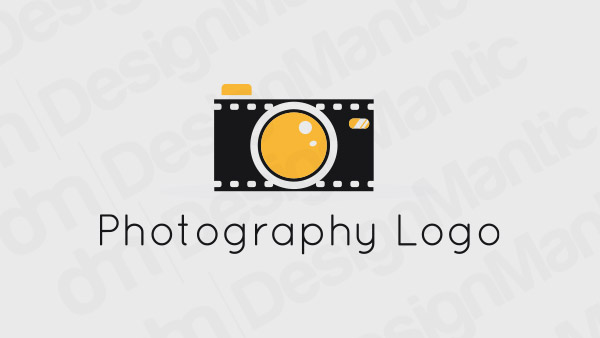
Camera and reel logo for a contemporary photography design
Blue heart logo for a photography studio
Red and black camera logo for a contemporary photographer
2. Contemporary Design Essential: Clean Lines
As a photographer, you know how instrumental it is to take care of lines and borders in photography compositions. It’s the same in logo design. But when designing a contemporary logo, careful use of lines becomes a part of the logo architecture.
Therefore, we are showing you here a list of line art photography logos for your viewing and inspiration purposes. With the use of lines, you can introduce the architectural precision that’s so dominant in contemporary design. You can also use line art to create geometric shapes for logo design in the most minimal fashion, producing an edgy design.
To make your line art photography logo more interesting, try incorporating some shapes into the design as well. Make the logo truly stand out and have more design meat.
Line art camera logo in black color
Eye logo on shield for a photography logo design
Line art red camera logo
Camera logo with football in the lens
3. Contemporary Design Essential: True Colors
While authentic contemporary design is more inclined towards the use of neutral colors – greys and whites – when it uses colors, they are more intentional, bold, and ‘present’. Think of pure reds, the greenest greens, and the bluest blues.
These true colors are then paired with contrasting or complementary colors that make them stand out more. Such as black, white, and brown. If you want to design a photography logo that truly makes a statement, pick a true, bold color from the palette and make it your brand’s shade. You can, of course, pick a more neutral tone and go really minimalistic in your whole logo aesthetic, use photo enhancement services but we’re hoping the design examples here will be enough to convince you otherwise.
If there are no design restrictions from your brand image, we suggest looking at these logo examples as your possible photography brand identity and think how easy it will be to spot your solid color logo in a sea of neutrals.
Pink camera logo for a photography business
Bright blue camera logo in a suitcase shape
Camera with a heart logo
Purple fish logo depicting a camera
4. Contemporary Design Essential: Statement Typography
The most important purpose of a logo is to create a design that will not only identify the brand but will make that identification stick into people’s minds. Make that information easy to remember, quick to recall.
With this purpose in mind and following contemporary design rules, your photography logo will have a more ‘current’ and future feel with a typography that is statement-making, simple, and neat. Fewer frills and more strokes.
Related: How Typography Plays With Consumer Moods: A Dance of Letters!
The fonts that go with this style are Serifs and Sans Serifs – with only a few Scripts in the mix sometimes. Or you can be more ambitious and create a whole new custom font.
Below, we are going to showcase a variety of contemporary photography logos that use statement typography as their defining feature. Here, the type is handling the reigns.

Image Source: Behance/Neetu Rastogi
Image Source: Behance/Ahmed Samy
Image Source: Behance/Vishnu Narayanan
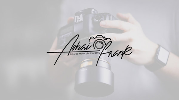
Image Source: Behance/Design98
The Final Cut
How you want to use these contemporary design essentials in your photography logo design is up to you and your brand persona. Remaining within the working boundaries of your logo art brief, you can mix and match these essentials when designing your photography studio logo. Pair a statement type with a clean line-art design for the oomph factor or use a simple shape and fill it with the bursts of a solid color. Once you’ve mastered these essentials, you’ll see how fun it is to experiment with them and create awe-inspiring brand identities.
Try Our Personalized Logo Maker Tool:

