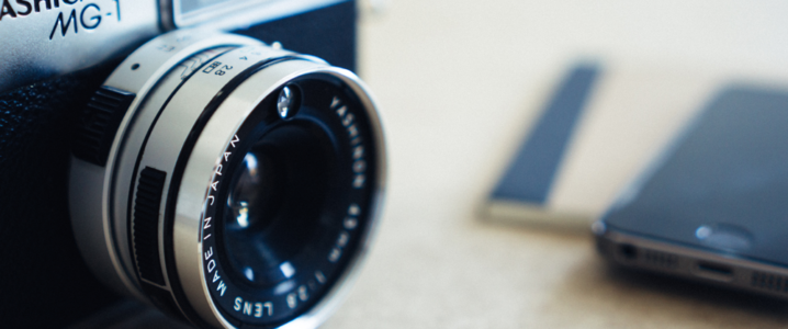
In the world of digital art, photographers have to be extra vigilant about keeping their portfolios up-to-date with new trends. Not only that, but they have to maintain consistency throughout their online presence to ensure strong visibility and good brand recognition. And what better way to achieve this is than to have creative brand symbols for your photography portfolio. Branding your photography venture can be extremely decisive for your future growth as it will provide you substantial clients and recurring work.
You can never go wrong in symbolizing your work in the form of a logo. It is such an important aspect that your logo design should reflect your brand identity which will eventually leave an everlasting impression on your followers.
Surely creating a logo for photography business can be a difficult task but today we’re going to walk you through on how to make your logo and factors that are paramount in shaping your photography portfolio.
![]()
Getting Started With Your Own Personalized Logo
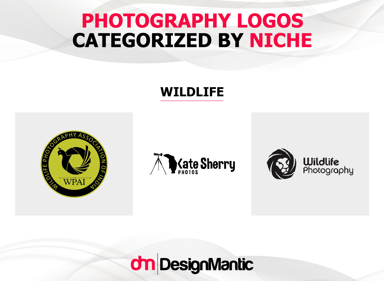
Identifying your portfolio’s niche is building blocks for a great logo design. Whether you’re a wildlife, marine, landscape or any other intricate categorical photographer. Your logo should have a distinct look so that it shows exactly what your style is.


However, many of us think that a logo is just a visual art. But little do we realize that logos are front-runners of a successful brand equity. If we are not sure about the type of logo that is required, our final design will lack in vision and creativity.
Let’s just say you are to make a logo for your brand new aerial photography page and you missed out infusing 3D elements of RC Helicopters, drones or even wings of the famous steller’s sea eagle. Your logo will have insufficient relevancy to your aerial photography style and will ultimately leave your audience’s perception muddled. Even if you don’t implement these elements, but anything that indicates an aerial element in your logo would surely give a distinct and noticeable look to your logo.
Similarly, a well-illustrated logo can give meaning to your pictures, tell a story and even improve social media exposure – as forging these concepts in your design and following ways to go about in designing a photography logo will eventually round you up for a well-deserved praise from your audience.
Giving Your Logo The Perfect Look
Most of the time designers stress on how they can make the logo stand out from the rest. They are usually fond of drafting complex or vague designs.
But to break it down, logos can be as simple as your name in a pre-defined font or as creative as in a multi-font, multi-color, black and white or any other diversified categorical branding graphic.
The choice is all yours depending on what layout you want to keep. Usually commercial wedding photographers have logos with their names watermarked on their pictures.
Since the logo cannot cover a wider area of the picture. Photographers mainly utilize symbols and shapes to enrich the feel of their portfolio.
Nonetheless, let’s dig in deeper and find out the type of logos one can take ideas from when designing a logo for photographers themselves.
Word Mark – These kind of logos are mainly distinct text only logos in unique fonts. They hold uniqueness and elegance in their look with a lot of variations in text, color, pairing. Let’s have a look at few of them;


Combination Mark – These kind of logos contain graphics from both text and symbol/icon that will perpetuate the brand’s image that you ought to create for your organization. Some examples of combination mark logos are;

![]()
Emblem – Emblem logos are specifically text contained in a shape with other elements that are inseparable. Few examples are:

Related: Do’s and Don’ts of Wordmark Logos: A Guide for SMBs!
3 Traditional Types Of Photography Logos To Watch Out For
In light of recent years logo designs have improved drastically – and how businesses were tempted to revamp their logo aesthetics every once in 3 to 4 years to re-capture their audience’s attention. It is still true that the heart of every marketing strategy, PR campaign and website development is a simple yet effective logo design that will help your business attain that reputation.
Here we list down some of the important traditional photography logo categories that will help you broaden your horizon for logos.
- The Arboreal Photographer
- The Modern Monogram
- The Stock Icon


The Arboreal Photographer
Mind you that this look goes way back in the days when photographers focused on wildlife and woodwork photography. The approach portrays sleek and elegant embellishments of trees shaped in different 2D/3D dimensions in the logo design.
However, if you use this format with a little pinch of grace – it can give your logo an opulent look as it mainly integrates the concept of nature and indicates a feminine feeling.
The look comprises of various cursive fonts as show below:
Milkshake:

Noelan:

King Basil:

The Woodlands:

The Inspiring Monogram Look

Take a moment and analyze this amazing aesthetic design. Monogram logos are all about classy signature styles or the person’s initials embedded with the word “photography” or “studio” invariably.
These type of logos are bold and masculine in nature but with an exquisite touch of delicacy by infusing ornamental motif like Irina Zelenkova – it can easily attain a feminized look!
The Stock Icon

The Stock Icon is the most well-known schema of the logo that you might have ever come across in the world of photography. Mostly digital photographers would go with this type of design to embrace their portfolio.
A lot of photography logos have been based on the schematic camera look like the one above or a shutter snap edged by rectangular linear component embossed by line art variation.
But always remember to design your logo symmetrical and well-balanced between the proportion of art and text so that it is memorable and striking to the eyes.
The Role Colors Play In Your Photography Branding
Colors are amazing. They give meaning to life and value to your designs. But as irresistible as it can get filling your design with colors up-front, it is always wise to keep this part of the process at the end and start off with a black and white prototype.
Related: What Color Should Your Logo Design Be
As your design has to be manipulated according to the output you wish to render– whether it’s printed on a colored business card, photocopied, faxed to someone or placed in your website’s header. An attractive, effective logo always shines with or without color.


Is Your Logo Here To Stay?
When you brainstorm for ideas regarding logo creation process, your creative design team has to keep one thing in mind. That your logo design should be ‘future-proof,’ meaning that it has to be eye-catching for many years to come. Because as time passes, your logo becomes mundane and loses its beauty.
Throughout the years, photography brands have developed an interesting style of infusing theme-based concepts. Here are few examples.

Be Patient For Your Logo To Flourish
Your logo will take numerous revisions to perfect and will require a decent amount of time to form in its real shape. So all of you photographers have to be extremely patient throughout the logo developmental process. However, if you are getting a logo made from a logo design builder – it will exceptionally reduce the time and effort of yours and will bring you great results in no time!
![]()
Final Verdict!
All the elements combined together will bring an original and versatile logo to be an icon for your photography portfolio. However, it’s always encouraging to experiment with new ideas or render any one of the cliché concepts in a unique style. So that you always stay on top of the game and also give a primitive look to your business which people can always relate back.
And to help you kick start your first photography endeavors, you can draft your personal photography logos from DesignMantic’s free logo maker tools.


