What do you see when you see a square? A circle? A cross? Do the corners of a square affect you the same ways as the jagged edges of a triangle? In addition to the other golden rules of designing memorable logos, shapes have an important role to play in effective logo designing as well. Designers know that each shape communicates a different message to audiences. They also know that shapes do more than ensure perfect symmetry and balance in designs – they tell stories.
How Geometry Works in Logo Design?
According to Su Matthews Hale, senior partner at design firm Lippincott, “A company’s logo is shorthand, a visual clue that tells a story of the brand’s culture, behavior and values.” In this way, a combination of shapes can project corporate visions better than any marketing material.
However, using different shapes to design a logo that only has seconds to tell its story can sometimes be the most challenging aspect of branding. How effective these ‘stories’ are depends on how creatively brands use geometrical shapes in logo design – something that they can only do if they know how the mind associates itself with these shapes.
What roles do different geometric shapes really play in branding? In this post we will discuss how geometric shapes affect logo design and their impact on brand storytelling.
1. How To Use Circle in Logo Design?
When circle is used in logo design, it projects:
- Positive emotional message.
- Bonding – community, love and friendship.
- Unity and commitment to a single focused goal.
- Strength and steadiness.
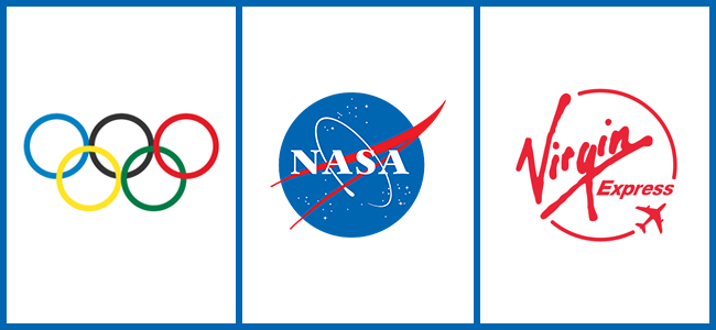
Some of the most iconic brands have circles in their logos. The Olympic logo is comprised of nothing but circles, all of which represent different regions across the globe. NASA’s former ‘meatball’ design displays a sphere that “represents a planet.” Virgin Express effectively uses the trajectory of airplane in flight as a circle.
• Why Circles?
When it comes to logo design, a circle becomes anything but a shape. Designer Augie Freeman throws light on the circle’s role in logo design by comparing it to a “portal” to another dimension. He says, “Circles typically represent (among many things) unity, a linkage between people (Olympic logo), a global market (AT&T), controlled chaos, a sense of eternity, unity and perfection, wholeness, completion and a ‘natural sense.’” Using circles as design elements, companies stand a good chance of increasing sales turnover with a viable logo design!
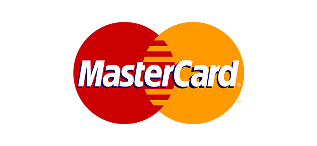
Let’s take MasterCard’s logo design as an example. The company’s logo is one of the most recognizable in the world of finance. It consists of two interlocking circles. One is red and represents vitality. The other is ochre which represents happiness and prosperity. If we take Freeman’s portal theory into account, MasterCard’s mission seems apparent. It seems as if the brand is telling consumers that their finances will change for the better if they use its services.
2. How To Use Square in Logo Design?
When square is used in logo design, it depicts:
- Balance and proportion.
- Effective use of space and efficiency in design.
- Professionalism and problem resolution.
- Equality and safety.
Some brands choose squares to make their logos tell their stories at a glance. For example, Microsoft’s new logo is comprised of four colored squares with the blue one indicative of its trademark Windows software while the others represent its “diverse range of products.” YouTube rounded square design looks like a television screen. Similarly, Facebook’s logo seems to indicate an environment where visitors can network safely and easily.
• Why Squares?
What comes to mind when you think of a square? Don’t the jagged edges and perfect geometric proportions refer to something manmade? It’s because our mind associates this shape with things that provide us security, comfort, efficiency and balance. Vivien from Inspirationbit.com associates squares with “familiar manmade objects” like “… the buildings we look at and live in, books, newspapers we read.” Other square shaped objects that provide us with comfort or security can be concrete structures like your home or your bed.
Brands that have squares for logos use such perceptions to tell their own stories on a subliminal level. Let’s take the Lego logo as an example. Doesn’t the brick shaped design point to the brand’s signature building blocks? The square shape itself induces a sense of safety. And what parent doesn’t want his children to feel safe?
3. How To Use Triangle in Logo Design?
When triangle is used in logo design, it implies:
- Religious associations.
- Dynamic approach and power.
- Sense of connectivity and hierarchy.
- Motion and believe in continuous improvement.
According to Steven Bradley, triangles “represent dynamic tension, action and aggression. Triangles have energy and power and their stable/unstable dynamic can suggest either conflict or steady strength.” In other words, unlike a square, a triangle does not induce any feelings of comfort or security.
This is also why this shape is particularly tricky to work with when it comes to logo design. However, some brands have used this shape to communicate their own messages pretty efficiently and make their logos unique. For example, Delta Airlines uses the shape to make their logo look like a plane or a plane’s wing. Google Play uses it to signify the universal symbol ‘play’. Axis Bank uses a triangle pointed upwards to represent progression and the letter ‘A.’
• Why Triangles?
When you look at a triangle, how do the harsh jagged points seems to you? It seems like an arrow, doesn’t it? With this in mind, a triangle can also signify progression if it is pointed upward or direction if it points to the right.
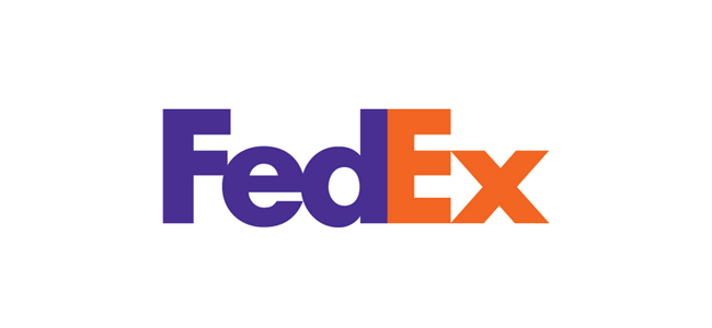
Some brands have taken notice of these perceptions and used the shape to deliver their messages. Take FedEx’s award winning design as an example. Notice how the letters ‘E’ and ‘x’ come together to form an arrow. A clever use of negative space makes the arrow stand out while subliminally referring to FedEx’s specially as a courier delivery service.
Like stories, logos are capable of communicate messages on a variety of levels as do geometric shapes. By using shapes in logo design, brands can project their messages on a subliminal level – a fact that can come in handy when it comes to delivering the right message to the right audience.


nice article, i use the geometry on my logos.