Geometric designs are a popular trend these days. If your aim is to create a perfect logo, the great news is that geometric translates really well to logo design! A geometric design gives you a clean, attractive logo that it aesthetically pleasing and has a lot of room for creativity.
Today we’re going to take a look at the steps involved in creating a geometric car logo, using a simple to follow, user-friendly approach.
Why Use A Geometric Logo?
Geometric logos and other pieces of the geometric design are more than just the sum of their parts! This type of design gives you a trendy, cutting edge logo that lends itself well to the auto industry.
Geometric design encompasses a variety of shapes and lines. Think of triangles, squares, rectangles, and circles, but also consider the use of geometric lines and shapes within the confines of another shape. Whether you choose to use the outlining shape of a car or a shape inspired by a car or by driving, straight lines and right angles offer a minimalist, professional look that is easy to scale down or up.
This type of design also gives your logo a tone of stability, which is important in building your company or automobile blog and establishing a reputation.
But geometric logos are also one of the most current trends, an up-and-coming look that will make it clear that you’re interested in the new. Also, a good tone for someone in the auto industry. DesignMantic lists geometric logos as one of the ten biggest logo trends for the year 2020 and the trend is still going strong.
Geometric logos offer:
- On-trend look
- Simple design
- Scalability
- Stability
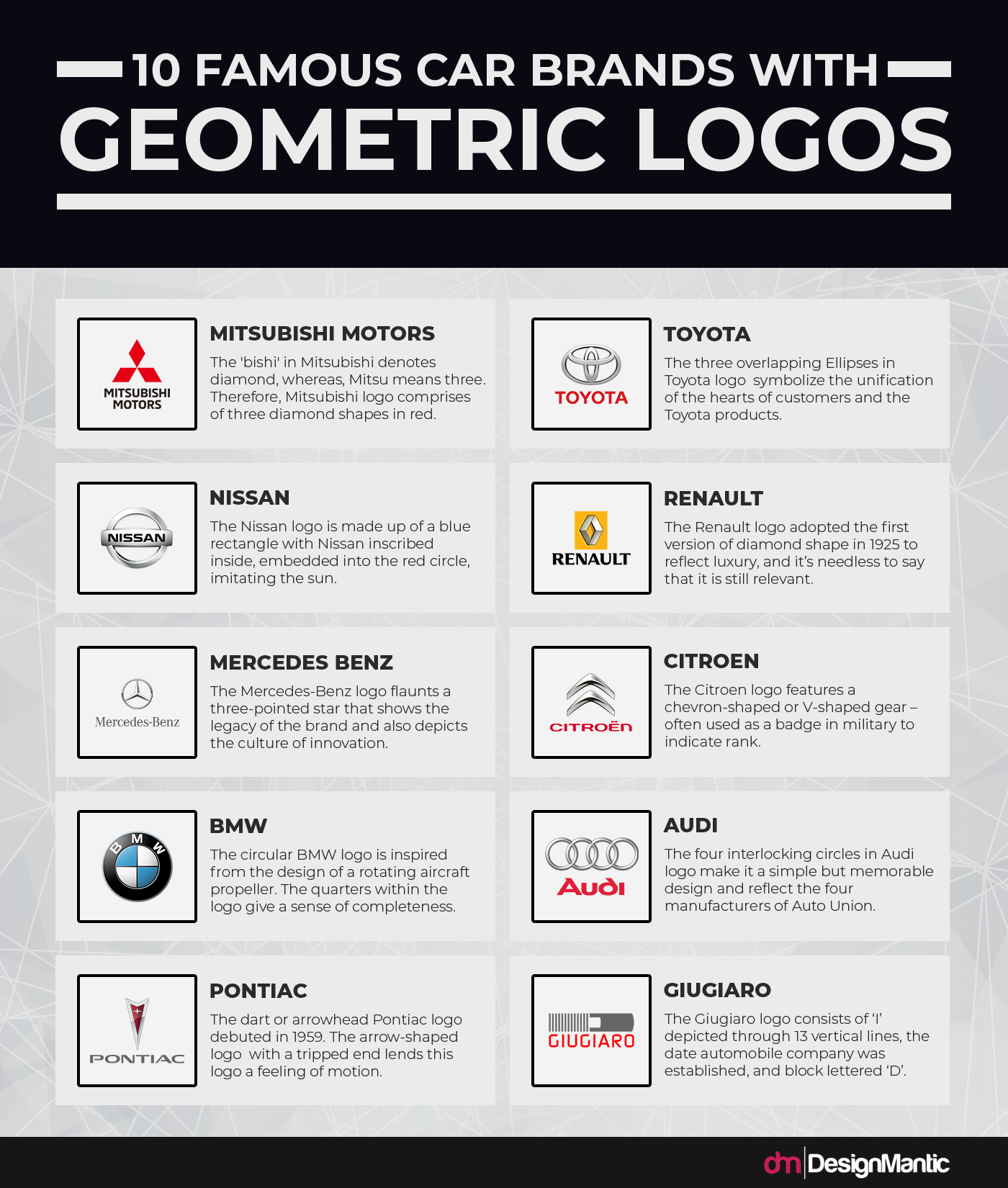
Geometric Design in the Auto Industry
As can be seen from the above, geometric design and car-related logos and design often go hand in hand.
Though we’ve discussed why geometric logos are a hot trend to turn to in general, why are they specifically a natural choice for car-related companies?
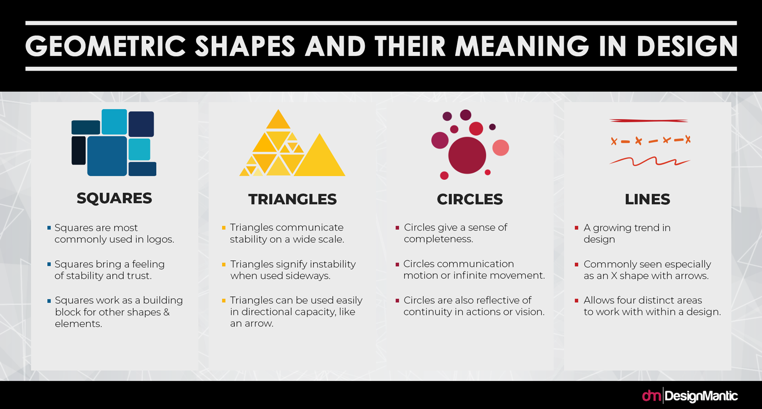
Using the psychology of shape as pointed out in the above infographic, geometric logos can ground a car company — the logo is the brand ambassador, after all, and is frequently the most common image associated with any given brand. Using a solid, simple, easy-to-remember geometric logo can give your business a stable base to build on.
Which is exactly what people want when it comes to cars.
Consumers want a reliable, trustworthy source for their vehicles. They carry their children in their cars, they rely on their car to get to work every day — the company they purchase from or turn to for repairs can influence the consumer’s trust in their car. The logo, in turn, can start the ball rolling to build that trust.
Well-designed geometric logos should:
- Give a sense of reliability and trustworthiness
- Communicate the company’s tone
- Clearly identify who the company is
- Be readily memorable
- Be easily scalable
- Encourage the customer to build a relationship with the company
As with any logo, caution should be taken that the logo isn’t overdesigned, giving a stuffed feeling to the design. Too many elements render it less easily remembered — as an example to illustrate this, sketch out the Audi logo. Now try to sketch the Porsche logo.
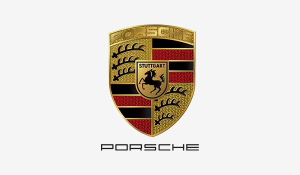
When comparing the two, there’s a drastic disparity in the number of elements and the complexity of the logo. The Porsche logo is a beautiful design, it’s true, but in terms of memorability and the connection with the consumer, it doesn’t quite do as well as a simpler design would.
Attention should also be paid to the fit of your font — how well does your chosen font work with a geometric logo? This doesn’t require that it also be “geometric” or blocky; script fonts may be a nice counterpoint to a well-defined logo with lines and angles. But the typeface should contribute to the same tone.
The same is true of the color choices used within the logo. Typically, within the auto industry, logos are commonly seen with a very limited palette, perhaps one bold color with silver, black, or white. This helps the logo to stand out easily and builds emotional connection with the brand, regardless of the size in which it is rendered.
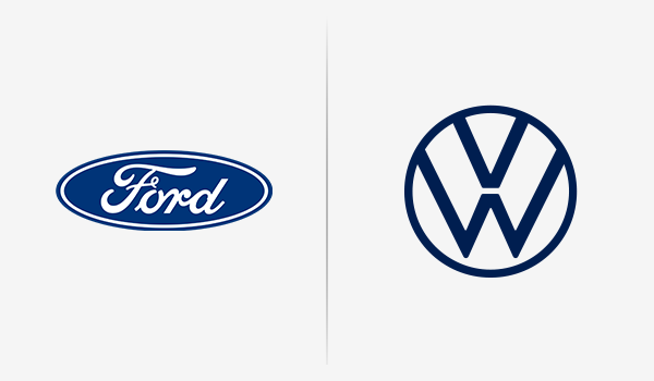
Car logos are designed to be easily recognized from the logo alone, without accompanying text (except for wordmark or lettermark designs, such as Ford or Volkswagen) and using clear, simple shapes with a bold color may help your logo to follow that design.
The Takeaway
To design a logo that builds trust in your company, promotes memorability and makes use of a hot trend, create a simple, dynamic geometric logo that, just like the cars you offer, will go far.


