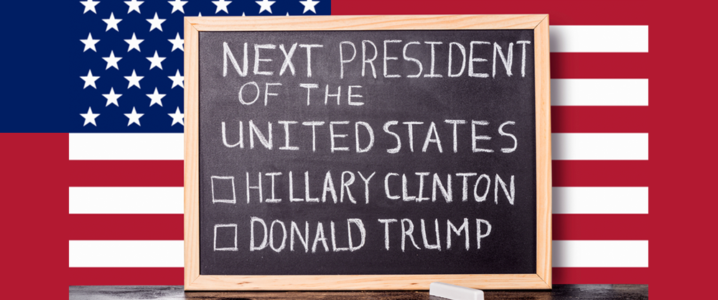
The age old adage, “Don’t judge a book by its cover”, masks the conspicuous connection between substance and presentation. While people say that looks don’t matter, design has an imperative part to play, especially if the website or other branding elements outline a potential candidate running for the President of the United States!
The former first lady (Hillary Clinton) and the former host of “The Apprentice” (Donald J. Trump) have entered the arena for what is indubitably the most massive and epic brand battle of 2016. As we get ready for the ultimate showdown of ‘hair’ vs. ‘pantsuit’, we can bicker to no end until we’re blue in the face over which candidate offers the most awe-inspiring plans for foreign policy, the economy, civil rights, health care, and more. One thing however, is not up for debate; the importance and design quality of the branding elements used by the leading candidates.
Winning The Political Battle With Design!
Seeing is believing. The more a candidate’s branding design resonates with the audience, the more they are apt to appeal to their inner emotions. While our political investment in the race is minimal, we have been closely scrutinizing the visual branding battle raging on in all its fervor, and couldn’t help but notice how Hillary’s clean, unified, and consistent branding elements are trumping the other candidates. While Trump’s branding secret has been unveiled, Hillary Clinton truly comprehends the merits of strong communication and vision, and has exemplified these attributes in her web designs and various branding elements. While the elections are still a staggering month away, let’s scrutinize the visual branding of both the candidates to see why we think Hillary is far suited to sit the iron throne!
Round 1: Official Campaign Website
Vibrant And Cheerful V.S. Gloomy And Bleak
While some candidates are capitalizing on their bold attitudes and eccentric personalities to gain followers (Hint: Hair), Hillary’s subliminal campaigning has really resonated with us. Coming to her official Campaign Website, it redirects the users to a modern and colorful splash page on the first visit of the site, aiming to solicit campaign donations. The vibrant and cheerful look and feel of the splash page incites an urge to donate for her campaign, augmented with the clear red call to action button and an incentive to receive a free Tim Kaine button pack on donations over $10! Trump’s splash page in comparison is dull, so that the call to donation doesn’t stand out. In addition, by incorporating two call to actions on the same page, it leaves one muddled as to whether to sign up or donate.

Image: Hillary Clinton Official Website

Image: Donald Trump Official Website
Humane And Amiable V.S. Cocksure Arrogance And Remote
Continuing on to the main site, Clinton’s site appears informative, professional and clean throughout. Her campaign leverages flat design elements, and from 2015 until a few months ago, the hero image has dominated the front page of the website. The image kept changing depending on the current socio-political events, conveying what she stands for and the message she believes in.
Hillary Clinton‘s website similarly welcomes you with a full width image of her with the citizens of America, while landing on Trump’s page one is greeted with a smiling full width image of the man himself! Informal CTA texts such as “Start Calling”, “See for yourself”, “chip in”, and “Text me” appeal to human emotions and makes it appear as if Hillary is actually engaging in a one-to-one tête-à-tête with her audience.
Trump’s site on the other hand appears rather cold, no-nonsense, and remote; lacking the “humane appeal” we have come to associate with the man. Adding a personal touch to her audience certainly gives Hillary an edge over Trump’s site which seems to be the epitome of arrogant self-branding!
The War Of The Typefaces; Hillary Lands Another Blowing Punch
The main typeface of Hillary’s website, called unity, is a rendition of Sharp sans by Lucas Sharp. An unadorned Geometric sans with regularized letter widths and large x-height, along with the website’s more frequent use of lowercase, strikes a friendly and amiable tone, as opposed to the frequent use of caps and slab serifs by Trump. To us, Trump’s site shouts loud, obnoxious, and grasping for attention!
The Battle Of Navigation; Hillary Leading The Right Path
The use of a sticky header with ready-to-use navigation is another aspect we love about Hillary’s website design. From a UX perspective, its great news since the header allows visitors to navigate to any page from any page, instead of scrolling back up. On the other hand, Donald Trump’s website is devoid of a sticky navigation, making visitors scroll all the way back up if they want to access the top bar navigation. In addition, while Clinton’s website clearly displays an “En Español” link in the main navigation bar, unsurprisingly Trump’s site touts no such link, consistent with his unflinching stance on immigration.

Image: Hillary Clinton Official Website

Image: Donald Trump Official Website
Talking of the navigation on the landing page, Hillary manages to fit all pertinent tabs on a single bar, in contrast to Trump’s site dividing the navigation bar into secondary and primary navigation. While Hillary knows that the most important thing visitors wish to do is to read “About” the presidential candidate, putting the “About” tab on the secondary nav bar, featuring smaller font size and a cooler background color, isn’t going in Trump’s favors and shows his lack of political acumen.


Verdict: Be it bad typography, narrow, dark drop shadows, a haphazard layout of the main content, a textured background, or gradient in the navigation, Trump’s poorly designed website should come as no surprise, since he is frequently quoted as saying, “a website costs me three dollars!” It’s becoming obvious MR. Trump!
Round 2: The Official Campaign Logo
![]()
When Hillary’s official campaign logo was revealed a year back, people were appalled. However, within a year, people have come to adore Michael Bierut’s bold design and the general consensus has it that his stroke of genius could become a design classic.
Michael Bierut at his finest. @HillaryClinton #logodesign #gorgeous pic.twitter.com/BQHvwp8nCS
— Desiree Nasim (@desinasim) February 5, 2016
Moving Forward Into The Future!
Here’s what we think; the logo is Colorful, modern, and young, and we are going gaga over it! The Blue Single letter ‘H’ crossed out with a red arrow pointing right has been construed as a message of “moving forward into the future”. The Sharp Sans logo is professional and polished, and simultaneously poses a friendly and humanist face that is still credible and clean. The ‘H’ implies power. If she had used the full name ‘Hillary’, the logo might have appeared too unceremonious for a presidential candidate, albeit more amiable. The ‘H’ with its heft serves to bridge that gap!
While some seemed to diminish the logo by noticing that the red “H” arrow pointing right hints at endorsing the Republican Party. However, according to Graphic designer and author, Will Harris, “The arrow is pointing to the right because we read from left to right, so it’s pointing into the future and it’s red because that connotes power. But Hillary is also not a far-left candidate, she’s a centrist. So if the logo can appeal to undecided Republican voters concerned about voting for a potential dictator, then yes, it’s a smart message.”
In the last two months, we have seen the logo in a myriad avatars, including these:

Image: Clinton pop. (Montage by Quartz)
I Am With Her!
These iterations exude the full iconic prowess of Hillary’s logo: the different backgrounds are the visual embodiments of the values around which the entire Clinton’s campaign is built, the logo remains highly recognizable despite the alterations, and the arrow now truly personalize the promise of moving forward in all aspects. In addition, seeing how ubiquitous social media channels have become, Hillary’s logo is perfectly functional and able to hold up against digital platforms, broadcast, and print! Supplemented with her heartwarming copywriting, ‘I’m with her!’ and ‘Hillary for America’, the entire campaign is focused on looking forward, rather than delving in to an imaginary past that is the emblem of Trump’s divisiveness!
Trump Logo: The Hunchback Of Notre Dame!
Coming back to Mr. Trump (and stuffing in gales of laughter), how many of you remember the initial Trump Pence Logo that had us all truly ROFL’ing? For those who feel sick to their stomachs at the mere sight of “hair”, the logo proved how anybody who came to be associated with Trump was “screwed” for life (pun intended). The travesty that was his logo had been the butt of every Twitter joke the second it was launched. Enough said; let us refresh your memory:
https://t.co/h2Ui0f0YY6 pic.twitter.com/VXX44UGiGd
— Anthony De Rosa (@Anthony) July 15, 2016
or something@JuddLegum pic.twitter.com/0AJJDFqiSp
— darth™ (@darth) July 15, 2016
“I don’t get it.”
“It’s the T…the way it goes into the P…”
“I don’t see it.”
“It looks like–”
“Yeah? WHAT?”
“Nothing, Mr. Trump.”— Mark Harris (@MarkHarrisNYC) July 15, 2016
MR. Trump soon realized the boo-boo he had made, and set out to revamp the “look” and “feel” of his logo. And this is what he conjured up, after many tossing and turning days and nights of course (Wink).

Image: Make America Great Sticker/Trump Website
Why does the new Logo make us think of Tommy Hilfiger! Not that we don’t love Tommy and his clothes, but nothing stirs within when looking at the new Trump logo, and trust us; we have looked long and hard… still nothing. While using the American colors and the insinuation of stars do hint at patriotism, it stops there. Due to the use of Akzidenz Grotesk Bold Extended for the logo and FF Meta Bold for the slogan text, all that the logo appears to be saying is corporate and heavy!
Verdict: Sorry MR. Trump, your complete lack of graphic design is no surprise given your long history of not paying your contractors. The reason his logo is such a huge disappointment is because he probably never hired a “REAL” designer, or the poor guy couldn’t get anyone with a conscience to do it for him. Better luck next season.
Round 3: Branding Merchandise
“Made For History” By Hillary
The Design love we harbor for Clinton didn’t stop at her logo and website; the Clinton campaign has recently unveiled their limited-edition “Made for history” collection of Tee-shirts, bandannas, and pouches from big designers like Joseph Altuzarra, Tory Burch, Diane Von Furstenberg, and Marc Jacobs, to help elect the first woman president of the United States! Each item of merchandise incorporate stunning design, imbued with a deep meaning and a gorgeous profusion of color and contrast, and heart-warming slogans that make us overwhelmed with design joy. What we love even more is that in the description section of each product is a heartfelt quote about Hillary from real people which fortifies our belief in her. Here are our favorites form the collection:

The 45 Pins project
Last month, the Clinton campaign gave us even more gorgeous promotional items: the 45 Pins Project. The project gave us a set of 45 badges, designed by 45 top-notch designers and artists, including Michael Beirut and Paula Scher, to create designs that embody their reason for supporting Hillary. Why 45? If and when elected, Hillary will be the 45th President of the United States of America! We are in love with the stunning designs and catchy phrases on each but ton, such as “So my daughter knows she can be president”, “Pantsuits for President”, “We for she”, “She can do it”, and “Love trumps hate”. The fun, optimistic, bursting with energy, and colorful buttons are so gorgeous, we can’t wait to buy them all!
And then there are the button sets with such potent impact when read together. Here are some of our absolute favorites from the collection, including those from designers Agnieszka Gasparska, Joslynn Hupe, Courtney Garvin, and Paula Scher:

Hillary Stuns With Merchandise Galore!
In addition, the official Hillary merchandise includes custom state tee-shirts to let you flaunt your home state and your president, retro, distressed logo tees for the savvier lot, the Clinton-Kaine organizer kits, the official Woman card to let Donald Trump know the extents of your feminism, phone cases, baby one-sies, Tattoo sets, key chains, socks, Tote bags, Clever mugs saying “Chillary Clinton”, and “Red, white, and brew”, witty posters and postcards, stitch by stitch throw pillows that say, “A woman’s place is in the white house.”, and so much more that it’s a designer’s heaven, that shop is! Even if you are team Trump, you can’t help give a nod of approval to the awe-inspiring designs and variety of merchandise Hillary has to offer!

Disappointing “Merchandise” Of Mr. Trump!
After we were done drooling over the “all the rage” collection of Hillary’s official merchandise, we decided to scout out MR. Trump’s shop as well, and see what if he made up for his lack of aesthetics in that department. Since we went enamored with the kaleidoscope of catchy phrases that are redolent in Hillary’s store, we were blasted with the overwhelming “Make America Great again”, “#Build the Wall”, “I’m with you”, and “Trump-Pence”. In terms of design, we harbored high expectations after seeing the color vortex that was Clinton’s store. At trump, we were met with his logo and the colors of American flag that apparently passed for “design” in his eyes. No. We are not biased. Yes. We scoured the entire store, and here’s a sum-up of what we saw:

Hillary: 3, Trump 0!
Sadly Trump’s dull and lifeless design strategies prove how high he thinks of himself. Each aspect of Trump’s design appears self-centered, in contrast to amiable, conversational style adopted by Hillary. While she appears to be a human, Trump seems like a mighty imposing organization giving us Goosebumps. Much like Trump’s strategy of playing “blame games”, and throwing allegations, his design stratagems are enough to hold him liable in Graphic design court! If you don’t come up with something better and hopefully a tad more genuine, you are in deep trouble MR. Trump! After Hillary’s huge, mammoth, staggering win at design, we hope you say “you are fired” to all your designers before you are fired from the Presidential campaign!