This content has been reviewed and verified by Zaheer Dodhia, a logo and branding expert.
When designing a logo, banks need to instantly communicate professionalism, trust, and commitment in order to gain their clients’ confidence and manage their money. While the design elements of a logo are essential for this purpose, you can’t ignore the importance of the color palette used. Not only does it ensure that the logo of your financial establishment stands out, it also evokes certain emotional responses in clients. For instance, blue assures your clients of stability in performance while red evokes feelings of passion and strength. Similarly, once you have your logo in PNG raster format, you can easily refine its color presets and further export it as an vector SVG for further customization. The PNG to SVG converter helps to achieve this conversion effortlessly, even providing Black and White for professional appeal and High Color for a vibrant logo look.
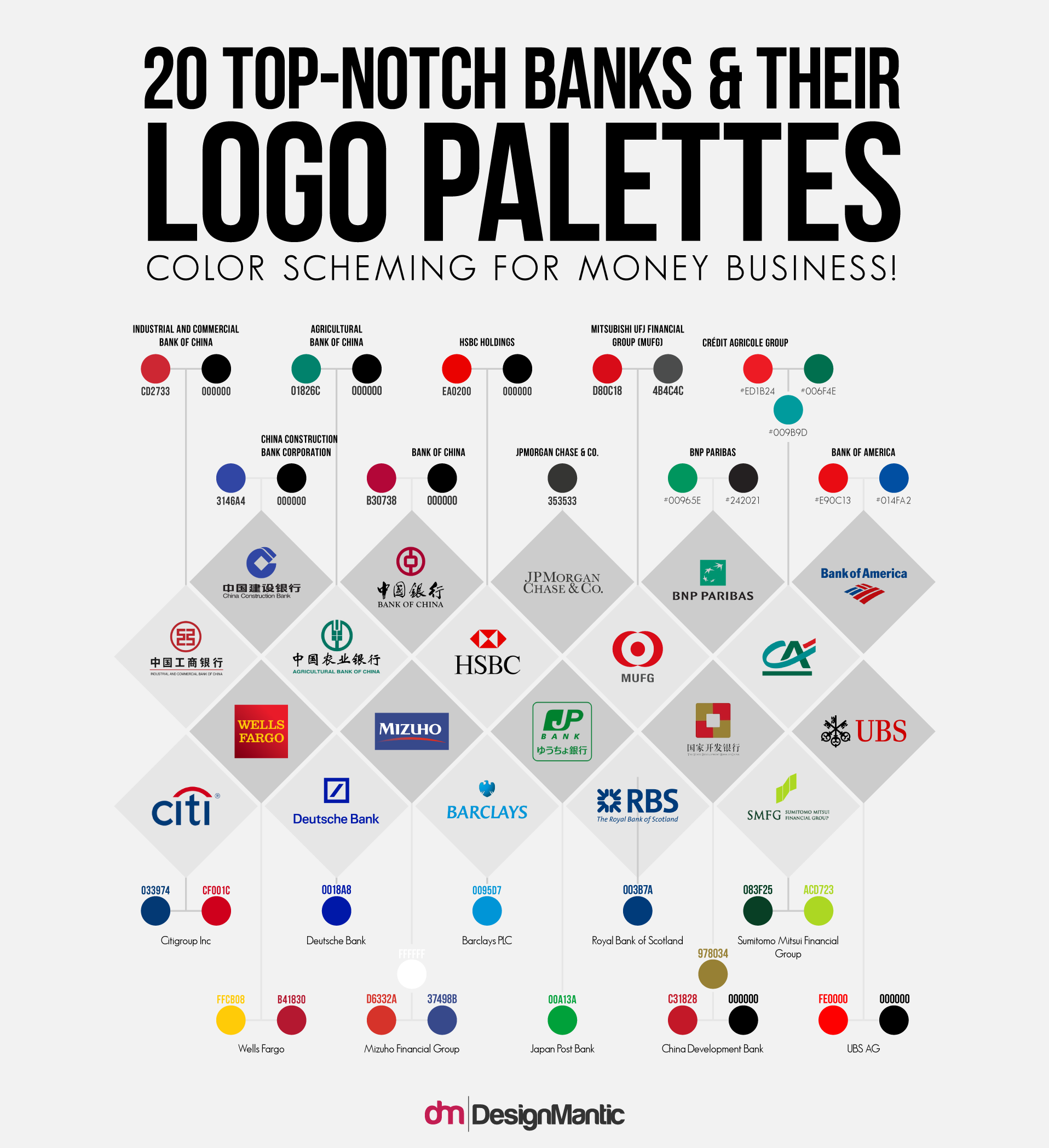
To effectively complement its design elements, the colors used in a professional bank logo should instantly communicate professionalism, trust, and commitment. Only then can your financial institution gain clients’ confidence. If you’re in the process of designing a logo and need an identity that can help you make your way to your customers’ hearts, this infographic is for you.
What Are The Best Colors For A Bank Logo?
Analyzing the logos of the top 20 banks across the world, you’ll notice that they use hues of black, red, green, blue, and yellow.
- Black, and even gray, allude to power, elegance, and sophistication.
-
Red complements black, adding passion and strength to the list of emotions your bank logo can evoke in customers.
- Green conveys luck, wealth, and initiative.
- Blue signifies confidence and stability in performance
- Yellow evokes feelings of hope, happiness, and innovation.
Related: Branding Your Bank Right: From Logo Design To Stationary!
Whether combined or separate, these colors will help you get the reactions you seek from your clients. Just remember to carefully select the best shade for your logo. In fact, if you scroll a little, you’ll notice that there are 11 shades of red used in different logos. So, take the time to customize your logo and make it represent the essence of your bank.
Selecting the right color for your bank logo can be quite a challenge because a lot of things rapport, impression, and relation with customer depends on it. For instance, opting for a green shade similar to that of American dollars can make your financial institution appear greedy and money-oriented. Your customers may also confuse your brand for another, which was the case when the Capital One logo was launched. Many were reminded of toothpaste brand Colgate, opting out of the bank’s services. The additional made things worse as it took the design ten years back.
These are just some of the issues you can face while designing your bank logo. If you want to get things right from the very first time and avoid costly redesign and rebranding, download the free guide Logo Maker For Banks Guide. Everything you need to know about colors, design components, and the overall process of designing bank logos is detailed in this concise guide.
Don’t forget to share your thoughts in the comments section below.
Embed in your site:


