More than 80 countries celebrate Labor day/May day on the 1st of May. In Athens, masses gathered to protest the austerity measures of the government, while Occupy Wall Street marched through Lower Manhattan in New York in solidarity with the immigrant rights groups and unions. A plethora of Russians took to remonstrating the presidential elections months earlier, and more than 100,000 citizens marched alongside President Putin in Moscow. Depending on the political group in power, the country, and the decade, May Day holds different meanings for many, yet embodies the same unified, empowering spirit. Similarly the International Workers’ Day, or the Labor Day is a celebration of working classes and laborers that is promoted by the International labor anarchists, communists, socialists, and movements, and falls every year on May Day.
In the stunning vintage posters we have collected, you can witness the uniting visual cues in design- muscular workers swinging powerful hammers, the fists, the billowing banners, a kaleidoscope of colors, garish embellishments, the in-your-face fonts, and everything that makes Vintage art so popular even today. Flip through the vintage Labor Day/May Day posters plucked from all over and decipher the art lessons these historic posters have in store for designers. Plus these Design posters can be Pinspired for future inspiration.
1. Go Bold Or Go Home
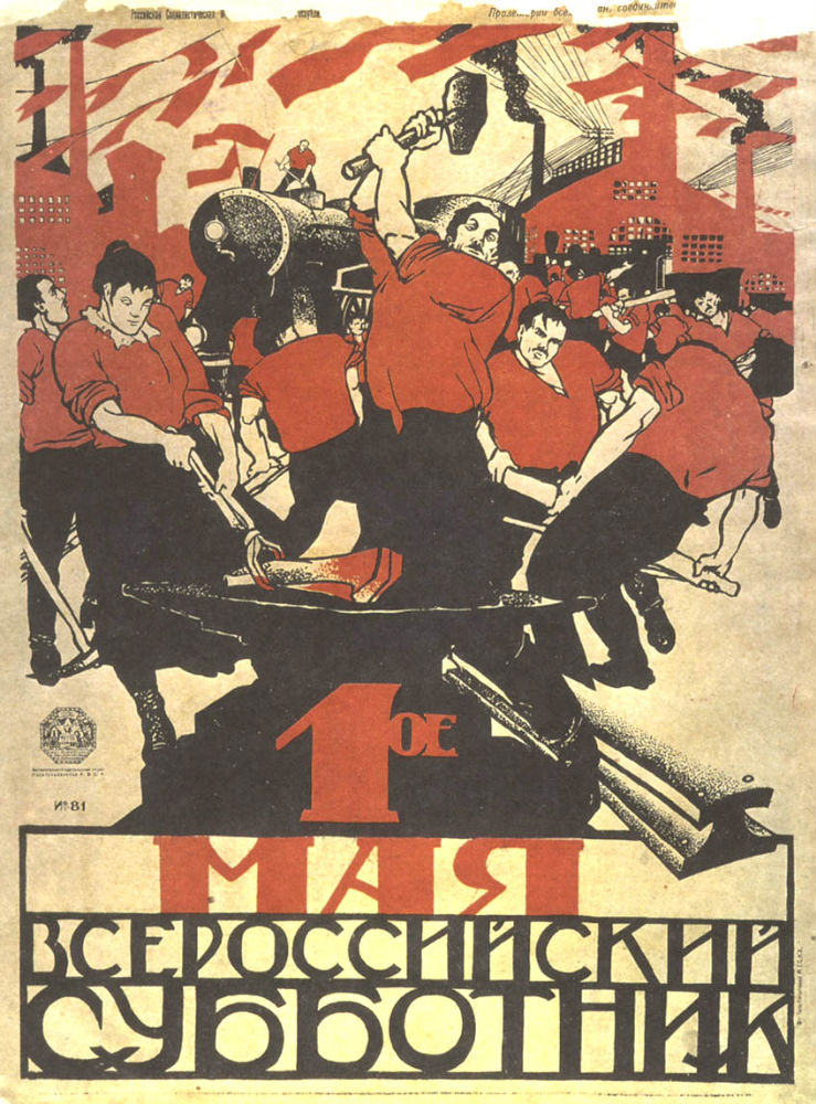
If vintage posters teach us anything, it is to be daring and bold when designing posters for promotional materials. The aim is to make them memorable and leave a strong impact on your audience. In order to elicit strong emotions like horror, outrage, patriotism, or a surge of loyalty for a cause, you need to give them something influential enough to react to, even if it entails using bold images, hues, and typography. That is exactly what the vintage styled May Day poster above accomplishes – depicts the sweat and blood of laborers wielding heavy axes, and doesn’t shy away from inducing a sense of belonging with the subjects of the poster.
2. A Kaleidoscope Of Typography
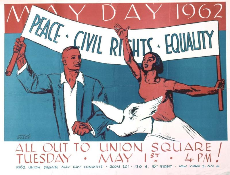
In addition to bold design elements, vintage styled posters leverage fonts that are intelligently mixed. While most posters tout more than a single font, they are blended in an attractive and elegant way. The use of myriad fonts adds to the appeal of your poster and lends it a chic, retro feel. For instance, the May Day Committee poster proclaiming, “Peace – Civil Rights – Equality,” above depicts the demands that the participating unions and other organizations were planning to put forward in the 1962 May Day parade. By that time, the participating organizations had significantly dwindled in numbers and influence, and this was one of the last May Day parades in history. Notice how the amalgamation of various fonts inside a single poster adds to its character and emphasizes distinct areas separately.
While fonts are an essential element of any design, they are more so in the case of posters, since they are used in names, dates, titles, captions, productions, etc. Some of the most commonly used vintage fonts are Ugly Qua, Bazar, Matchbook, and a lot of posters even mix retro and contemporary together to create something awe-inspiring.
The age-old adage of “Never use more than three typefaces on a page” isn’t an impregnable truth these days; rather, it is construed as more of a modernist principle that’s best suited to editorial design. Just as most legendary pop songs use only three chords, but some use less or more, the same rings true of types. Peruse through most early 20th century posters, and you’ll notice that they used a lot more than three typefaces at a time, even throwing the entire type case at the job at times. Aficionados of this style today find it charming and aspire to emulate it in their designs.
That said, designers should tread carefully when it comes to selecting the combination of fonts to be used in a design. Choose the wrong combo, and you run the risk of making your design appear rather odd and unbecoming, rather than aesthetically pleasant. When combining different fonts to highlight something specific in the text, it is also possible to replace italics in the same font with a different font altogether for a greater diversity.
3. Evoking The Desired Reaction From Audience
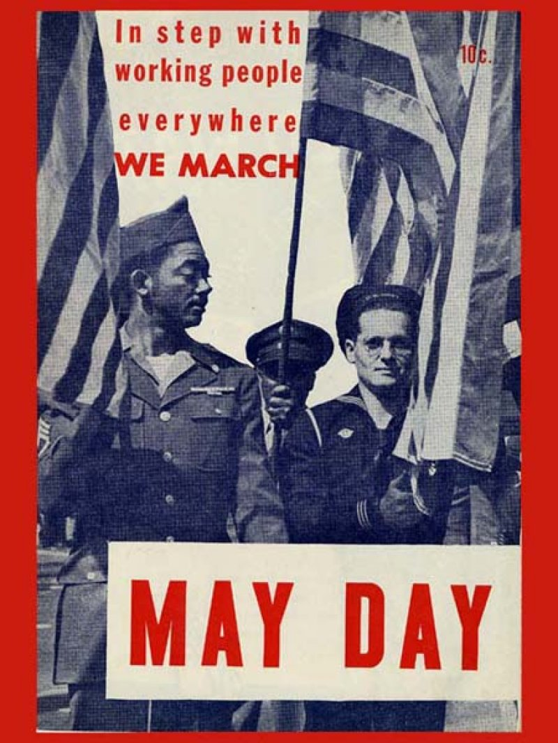
Most Vintage posters don’t shy away from explicitly inciting potent feelings in their audience and focus greatly on what they want their audience to feel when they look at them. Recall the last time you felt a surge of patriotism, a wave of nostalgia, a rush of melancholy, or a chill down your spine while looking at a vintage poster? This a valuable lesson designers should take away from historic posters; incite an emotion or feelings that would be strong enough to draw people to their causes. For instance, if you consider the pamphlet from the United Labor and Peoples Committee for May Day, proclaiming “In step with working people everywhere we march”, it portrays three uniformed service men, with two African American men amongst them, marching with an American Flag. The poster strongly delineates its loyalty to the working class and the idea of a United America.
The design you create for your poster should also achieve the desired results. However, this is a crucial step which must be determined deliberately. You may end up getting the design all wrong if you are unsure what you want your audience to do. Before creating a poster design, scrutinize your clients and find out who your target audience is, what their requirement is and what inspires them, and what you want them to do in reaction to the poster. Getting the design right would be a piece of cake once you know what you want from your audience.
4. Minimalism Is Out; All Hail Maximalism
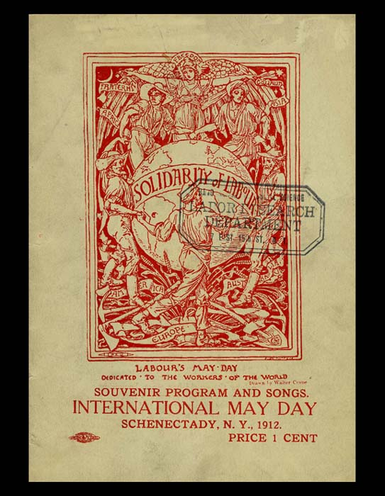
For the past decade, Minimalism has reigned sovereign over the modern design industry. We worshiped at the church of Dieter Rams, eulogized the logic of Helvetica, and embraced the Apple aesthetic with good grace. Most recently, it has served its purpose as a correctional to the elaborate excesses of the 90’s. However, in a recent turn of events, asceticism has given way to the eclecticism and audacity of the vintage era. Designers are experimenting with ambitious silhouettes, embracing luxurious textures and printing mediums, and piling on the details to yield designs which are emotionally evocative and visually enticing. For instance, consider the cover of this souvenir program from the May Day celebration in Schenectady, New York in 1912 shown above, known as the “Solidarity of Labor.” This enchanting Walter Crane drawing beribbons the globe and depicts a multitude of people joining together from Africa, America, Australia, Asia, and all around the globe, amongst agricultural tools of their work primarily. The poster hopes to celebrate the awakening of the working class consciousness on May Day in organized society.
5. Tilt For The Effect
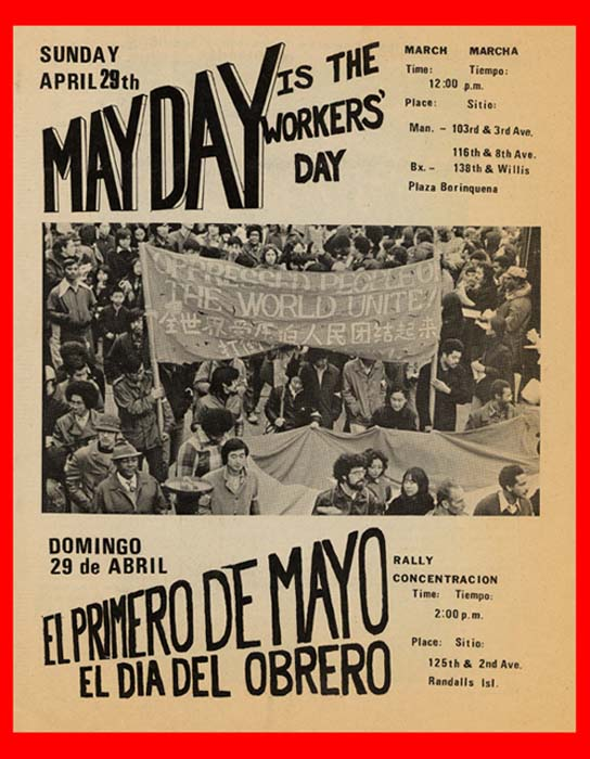
Here’s another trend that we have witnessed a plenty in vintage posters; back then, every time a subject matter threaded to be dull, a common trick was to tilt the subject in order to create more diagonal and dynamic angles and lines and automatically direct the viewers’ eyes to the intended section. Designers go to painstaking lengths to decide how to place lines in their composition, so that they can impact the way people view their designs. For instance, the El Primero de Mayo, el dia del obrero, launched this poster in Spanish and English on May Day, advertising 1973 May Day rallies in the Bronx and Manhattan. The poster depicts marchers in an earlier parade sporting a magnificently billowing banner with the words “Oppressed people of the world unite” inscribed upon it in Chinese and English. To divert attention from the photography and on to the text, the designer has lead with lines.
Can you think of any more key-takeaways for designers from Vintage Labor day posters? Do let us know in the comments below!


