In the glorious days gone by, one could authenticate the sender of a letter by their wax emblem embossed on the letter, impressed with a signet ring. Each person bore his own unique seal in the medieval times, and the motif and size of the seal was a testament to the status of its owner. Vital documents, historic treaties, and furtive proposals were penned down with majestic quills dipped in ink, and sealed with grave importance to avert counterfeit activity. Any avid Aficionado of game of thrones cannot be oblivious to the dread one felt when Jon Snow received the letter from hell bearing the seal of the flayed man!
Furthermore, since betrothals and nuptials were prearranged, true words of passion and fervor were secretly written in the murky depths of night, and the contents of the envelope would then be secured by a wax seal so that the recipient could ascertain that their passion remained clandestine.
In the era of ravens and letters carried for thousands of miles on foot, this tradition was the closest to security one could garner to protect the contents of the letter from being intercepted and to validate the identity and credibility of the sender. However, with the nature of the letters taking on more of an electronic façade, sealing wax has also morphed into its classier progeny; the “letterhead”.
If Letters Could Talk, Letterheads Would Be The Customary Introductions
You see a gorgeous girl sitting alone at a bar, slurping at a martini. What do you say? “Can I buy you a drink” or “”Hey, baby. Want a raisin? Sorry, none left. Perhaps a date then?”
Each time you send a letter to your customers, it’s akin to sending over an ambassador from your company to woo over potential clients, customers, and colleagues. The professional letterhead appearing at the top of the page is the only official representation of your business in your absence, and it’s highly indispensable that it says all the right things. Imagine stumbling across the person who could be the “one”, only to open your mouth, blurt out a stream of unintelligent bleats, and see them raise a dubious eyebrow and walk away!
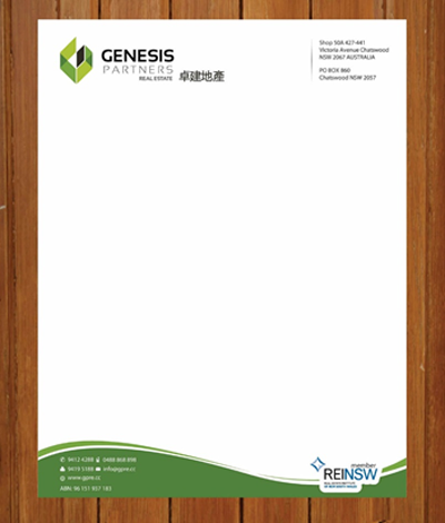
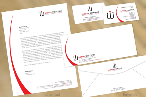
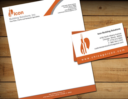
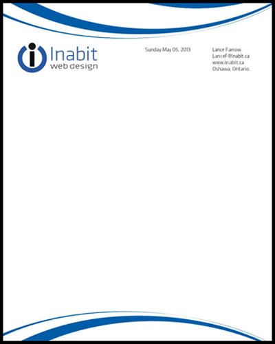
A letterhead is more than a blurb you encounter at the top of each corporate letter. It incorporates all the information that a customer might like to know about a business, conveyed in a potent combination of the contact information, logo, and company name, rather than a single intuitive insignia of a wax seal. With so little space to work with, an articulate design approach to your company stationary would go a long way in establishing the message of your business.
Something as seemingly unpretentious as a letterhead could give away much about your business at a glance. As such, a diligent letterhead design exudes professionalism and lets the recipient know that you have invested care and time into the services and products you offer, and communicates a sense of reliability to clients and customers. On the other hand, a sloppy letterhead reflects slovenly business practices and makes people less predisposed to associate with your business. A clear and laconic message, in conjunction with a top-notch logo instills a sense of trust and promise of delivery in your associates. A professional and smart letterhead should be aligned with your overall marketing plan, as the design you project will appear on all your business communications.
Tips To Design Letterheads
Here’s how you can make sure your letterhead says all the right things to make your customers blush and giggle:
1. Letterhead As A Branding Tool
Branding is one of the most indispensable aspects of a business, especially in the perpetually connected and highly visual world of today. People have more choices to move on to, and it’s easy to get lost in the shuffle if your company doesn’t stand out. You have most probably splurged a lot of capital, energy, and time establishing a look for your brand, and it is vital that the look transfers to your letterhead as well.
A recognizable brand should make the people reminisce your business and all that it offers the instant they see it. Your letterhead doesn’t even have to be extravagant or intricate to work as a branding essential for business. In fact, a streamlined image that articulates your core business message is all it takes to make sure your letterhead is memorable; not just another nameless face in the crowd that they are prone to push to the backs of the minds (to never bring forth again).
Regardless of the medium of your communication, your company letterhead double as a miniature advertisement. Not only does it broadcasts your brand, it informs customers how to contact you and serves as a reminder of why they purchased your services and products in the first place. To boost this impact manifolds, you can consider adding a single slogan to your letterhead.
When a direct mail communication, invoice, or a letter arrives bearing your company letterhead, it commands more attention than if the same message was printed on plain paper. It’s also prudent to place your logo on the outside of envelopes to craft a consistent stationery design that leverages the power and reach of your brand image.
2. Include The Vital Information
Since you can’t possibly cram the ins and outs of your company in the letterhead, decide what information is absolutely critical and incorporate it in your letterhead succinctly: company name, contact number, address, logo, website, and email address are standard pieces of information commonly found on letterhead or different invoice types.
3. Use Hierarchy In Your Design
In most cases, the most important piece of information you need to convey is the sender of the Email; the individual or company responsible. After that, a fax number, email address, telephone number and a return address are all needed; but are they ever more important that the company name?
Before you get down to designing your company letterhead, assemble the vital pieces of information your letterhead should convey and how to position it in hierarchy of importance, so that the most pertinent information is positioned obviously and conspicuously, while less important information can be reduced down and stowed away in some less obtrusive part of the letterhead design.
4. Simplicity Is Elegance
Whatever flourishes, embellishments, and design elements you may choose to incorporate in your company letterhead, remember that true elegance and poise lies in simplicity. The worst thing you could do is design a letterhead that appears busy, and then attempt to add even more fancy printed elements to it (hint: Unintelligent blurting + in cohesive musings= big turn off).
Keep it simple and steal the maidenly K.I.S.S.
5. The Devil Is In The Details
You need to pay close attention to the details when crafting an impactful business letterhead. However, remember that as much time as you while away scrutinizing the flourishes, logo, and the font, your recipients are prone to seeing the package as the sum of its myriad parts.
6. The Right Use Of Space
Keep in mind that the whole point of garnering a letterhead is so you can craft and send personalized business correspondence. If you do not leave ample space to do that, the entire purpose of having a letterhead is defeated. Also, check for symmetry and balance in the negative space between your myriad design elements to ensure clarity. This sterile space lets your brand’s identity pop out without any distractions to hold in under. White space don’t necessarily have to be white; they are just spaces devoid of unnecessary images or text. This would enable your recipients to focus solely on your company logo.

7. Fonts Speak Where Words Fail
If you already have an established and reputable brand, chances are that you have decided on a cohesive font for use on your company website, in your email signatures, and on your business cards. In order to maintain consistency, the same font should be used for your letterhead. If all of those branded materials are touting different typography, it’s indispensable to unify your brand’s visual presence before designing a letterhead along those same principals.
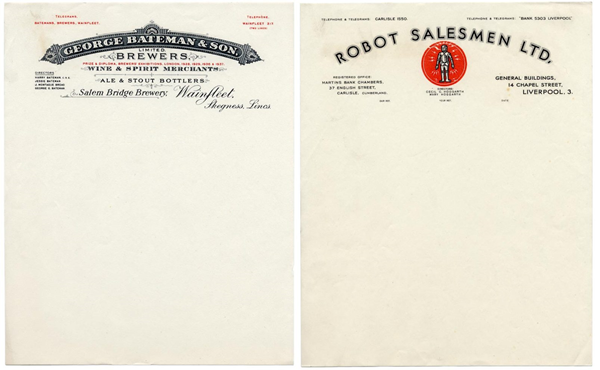
8. Go Retro With The Right Typography
Name one thing more old school than receiving a typewritten letter in your post? You can capitalize on the vintage appeal and charm of opening a printed letter by using colors, layout styles, and typefaces that play up the times gone by and invoke a sense of nostalgia.
Related: The 10 Commandments of Typography
You don’t have to go all antique, except perhaps if you are running a hipster coffee shop or a vintage store, but a subtle resemblance to the golden age of secretarial letters will incorporate a chic, retro edge to your company letterheads. Great typography is the key to achieve this look and feel. Typewriter fonts come in a myriad forms, some more stylish than novel, so look for typefaces that tout a geometric style, minus the aged effects, to make it look slick.
9. Use Color Sparingly
Color is one potent tool which has the potential to make or break your design. In line with keeping the design as simple as possible without compromising the essentials, colors should be used sparingly on letterheads to highlight the content but not detract from it.
Colors on your letterhead could reinforce your branding and draw attention to whichever areas of the design you want, not to mention invoke feelings and emotions in readers. Use the branded color scheme of your company only in your logo, but never in the surrounding text on the letterhead. The logo should be the primary star of the show, not the fax number per say. Try to keep all other text neutral in navy blue, dark grey, or black.
10. Readability
As a rule of thumb, a lighter background renders dark letters highly conspicuous. By incorporating this design principal, the readability of your letterhead is enhanced. Dark backgrounds are the arch enemies of readability. While neutrals are a prudent choice, you don’t have to be limited to black ink if you aspire to be original. Red, dark green, or brown lettering may also suffice. Since the letterhead is a direct representation of your company, the choice of the style, color, and font size are all vital. Also, steer clear of fancy font combos that are illegible at best, no matter how pretty or high-end they look (Prince charming of fonts). You don’t want any spidery, scrawled, or scribbled font choice to take the lime light, pushing the vitals back stage.
Having a meticulously designed letterhead is indispensable to the image of your company and can impinge the right impression on your recipients. However, if you don’t have the time or the capital to hire a professional to help with your letterhead design, you can choose from a plethora of amazing pre-made letterhead templates from DesignMantic, and tailor it to your needs.