BBC Three just changed its logo and a part of the design industry is up in arms about its appearance. However, some experts laud the redesign and see it as a bold way for the brand to cater to a digitally savvy audience. Will audiences like the new design or won’t they? Last week, we discussed how Star Wars branding efforts hit all the right notes with audiences. This week, we will discuss how modern audiences might perceive BBC Three’s brand new logo.
The Old Logo
BBC’s official logo has been its brand identity since the 1960’s. Its sister channel, BBC Three is geared towards younger audiences and has its own logo as well. Television audiences are familiar with the channel’s old logo –
The channel’s old logo design is fairly simple and is executed well. BBC’s trademark logo is at the top with the letter “three” below.
A New Brand Identity
In November 2015, the brand announced that BBC Three “would move online for good.” The channel chose to celebrate the move by redesigning its old logo completely. Here is what the new logo looks like –
The wordings are represented with a symbol and the word “three” is visibly absent. In its place are three lines with the third one in the form of an exclamation mark.
At first glance, the new design does seem to make you wonder about its intent. Do the three lines represent the number three or the number eleven? Is it BBC 11 with an exclamation mark? With this in mind one must wonder whether BBC’s foray into logo redesign will pay off for the long term. Most people seem to be divided on the issue.
- Nikki Carr, Head of marketing at BBC Three
- John Ramskill, Creative Director at Brand Opus
- Armin Vit, Co-founder of UnderConsideration
Let’s see what these experts have to say about BBC Three’s new logo.
New And Improved?
Head of marketing at BBC Three Nikki Carr defends the concept behind the new logo design while acknowledging critique from naysayers –
“…the visual identity brings new BBC Three together – a new logo, new indents, new animations and new on screen presentation, all with a new color pallet….What is most striking is the new logo and the fact that it doesn’t actually say three. It’s easy to belittle the importance a log has in supporting a brand, and I’m sure the usual critics will have their say – ‘it looks like Adidas’, ‘it looks like a hamburger menu icon, ‘it doesn’t even say three’, ‘are they Roman numerals?’ – but if I’m being honest, I’m not worried.”
A Fresh Voice For The Brand
According to sources, the main reason for the redesign is to make it more relatable to a digitally savvy audience.
But will it in actuality?
Creative Director at BrandOpus John Ramskill certainly seems to think so. Like Advit, he explains that the new logo is “…far more ownable and unique than the online detractors suggest.” He argues that, “This is vital in establishing a memory structure with which users will connect. Devices are nowadays filled with apps and there is vast opportunity for distraction when looking for entertainment. Being memorable and standing out will help cut through this and more likely increase usage of the BBC Three app over other viewing options.”
Poor Execution?
The redesign seems to be a brilliant way for BBC Three to preview its entry into an exclusively digital realm. But some critics like Armin Vit say that the new logo is not executed well –
“The new logo has the right idea, changing from the spelling of the number three to a Roman numeral…the problem is that the execution is completely wrong. To pull off this kind of simplicity and relative complexity of concept the logo would have needed to be much more nuanced, have a better relation with the three BBC letters, and just all around be smarter.”
How Audiences Reacted
There appears to be a great divide here in terms of perception. There are also a number of others who would agree with Armin Vit about the questionable implementation of the new design –
@scottygb @bbcthree It bothers me to no end that the three parallel bars beneath the BBC logo aren’t lining up with it.
— Oscar Nom. Cian (@CianOMahony) January 4, 2016
Oh my, that new #bbcthree logo is baaaad.
— Chris Orton (@chrisorton2011) January 4, 2016
Others however, welcome the change with open arms and laud the channel’s attempt at a distinctive design –
New #BBCThree logo. Eye-catching and says something about its content, which can’t be said for most channel logos! pic.twitter.com/5DNMUk05xj
— Billy Garratt-John (@GarrattJohn) January 4, 2016
@bbcthree @bbcthree like your new logo, clean, concise and a bit bolshy. Attention to the spacing and square detail a nice touch.
— Terry Moore (@TFMoore08) January 4, 2016
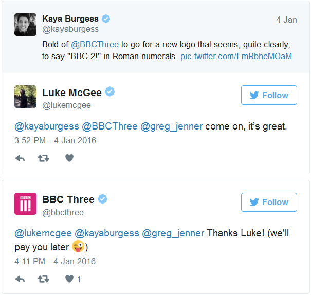
Even the brand itself acknowledges the issue but chooses to keep things lighthearted.
Is The New Logo An Improvement?
Television audiences may cry foul at BBC Three’s execution of their new logo. However, it can be argued that the redesign is a clever way for the brand to introduce the channel to an online audience. What do you think about BBC’s new logo? Do you think that it is an improvement on the old design? Give us your thoughts below.

