Branding needs to be done smartly and by focusing all the elements which might have the slightest possibility to backfire. For a prestigious brand, it is very crucial to come out with a branding fix or change because people are used to of the previous branding of the brand. Previously we discussed about logo redesigning of BBC 3, recently under the CEO-ship of Steve Easterbrook, McDonald’s branding transformed. This transformation of branding is based on a few pointers, if we look at it from a distance; the main features are:
- Bold
- Cleaner
- Simplistic
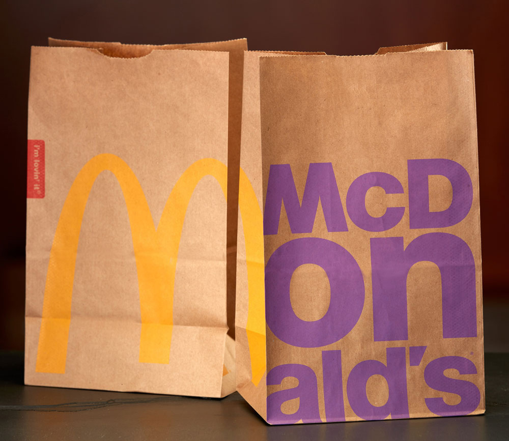
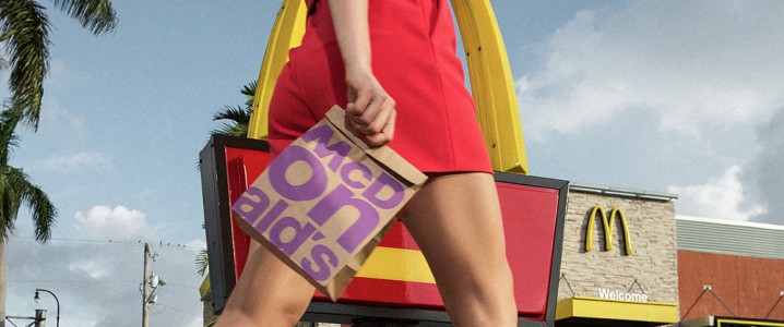
Image Source: McDonald’s
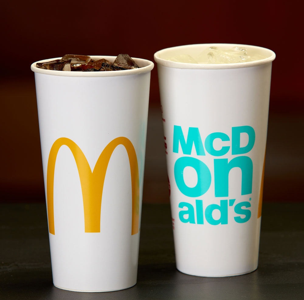
Image Source: McDonald’s
- Matt Biespiel, McDonald’s senior director of global brand development
- Diana Budds, New York based Senior Editor at Co.Design
- Scott Rothbort, chief market strategist for the Stillman School of Business at Seton Hall University
- Armin Vit & Bryony Gomez-Palacio, Co-Founders Under Consideration LLC

Advocacy Of The Packaging
In order to support and give insight about the branding transformation of McDonald’s packaging, the senior director of global brand development of McDonald’s, Mr. Matt Biespiel says
“The modified packaging is part of an effort to get a consistent brand experience in stores, drive-thrus, kiosks and on McDonald’s mobile app. The world is coming at people at a faster and faster pace; the packaging has to be simple, it has to be iconic and it has to be true to what the brand is. It is really looking and feeling modern, feeling progressive.”
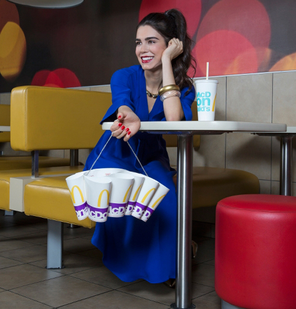
Image Source: McDonald’s

Analysis Of McDonald’s New Packaging Style
Diana Budds, the senior editor of Co. Design shares her findings and opinion on McDonald’s branding modification as
“In October 2015, McDonald’s posted the first rise in sales in two years (a meager 0.9% in the US and 4% worldwide for same-store sales) and its stock value is on the uptick. The new packaging design is modern, legible, and certainly more refined than its cacophonous predecessor. It will scale well with McDonald’s new initiatives. But it may be like putting lipstick on a pig.”
She also tweeted:
For 2016, McDonald’s put it packaging graphics on a diet: https://t.co/onCuV1K2zQ via @FastCoDesign pic.twitter.com/dIfJSuSfHa
— Diana Budds (@DianaBudds) January 7, 2016
The colors used in the new packaging include usual yellow and red along with Zesty Lime, Optimistic Orange, Passionate Purple, Ocean Fresh Blue, and Magical Magenta.
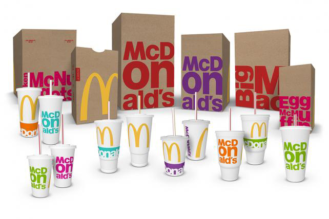
Image Source: McDonald’s

A Piece Of Instruction For Team Mcdonald’s
Scott Rothbort, chief market strategist for the Stillman School of Business at Seton Hall University says
“That’s all well and good but McDonald’s still has an uphill battle to fight. Packaging is important when you put products on a shelf. McDonald’s does not put products on a shelf. A good deal of the products are eaten in the restaurant or car, or taken home. Changing the actual packaging has negligible impact, if any, and certainly isn’t worth the money. They need to invest in their menu.”
This is what he said to the Newsweek.
Image Source: McDonald’s

Opinions Are Complementary
Everyone has their opinions and they are free to express them as well. That’s what Under Consideration LLC Co-Founders, Armin Vit and Bryony Gomez-Palacio do in one of their blogs by saying
“I rarely use the “this looks like student work” description in my reviews because it’s not the most helpful of critiques but in this case this does look to me like a student exercise of someone trying to make McDonald’s look hip but lacking expertise and refinement in typography, layout, and finishing to do it convincingly. I have the feeling that a lot of people will like this new look and I may be on my own in my dislike for it, which I can accept since 69 million people like McDonald’s every day and I don’t.”
Here’s what’s been shared on Twitter
Evolution of Mc Donald’s Packaging
From Speedee to Sustainable, here’s a look at the evolution of our McD’s packaging. #tbt https://t.co/vybRR2nRpn pic.twitter.com/8s7dbvweLD
— McDonald’s (@McDonaldsCorp) January 7, 2016
McDonald’s New Year, New Look
New year, new look! McDonald’s Global Packaging Launches In Style https://t.co/qAmJnUj2Tm pic.twitter.com/wZr4KunV5O
— McD’s South Florida (@McD_SouthFla) January 8, 2016
Anyhow, people are responding to the redesigned packages of McDonalds. Some like it and some have their different views related to that. In the following tweets, responses on redesigned packaging are quite obvious.
Bad advertising by McDonalds @brysonjj_ pic.twitter.com/rAezN2G7PS
— Kevin Nawa (@nawa_kevin) February 9, 2016
Today’s #LunchRead: @McDonalds unveils simplistic, minimalist graphic #packaging redesign https://t.co/HEIXk2avyW 🍔🍟 pic.twitter.com/vHE7Giztys
— AIGA (@AIGAdesign) January 8, 2016
Font is off to strong start this year as @McDonalds unveils its new #packaging. That’s a lot of helvetica. Thoughts? pic.twitter.com/mK3MG3cjwC
— Faryn Hill (@MsFaryn) January 25, 2016
@ystriya @morozhnoye and beyond…
(seriously, found this just recently during a 25-year clear out.) pic.twitter.com/T4hD7Q01BK— Keir Giles (@KeirGiles) January 31, 2016
Your Say?
These are their opinions for McDonald’s redesigning of packaging; what’s yours?