The modern world has changed the definition of fine art as far as its intent is concerned. Traditionally, fine art was made only for the sake of artistic exploration. Today, while the fine art may be art for art’s sake and may primarily serve the purpose of creative exploration, it also serves as a business commodity. You need to market your art to galleries, museums, patrons, filmmakers, production houses, clients, and connoisseurs. In this way, the fine art starts to serve a utilitarian purpose too – that of a commercial commodity which has a monetary value attached to it.
Do You Really Need A Logo For A Fine Art Studio?
Of course, when fine art becomes a business, you immediately need a logo for your art and crafts to help propagate your business. Here are some advantages of having a proper logo for your fine arts studio:
- A logo helps establish a brand identity for your fine art studio
- It gives information about the kind of services you provide
- It makes you look like a professional, well-put-together studio that operates on standards and principles
- Clients are more likely to hire services from fine art studios that have proper branding
In this article, let’s go deep into two types of fine art studios and see how their logos can differ to effectively allude to the kind of services they provide.
Traditional Fine Art Studios vs. Digital Fine Art Studios
Before designing your studio logo, it is important to know what traditional fine art and digital fine art constitute. This will help you develop laser-sharp clarity about your logo design approach.
Traditionally, fine art was known as the visually pleasing art –where it did not have any intrinsic functional value. The typical forms of fine art were drawing, painting, sculpting, printmaking, and even photography. Today, fine art is typically divided into two categories: Traditional Fine Art and Digital Fine Art. Traditional fine art follows the traditional techniques, while digital fine art use technology.
Traditional Fine Art Studio Logo
What is your immediate response when you find out if someone is a painter? If you are imagining a bohemian artist feverishly wielding his paintbrush across the canvas, or someone frantically splattering paint onto the floor canvas Jackson Pollock-style, what you are thinking about is traditional fine arts.
Related: Art And Design – The Twain That Shall Never Meet
Traditional fine art refers to art that is made with real art tools and materials instead of digital ones. For instance, a painting made by hand, a sculpture made with traditional hands-on techniques or a photograph snapped the old-fashioned way.
Preserving The Intent Of Traditional Fine Arts Studio In Your Logos
Traditional fine art studios usually exist to safeguard and promote traditional styles and techniques. This means that apart from the finished product, the art process and the technique is very important as well. Significantly, your traditional fine art gallery logo should reflect this. Whether your traditional fine art studio sells traditional pieces, holds traditional fine art classes, or delivers other kind of services, the value of the traditional process must reflect your brand. Here are some examples of the elements used in traditional fine art logos that might help deliver the right message:
1. Symbols
i) Art Tools As Symbols
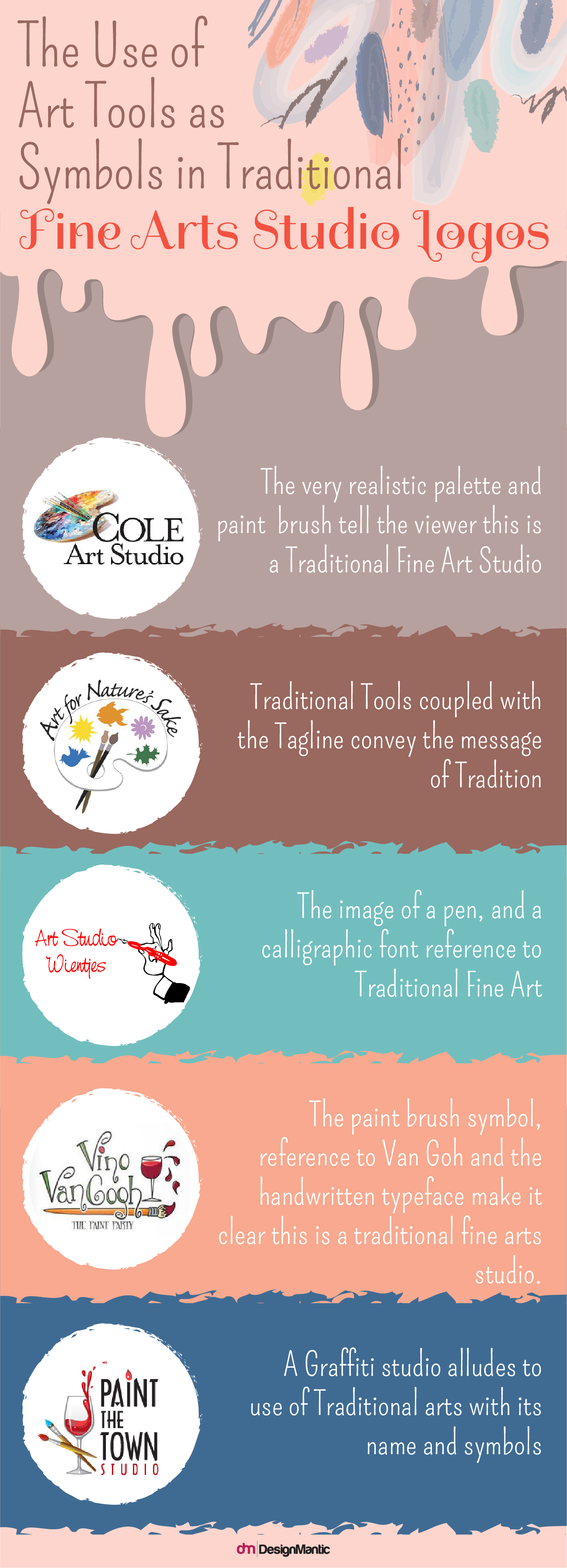
Traditional fine art studios utilize traditional tools as symbols. These include paintbrushes, canvases, pencils, pens, paints, and palettes.
ii) Animals, Birds Or Natural Elements As Symbols
Nature has been a common subject of traditional fine art. Whether it was the natural landscape, birds, and animals or even a human being’s body, the traditional art is rife with natural references in logo design. Nature serves as a standard of beauty and perfection as well as a source of inspiration. This is why you will often see traditional fine art studios giving references to nature to show their link with the traditional art. Here are some examples:
The Rolling Hills Creative Art Studio shows hand-painted trees and mountains logo to indicate the link between customary art and nature. You can instantly imagine a French artist painting in a dazzling landscape.
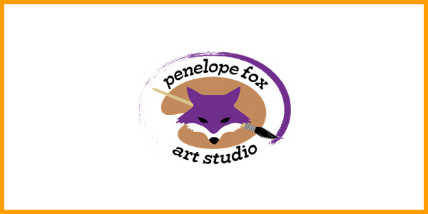
Foxes have been known as mysterious spirits in nature and tradition. This is why traditional art studios often use the icon of a fox to give reference to tradition, mystery, creativity, and nature.
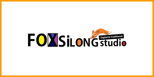
The Fox Silong studio is a digital and traditional fine art studio. The image of a fox jumping over the digitized typography is referred as the studio’s link with traditional art, hence bridging the gap between tradition and digital and bringing it together.
The symbol of a dandelion perfectly conveys the traditional tone of the art studio. For one, it is a symbol of nature, delicacy, and the ephemeral quality of life. For another, it represents the ‘past’ (and hence reference to the tradition) and how it flies away with time, giving way to newer ways.
Birds are also often used as a traditional art symbol because they convey a link to nature and the values of the old.
iii) Mythological Images As Symbols
Other traditional symbols may include symbols of mythology or supernatural beings. For example, this traditional fine arts studio utilize the symbol of wings as a connection between mythical and traditional art.
2. Typography
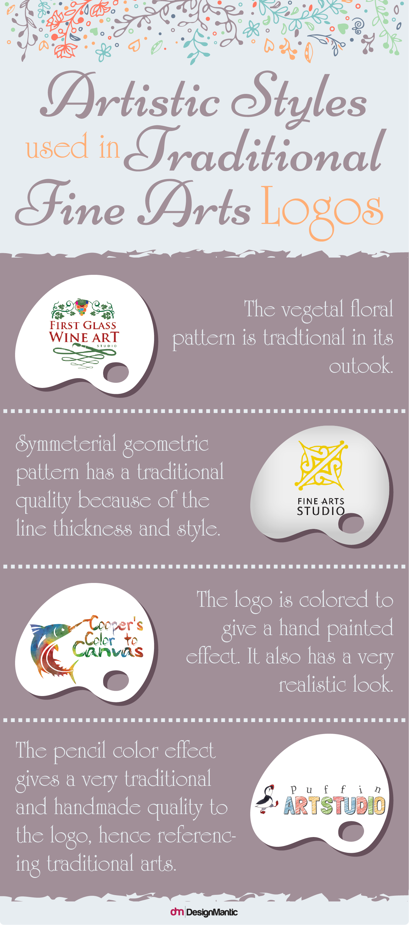
Traditional fine art logos utilize more traditional fonts, for example serifs or calligraphic fonts. Here are some examples:
3. Style
Traditional fine art logos are built in traditional styles. This is why you will see these logos created with floral art techniques, having free-flowing, organic forms and composition.
Digital Fine Art Studio Logo
A digital fine art studio typically utilizes digital technology in its art. For example, a digital fine art studio may make clients digital paintings using a tablet and a graphic software. Similarly, a digital fine art version of a sculpture may be a 3D-printed sculpture; in photography studio logos, it can manifest as digital photography that is manipulated using photography and image-creating software. Digital art heavily relies on computer tools and technology and this is its defining trait.
A digital fine art studio logo should be very clear from the onset. It should have a very progressive, avant-garde look to it and should not be confused with traditional fine art. Here are some defining features of a digital fine art studio logo that differentiate it from the traditional counterpart.
1. Symbols
Digital fine art studios use some typical symbols that help people instantly identify their niche. Some of these include:
i) Abstract Symbols
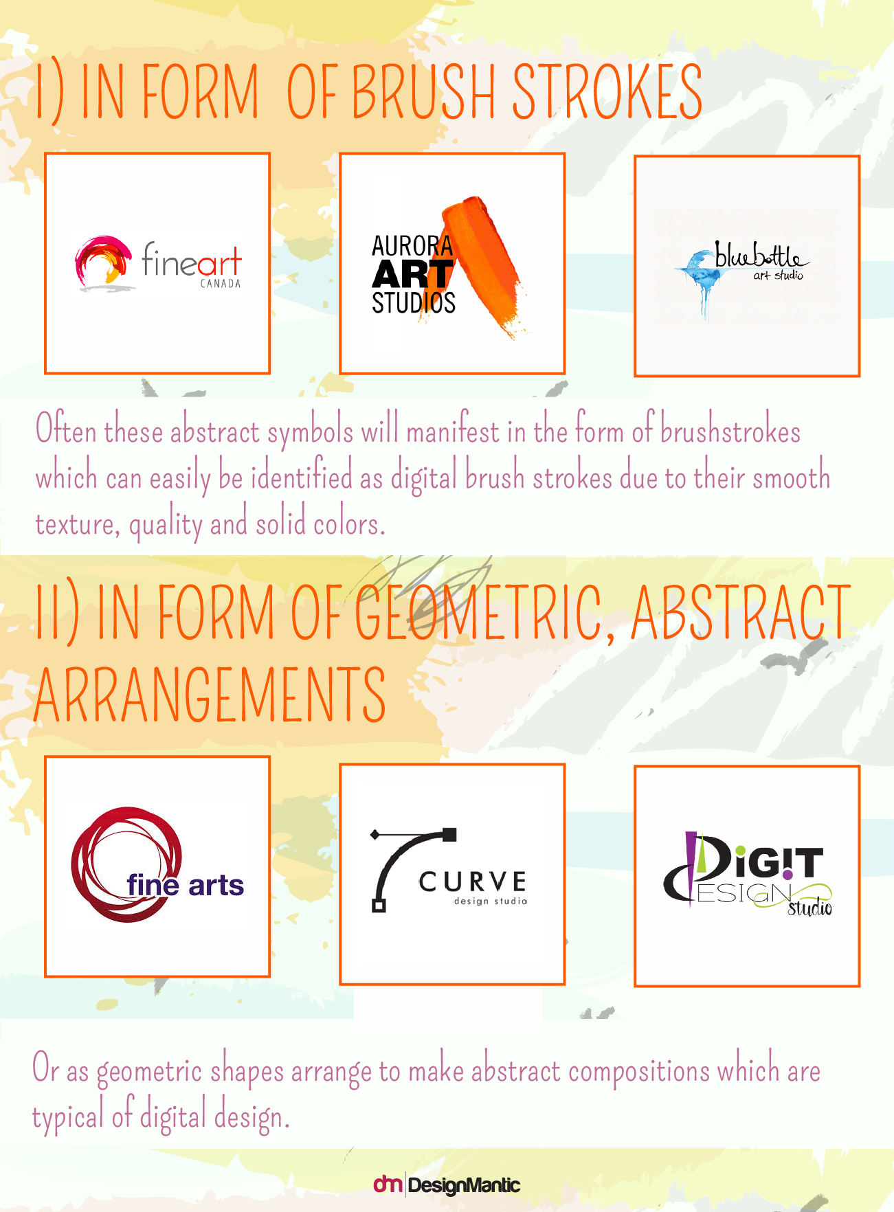
A digital fine art studio will mostly not want to reference realistic depictions or concrete symbols and shapes. Most digital fine art studios express themselves using abstract symbols and shapes that clearly show computer manipulation, so viewers are instantly able to identify their digital nature.
ii) Clip Art Icons
Another type of symbols used by digital art studios is clip art icons. Computer icons have a distinct “digitized” quality that is very easy to interpret –the viewer instantly recognizes their connection with digital arts. When these icons are used to represent digital fine art, the message is even clearer.
In the above painting and decorating supplies logo, the paintbrush refers to fine art; however, the font and the design style refers to a more digital and progressive nature of fine art. Other art icons used in digital art studios may include digitized trees or even other symbols.
2. Typography
Typography is an important part of logos. Just as symbols convey a story or a business trait, typography plays its share too. Digital fine art studios may make use of typography alone in their logos. Usually, they will emphasize fonts and characters because fonts convey a typically “computerized” feel. The font may or may not be used in conjunction with other symbols.
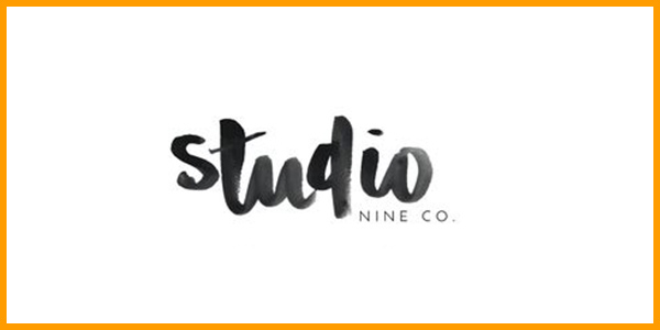
For example, Studio Nine Co. uses only the font to make their logo. The font has a calligraphic quality that may refer to fine art, but the way it is composed in relation to “Nine Co.” suggests it is a digital fine art studio. The black and white color is another clue, which alludes to digital fine arts.
3. Styles
i) Minimalist Style
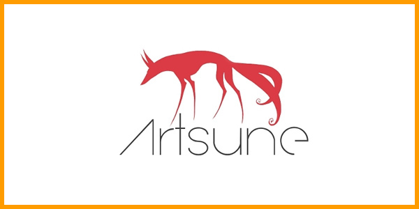
When it comes to style, a digital fine art studio logo will usually have a minimalistic style or a geometric one. This is because we associate digital art with minimalism and symmetry. The composition will be geometric and simplistic, and so might be the elements. For example, take a look at this digital fine arts studio logo here:
What makes it a digital fine art studio logo? Many things, actually; for one, the fox symbol refers to fine art because fine art was typically the “traditional” art. However, the digitized nature of the fox logo tells us this is digital fine art instead of the traditional. Similarly, the perfectly centered composition feels like a photographic frame –another reference to the geometry of the digital art. And finally, studio’s name in the sans-serif font shows us the modernist nature of this digital fine art studio. This is how the image works as a whole to convey the message.
Surrealist Style Of Digital Fine Arts
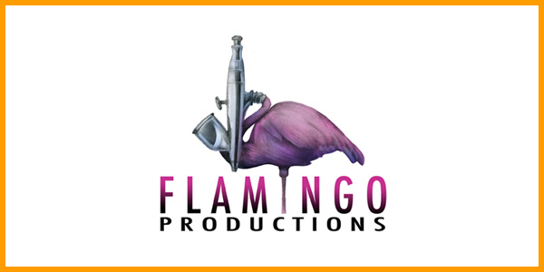
Apart from the minimalistic nature of digital fine art, they also have another side to them, that of dreamy, elaborate, and surreal depictions. This is because digital fine artists often superimpose realistic and computer images or hand-drawn images with digitized details. This creates an elaborate look. For example, the following logo for flamingo productions (a digital fine arts studio that caters to media productions), has a very surrealist look. The image is clearly airbrushed and digitized. However, its painting style refers clearly to fine art. Therefore the viewer is clearly able to interpret it as a digital fine art studio logo.
Conclusion
You will probably have noticed a lot of similarities between the digital and traditional fine art studio logos. Both touch upon the work of painting, sculpting or drawing, however traditional fine art studio logos typically use traditional symbols and a hand-made quality to point towards the traditional arts, where real material and tools are exploited. Whereas, the digital fine arts point to the crafts of painting and drawing, but with a digitized feel which might be conveyed by the use of solid colors, digitized paintbrush looks, or special digital effects, such as an airbrush.
What are your takeaways from this post? Let us know in the comments below!
Try Our Personalized Logo Maker:
Create Oil Paint Logo Designs
Face Painters Logo Maker
Logo For Artists Commercial and Industrial
Craft Centres and Shops Logo Design
Make Traditional Art Logo
Museums Logo Generator

