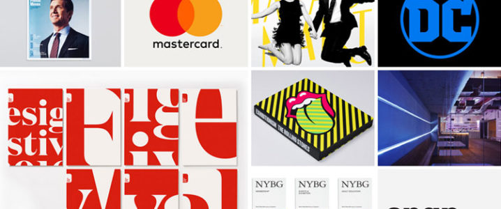
Graphic design is a lot like languages; It’s an identity; enigmatic and beautiful simultaneously. Talking of design, who knows more about the beauty, sheer elegance, and ABC of design more than Pentagram; the world’s largest independent design consultancy, based on multiple locations around the world. It’s rare that we see an incredulous piece of design without it being credited to the spectacular firm. Great design cannot happen without personal commitment, intelligence, and passion, as can be seen by these 20 awe-inspiring projects taken up by Pentagram Designers and their teams:
1. Frida Kahlo And Diego Rivera: Mexican Modern Art By Eddie Opara
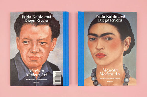
Image: Mexican Modern Art
Pentagram’s partner Eddie Opara and senior designer Brankica Harvey have designed the catalogue for ‘Frida Kahlo and Diego Rivera: Mexican Modern Art’, a new exhibition currently on view at the Nova Southeastern University Museum of Art Fort Lauderdale. Portraying the eminently monobrowed mistress of 20th Century, along with her fellow artist and husband Diego Rivera, the confident, strong, and simple design lets the imagery speak for itself. The use of a vibrant blue shade for the spine of the book is inspired by the couple’s home in Mexico City, famously known as Casa Azul. According to Pentagram, the palette is a reflection on the Mexican folk art, and the stunningly handsome portraits on the back and front covers seek to position the duo as icons.
2. Sassy Brand Identity Of The Wing By Emily Oberman
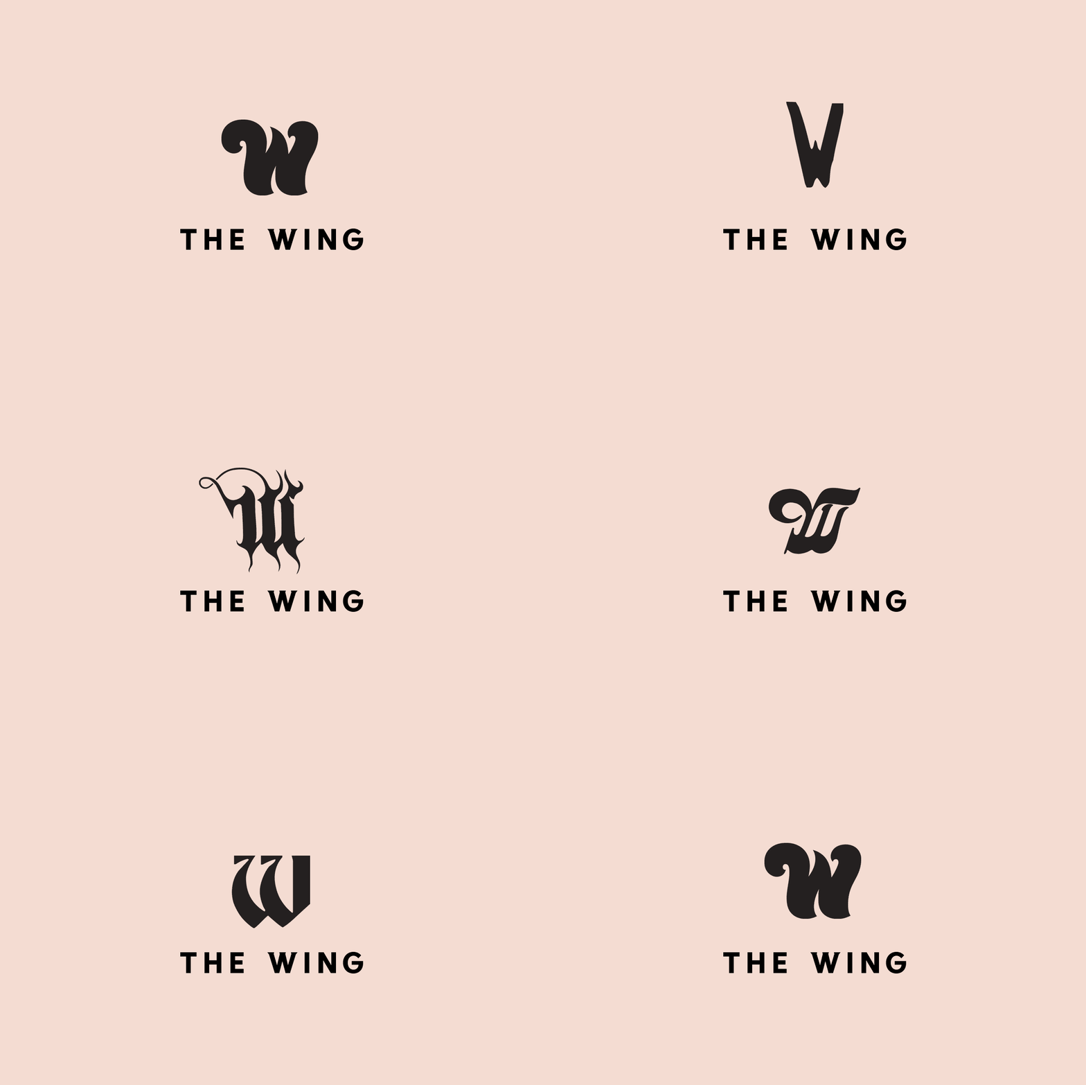
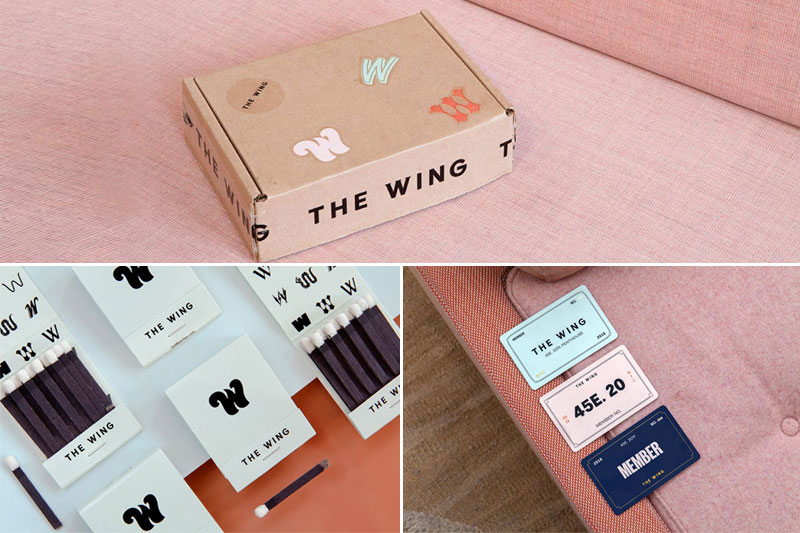
Image: The Wing By Emily Oberman
The Wing brings together women from myriad backgrounds and fields so that they can have a creative exchange. Pentagram’s partner Emily Oberman along with her team of all-female designers, has created a brand identity for The Wing that is inspired from the history of vernacular design and suffrage graphics to create a visual personality that’s fun, empowering, and smart. The project spans across everything from the collateral, messaging, and logo, to branded amenities for the club, the Wing website, environmental graphics, and products for the online shop.
3. Marimekko Store Makeover By William Russell
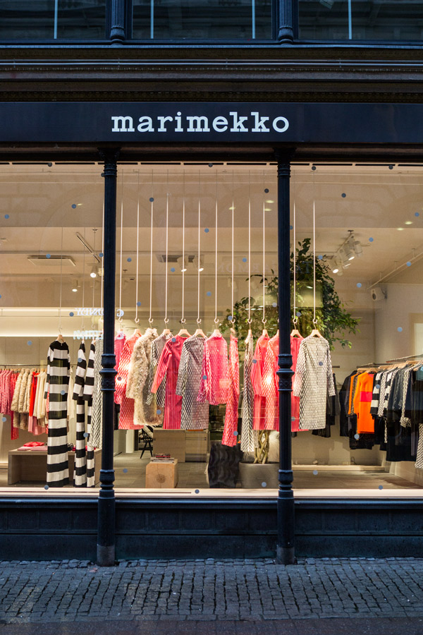
Image: Marimekko
Pentagram Partner William Russell was in charge of creating a new brand concept for Marimekko’s flagship store in central Helsinki. The brief demanded a concept that would infuse the space with cordiality and a quirky sense of Nordic humor. Russell achieved this by creating myriad atmospheres within the store, each representative of a separate aspect of the Marimekko lifestyle. The architectural features of the store strongly reflect Finnish design traditions and aesthetics, in addition to the enduring and timeless values behind these, which are appreciated by their international customers. The material palette has been kept natural and simple as well, with bronze, stone, birch plywood, and larch wood being used for different sections.
4. China Through The Looking Glass By Natasha Jen
The catalogue for the blockbuster exhibition, China: Through the Looking Glass, held at the Costume Institute of the Metropolitan Museum of Art in New York, is designed by Pentagram partner Natasha Jen and her team. The exhibit features avant-garde ready-to-wear and haute couture by designers including John Galliano, Yves Saint Laurent, Alexander McQueen, Karl Lagerfeld, and Christian Dior, to explore the influence of Chinese aesthetics on Western fashion.
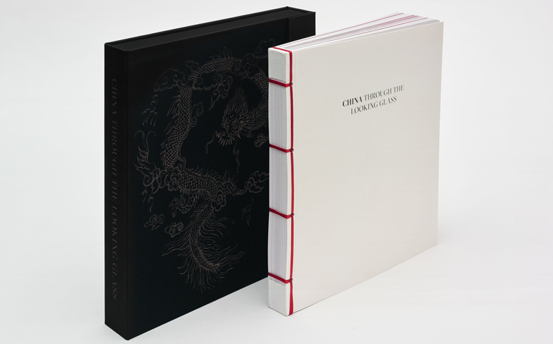
Image: China Through The Looking Glass
The book design by Pentagram illustrates the creative dialogue between present and past, and the West and East explicitly. Drawing from the exhibition, the catalogue connects fashions and objects across myriad mediums and periods. Works are intermixed with other art forms and paired in spreads, giving birth to a cross-disciplinary flow perfectly integrating into the thematic arrangements of the galleries.
The catalogue is available in two lavishly produced editions. The deluxe edition is nestled inside a black box embossed with a dragon imprint and featuring a Chinese-string binding. The standard edition is wrapped in a textural gold-stamped silk cover, decked out in a pattern inspired from the 19th-century festival robe which is a part of the museum’s collection.
5. The Book Of The Bird By Angus Hyland
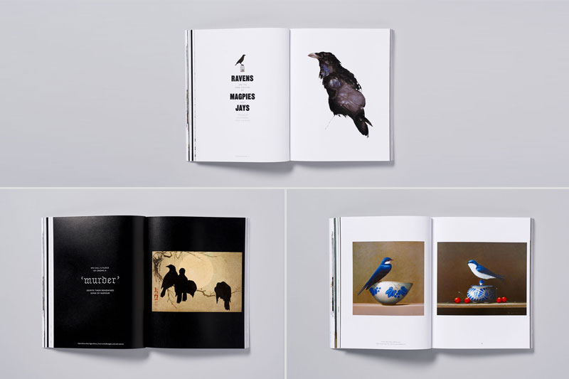
Image: The Book of the Bird
Birdsongs, feathers, nests, and eggs: the trappings of birdlife have never failed to intrigue. However, what really fueled the imagination of Angus Hay is the ability of birds to take flight. The Book of the Bird features artworks of all things avian, including works of both contemporary and historical international illustrators and artists. Pentagram partner Angus Hyland and his team selected scores of images, covering all types of birds from ominous magpies to small wrens, in order to explore power of bird symbolism in art. The photographs are periodically peppered in with short texts and spiffy statements about the different species and their artists.
6. ‘Exhibitionism- The Rolling Stones’ By Abbott Miller
Delving into the career of the legendary group that has been dubbed “The Greatest Rock ‘n’ Roll Band”, exhibitionism is an extremely immersive and comprehensive insight to date when it comes to Rolling stones. Synthesizing sound, media, objects, and environment, Pentagram partner Abbott Miller has designed a theatrical experience that perfectly embodies the revolutionary spirit of the Stones. The exhibition takes up two floors of the Saatchi Gallery, and takes the viewers on an engaging narrative journey through the band’s career spanning over 50 years.
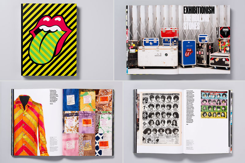
Image: Exhibitionism- The Rolling Stones
The accompanying beautifully produced book also mirrors the immersive experience of Exhibitionism, offering an in-depth peak at the impact of the band. A series of portfolios depict original art and sources, clothing, and instruments from the development of the band’s album covers, in addition to a collection of stage designs for tours. The volume includes pages from original notebooks with handwritten lyrics, as well as tape boxes from the original recording sessions, documentary footage, and stills from videos and films. The cover of the volume reproduces the iconic Stones symbol in a striped pattern, a subtle nod to the traveling exhibition.
7. Ten Trinity Square By John Rushworth And Joe Stephenson
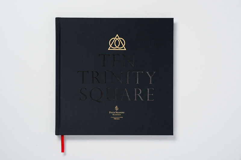
Image: Ten Trinity Square
Pentagram partner John Rushworth and lead designer Joe Stephenson were responsible for establishing a visual identity and brand strategy for Ten Trinity Square. The visual identity embodies the two widely conflicting attitudes that have a major bearing on the reputation of the club and its members: understatement and power. Leveraging two circles, to represent East and West, linked by a triangle, the symbol surmises the resolution of the club. The new logotype supported by a red, gold, and black palate, draws on the classical lettering that used to adorn the front of the original building. The new identity is relevant culturally in both China and London.
8. Circular 19 By Domenic Lippa
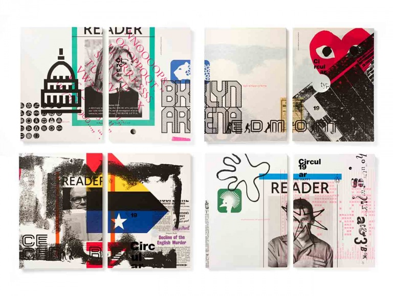
Image: DesignWeek
The most recent issue of ‘Circular’ is designed by the Pentagram partner Domenic Lippa, and we are loving it! The Journal issued by the Typographic Circle is an advert-free typographic blitz, replete with foiled page numbers and oversized typography. Domenic Lippa invited the world’s most influential cultural and influential editors to select a subject for the journal’s viewership, which is self-indulgently of interest to them. As a result, the design of the issue is marked by a disruptive execution, with haphazard page numbers in different positions and sizes, bouncing around against a title layout and an instructed grid. Dominic kept the design to a few core colors and typefaces, reflecting the exclusiveness of the issue for its avid typographic and design audience base.
9. WCS Identity By Michael Bierut And Jesse Reed
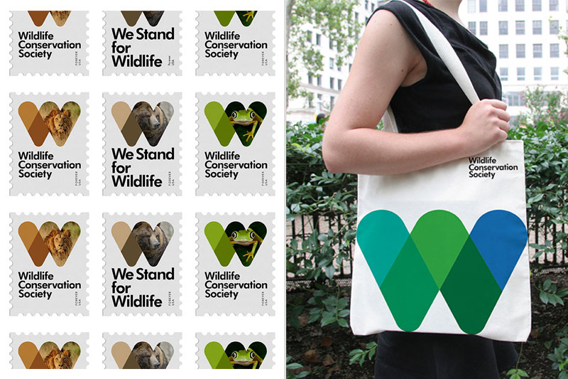
Image: WCS Identity
No matter how many ifs and buts fumed from Michael Beirut’s controversial concept of creativity, we think he’s the ultimate design guru. Pentagram’s famed partner Michael Bierut and lead designer Jesse Reed have designed a brand new identity for an organization that touts its position as a global leader in wildlife conservation. The branding draws on an accessible and friendly mark that is intuitively created to appeal to everyone from policy makers to park visitors. The new identity utilizes a stylized “W” to strengthen the promise of the Wildlife conservation society to stand for wildlife. The simple geometry of the mark makes it adaptable to a wide range of expressions, running the gamut from lively to serious, and its built-in flexibility goes a long way in reflecting the notion of biodiversity.
10. Siberian Digital Arts Festival Identity By Jody Hudson-Powell And Luke Powell
A wonderful bespoke brand font was designed by the Pentagram partners Jody Hudson-Powell and Luke Powell for Resonate, an International festival launched in 2015 that explores digital arts, visual arts, and music in Belgrade, Serbia. The font was devised as part of the new visual identity for the festival, which is a platform for education, knowledge sharing, and networking. In order to mirror this collaborative spirit, the partners have created a bespoke glyph system, font, and grid for the festival, which they are planning to tweak each year to create a rejuvenated but consistent identity.
11. Philadelphia Museum Of Art’s Identity By Paula Scher
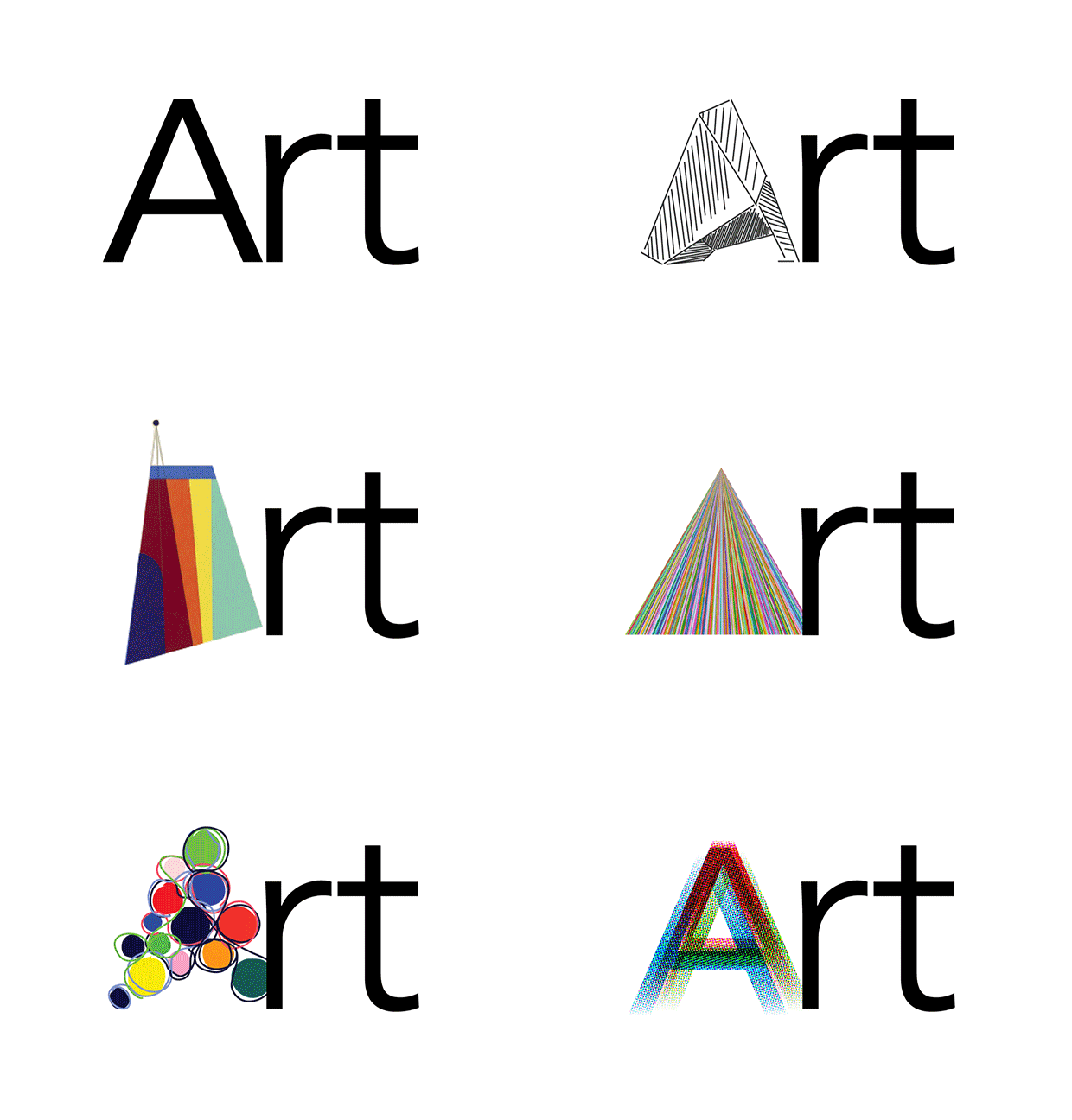
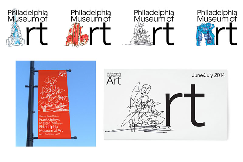
Image: Philadelphia Museum of Art Identity
In order to place “Art” front and center, a bold new identity for the Philadelphia Museum of Art was designed by the Pentagram Partner Paula Scher. Expressive and iconic, the logo capitalizes on the letter “A” to accentuate the extent of the Museum’s outstanding collection. The brand identity renewal coincided with the plans for a major expansion and restoration of the Museum by the renowned architect Frank Gehry. The letter “A” in the new wordmark can be customized in diverse contexts up to 200 different “A”s that signify various styles of works and arts in the collection, from photographic and sculptural interpretations to Pop-inspired graphic letterforms. The mark infuses a touch of playfulness to the Museum’s brand identity, and can be adapted for various collections and exhibitions in the future.
12. The Unfettered Gaze Of The Rasch Brothers By Justus Oehler
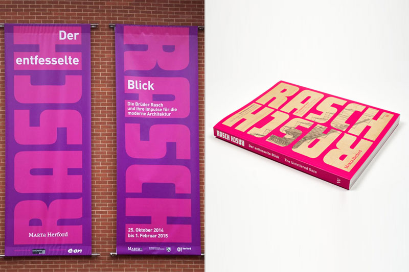
Image: The Unfettered Gaze of the Rasch Brothers
Pentagram partner Justus Oehler and his team were responsible for creating printed materials for The Unfettered Gaze – The Rasch Brothers and Their Influence on Modern Architecture! The exhibit concentrated on Heinz and Bodo Rasch, the most noted masters of modernist architecture to date. Justus Oehler and a team of designated designers created banners, invitations, leaflets, a poster, and a 240-page catalogue for the exhibition.
13. Brand Identity For Second Home By Marina Willer
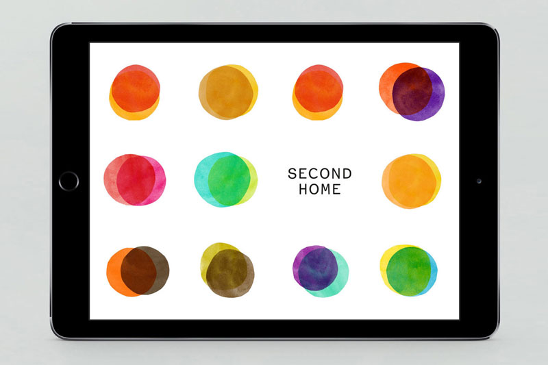
Image: Second Home
Pentagram partner Marina Willer and her brilliant team established the brand identity for Second Home, a creative workspace and institution in Shoreditch, offering state-of-the-art private studios for entrepreneurs and fast-growing technology firms. The brand is centered on fusion and the identity draws on the crossovers between invention and knowledge, science and art, and work and life that a collaborative and shared environment promotes.
Willer designed a suite of 12 logos, each constituting two overlapping circles in different hues. The Second Home word mark is located at the overlapping section of the logo; a space where new ideas spring up. The logos are done up in a wide array of colors, reflecting the energetic spirit and diversity of their members. In order to convey approachability, Courier Sans is used for the headline typeface.
14. Mad Men Monument By Lorenzo Apicella, Emily Oberman, And Michael Bierut
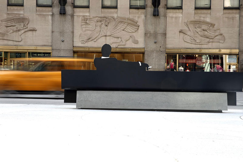
Image: Mad Men Monument
Designed by Pentagram’s partners Lorenzo Apicella, Emily Oberman, and Michael Bierut, AMC revealed a special installation to memorialize the impact of Mad Men in the city. The monument is designed in the form of an elegant and sleek bench that features the iconic silhouette of Don Draper, with his arm draped over a couch, from the show’s opening title sequence. The bench is situated outside the fictional home of Sterling Cooper Draper Pryce, the Time & Life Building. The idea behind the bench is strong and simple. Rather than refabricate the look of the period as the show has done, Lorenzo Apicella’s design for the bench mirrors it in smooth and clean lines, making it the most sophisticated and chicest piece of street furniture to date.
15. Archtober 2016 By Luke Hayman
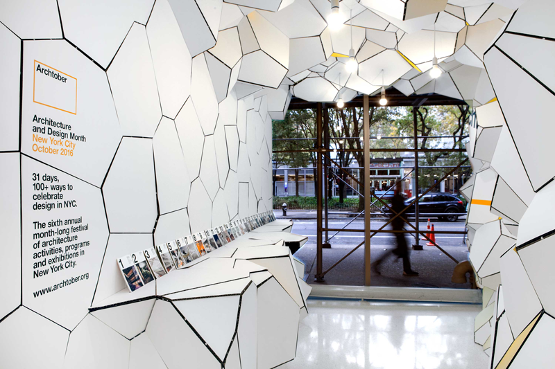
Image: Archtober 2016
The responsibility of designing the exhibition and identity for Archtober 2016 fell to Pentagram’s partner Luke Hayman and his team. The 2016 identity for the 6th Archtober extended the developed graphic program for the previous five editions of Archtober. This year’s identity draws from the mathematical diagram known as Voronoi tessellation; a honeycomb-like installation of irregular polygons, generated from six points in this case. Built of crenelated cardboard, joined together by butterfly bandages, the construction renovated the gallery into a one of a kind architectural setting on a shoe-string budget.
16. Top Of The Rock Advertising Campaign By Michael Gericke
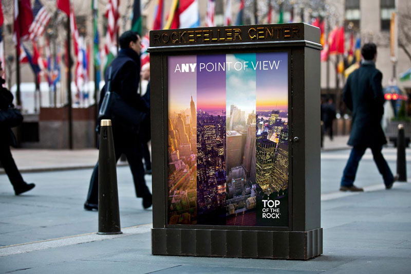
Image: Top Of The Rock
Pentagram’s Partner Michael Gericke and his brilliant team designed an elegant and bold graphic program and advertising campaign for “Top of the Rock”, that accentuates the breathtaking, unprecedented vistas one can witness from the deck. The campaign is designed to appear in websites, promotions, print advertisements, and on buses, banners, digital kiosks, and posters throughout New York. The campaign visibly flaunts at the 77-story skyscraper Rockefeller Center, where the vibrant graphics attract millions of visitors. Since the views at Top of the Rock continuously switch between seasons and days, the campaign puts together a panoramic accumulation of images shot from the observation deck at different times of the day.
17. Ungifted Website By Naresh Ramchandani
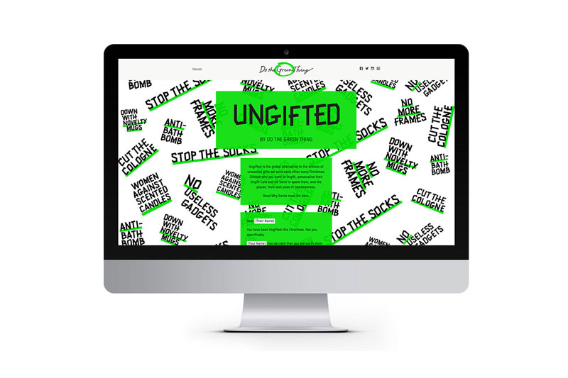
Image: Ungifted
Pentagram partner Naresh Ramchandani teamed up with the “Do Green Thing” team to launch the website titled “Ungifted”, in response to the billions of unsolicited presents exchanged during the holiday season. The campaign calls on people to join the anti-tat movement by sparing the planet and the people they care about from bulks of seasonal junk year after year. The website allows users to personalize and send Ungift cards, which are anti-consumption Mad Libs written and designed by Naresh Ramchandani and team. The website also incorporates catchy anti-tat slogans, done up in Natasha Jen’s duct tape typeface, in an attempt at typographic sustainability.
18. The Last Stop By DJ Stout And Barrett Fry
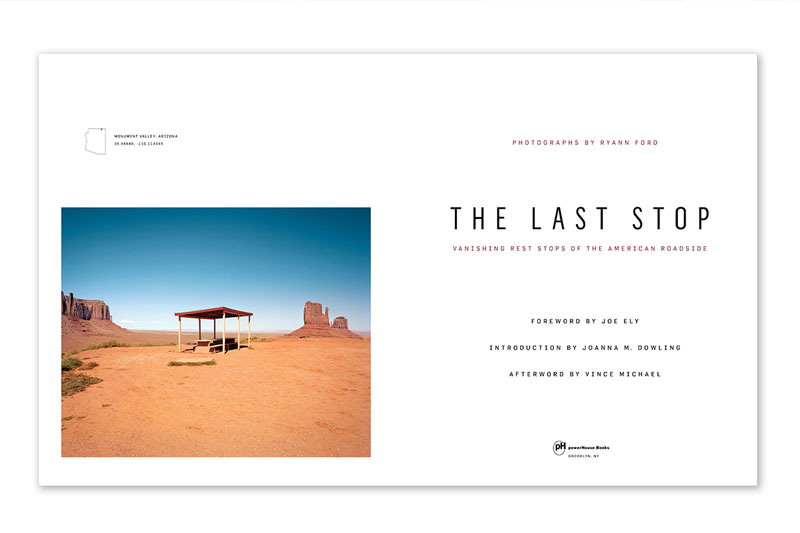
Image: The Last Stop
Partner DJ Stout and lead designer Barrett Fry had their hands busy designing a new book for famed travel photographer Ryann Ford, in Pentagram’s Austin office. In the coffee-table, oversized volume, titled “The Last Stop: Vanishing Rest Stops of the American Roadside”, the photographer pays a loving ode to the last vestiges of a uniquely American icon. To ease the readers on this eclectic photographic road trip, the Pentagram designers have interspersed the photographs with the exact longitudinal and latitudinal coordinates and a small map graphic for each rest stop within the book’s modest titling.
19. Last Folio By Daniel Weil
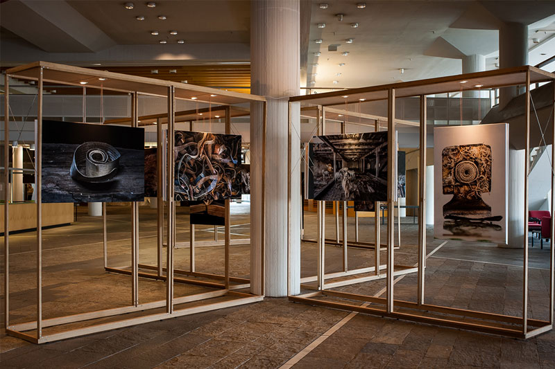
Image: Last Folio
Pentagram partner Daniel Weil designed the exhibition of photographs by Yuri Dojc, titled “Last Folio – Traces of Jewish Life in Slovakia”, which came to Germany for the first time since its inception in 2009. The design brief entailed a display that would be apt for the Gonville and Caius College Library in Cambridge. Weil structured a succession of virtual spaces that imitate the volume of vacant bookcases, each ghostly space nestling a single photograph. These modest and skeletal oak structures are ubiquitous throughout the exhibition’s tour; each space bursting with unspoken meaning.
20. New Identity For The Royal Academy Of Arts By Tiffany Fenner
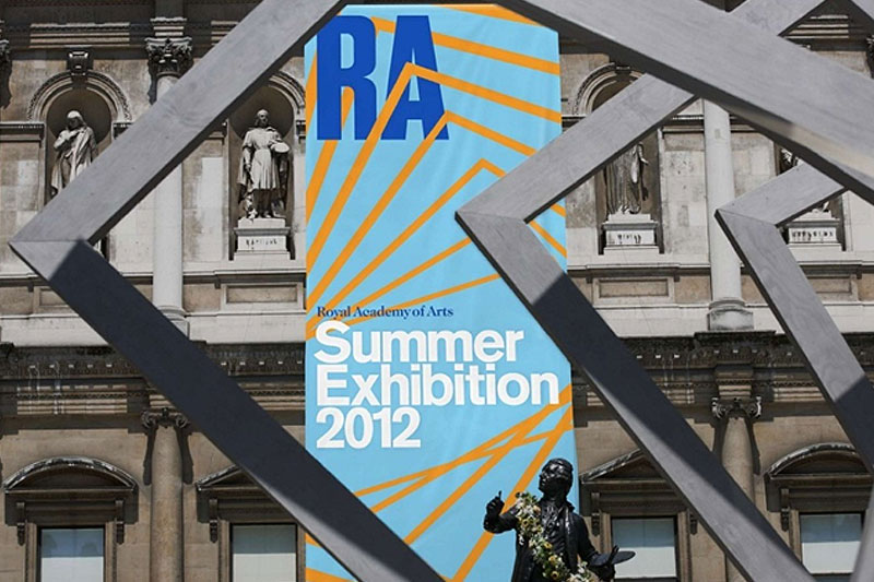
Image: Royal Academy of Arts
Being one of Britain’s oldest institutions, the mission of the Royal Academy of Arts has always been to create, promote, and support visual arts through discussion, education, and exhibitions. For Pentagram’s partner Harry Pearce and lead team designer Tiffany Fenner, creating a new identity for this timeless establishment was all about creating a foundation for a confident future, bringing authority to the present, and honoring the past. Pearce created a design system which lets the organization become a sensitive and confident author of all its visual material. The new identity is a nod towards the institution’s history, featuring Azkidenz and Caslon as the core typefaces, illustrating graphic nuances from modern to classic, and boasting the rather contemporary typographical RA symbol drawing from the type forms featured on some of its early posters.
Have you seen more of Pentagram’s works that have left you gaping in design awe? Do let us know in the comments below!

