This post is contributed by Alex Moncada.
The construction industry is sky-rocketing at a mammoth rate. At the same time, each new player in the market is causing the competition to become ever more intense. This is a wakeup call for business owners to carve a viable identity in the field, so as to help clients offer them new contracts and recognize the company. However, before any marketing strategies in the field of construction are successfully executed, businesses need to invest in a winning logo design which serves as the icon of the company.
With the passage of time, the logo of a construction company becomes a hallmark of the quality of services offered by the business. Customers inadvertently start looking at a company logo as a mark of reliability and trust. Construction company logos create a potent brand identity to build a loyal customer base, which is the foundation stone of any business. In addition to demonstrating that they are builders more than apt to take on the next job, construction companies also need to effectively stand out and leave a lasting impact amongst the masses of hard hats and hammers imagery that has become synonymous with construction logos. Striking a balance between maintaining the elegance of a well-constructed logo and the bold strength needed to demonstrate a sense of lasting trustworthiness, is something that all Construction companies should master.
How To Design A Construction Logo?
In the minds of the client, an ideal construction company must be responsible, stable, and reliable. A viable brand identity can help businesses create the right buzz around their brand. This is accomplished through selection of the right icons, fonts, colors, and smart element arrangement.
Your construction logo has to be unique and authentic, so it can give you an edge over competition. When it comes to selecting icons, Construction companies often draw upon standard real estate images such as skylines, buildings, roofs, and house silhouettes. Brand identity for construction business needs to be imbibed with the right dose of reliability and appealing ruggedness, which are often reflected by the images of the equipment or tools, or strong animals supporting constructed objects (equipment, tools, building, and houses, with animals like lions, cheetah, and others).
Construction companies often go for masculine, strong logos with bold colors, since they cannot employ lines that are too thin or colors that are too muted, lest they unintentionally create the subconscious perception that the workmanship of the company isn’t solid or up to the mark. Construction companies need to portray a sense of security. The promise of a construction company is to provide stability and shelter whether they construct houses or commercial buildings, so it is prudent not to add too many colors in your logo. Such a kaleidoscope of colors could make your logo come off as a bit unreliable. It’s pertinent to choose formal colors, such as white, red, black, magenta, and brown, as our brains associate these colors with bricks and buildings. In order to keep the logo design looking professional, stick to no more than 2-3 colors.
Related: The 10 Commandments of Color Theory
When it comes to choosing the right font for your construction logo, try to steer clear of hard-to-read fonts with excessive serifs and scrolls, and any other fancy, handwritten fonts. Opt for a solid font to reverberate your message, especially in combination with a massive icon, a trend redolent in the construction industry. Clean and straight fonts, such as Garamond, Europe, Ageone, and MagistralC are your best options. Never choose more than two typefaces for a logo as too many fonts can undermine the legibility and effectiveness of an otherwise professional logo.
While designers and business owners in the construction industry often consider the above considerations while designing their logos, one overlooked, yet highly effective, factor is the geometric shape of the logo. When leveraged right, shapes can impart strong yet subtle messages and make your logo come off as unique!
Shape Psychology In Construction Logos
Although trademarks are assets that people usually just use to recognize brands, there is a whole world behind them. They are more than just an identifier as their components tell a story and enhance their brand identity. If carefully planned out, a trademark will let you know everything that there is to know about the company.
The idea that these components are more than just a symbol is the basic theory of design called Gestalt. Discovered in Germany in 1912 by Max Wertheimer, Gestalt states that the whole is different from the sum of its parts. This isn’t relevant to just design, but to every visual aspect in life, since it also had the idea that observers had the ability to break down elements of their perception into sensations.
This theory explains why simple things such as shapes are more than just a swatch of color when used in trademarks. Shapes tend to illustrate the product or service that the company offers, and they usually let you know the company’s personality. For example, if the logo mark is big and bold, that usually means that they are open and accessible, while small and intricate ones tend to represent exclusivity. But it is also important to note that shapes might mean different things according to the culture of the place or even with the position of the shape. The triangle is a perfect example of this, to the Celts a triangle meant the cycle of life, while to the Greeks it meant a doorway.
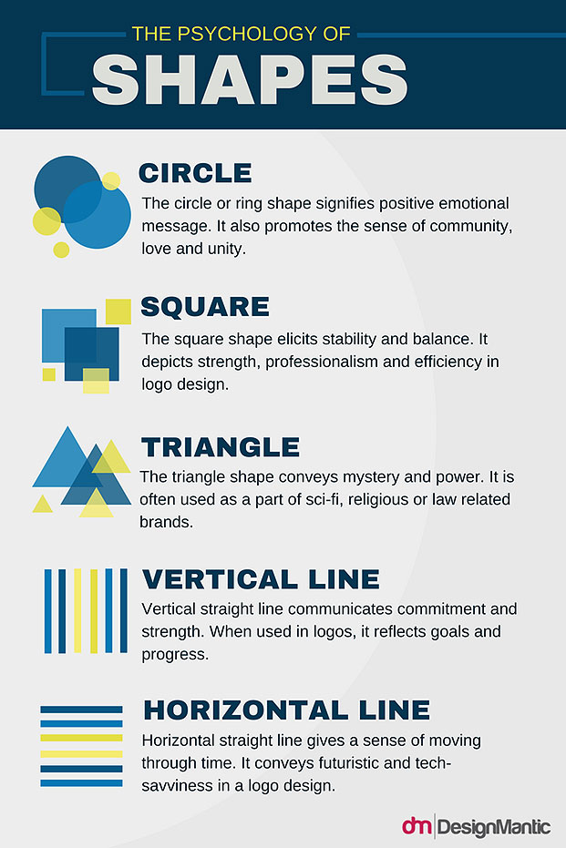
But without going into the tangent of different cultural meanings, here is a chart explaining the meaning behind shapes used in visual communication, but especially in trademark design.
Narrowing down this idea of shapes being used in trademarks, construction companies have a need to represent solid and stable work. To narrow it down even more, these are five construction companies in Savannah, GA that use different shapes in their logo marks.
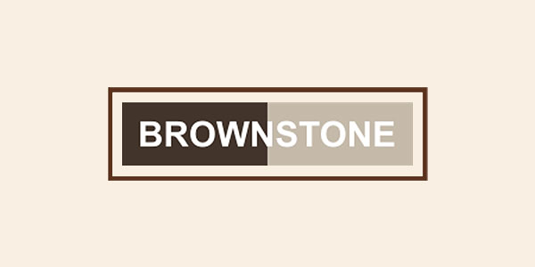
• Brownstone Construction Group
The first being the Brownstone Construction Group which uses more than one shape in their trademark, but they are all the same shape: rectangular. Analyzing visually, the middle rectangle represents balance (especially because of the use of color). The outer rectangle may signify stability, but it also serves the purpose of a ring giving a sense of protection provided by the company’s work. It may not necessarily a circle, but this outer rectangle may also mean that it has a sense of community.
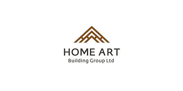
• Home Art Building Group LTD
The logo of Home Art Building Group LTD uses a triangular shape in their logo, since triangles are known to be associated with law, religion, science, and power; all masculine traits. It hardly comes as a surprise that logos of companies with a masculine bias often feature triangles in their business logos. In addition, Triangles are the perfect shape for giving the impression of rooftops for homes. Construction businesses catering to domestic housing would really benefit from making their clients know their specialty.
• JEDunn
JEDunn is a trademark where there is a figure-to-ground play using a circle. This company is located downtown, so the circular shape definitely signifies belonging to a community, since it is right in the center of the city where most people hang out. Furthermore, the blue color makes the user feel invited to use their services.
• Collins Constructions
Collins Constructions’ trademark uses horizontal lines rather than a blocky shape. These lines are used to create buildings and a landscape, making this trademark have a calmer feeling than that of its fellow competitors.
• Snipes Homes And Constructions
Last but not least, Snipes Homes and Constructions has an intriguing mark since they use the combination of a circle and a triangle. Including both a sense of being stable and sturdy but rounded enough to be protective and a part of the community, these two shapes also make a simple house.
After analyzing these different trademarks, it is clear that construction companies need to tell their clients that their work is sturdy and well balanced and it is also going to provide a sense of security. Following these guidelines, one can design a plethora of different trademarks that will provide the construction company with an asset that will attract more customers and help evoke their company’s mission.
There is not a limited amount of ways in which construction trademarks need to be done, but it is safe to say that they need to give this sense of security and comfort, while also displaying that their work is balanced and sturdy. This is why shape psychology is so important, because it does more than just adding a colored visual to a couple of letters. If used appropriately and smartly enough, you might find yourself attracting more people because your logo mark spoke to them in ways your competitors didn’t.
Leveraging Shapes To Create Negative Spaces
In addition to the traditional shapes of logos imbued with meaning, designers these days are experimenting with unique logo shapes to build a stellar reputation amongst the clients. Incorporating a hidden meaning in your construction logos seek to offer a waft of some fresh aesthetical pleasure to your viewers and catch them by surprise. The pleasure of discovery is such that people are unlikely to forget the elements of surprise in the design for a long time.
In creating such memorable construction company logos, designers incorporate the core message of the company clandestinely by leveraging negative space as a design tool. The objective is to design a logo that communicates the company message to the audience subtly. Capitalizing on negative space in such a way helps the logo figure take on a new shape. This new shape of the design may turn out to be a symbol of trust and strength or the company name and so on. If you want to lure your customers to your business, negative spaces are the way to go. Here are some of the best instances of negative spaces in construction logos:
By incorporating a hidden arrow between the ‘t’ and the ‘x’, the logo of Project X Construction is a play on the FedEx concept, where the “X” is designed to communicate trustworthy, reliable, and speedy services.
The concept of this construction company is rendered beautifully in the design. The coin poised between the thumb and index finger of the hand is hinting at the economical aspect of buying a house, while a house symbol is ingeniously hidden in the negative space within the hand.
The logo of Smart Construction solutions is one of the most popular construction logos out there due to the fact that the symbol “S” in the logo mimics the form of construction machines in action.
The awe-inspiring construction logo of Shebzo, feature the four states: Korean Flag symbol, nut-screw, wrench, and Honeycomb. The honeycomb forms a potent hexagonal structure in construction, while nut screw and wrench ate popular tools. The allusion to the Korean flag is due to the fact that the business has its roots in Korea.
Can you think of more construction logos, leveraging shapes to their advantage? Do let us know in the comments below.

