While a logo is an important piece of identity for any brand, for a beauty business its importance becomes critical. You want people to believe that you know beauty? You can’t do that with an unsightly brand logo.
Therefore, begin by stepping your best foot forward. And that starts with a stellar and striking brand logo. Below, you will find four sure-fire ways to fix most mistakes you can commonly find in logo designs, including beauty logo design.
We discuss each of these fixes and helpful tips in detail and share insights on how you can create flawless designs in the future.
So let’s start, shall we?
1. Descriptive Vs. Non-Descriptive Logo
You want your beauty logo to stop people in mid-track? Consider a descriptive vs. non-descriptive approach. Think long and hard about which route to take and which seems most natural to your brand identity and character.
For some brands, a descriptive logo – containing beauty icons and shapes that have a direct link to the beauty industry, such as lipsticks and nail polish bottles – seems like the best idea. While for others, a non-descriptive logo such as the brand’s name itself or the owner’s name suffices. The latter approach is most effective for beauty bloggers, beauty salons, and such. While the former suits cosmetic brands that sell beauty items and the like.
Deciding between a descriptive and non-descriptive logo is the first step towards ensuring that the rest of your design process will have a direction and follow a smooth course. It also helps you with important design decisions such as the layout of the design, colors that’ll help, and even alignment of shapes.
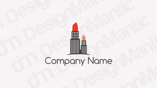
Logo with building turned into lipstick
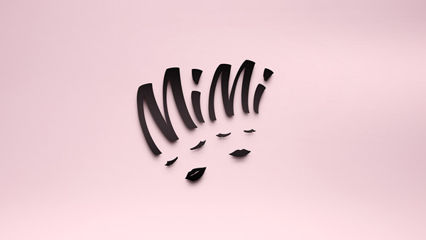
Image Source: Behance
Image Source: LogoPond
Image Source: Dribbble
2. Color Contrast
Color is a huge part of logo design, even more so for beauty logos, because it directly impacts your brand message. Color contrast is something that not only helps the design technically but also increases the aesthetic quality of the whole layout. The lack of it can make the design look one-dimensional, flat, and devoid of any character. In certain lights and against certain surfaces, zero color contrast can even make the design look dull and impossible to decipher.
Related: [INFOGRAPHIC]: The 10 Commandments of Color Theory
How to make it better?
Look at the logo designs below. From the classic black and white to a naughty shade of red on an otherwise symmetrical blue, you’ll find all sorts of color contrasts in these examples. Then there is the unique contrast of blue, green, and white plus another with multiple colors thrown in.
So you can see that to add contrast in your colors, your choices are quite unlimited. As long as you are being strategic in your color choices – choosing shades that match your brand and that look good together – you’ve nothing to worry about.
Plus, don’t think you’ll have to go all out to add contrast in your colors. You can easily do that with even the slightest quantity of color. Just make sure you’re using colors that are either contrasting or complementing so you can produce a unified and comprehensive look to set your beauty logo apart.
Dragonfly logo with dual colors
Image Source: Behance
Image Source: LogoPond

Image Source: Dribbble
3. Add Colors To Make It Distinct
For logo designs that look blank and bland, it’s usually because they consist of a single color palette that does nothing to enhance the beauty of the work. Sometimes, boring shapes and repetitive icons are the culprits in such designs.
Whether it’s the colors or the shapes that are bringing your cosmetic logo down, working on your color palette can improve a lot of things for your brand. Adding a pop of a striking color can make a shape pop up. Similarly, if you are worried that your use of a single tile of color is causing trouble in your design, try adding a splash of another color to see how things improve.
As the logo design examples below would demonstrate, you don’t have to add a lot of color or change your whole palette to make your design shine. A bright red here, a neutral white there, plus the pop of a striking green, and you’re done. And you can add these pops anywhere in the design you like: in the parts of the icon, as a tiny new detail, or even in the font. Just keep it neat.
Chinese girl silhouette logo
Image Source: Behance
Image Source: LogoPond
Image Source: Dribbble
4. Use Relevant Icons
So the design approach and colors taken care of? Let’s talk shapes.
Icons are the centerpiece of any logo design. They give you the canvas on which you can draw the rest of your art. They give a logo relevance to the industry it is designed to promote, and help people make instant connections. Therefore, it is vital to use icons in your beauty logo that are relevant to your business.
Related: 20 Stunning Beauty Logo Designs To Inspire Your Next Project
For example, if your beauty business offers organic products, perhaps focusing on an icon that looks natural and has a lot of green in it will make it more relevant. Similarly, for a skincare logo, use an abstract icon such as a swan or a butterfly or even a hand logo that’ll look more connected to the skincare industry.
With relevant icons, you can make people knowing about your business way easy and take away all the confusion.
Lotus logo with Swan
Image Source: Behance
Image Source: LogoPond
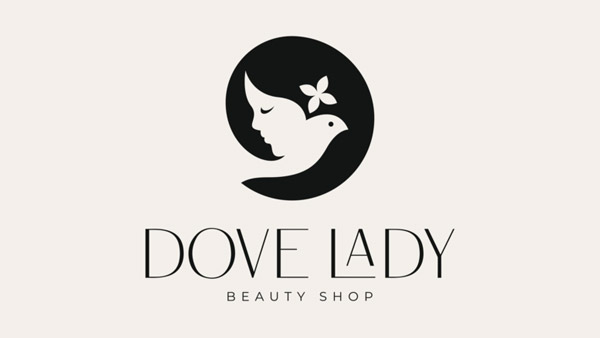
Image Source: Dribbble
Summing Up
To make your beauty logo design work, you have to make sure you are paying extra importance to all the visuals of the designs. The shapes and icons you choose, the colors you pick and the way you manage them on the design, and the font you use in beauty logo that binds the whole thing together, you need to get all of these details right.
While all of the ways to improve your design we’ve shared here are important, what works the best is when they work in a unified manner and give you a cohesive and comprehensive picture. So, get to work, start designing, and put these tips to practice.
Check Out Our Personalized Logo Maker Tool:
Logo Templates For Beauticians

