While a boxer may wonder if Muhammad Ali would approve of their right hook, or a dancer may find herself introspecting what Michael Jackson would have had to say about her dance moves, logo designers often ask themselves what Paul Rand would think of their logo.
Related: 14 Inspiring Paul Rand Quotes to Ignite your Designer Passion
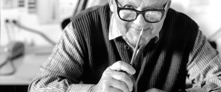
American graphic designer and art director Paul Rand is best celebrated for his corporate logo designs, such as the logos for IBM, Steve Job’s Next, ABC, and UPS. While critics sometimes interpreted his designs as being simple, he answered them saying,

According to Paul Rand,
“The principal role of a logo is to identify, and simplicity is its mean. Its effectiveness depends on distinctiveness, visibility, adaptability, memorability, universality, timelessness, and simplicity.”
Entrepreneur and writer Dave Schools used this Quote to come up with a seven step checklist to allow designers to check if their logo is indeed a great one. Let’s put the most recent brand overhauls through Paul Rand’s seven step test to see if the logo change was a fail or a win!
1. Oxygen Redesign

Having announced a complete shift to a “fulltime crime destination for women” in 2017, Oxygen unveiled a new tagline “Crime all the time”, and a new logo as part of the brand overhaul to celebrate the massive success of its popular unscripted original programming, making it one of the fastest growing cable entertainment network. Designed by Trollback+Company, the logo is suffused with just the right amount of creepiness, keeping in line with the focus of the channel. This goes in the favor of the channel as the logo manages to perfectly capture the masking-tape-to-label-evidence aesthetic in addition to the police-line-do-not-cross vibes, neither of which is least expected.
Will It Survive The Paul Rand’s Test?
Is it distinctive? Not quite
Is it visible? Yes
Is it adaptable? Yes
Is it memorable? Yes (Thanks to the much frowned-upon subway application)
Is it universal? No
Is it timeless? No
Is it simple? Yes
2. Audi

Audi last became the hub of all design attention way back in 2009 when they gave their rings a coat of polish, launched their custom type family, and rendered its distinctive wordmark a little less loud. In its latest logo iteration, the German automobile manufacturer has completely ditched the wordmark altogether, de-polished and flattened out the rings, and transformed the rings into the brand logo.
While a new logo designed today in this fashion is bound to get demolished, association with some of the finest vehicles available on the road today and equity of years of use have become the saving grace of the simplicity of these rings. While easing the luxury brand into a flat design, each detail is well thought-out and meticulously considered so that the end result is easy to implement by a wide array of vendors, dealers, and the in-house team. The overall design is luxurious, minimal, audacious, and poised in a way that matches the panache of Audi’s cars.
Will It Survive The Paul Rand’s Test?
Is it distinctive? It’s a signature
Is it visible? Yes
Is it adaptable? Yes
Is it memorable? Yes
Is it universal? Yes
Is it timeless? Yes
Is it simple? Yes
3. NBC Universo

“Breaking Boundaries,” the latest positioning of Universo, inspired Trollback+Company to take the brand design far beyond that of its competitors. Bold minimalism and impactful animation lead to a modern look that embodies to perfection the spirit of a diverse, young Hispanic demographic. Though perfectly understandable, the old logo of Universo was so heavily NBC-branded that it barely left room for anything else to be fabricated into it. In addition, the dipping ‘R’ was nothing short of a design travesty, and we are glad the brand subsidiary decided to get rid of it. By Dropping the NBC label and rendering the iconic NBC peacock in a single color, the logo suddenly seems like a synergy between a name that immediately signals “Spanish” and the recognizable icon, and much less like a licensed brand. The logo design combines musical diversity with typographic simplicity to cause a restrained explosion of rhythm.
Will It Survive The Paul Rand’s Test?
Is it distinctive? It’s derived from a signature
Is it visible? Yes
Is it adaptable? Yes
Is it memorable? No
Is it universal? Yes
Is it timeless? No
Is it simple? Yes
4. Calvin Klein

Underwear brand CALVIN KLEIN launched an all new logo to mirror the brand’s aspirations of going back to the future. All-caps replace the lowercase letters of the previous rendition with a smaller kerning gap between letters, and the company touts the new design as: “A return to the spirit of the original; an acknowledgement of the founder and foundations of the fashion house.” The in-house creative team of Calvin Klein, led by CCO Raf Simons, designed the new brand identity in collaboration with celebrated graphic designer and British Art director Peter Saville. The san-serif typeface of the logo is reminiscent of its iconic text based predecessor without that overtly vintage feel. However, the change has been deemed unnecessary by many critics since it does nothing to inspire customers, separate the brand from its contenders, or move the brand forward.
Will It Survive The Paul Rand’s Test?
Is it distinctive? No
Is it visible? Yes
Is it adaptable? Yes
Is it memorable? Yes.
Is it universal? Yes
Is it timeless? No
Is it simple? Yes
5. Stanley Park Brewing

Stanley Park Brewing has recently launched a new identity for its products, designed by the local firm Will. Keeping in mind that the brewery and the entire team behind it draws inspiration from the park, it seemed only natural to bring the brand closer to its roots. Upon a closer look, the new brand is replete with substance, yet approachable and simple at a glance, just like nature. Inspired by the shape of the park, the logo features illustrated park scenes done up within a restrained palette, while the stick-inspired, natural letterforms of the typeface are inspired by the historical Stanley Park sign. The minimal tree illustrations and the wood-carved park-inspired typography ensure a huge aesthetic departure from the last logo iteration.
Will It Survive The Paul Rand’s Test?
Is it distinctive? Yes
Is it visible? Yes
Is it adaptable? No
Is it memorable? Yes. Unless a customer really abhors the woods, this is an amazing direction that makes this beer stand out amongst traditional beer designs.
Is it universal? No
Is it timeless? No
Is it simple? Yes
6. IBM Watson

The old logo of IBM Watson was inspired by the series of IBM’s “Smarter Planet” icons, where each symbol had the recurring visual structure of circular compositions surrounded by exclamation marks, as an assertion of a new world view. With an award winning marketing campaign, IBM aspired to show how a generation of intelligent, more-powerful-than-ever technologies and systems could be encouraged to unearth solutions of unprecedented world dilemmas. The old logo sufficed as an abstract representation of AI- connected, neural-looking things- and could have been utilized for many more years before somebody had a problem with it.
The new logo is executed beautifully, despite retaining similar concepts and structure, leveraging the use of gradients that seamlessly fade into the back of the logomark to capture its three-dimensionality to utmost perfection. Metaphorically speaking, the new logo couldn’t have felt more like the living system that we call Watson. We specially love the color palette that deviates away from the clichéd, in-your-face vibrant palettes that have been quite prominent over the past couple of years. Overall, the logo works perfectly for a product that poses quite a challenge when it comes to marketing and presenting in a way that brings out its innovation in technological advancement and not make it seem like a hyper-intelligent robot that would kill you in your sleep when Internet of Things and digital overlords take over.
Will It Survive The Paul Rand’s Test?
Is it distinctive? Yes
Is it visible? Yes
Is it adaptable? Yes
Is it memorable? Yes
Is it universal? Yes
Is it timeless? No
Is it simple? Yes
7. Huffington Post

As a liberal news blog, founded by Arianna Huffington in 2005, Huffington Post has seen myriad ups and downs and came out stronger than ever. Its place as a formidable voice entailed that it got a proper wordmark, and ditch a wide array of newspaper-style titles it had become accustomed to. In addition to changing its name, the news blog unveiled a new logo identity. Designed by the New York agency Work-Order, it is set in bold italic and typeset in a Klim Foundry font called National, since they evoke memories of the slashes in URLs, while pointing us forward.
Similarly, the slashed blocks bookending the logo are a nod towards the forward momentum of the logo, as well as hinting at the blog’s place as the first digital-only news brand in the U.S. The mark forms an abstract H, a slash, a road- people perceive different things in the logo and we are open to embracing all the possibilities. They have also brightened their signature green for the era, a color synonymous with HuffPost.
Will It Survive The Paul Rand’s Test?
Is it distinctive? No
Is it visible? Yes
Is it adaptable? Yes
Is it memorable? Yes
Is it universal? No
Is it timeless? Yes
Is it simple? Yes
8. Skype

The popular instant messaging App recently bid adieu to the full wordmark-in-bubbles for a bare-bone rendition done up in Microsoft’s corporate typeface, while retaining the standalone “S”-in-bubbles monogram synonymous with the App icon. While the old logo was pretty recognizable, it was downright atrocious actually. The logo revamp is a clear indication that the App isn’t the adorable Danish startup people might still think it to be, but is on the same level as the other products in the Microsoft universe.
Will It Survive The Paul Rand’s Test?
Is it distinctive? Yes
Is it visible? Yes
Is it adaptable? Yes
Is it memorable? No
Is it universal? Yes
Is it timeless? Yes
Is it simple? Yes
Can you think of a recent brand overhaul that ticked all the boxes of the Paul Rand’s test? Do let us know in the comments below.