Balance is one of the fundamental principles of visual arts, and it is equally important in logo design. A well-balanced logo lends the image a certain power and impact. But what do we mean by a balanced logo? Basically, a balanced logo is one with a well-adjusted composition. This means the composition is arranged in a manner that feels just right. Such a composition not only has a stable quality but is also aesthetically pleasing. A balanced logo or symmetrical logo may have multiple focal points that demand your attention, but this attraction is never so imbalanced that you cannot see the other elements.
Balance Is The Key To Visual Success Of An Image
Typically, the concept of balance stems from the set of gestalt visual theories. According to this theory, our mind always organizes information in groups or patterns, which can be called ‘composition’. A well-balanced composition will be naturally pleasing to the eye because it will feel stable and right. This is why it is important for logo designers to consciously incorporate balance and perfect order in logos. And to achieve this end, we need to pay attention to both sides of our logo; the negative space and the positive space. When all of the elements of a brand icon fit together to form a cohesive whole, we say the balance has been achieved.
Dangers Of An Unbalanced Brand Icon
The dangers of an abstract logo are as many as the benefits of a balanced one. For one, an unbalanced composition can cause visual tension in design. This is something no designer wants because a visual tension will lead to a missing out of information on the viewer’s part. As designers, we want our logos to convey certain messages. For example, if you lead a mindfulness fitness group, you want your health and fitness logo to convey a certain serenity, wholesomeness, and strength. However, a tensed composition can undo these very messages and lead to the wrong interpretation. Unless an unbalanced composition is specifically working on the message you want to convey, it will seldom be the right choice.
Today, we are going to analyze the principle of balance with respect to Fitness logos. We will go through the different ways of creating this compositional stability, and see what fits our logo the best.
How Visual Balance Works
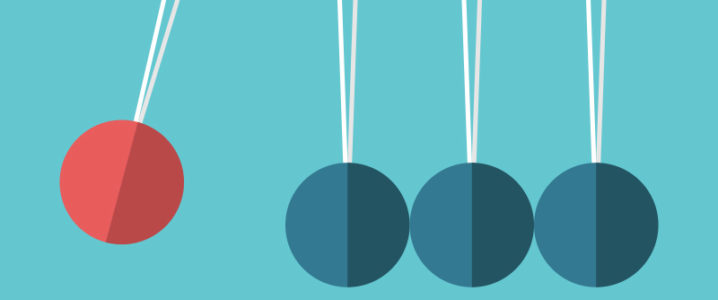
Visual Balance works in the same way as physical balance. Physical balance is dependent on the individual forces. When the forces acting on two sides balance and cancel out each other, a teeter-totter will be seen to hold its stability and balance. Visual balance works in the same way. When the visual weight of all sides of an image is equal, the composition will convey a sense of balance. To put it simply, visual weight is the measure of how much a single element demands the attention of a viewer in logo designs.
So how do we achieve a visual balance? It is simple, when all parts of your fitness logo hold an area of interest, or carry the same visual weight, it will result in visual balance. When your fitness class logo lacks a visual balance, you will find some areas of it will be redundant, and won’t draw attention at all.
This is an example of an imbalanced fitness icon:
This logo has a bad ratio of negative and positive space. The composition feels tacky, suffocated and constricted. There are also a lot of things that are lost in translation. For example, the tagline does not draw attention at all, and the male figure is equally subdued in the icon. All of this gives an overall feeling of imbalance. The visual weight of the individual elements is not the same in this composition.
On the other hand, this logo gives a very balanced feeling.
You can see the same pattern in this logo; the use of a male and female fitness silhouette in logo design. However, the overall arrangement conveys a sense of harmony and stability. The individual elements enjoy a similar visual weight. The human figures, the brand name, and outer boundary all draw equal amounts of attention at different intervals.
Four Types Of Balances And Their Benefits
Many laymen confuse balance with symmetry; however, symmetry is just one of the many ways of balancing a composition. There are multiple ways to bring a sense of equilibrium to your image, and all of these different ways suit different purposes. In this section, we are going to analyze each one.
1. Symmetrical Balance In Logos

Symmetrical balance is the most commonly understood type of compositional balance. It occurs when both sides of your design look exactly the same, and they carry the same weight. This weight is held in the center by a pivot or a fulcrum. If you use symmetrical balance in your gym logo, not only will one side be a mirror image of the other, they will also demand equal attention. So much so that the viewer will not even notice his/her attention is divided between both sides and will take in the image as a ‘whole’.
A symmetrical balance will have equal parts of negative and positive space on each side of the design. Here are some examples of fitness logos that employ this kind of balance:
![]()
Image: Dribbble/Cameron Jennings
The Annaliese Mortimer Personal Trainer logo looks clever and unique and has a specific charm because of its symmetry. You can see the merger of letters ‘A’ and ‘M’ within an image of weightlifting bar, arranged in such a way that it creates an abstract logo. If you draw a straight line from the center of the letter ‘A’, it will cleanly divide the logo image into two identical sides, with a specific visual fulcrum.
![]()
Image: Dribbble/Vladimirs Jeberza (Yoon)
This logo for fitness club has a symmetrical balance as well. However, the usual strictness and formality of a symmetrical logo have been subdued by packing it in a circle along with certain softness. One may argue that the antennas of the ant break away the symmetry, and that is true, however, the overall image remains largely symmetrical. It gives a very neat and balanced look at the logo.
![]()
Image: Behance/Kathy Smith
The Flower Vector logo has a symmetrical balance, however, the text adds a bit of twist to the rigid symmetry of the composition; with the asymmetrical use of color in the word ‘Arcadia Wellness’, the boring mundane nature of the composition has been broken! A very clever trick indeed!
Benefits Of Symmetrical Composition:
A symmetrical composition looks formal, neat and professional. Its rigidity and predictability make it perfect for formal usage or where a sense of elegance is needed. For example, if your fitness studio is targeted towards the corporate users, you may want to convey a certain sense of class, elegance, and formality with your fitness logo. In such a case, a symmetrical composition will work the best. For example, this fitness logo is an expensive county club, so they make use of symmetrical balance:
It is important to note that symmetrical balance in logos will mostly be in the form of the logo icon, and not always in the form of letter logos or wordmarks. This is because it is very difficult to achieve a sense of symmetry with the different letters that may make up a company or a brand name.
2. Asymmetrical Balance In Logos

Asymmetrical balance occurs when a composition uses unequal visual elements on each of its sides. For example, you may have a dominant element on the right and a less dominant element on the left. Typically, one visually heavy element is balanced with multiple lightweight elements on the other side.
In the field of logo design, asymmetrical logos are considered more interesting and dynamic. These are the organic logos with a modernist touch and a more organic feel. While asymmetry may be seen as a form of imbalance, there is usually a holistic order to such compositions, which gives it an overall symmetrical look. Asymmetry is commonly found in nature –which is one reason why it appeals to the human senses. The branches of a tree, our faces etc all look symmetrical from afar but are actually asymmetrical.
Here are some examples of asymmetrical balance in fitness logos:
In this zumba logo, you can see the right side as the visually dominant side, which is balanced with the human figure on the left side. While the right side draws more attention, it does not suppress the left side of the round yellow logo – which is exactly why we say this design is in a state of equilibrium.
Similarly, in this logo, you can see the weightlifting as the dominant element. However, while the weightlifting anchors your attention and draws in the eye, it does not limit your eye to it. Instead, the eye is moved to the right side where the design is being balanced with the text and white space. All of this creates a sense of harmony, beauty and balance.
Again, you see the left side as the dominant side which is being balanced by the lines on the right side.
The feeling of fullness that is created on the left of the image is also seen on the right side of the image, however visually the design remains asymmetrical
Related: How To Use Golden Ratio To Design A Balanced Residential Real Estate Logo?
Benefits Of Asymmetrical Balance:
Asymmetrical balance is considered to be a very interesting and dynamic form of balance. This is because such a composition introduces a lot of variety in design. There is also a sense of movement and energy in the final output. Which is why this is a great option for fitness logos that are seeking to create a sense of energy. However, asymmetrical balance is more difficult to achieve because the relationships between the individual elements of the logo get more and more complex.
3. Radial Balance In Logos
A Radial balance is exactly what the name suggests; a compositional balance where the elements are held in by a common center. Radial balance acts like a radiation; there is a center that emanates the energy, just like in the ripples of a pond. The central element in the radial balance will be the element that will draw the eye in. It will be the focal point or the pivot. This balance is very easy to create even for novice designers because we know all the energy has to lead back into the center, which should be the most dominant point.
Here are some examples of a radial balance:
![]()
Image: Behance/Wes Schaaf
In both of these examples, you can see a strong center which helps the elements orbit around it. The center is what draws the eye in.
Benefits Of A Radial Balance:
A radial balance is a quick and easy way to create a sense of balance. This type of balance can often hold a lot together; individual elements of different weights can form a coherent whole with the help of this technique.
4. Mosaic Balance In Logos
Mosaic Balance is basically balanced or ordered chaos. The individual elements lack a focal point or a single emphasis, and on the first glance, they seem chaotic and out of control. However, a second glance will unveil the balance and order in such a design. Overall, the design will seem to work. Here are some examples:
This elegant logo by a Fitness company called “Sweaty Saturday” seems chaotic at the first glance. However, you can see it all coming together in a balanced way.
Here is another example of a mosaically balanced composition:
Benefits Of A Mosaic Balance
Such a balance can help you create exotic logos. Mosaic balance may be the most difficult to achieve, and it may not work for every kind of fitness studio, but if this approach works to put across your message in the best way, it may be the most creative and freeing form of composition!
Conclusion:
Having some sort of balance is essential in your logos. Like you just saw, this balance can come in many forms, even forms as counter-intuitive as a mosaic balance. This inherent sense of order and stability in your design will serve to further your design agendas.
Try Our Personalized Logo Maker Tool:
Logo Maker For Fitness Equipment
Exercise Logo Designs
Business Logo For Exercising
Healthy Food Logo Generator
Nutritional Supplements Logo Ideas
Nutritionists and Dieticians Logo Designs Online
DIY Sports Clubs and Associations Logo
Make Sports Coaching and Instruction Logo
Design Sports Equipment Logos
Gymnasium Logo Maker Tool


